Benvenuto nelle Font Più Popolari — dove popolarità e qualità si incontrano. Qui trovi i font più scaricati e usati dell'anno. Se cerchi scelte sicure per logo, web o social, inizia da qui.
Ogni font top si distingue per equilibrio, leggibilità e versatilità. Troverai sans serif moderne, script eleganti, serif vintage e display minimalisti.
-
( Fonts by www.stimuleyefonts.com )
A playful, cursive handwritten font with smooth, connected characters.
 Scaricare 439 Downloads@WebFont
 -
( Fonts by CannotIntoSpaceFonts - KineticPlasma Fonts - Personal-use only. For commercial use please contact owner. )
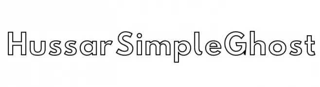
A modern, geometric outline font with consistent line thickness and high legibility.
![Hussar Simple Ghost font caratteri gratis]() Scaricare 439 Downloads@WebFont
Scaricare 439 Downloads@WebFont -
( Fonts by Saridezra - Personal-use only. For commercial use please contact owner. )
A classic serif font with bold strokes and high contrast, perfect for formal and elegant designs.
![MandalikaDEMO font caratteri gratis]() Scaricare 439 Downloads@WebFont
Scaricare 439 Downloads@WebFont -
( Fonts by Dieter Steffmann )
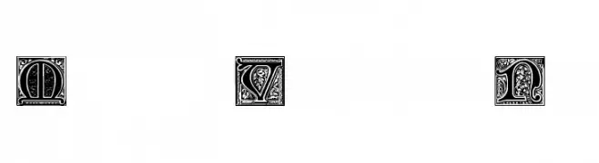
A collection of decorative symbols and emblems with intricate details.
![Belwe Vignetten font caratteri gratis]() Scaricare 439 Downloads@WebFont
Scaricare 439 Downloads@WebFont -
( Fonts by Paul Lloyd )
An ornate, medieval-inspired decorative font with intricate patterns.
![Medieval Victoriana No.2 font caratteri gratis]() Scaricare 439 Downloads@WebFont
Scaricare 439 Downloads@WebFont -
( Wojtek Zolty )
A bold, futuristic font with geometric shapes and clean lines.
![SpaceCapitan-Regular font caratteri gratis]() Scaricare 439 Downloads@WebFont
Scaricare 439 Downloads@WebFont -
( Fonts by www.crudfactory.com )
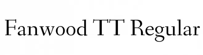
A classic serif font with elegant strokes and refined serifs.
![Fanwood TT Regular font caratteri gratis]() Scaricare 439 Downloads@WebFont
Scaricare 439 Downloads@WebFont -
( Fonts by www.blambot.com )
A bold, industrial font with a futuristic, geometric design.
![MechEffects2 BB font caratteri gratis]() Scaricare 439 Downloads@WebFont
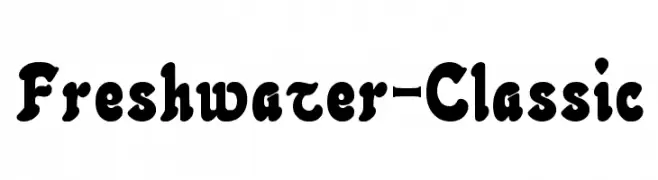
Scaricare 439 Downloads@WebFont -
![Freshwater-Classic font caratteri gratis]() Scaricare 439 Downloads@WebFont
Scaricare 439 Downloads@WebFont -
( Rachel San )
A modern, light sans-serif font with clean lines and excellent readability.
![MadeynSans Light font caratteri gratis]() Scaricare 439 Downloads@WebFont
Scaricare 439 Downloads@WebFont -
( Fonts by Alex Tomlinson - Skyhaven Fonts - shfonts.com )
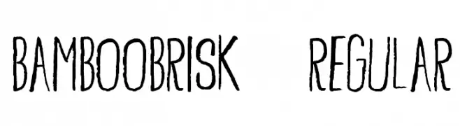
A hand-drawn, organic font with a natural, flowing style and varying stroke thickness.
![BambooBrisk-Regular font caratteri gratis]() Scaricare 439 Downloads@WebFont
Scaricare 439 Downloads@WebFont -
( Free for a personal use. For a commercial use please visit www.kevinandamanda.com )
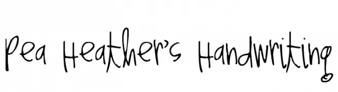
A playful, casual handwritten font with an informal and personal style.
![Pea Heather's Handwriting font caratteri gratis]() Scaricare 439 Downloads@WebFont
Scaricare 439 Downloads@WebFont -
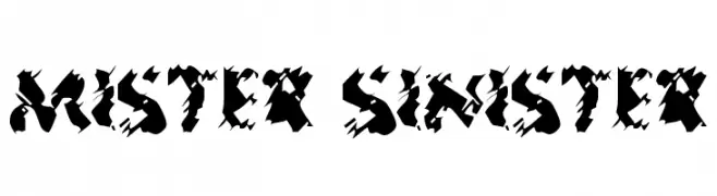
![Mister Sinister font caratteri gratis]() Scaricare 439 Downloads@WebFont
Scaricare 439 Downloads@WebFont -
( Fonts by Chen Yining )
A versatile font combining decorative and minimalist styles in uppercase letters.
![Straight Ruler~ font caratteri gratis]() Scaricare 439 Downloads@WebFont
Scaricare 439 Downloads@WebFont -
( Fonts by Jamie Place [FontBlast Design] - Personal-use only. For commercial use please contact owner. )
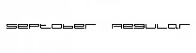
A futuristic, geometric font with clean lines and a modern appearance.
![Septober Regular font caratteri gratis]() Scaricare 439 Downloads@WebFont
Scaricare 439 Downloads@WebFont -
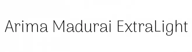
( Copyright 2015 The Arima Project Authors (info@ndiscovered.com) )
A clean, modern sans-serif font with a light and airy appearance.
![Arima Madurai ExtraLight font caratteri gratis]() Scaricare 439 Downloads@WebFont
Scaricare 439 Downloads@WebFont -
( Fonts by Daniel Zadorozny - www.iconian.com - Free for personal use )
A bold, angular, and condensed font with a dynamic and historical flair.
![300 Trojans Condensed font caratteri gratis]() Scaricare 439 Downloads@WebFont
Scaricare 439 Downloads@WebFont -
![Let's Eat font caratteri gratis]() Scaricare 439 Downloads@WebFont
Scaricare 439 Downloads@WebFont -
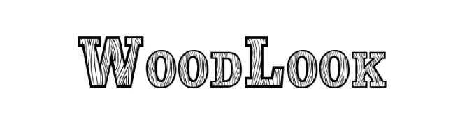
( Fonts by character - Personal-use only. For commercial use please contact owner. )
A bold, woodgrain-textured font with a rustic, decorative style.
![WoodLook font caratteri gratis]() Scaricare 439 Downloads@WebFont
Scaricare 439 Downloads@WebFont -
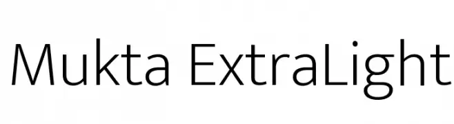
( Copyright (c) 2014, Girish Dalvi, Ek Type. All rights reserved. )
A clean, modern sans-serif font with consistent stroke width and balanced spacing.
![Mukta ExtraLight font caratteri gratis]() Scaricare 439 Downloads@WebFont
Scaricare 439 Downloads@WebFont -
( Fonts by CannotIntoSpaceFonts - KineticPlasma Fonts - Personal-use only. For commercial use please contact owner. )
An abstract, graffiti-like font with bold, irregular shapes.
![Warzone font caratteri gratis]() Scaricare 439 Downloads@WebFont
Scaricare 439 Downloads@WebFont -
( Fonts by Perspectype Studio )
A playful, bold handwritten font with dynamic strokes.
![Twinkle Spark font caratteri gratis]() Scaricare 439 Downloads@WebFont
Scaricare 439 Downloads@WebFont -
( Fonts by Nick Curtis - www.nicksfonts.com )
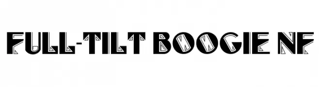
A bold, geometric display font with intricate line details and a dynamic style.
![Full-Tilt Boogie NF font caratteri gratis]() Scaricare 439 Downloads@WebFont
Scaricare 439 Downloads@WebFont -
( Fonts by Marina Sanders )
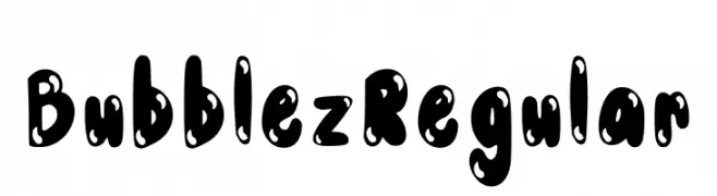
A playful, bubbly font with bold, rounded characters and a whimsical style.
![Bubblez Regular font caratteri gratis]() Scaricare 439 Downloads@WebFont
Scaricare 439 Downloads@WebFont -
![Jacek Zieba-Jasinski Regular font caratteri gratis]() Scaricare 439 Downloads@WebFont
Scaricare 439 Downloads@WebFont -
( Fonts by Jacob Fisher - www.pizzadude.dk )
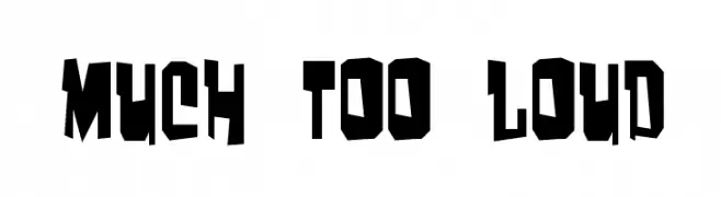
A bold, angular font with a modern and edgy design.
![Much too loud font caratteri gratis]() Scaricare 439 Downloads@WebFont
Scaricare 439 Downloads@WebFont -
( Fontry - M.G. Adkins - www.thefontry.com/ )
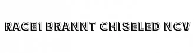
A bold, chiseled font with a three-dimensional shadow effect.
![RACE1 Brannt Chiseled NCV font caratteri gratis]() Scaricare 439 Downloads@WebFont
Scaricare 439 Downloads@WebFont -
( Fonts by MJType )
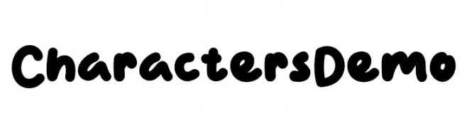
A playful, bold font with rounded, thick strokes and a whimsical style.
![Characters Demo font caratteri gratis]() Scaricare 439 Downloads@WebFont
Scaricare 439 Downloads@WebFont -
![Uecker font caratteri gratis]() Scaricare 439 Downloads
Scaricare 439 Downloads -
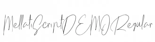
![Mellati Script DEMO Regular font caratteri gratis]() Scaricare 439 Downloads@WebFont
Scaricare 439 Downloads@WebFont -
( Fonts by Kong Font - https://fontkong.com/ - Personal-use only. For commercial use please contact owner. )
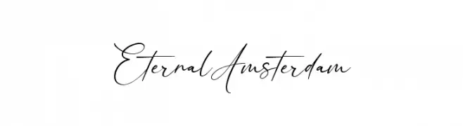
An elegant, cursive font with a sophisticated, handwritten style.
![Eternal Amsterdam font caratteri gratis]() Scaricare 439 Downloads@WebFont
Scaricare 439 Downloads@WebFont -
( Roger White - web.archive.org/web/20120416090521/www.rogersfonts.org.uk/ )
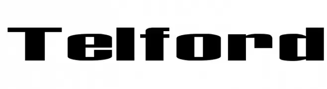
A bold, modern font with thick, block-like characters.
![Telford font caratteri gratis]() Scaricare 439 Downloads@WebFont
Scaricare 439 Downloads@WebFont -
( Helldunkel - www.helldunkel.com )
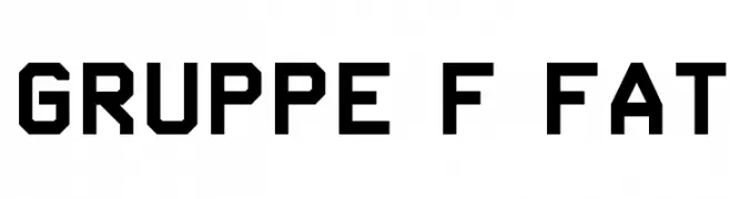
A bold, geometric font with an industrial and modern design.
![Gruppe F Fat font caratteri gratis]() Scaricare 439 Downloads@WebFont
Scaricare 439 Downloads@WebFont -
( Fonts by Graham Meade - GemFonts )
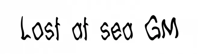
A whimsical, hand-drawn font with an organic, playful style.
![Lost at sea GM font caratteri gratis]() Scaricare 439 Downloads@WebFont
Scaricare 439 Downloads@WebFont -
( Fonts by www.legacyofdefeat.com )
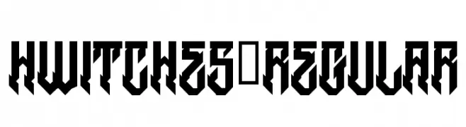
A bold, angular font with a gothic and modern aesthetic.
![HWitches-Regular font caratteri gratis]() Scaricare 439 Downloads@WebFont
Scaricare 439 Downloads@WebFont


Quali sono i font più popolari adesso?
Poppins, Roboto, Montserrat, Open Sans e Lato sono molto usati per le forme pulite e l'ampia applicabilità — dall'identità di marca alle landing page e ai poster.
Quali font si usano spesso nei loghi?
Le sans serif geometriche (es. Poppins, famiglie in stile Gotham) sono scelte comuni per un branding pulito e scalabile. Per un tocco personale restano valide script e stili manoscritti. Abbina un display deciso per i titoli a un corpo testo neutro per riconoscibilità ed equilibrio.
Ogni quanto si aggiorna la lista?
Con regolarità, in base ai download e all'attività reale. Torna spesso per scoprire in anticipo le nuove preferite.
💡 Consiglio: aggiungi ai preferiti — le tendenze cambiano in fretta e i font top di oggi possono ispirare il rebranding di domani.