Benvenuto nelle Font Più Popolari — dove popolarità e qualità si incontrano. Qui trovi i font più scaricati e usati dell'anno. Se cerchi scelte sicure per logo, web o social, inizia da qui.
Ogni font top si distingue per equilibrio, leggibilità e versatilità. Troverai sans serif moderne, script eleganti, serif vintage e display minimalisti.
-
 Scaricare 74 Downloads@WebFont
 -
( گالری فانت فارسی پژوهش آريانا - only compatible with Farsi and Arabic )
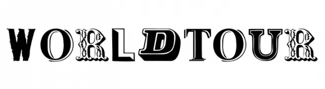
A bold, geometric font with a modern and impactful design.
![Soltaan II font caratteri gratis]() Scaricare 74 Downloads@WebFont
Scaricare 74 Downloads@WebFont -
( Fonts by Perspectype Studio - Personal-use only. For commercial use please contact owner. )
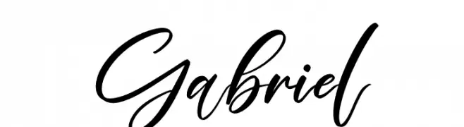
A dynamic and expressive script font with fluid, flowing letterforms.
![Gabriel font caratteri gratis]() Scaricare 74 Downloads@WebFont
Scaricare 74 Downloads@WebFont -
( Fonts by Kong Font - https://fontkong.com/ - Personal-use only. For commercial use please contact owner. )
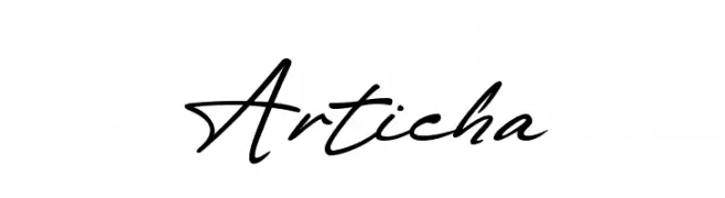
A flowing, cursive script font with elegant, connected letters.
![Articha font caratteri gratis]() Scaricare 74 Downloads@WebFont
Scaricare 74 Downloads@WebFont -
( Fonts by twinletter - Rozikan - Personal-use only. For commercial use please contact owner. )
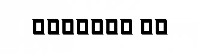
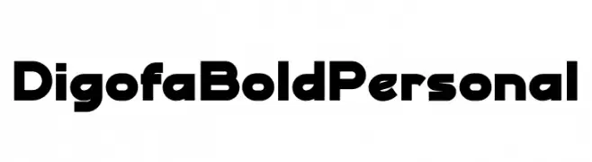
A bold, geometric font with clean lines and a modern aesthetic.
![Digofa Bold Personal font caratteri gratis]() Scaricare 74 Downloads@WebFont
Scaricare 74 Downloads@WebFont -
-
( Fonts by Alpaprana Studio )
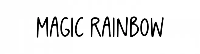
A playful handwritten font with smooth, rounded edges and a casual style.
![Magic Rainbow font caratteri gratis]() Scaricare 74 Downloads@WebFont
Scaricare 74 Downloads@WebFont -
( Fonts by Maelle.K - Thomas Boucherie - Personal-use only. For commercial use please contact owner. )
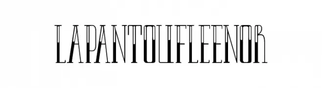
A tall, narrow font with Art Deco influences and elegant serifs.
![LAPANTOUFLEENOR font caratteri gratis]() Scaricare 74 Downloads@WebFont
Scaricare 74 Downloads@WebFont -
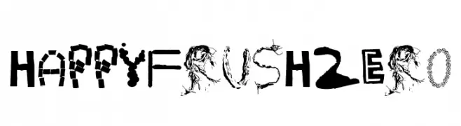
![HappyFrushZero font caratteri gratis]() Scaricare 74 Downloads@WebFont
Scaricare 74 Downloads@WebFont -
( Fonts by Daniel Zadorozny - www.iconian.com - Free for personal use )
A dynamic 3D italic font with a futuristic and bold design.
![Quark Storm 3D Italic font caratteri gratis]() Scaricare 74 Downloads@WebFont
Scaricare 74 Downloads@WebFont -
( Mushroom font )
A pixelated, grid-based font inspired by retro digital displays.
![bitfont font caratteri gratis]() Scaricare 74 Downloads@WebFont
Scaricare 74 Downloads@WebFont


Quali sono i font più popolari adesso?
Poppins, Roboto, Montserrat, Open Sans e Lato sono molto usati per le forme pulite e l'ampia applicabilità — dall'identità di marca alle landing page e ai poster.
Quali font si usano spesso nei loghi?
Le sans serif geometriche (es. Poppins, famiglie in stile Gotham) sono scelte comuni per un branding pulito e scalabile. Per un tocco personale restano valide script e stili manoscritti. Abbina un display deciso per i titoli a un corpo testo neutro per riconoscibilità ed equilibrio.
Ogni quanto si aggiorna la lista?
Con regolarità, in base ai download e all'attività reale. Torna spesso per scoprire in anticipo le nuove preferite.
💡 Consiglio: aggiungi ai preferiti — le tendenze cambiano in fretta e i font top di oggi possono ispirare il rebranding di domani.