Benvenuto nelle Font Più Popolari — dove popolarità e qualità si incontrano. Qui trovi i font più scaricati e usati dell'anno. Se cerchi scelte sicure per logo, web o social, inizia da qui.
Ogni font top si distingue per equilibrio, leggibilità e versatilità. Troverai sans serif moderne, script eleganti, serif vintage e display minimalisti.
-
 Scaricare 74 Downloads@WebFont
 -
( Fonts by Mans Greback - www.mansgreback.com - Personal-use only. For commercial use please contact owner. )
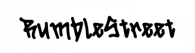
A bold, hand-drawn font with dynamic, uneven strokes and a playful style.
![Rumble Street font caratteri gratis]() Scaricare 74 Downloads@WebFont
Scaricare 74 Downloads@WebFont -
( Fonts by M Ridwan )
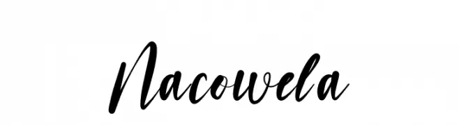
A lively, expressive script font with fluid, connected letters.
![Nacowela font caratteri gratis]() Scaricare 74 Downloads@WebFont
Scaricare 74 Downloads@WebFont -
( Fonts by Art Designs by Sue - Personal-use only. For commercial use please contact owner. )
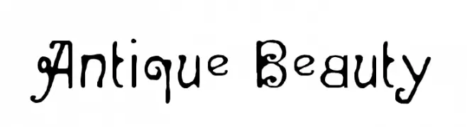
A decorative and whimsical font with intricate curls and swirls.
![Antique Beauty font caratteri gratis]() Scaricare 74 Downloads@WebFont
Scaricare 74 Downloads@WebFont -
( Fonts by Type Factory )
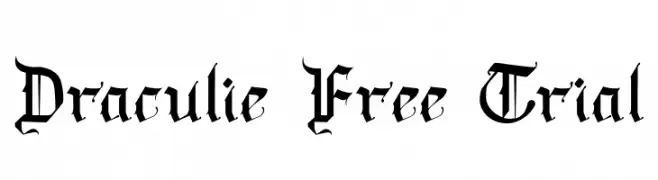
A bold, blackletter font with intricate, angular letterforms and a medieval aesthetic.
![Draculie Free Trial font caratteri gratis]() Scaricare 74 Downloads@WebFont
Scaricare 74 Downloads@WebFont -
-
( Fonts by nidenide )
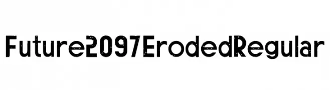
A bold, eroded font with a rugged, futuristic style.
![Future 2097 Eroded Regular font caratteri gratis]() Scaricare 74 Downloads@WebFont
Scaricare 74 Downloads@WebFont -
( Fonts by Daniel Zadorozny - www.iconian.com )
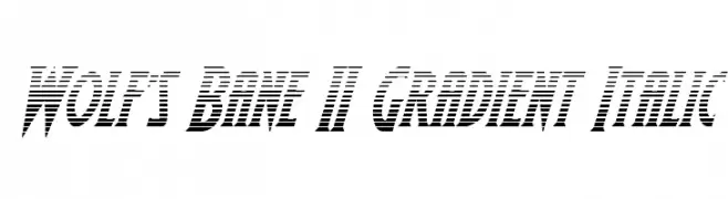
A bold, italicized font with a dynamic gradient effect.
![Wolf's Bane II Gradient Italic font caratteri gratis]() Scaricare 74 Downloads@WebFont
Scaricare 74 Downloads@WebFont -
( Fonts by Hanoded - David Kerkhoff - Personal-use only. For commercial use please contact owner. )
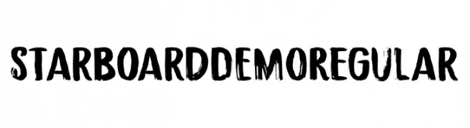
A bold, brush-stroke font with a dynamic and artistic style.
![Starboard DEMO Regular font caratteri gratis]() Scaricare 74 Downloads@WebFont
Scaricare 74 Downloads@WebFont -
( Chequered Ink - chequered.ink/ )
A bold, angular font with a futuristic, geometric style.
![Megarok font caratteri gratis]() Scaricare 74 Downloads@WebFont
Scaricare 74 Downloads@WebFont -
( Fonts by Halymunt Studio )
A refined and elegant script font with flowing, interconnected letters and delicate strokes.
![Slashdaily font caratteri gratis]() Scaricare 74 Downloads@WebFont
Scaricare 74 Downloads@WebFont


Quali sono i font più popolari adesso?
Poppins, Roboto, Montserrat, Open Sans e Lato sono molto usati per le forme pulite e l'ampia applicabilità — dall'identità di marca alle landing page e ai poster.
Quali font si usano spesso nei loghi?
Le sans serif geometriche (es. Poppins, famiglie in stile Gotham) sono scelte comuni per un branding pulito e scalabile. Per un tocco personale restano valide script e stili manoscritti. Abbina un display deciso per i titoli a un corpo testo neutro per riconoscibilità ed equilibrio.
Ogni quanto si aggiorna la lista?
Con regolarità, in base ai download e all'attività reale. Torna spesso per scoprire in anticipo le nuove preferite.
💡 Consiglio: aggiungi ai preferiti — le tendenze cambiano in fretta e i font top di oggi possono ispirare il rebranding di domani.