Benvenuto nelle Font Più Popolari — dove popolarità e qualità si incontrano. Qui trovi i font più scaricati e usati dell'anno. Se cerchi scelte sicure per logo, web o social, inizia da qui.
Ogni font top si distingue per equilibrio, leggibilità e versatilità. Troverai sans serif moderne, script eleganti, serif vintage e display minimalisti.
-
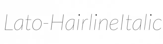
( Copyright (c) 2010-2011 by tyPoland Lukasz Dziedzic with Reserved Font Name "Lato". )
A sleek, modern hairline italic font with a clean and elegant design.
 Scaricare 424 Downloads@WebFont
 -
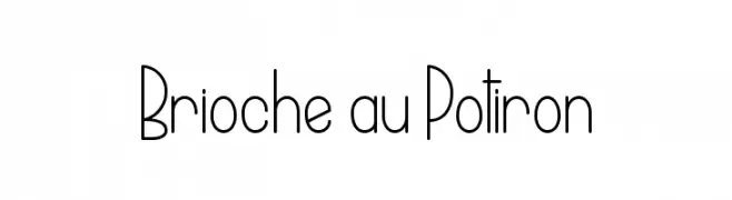
( Fonts by www.dcoxy.com )
A playful, narrow font with consistent stroke width and a whimsical style.
![Brioche au Potiron font caratteri gratis]() Scaricare 424 Downloads@WebFont
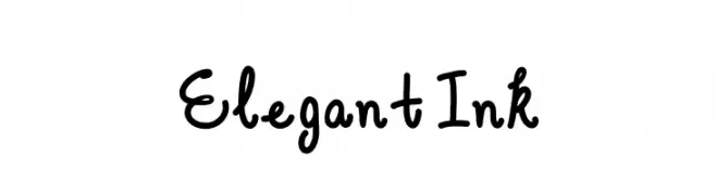
Scaricare 424 Downloads@WebFont -
![Elegant Ink font caratteri gratis]() Scaricare 424 Downloads@WebFont
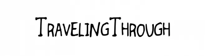
Scaricare 424 Downloads@WebFont -
![TravelingThrough font caratteri gratis]() Scaricare 424 Downloads@WebFont
Scaricare 424 Downloads@WebFont -
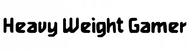
![Heavy Weight Gamer font caratteri gratis]() Scaricare 424 Downloads@WebFont
Scaricare 424 Downloads@WebFont -
![lkn font caratteri gratis]() Scaricare 424 Downloads@WebFont
Scaricare 424 Downloads@WebFont -
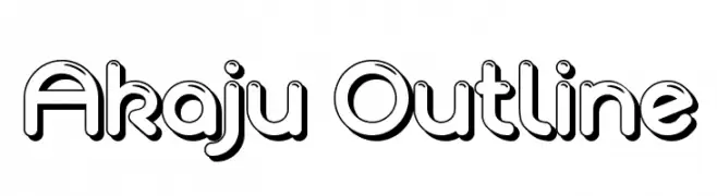
![Akaju Outline font caratteri gratis]() Scaricare 424 Downloads@WebFont
Scaricare 424 Downloads@WebFont -
( Fonts by Fontfabric - Svetoslav Simov - Personal-use only. For commercial use please contact owner. )
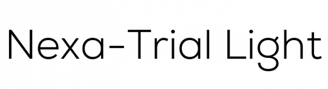
A clean, modern sans-serif font with geometric structure and consistent stroke width.
![Nexa-Trial Light font caratteri gratis]() Scaricare 424 Downloads@WebFont
Scaricare 424 Downloads@WebFont -
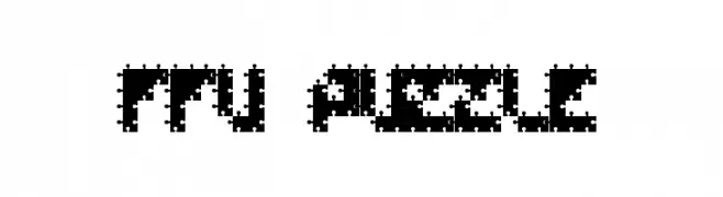
![FFU Puzzle font caratteri gratis]() Scaricare 424 Downloads@WebFont
Scaricare 424 Downloads@WebFont -
( www.швчк.рф )
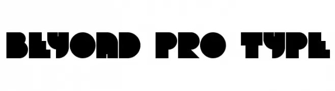
A bold, geometric font with a futuristic and modern design.
![Beyond pro type font caratteri gratis]() Scaricare 424 Downloads@WebFont
Scaricare 424 Downloads@WebFont -
( Fonts by Apostrophic Lab )
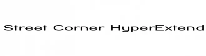
A modern, extended sans-serif font with smooth curves and clear readability.
![Street Corner HyperExtend font caratteri gratis]() Scaricare 424 Downloads@WebFont
Scaricare 424 Downloads@WebFont -
( Fonts by Cumberland Fontworks - http://www222.pair.com/sjohn/fonts.htm - S. John Ross )
A playful, handwritten font with tall, narrow letters and uniform strokes.
![High Fiber font caratteri gratis]() Scaricare 424 Downloads@WebFont
Scaricare 424 Downloads@WebFont -
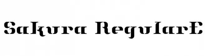
![Sakura RegularE font caratteri gratis]() Scaricare 424 Downloads@WebFont
Scaricare 424 Downloads@WebFont -
![Screaming Guitar font caratteri gratis]() Scaricare 424 Downloads@WebFont
Scaricare 424 Downloads@WebFont -
( Fonts by Aluyeah Studio - Personal-use only. For commercial use please contact owner. )
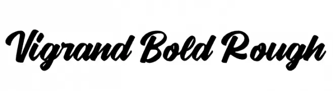
A bold, rough script font with dynamic, flowing strokes and a handwritten appearance.
![Vigrand Bold Rough font caratteri gratis]() Scaricare 424 Downloads@WebFont
Scaricare 424 Downloads@WebFont -
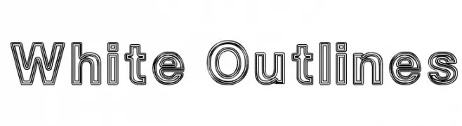
![White Outlines font caratteri gratis]() Scaricare 424 Downloads@WebFont
Scaricare 424 Downloads@WebFont -
( Fonts by Alit Suarnegara - Alit Design - www.alitdesign.net - Personal-use only. For commercial use please contact owner. )
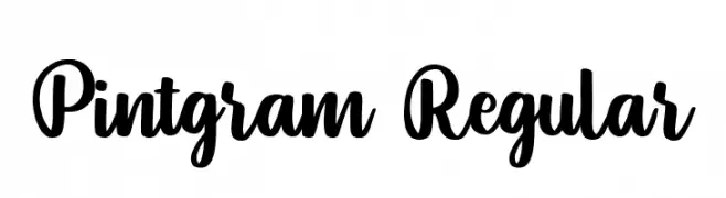
A bold, expressive script font with fluid, connected letterforms.
![Pintgram Regular font caratteri gratis]() Scaricare 424 Downloads@WebFont
Scaricare 424 Downloads@WebFont -
( Fonts by www.tepidmonkey.net )
A bold, geometric font with rounded edges and a modern feel.
![Sujeta Bold font caratteri gratis]() Scaricare 424 Downloads@WebFont
Scaricare 424 Downloads@WebFont -
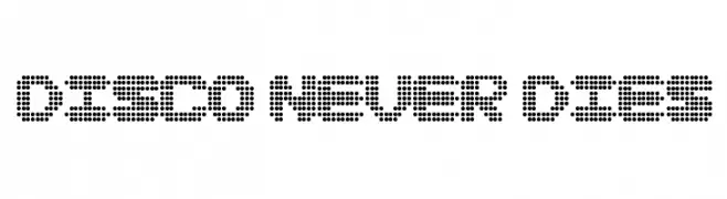
![Disco never dies font caratteri gratis]() Scaricare 424 Downloads@WebFont
Scaricare 424 Downloads@WebFont -
( Fonts by Carolina Giovagnoli - Personal-use only. For commercial use please contact owner. )
Elegant serif font with a classic italic slant and moderate contrast.
![Andada Italic font caratteri gratis]() Scaricare 424 Downloads@WebFont
Scaricare 424 Downloads@WebFont -
( Fonts by Octotype - www.foundmyfont.com - Personal-use only. For commercial use please contact owner. )
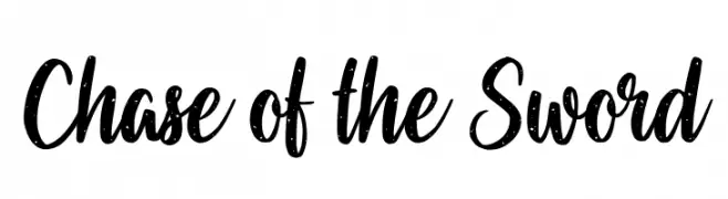
A bold, hand-drawn script font with a dynamic, cursive style.
![Chase of the Sword font caratteri gratis]() Scaricare 424 Downloads@WebFont
Scaricare 424 Downloads@WebFont -
![Telegraphic Light Italic font caratteri gratis]() Scaricare 424 Downloads@WebFont
Scaricare 424 Downloads@WebFont -
( Fonts by Jason Arthur - JibbaJabba Fonts - www.myspace.com/jasonarthurloaded )
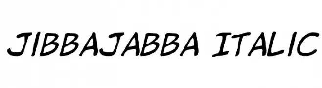
A bold, italicized handwritten font with a dynamic and casual style.
![jibbajabba Italic font caratteri gratis]() Scaricare 424 Downloads@WebFont
Scaricare 424 Downloads@WebFont -
( Fonts by Darrell Flood )
A bold, playful handwritten font with a comic book style.
![Comic Marker Deluxe font caratteri gratis]() Scaricare 424 Downloads@WebFont
Scaricare 424 Downloads@WebFont -
( Fonts by Aaron Amar - Personal-use only. For commercial use please contact owner. )
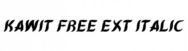
A bold, dynamic italic font with expressive, flowing curves.
![Kawit Free Ext Italic font caratteri gratis]() Scaricare 424 Downloads@WebFont
Scaricare 424 Downloads@WebFont -
( Fonts by Wahyu Eka Prasetya - wepfont.com - Personal-use only. For commercial use please contact owner. )
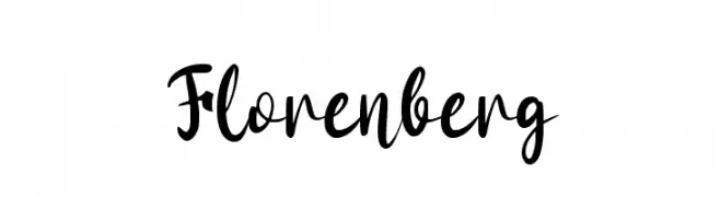
A bold, expressive script font with dynamic strokes and a handwritten feel.
![Florenberg font caratteri gratis]() Scaricare 423 Downloads@WebFont
Scaricare 423 Downloads@WebFont -
( Fonts by www.DigitalDreamDesign.net )
A bold, oblique font with a modern and dynamic style.
![D3 Cozmism Hiragana Oblique font caratteri gratis]() Scaricare 423 Downloads@WebFont
Scaricare 423 Downloads@WebFont -
( Fonts by CannotIntoSpaceFonts - KineticPlasma Fonts - Personal-use only. For commercial use please contact owner. )
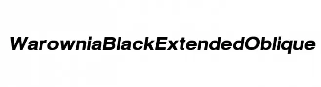
A bold, extended, and oblique font with a modern and dynamic style.
![Warownia Black Extended Oblique font caratteri gratis]() Scaricare 423 Downloads@WebFont
Scaricare 423 Downloads@WebFont -
( fonts.pistocasero.com )
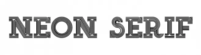
A bold, decorative font with a layered, neon sign-inspired design.
![NEON SERIF font caratteri gratis]() Scaricare 423 Downloads@WebFont
Scaricare 423 Downloads@WebFont -
( Musafir LAB )
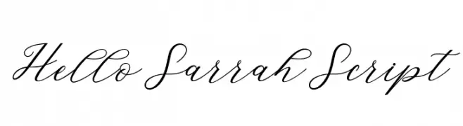
A graceful script font with fluid, interconnected strokes and a refined aesthetic.
![HelloSarrahScript font caratteri gratis]() Scaricare 423 Downloads@WebFont
Scaricare 423 Downloads@WebFont -
( Personal-use only. For commercial use please contact owner. )
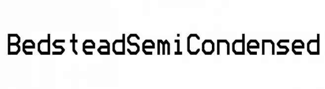
A geometric, monospaced font with a technical and modern design.
![Bedstead Semi Condensed font caratteri gratis]() Scaricare 423 Downloads@WebFont
Scaricare 423 Downloads@WebFont -
( LJ Design Studios - Luis Jaramillo - www.ljdesignstudios.com )
A bold, geometric font with a modern, industrial style.
![Striker Eureka PERSONAL USE font caratteri gratis]() Scaricare 423 Downloads@WebFont
Scaricare 423 Downloads@WebFont -
( Fonts by www.blambot.com )
Bold, italicized font with angular strokes and a futuristic style.
![UltraViolentBB-Italic font caratteri gratis]() Scaricare 423 Downloads@WebFont
Scaricare 423 Downloads@WebFont -
( Fonts by Font Bundles )
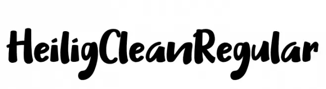
A bold, handwritten-style font with a playful and energetic appearance.
![Heilig Clean Regular font caratteri gratis]() Scaricare 423 Downloads@WebFont
Scaricare 423 Downloads@WebFont -
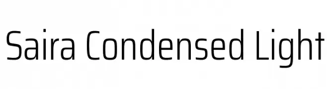
( Copyright 2016 The Saira Project Authors (omnibus.type@gmail.com), with reserved font name "Saira". )
A modern, condensed sans-serif font with a light weight and clean design.
![Saira Condensed Light font caratteri gratis]() Scaricare 423 Downloads@WebFont
Scaricare 423 Downloads@WebFont


Quali sono i font più popolari adesso?
Poppins, Roboto, Montserrat, Open Sans e Lato sono molto usati per le forme pulite e l'ampia applicabilità — dall'identità di marca alle landing page e ai poster.
Quali font si usano spesso nei loghi?
Le sans serif geometriche (es. Poppins, famiglie in stile Gotham) sono scelte comuni per un branding pulito e scalabile. Per un tocco personale restano valide script e stili manoscritti. Abbina un display deciso per i titoli a un corpo testo neutro per riconoscibilità ed equilibrio.
Ogni quanto si aggiorna la lista?
Con regolarità, in base ai download e all'attività reale. Torna spesso per scoprire in anticipo le nuove preferite.
💡 Consiglio: aggiungi ai preferiti — le tendenze cambiano in fretta e i font top di oggi possono ispirare il rebranding di domani.