Benvenuto nelle Font Più Popolari — dove popolarità e qualità si incontrano. Qui trovi i font più scaricati e usati dell'anno. Se cerchi scelte sicure per logo, web o social, inizia da qui.
Ogni font top si distingue per equilibrio, leggibilità e versatilità. Troverai sans serif moderne, script eleganti, serif vintage e display minimalisti.
-
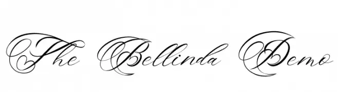
( Fonts by Burhan Afif - hanscostudio.com - Personal-use only. For commercial use please contact owner. )
An elegant script font with intricate swirls and a classic calligraphic style.
 Scaricare 423 Downloads@WebFont
 -
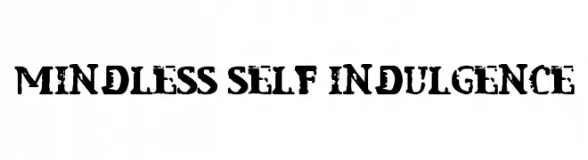
![Mindless Self Indulgence font caratteri gratis]() Scaricare 423 Downloads@WebFont
Scaricare 423 Downloads@WebFont -
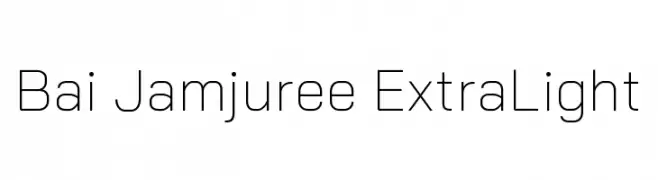
( Copyright 2018 Bai Jamjuree (https://github.com/cadsondemak/Bai-Jamjuree) )
A modern, geometric sans-serif font with clean lines and balanced spacing.
![Bai Jamjuree ExtraLight font caratteri gratis]() Scaricare 423 Downloads@WebFont
Scaricare 423 Downloads@WebFont -
![Aayat Quraan 5 font caratteri gratis]() Scaricare 423 Downloads@WebFont
Scaricare 423 Downloads@WebFont -
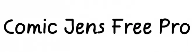
( Fonts by Jens Kutilek - Personal-use only. For commercial use please contact owner. )
A playful, rounded font with a handwritten, informal style.
![Comic Jens Free Pro font caratteri gratis]() Scaricare 423 Downloads@WebFont
Scaricare 423 Downloads@WebFont -
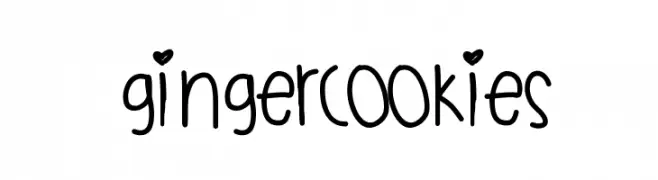
( Fonts by a Des Gomez. Personal-use only. For commercial use please contact owner. )
A playful, handwritten font with a whimsical and friendly style.
![GingerCookies font caratteri gratis]() Scaricare 423 Downloads@WebFont
Scaricare 423 Downloads@WebFont -
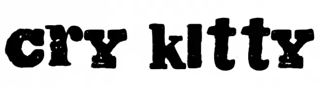
( Free for a personal use. For a commercial use please visit www.kevinandamanda.com )
A bold, distressed font with a vintage, grunge aesthetic.
![Cry Kitty font caratteri gratis]() Scaricare 423 Downloads@WebFont
Scaricare 423 Downloads@WebFont -
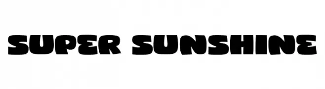
( Fonts by fsuarez913 )
A bold, playful font with rounded, thick strokes and a bubbly appearance.
![Super Sunshine font caratteri gratis]() Scaricare 423 Downloads@WebFont
Scaricare 423 Downloads@WebFont -
![polka dot font caratteri gratis]() Scaricare 423 Downloads@WebFont
Scaricare 423 Downloads@WebFont -
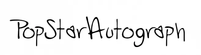
( Fonts by Andrew Hart - dirt2.com )
A playful, handwritten font with a dynamic and energetic autograph style.
![PopStarAutograph font caratteri gratis]() Scaricare 423 Downloads@WebFont
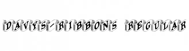
Scaricare 423 Downloads@WebFont -
![Davys-Ribbons Regular font caratteri gratis]() Scaricare 423 Downloads@WebFont
Scaricare 423 Downloads@WebFont -
![Gkreator Inside Beta1 font caratteri gratis]() Scaricare 423 Downloads@WebFont
Scaricare 423 Downloads@WebFont -
( Fonts by Dieter Steffmann )
A bold, blackletter font with gothic, angular strokes and intricate detailing.
![GotenburgA-Bold font caratteri gratis]() Scaricare 423 Downloads@WebFont
Scaricare 423 Downloads@WebFont -
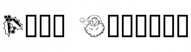
( Fonts by Graham Meade - GemFonts )
Christmas-themed dingbat font with festive illustrations.
![Xmas Clipart font caratteri gratis]() Scaricare 423 Downloads@WebFont
Scaricare 423 Downloads@WebFont -
( Fonts by ijem - Ferdiansyah Ferdiansyah - Personal-use only. For commercial use please contact owner. )
A bold, modern font with thick, uniform strokes ideal for impactful headlines.
![BERRYBOLD-Bold font caratteri gratis]() Scaricare 423 Downloads@WebFont
Scaricare 423 Downloads@WebFont -
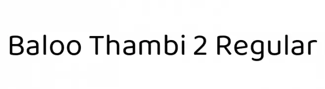
( Copyright (c) 2015 Ek Type (www.ektype.in) )
A friendly, rounded font with smooth, balanced characters.
![Baloo Thambi 2 Regular font caratteri gratis]() Scaricare 423 Downloads@WebFont
Scaricare 423 Downloads@WebFont -
Caratteri di vladocar. For commercial use please contact the owner.
( Linda Farmhouse Font )
Casual, connected handwritten script with smooth curves.
![Linda font caratteri gratis]() Scaricare 423 Downloads
Scaricare 423 Downloads -
( Fonts by Andi Moz )
A playful, handwritten font with tall, narrow characters and whimsical loops.
![Joking font caratteri gratis]() Scaricare 423 Downloads@WebFont
Scaricare 423 Downloads@WebFont -
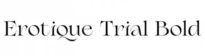
( Fonts by Zetafonts - Personal-use only. For commercial use please contact owner. )
An elegant serif font with high contrast and sharp serifs.
![Erotique Trial Bold font caratteri gratis]() Scaricare 423 Downloads@WebFont
Scaricare 423 Downloads@WebFont -
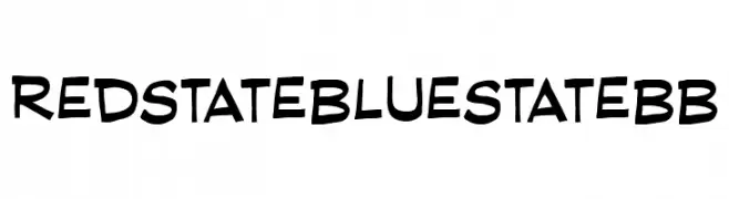
( Fonts by www.blambot.com )
A bold, playful font with a hand-drawn, informal style.
![RedStateBlueStateBB font caratteri gratis]() Scaricare 423 Downloads@WebFont
Scaricare 423 Downloads@WebFont -
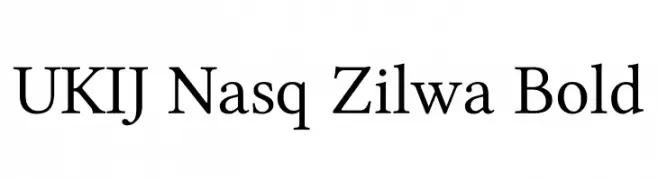
( Fonts by Geyret.T.Kenji - Personal-use only. For commercial use please contact owner. )
A classic serif font with bold, elegant strokes and balanced readability.
![UKIJ Nasq Zilwa Bold font caratteri gratis]() Scaricare 423 Downloads@WebFont
Scaricare 423 Downloads@WebFont -
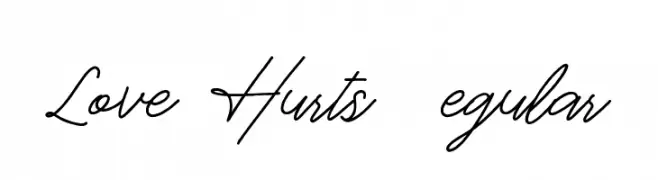
![Love Hurts DEMO Regular font caratteri gratis]() Scaricare 423 Downloads@WebFont
Scaricare 423 Downloads@WebFont -
![Brass Mono Regular font caratteri gratis]() Scaricare 423 Downloads@WebFont
Scaricare 423 Downloads@WebFont -
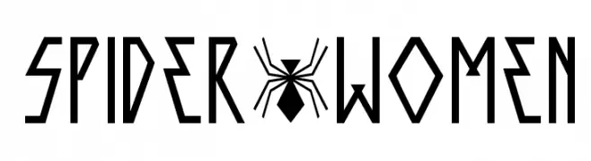
Caratteri di spideraysfonts. For commercial use please contact the owner.
( SPIDER-WOMEN )
A futuristic, angular font with sharp lines and geometric shapes.
![SPIDER-WOMEN font caratteri gratis]() Scaricare 423 Downloads@WebFont
Scaricare 423 Downloads@WebFont -
![Nasa21 font caratteri gratis]() Scaricare 423 Downloads@WebFont
Scaricare 423 Downloads@WebFont -
( Fonts by Fonthead Design - www.fonthead.com )
An ornate, calligraphy-inspired font with intricate detailing and a classic yet modern appeal.
![Noel font caratteri gratis]() Scaricare 423 Downloads@WebFont
Scaricare 423 Downloads@WebFont -
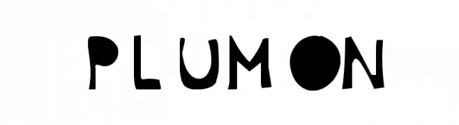
![Plumon font caratteri gratis]() Scaricare 423 Downloads@WebFont
Scaricare 423 Downloads@WebFont -
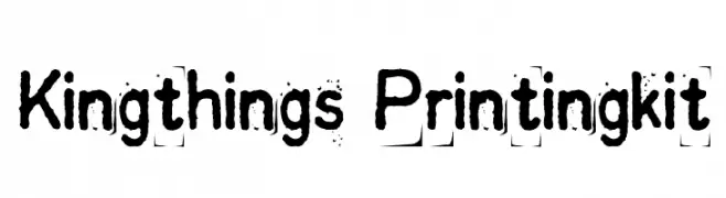
( Font by kingthingsfonts.co.uk )
A textured, handcrafted font with a bold, artistic style.
![Kingthings Printingkit font caratteri gratis]() Scaricare 423 Downloads@WebFont
Scaricare 423 Downloads@WebFont -
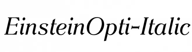
( Fonts by Castcraft Software - opti.netii.net - check the website before use )
An elegant serif font with a classic italic style, perfect for sophisticated designs.
![EinsteinOpti-Italic font caratteri gratis]() Scaricare 423 Downloads@WebFont
Scaricare 423 Downloads@WebFont -
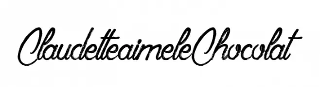
( Fonts by Maelle.K - Thomas Boucherie )
A dynamic, expressive script font with fluid, cursive strokes and elegant flourishes.
![ClaudetteaimeleChocolat font caratteri gratis]() Scaricare 423 Downloads@WebFont
Scaricare 423 Downloads@WebFont -
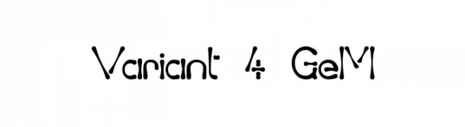
( Fonts by Graham Meade - GemFonts )
A playful, hand-drawn font with irregular, organic shapes and varying stroke thickness.
![Variant 4 GeM font caratteri gratis]() Scaricare 423 Downloads@WebFont
Scaricare 423 Downloads@WebFont -
( Fonts by Naima Ben Ayed )
A modern, elongated font with narrow, elegant characters.
![Tulpen One font caratteri gratis]() Scaricare 423 Downloads@WebFont
Scaricare 423 Downloads@WebFont -
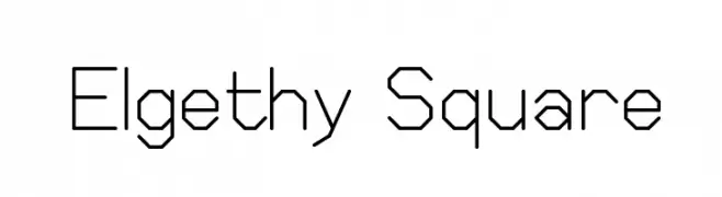
( Fonts by Graham Meade - GemFonts )
A geometric, angular font with consistent stroke width and a modern, technical aesthetic.
![Elgethy Square font caratteri gratis]() Scaricare 423 Downloads@WebFont
Scaricare 423 Downloads@WebFont -
( Fonts by Bud White. Personal-use only. For commercial use please contact owner. )
A bold, distressed font with a rugged, eroded appearance.
![Landslide font caratteri gratis]() Scaricare 423 Downloads@WebFont
Scaricare 423 Downloads@WebFont -
( Fonts by Fran Fernandez - Personal-use only. For commercial use please contact owner. )
A playful and dynamic font with bold, whimsical elements.
![Zootopia JPosters.com.ar font caratteri gratis]() Scaricare 423 Downloads@WebFont
Scaricare 423 Downloads@WebFont


Quali sono i font più popolari adesso?
Poppins, Roboto, Montserrat, Open Sans e Lato sono molto usati per le forme pulite e l'ampia applicabilità — dall'identità di marca alle landing page e ai poster.
Quali font si usano spesso nei loghi?
Le sans serif geometriche (es. Poppins, famiglie in stile Gotham) sono scelte comuni per un branding pulito e scalabile. Per un tocco personale restano valide script e stili manoscritti. Abbina un display deciso per i titoli a un corpo testo neutro per riconoscibilità ed equilibrio.
Ogni quanto si aggiorna la lista?
Con regolarità, in base ai download e all'attività reale. Torna spesso per scoprire in anticipo le nuove preferite.
💡 Consiglio: aggiungi ai preferiti — le tendenze cambiano in fretta e i font top di oggi possono ispirare il rebranding di domani.