Benvenuto nelle Font Più Popolari — dove popolarità e qualità si incontrano. Qui trovi i font più scaricati e usati dell'anno. Se cerchi scelte sicure per logo, web o social, inizia da qui.
Ogni font top si distingue per equilibrio, leggibilità e versatilità. Troverai sans serif moderne, script eleganti, serif vintage e display minimalisti.
-
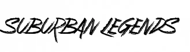
( Fonts by Jonathan S. Harris - www.tattoowoo.com. Personal-use only. For commercial use please contact owner. )
A bold, energetic script font with a hand-drawn, graffiti-like style.
 Scaricare 68 Downloads@WebFont
 -
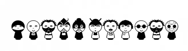
( Puff - - www.puff.com.ar )
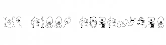
Cartoon character dingbat font with bold, rounded illustrations.
![Beluz Family font caratteri gratis]() Scaricare 68 Downloads@WebFont
Scaricare 68 Downloads@WebFont -
( Fonts by Muhammad Yafinuha )
![Falline font caratteri gratis]() Scaricare 68 Downloads@WebFont
Scaricare 68 Downloads@WebFont -
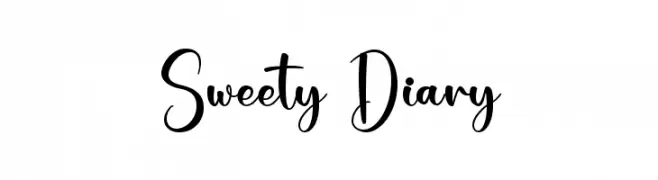
( Fonts by Nirmala Creative - Personal-use only. For commercial use please contact owner. )
Playful handwritten decorative font.
![Sweety Diary font caratteri gratis]() Scaricare 68 Downloads@WebFont
Scaricare 68 Downloads@WebFont -
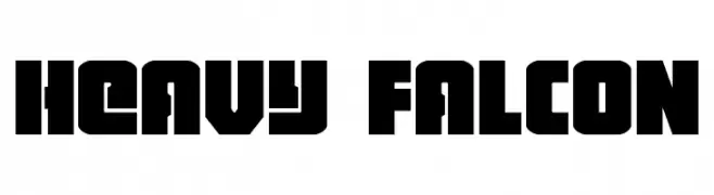
( Fonts by Daniel Zadorozny - www.iconian.com - Personal-use only. For commercial use please contact owner. )
A bold, geometric display typeface with a modern, industrial aesthetic.
![Heavy Falcon font caratteri gratis]() Scaricare 68 Downloads@WebFont
Scaricare 68 Downloads@WebFont -
-
( Fonts by www.dcoxy.com )
A playful and decorative font featuring unique cartoon characters.
![My Sweet Sunshine font caratteri gratis]() Scaricare 68 Downloads@WebFont
Scaricare 68 Downloads@WebFont -
( Matthias De Vylder - www.matthiasdevylder.be )
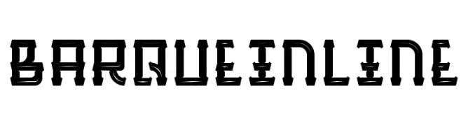
A bold, inline font with sharp angles and strong lines for impactful designs.
![BarqueInline font caratteri gratis]() Scaricare 68 Downloads@WebFont
Scaricare 68 Downloads@WebFont -
( Fonts by Perspectype Studio - Personal-use only. For commercial use please contact owner. )
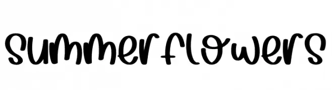
A playful, bold handwritten font with a modern twist.
![Summer Flowers font caratteri gratis]() Scaricare 68 Downloads@WebFont
Scaricare 68 Downloads@WebFont -
( Character )
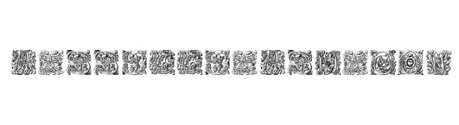
An ornate and decorative font with intricate swirls and flourishes.
![MasselleAMShadow font caratteri gratis]() Scaricare 68 Downloads@WebFont
Scaricare 68 Downloads@WebFont -
( EmmaLemon Fonts )
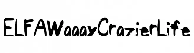
A bold, expressive font with a brush-like, graffiti-inspired style.
![ELFAWaaayCrazierLife font caratteri gratis]() Scaricare 68 Downloads@WebFont
Scaricare 68 Downloads@WebFont

Quali sono i font più popolari adesso?
Poppins, Roboto, Montserrat, Open Sans e Lato sono molto usati per le forme pulite e l'ampia applicabilità — dall'identità di marca alle landing page e ai poster.
Quali font si usano spesso nei loghi?
Le sans serif geometriche (es. Poppins, famiglie in stile Gotham) sono scelte comuni per un branding pulito e scalabile. Per un tocco personale restano valide script e stili manoscritti. Abbina un display deciso per i titoli a un corpo testo neutro per riconoscibilità ed equilibrio.
Ogni quanto si aggiorna la lista?
Con regolarità, in base ai download e all'attività reale. Torna spesso per scoprire in anticipo le nuove preferite.
💡 Consiglio: aggiungi ai preferiti — le tendenze cambiano in fretta e i font top di oggi possono ispirare il rebranding di domani.