Benvenuto nelle Font Più Popolari — dove popolarità e qualità si incontrano. Qui trovi i font più scaricati e usati dell'anno. Se cerchi scelte sicure per logo, web o social, inizia da qui.
Ogni font top si distingue per equilibrio, leggibilità e versatilità. Troverai sans serif moderne, script eleganti, serif vintage e display minimalisti.
-
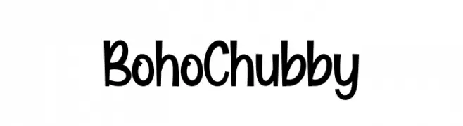
( Fonts by Scratchones )
A playful, bold, and rounded font with a whimsical style.
 Scaricare 418 Downloads@WebFont
 -
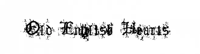
( Fonts by www.lars-manenschijn.nl )
An ornate Old English style font with heart embellishments and a distressed texture.
![Old English Hearts font caratteri gratis]() Scaricare 418 Downloads@WebFont
Scaricare 418 Downloads@WebFont -
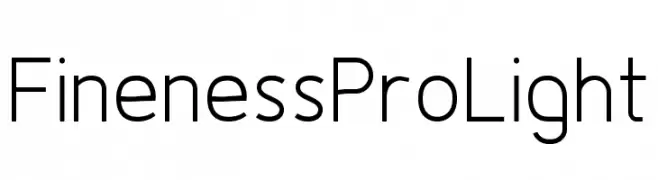
( Fonts by www.asleycruz.com - Asley Cruz - Personal-use only. For commercial use please contact owner. )
A clean, modern font with sleek lines and uniform structure.
![Fineness Pro Light font caratteri gratis]() Scaricare 418 Downloads@WebFont
Scaricare 418 Downloads@WebFont -
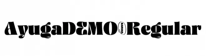
( Fonts by Zarma Type Foundry - Azzam Ridhamalik - Personal-use only. For commercial use please contact owner. )
A bold, playful font with dynamic strokes and a whimsical style.
![AyugaDEMO-Regular font caratteri gratis]() Scaricare 418 Downloads@WebFont
Scaricare 418 Downloads@WebFont -
( Fonts by Geronimo Fonts - Personal-use only. For commercial use please contact owner. )
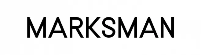
A modern, geometric sans-serif font with clean lines and uniform strokes.
![MARKSMAN font caratteri gratis]() Scaricare 418 Downloads@WebFont
Scaricare 418 Downloads@WebFont -
( Andreas Johansson - hem.passagen.se/anjo77/font/ )
A geometric, futuristic font with a modular and minimalistic design.
![Void font caratteri gratis]() Scaricare 418 Downloads@WebFont
Scaricare 418 Downloads@WebFont -
( Fonts by Din Studio - Donis Miftahudin - Personal-use only. For commercial use please contact owner. )
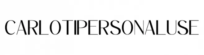
A modern, high-contrast font with elegant, sharp lines and a sophisticated style.
![Carloti personal use font caratteri gratis]() Scaricare 418 Downloads@WebFont
Scaricare 418 Downloads@WebFont -
Caratteri di typotopia. For commercial use please contact the owner.
( Fonts by Typotopia - Typotopia.co - Personal Use Only, for Commercial Use, please contact us )
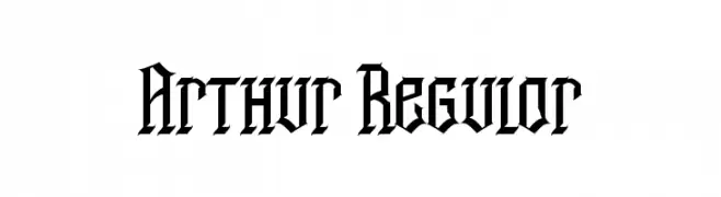
A bold blackletter font with sharp, angular lines and intricate detailing.
![Arthur Regular font caratteri gratis]() Scaricare 418 Downloads@WebFont
Scaricare 418 Downloads@WebFont -
![Shree-Pun-0955 font caratteri gratis]() Scaricare 418 Downloads@WebFont
Scaricare 418 Downloads@WebFont -
( Fonts by Apostrophic Lab )
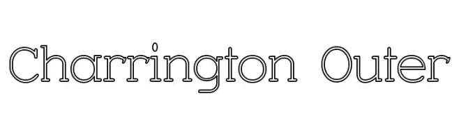
A modern outline font with a double-line effect, offering a unique and dimensional look.
![Charrington Outer font caratteri gratis]() Scaricare 418 Downloads@WebFont
Scaricare 418 Downloads@WebFont -
( Fonts by Nick Curtis - www.nicksfonts.com )
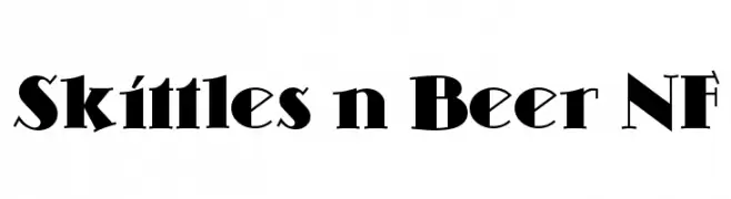
A bold, modern font with sharp angles and unique serifs.
![Skittles n Beer NF font caratteri gratis]() Scaricare 418 Downloads@WebFont
Scaricare 418 Downloads@WebFont -
![StickRice font caratteri gratis]() Scaricare 418 Downloads@WebFont
Scaricare 418 Downloads@WebFont -
( Fonts by Daniel Zadorozny - www.iconian.com - Free for personal use )
A bold, brush-style italic font with dynamic, expressive strokes.
![Fight Kid Italic font caratteri gratis]() Scaricare 418 Downloads@WebFont
Scaricare 418 Downloads@WebFont -
( Fonts by Iconian Fonts )
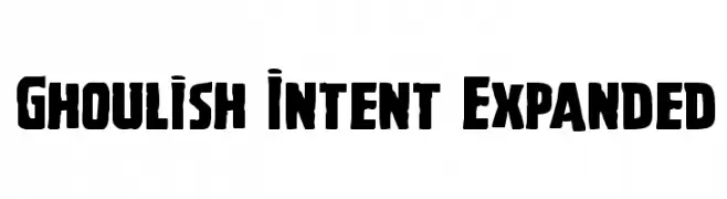
A bold, expanded font with a vintage horror vibe, perfect for eye-catching designs.
![Ghoulish Intent Expanded font caratteri gratis]() Scaricare 418 Downloads@WebFont
Scaricare 418 Downloads@WebFont -
( Fonts by Andy Krahling - Sunwalk )
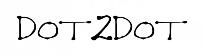
A playful, dotted-line font with bold, rounded characters.
![Dot2Dot font caratteri gratis]() Scaricare 418 Downloads@WebFont
Scaricare 418 Downloads@WebFont -
( Fonts by Vultype - Candra Hamdani - Personal-use only. For commercial use please contact owner. )
A bold, geometric stencil font with a modern industrial style.
![MELANOX Regular font caratteri gratis]() Scaricare 418 Downloads@WebFont
Scaricare 418 Downloads@WebFont -
( Fonts by Riki )
Elegant cursive script with a modern touch.
![Angolia font caratteri gratis]() Scaricare 418 Downloads@WebFont
Scaricare 418 Downloads@WebFont -
![Curvada font caratteri gratis]() Scaricare 418 Downloads@WebFont
Scaricare 418 Downloads@WebFont -
( Fonts by Leonard Posavec - leosupply.co - Personal-use only. For commercial use please contact owner. )
A bold, rounded font with a playful and energetic style.
![JumpParty font caratteri gratis]() Scaricare 418 Downloads@WebFont
Scaricare 418 Downloads@WebFont -
( Fonts by www.typodermicfonts.com - Ray Larabie )
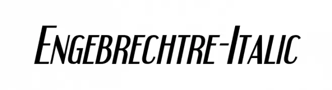
A sleek, modern italic font with elongated, narrow characters.
![Engebrechtre-Italic font caratteri gratis]() Scaricare 418 Downloads@WebFont
Scaricare 418 Downloads@WebFont -
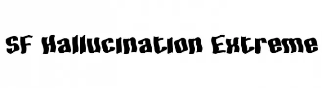
( Fonts by ShyFonts )
A bold, distorted font with a playful, chaotic style.
![SF Hallucination Extreme font caratteri gratis]() Scaricare 418 Downloads@WebFont
Scaricare 418 Downloads@WebFont -
![Reaverockfree font caratteri gratis]() Scaricare 418 Downloads@WebFont
Scaricare 418 Downloads@WebFont -
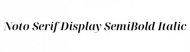
( Noto is a trademark of Google Inc. Noto fonts are open source. All Noto fonts are published under the SIL Open Font License, Version 1.1 )
A refined serif typeface with semi-bold weight and italic style, offering elegance and readability.
![Noto Serif Display SemiBold Italic font caratteri gratis]() Scaricare 418 Downloads@WebFont
Scaricare 418 Downloads@WebFont -
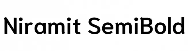
( Copyright 2018 the Niramit Project Authors (https://github.com/cadsondemak/Niramit) )
A modern, semi-bold sans-serif font with clean lines and excellent readability.
![Niramit SemiBold font caratteri gratis]() Scaricare 418 Downloads@WebFont
Scaricare 418 Downloads@WebFont -
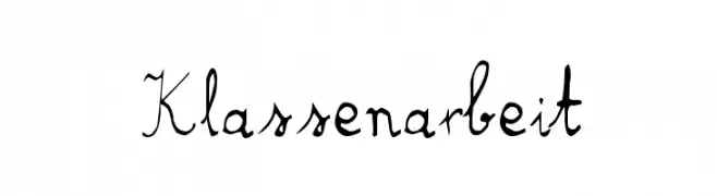
( Fonts by http://perso.calixo.net/~uzim/ )
A whimsical and playful script font with fluid, artistic letterforms.
![Klassenarbeit font caratteri gratis]() Scaricare 418 Downloads@WebFont
Scaricare 418 Downloads@WebFont -
( Fonts by Murozakul Akhsan - Personal-use only. For commercial use please contact owner. )
A playful and casual script font with smooth, flowing curves and a hand-drawn aesthetic.
![Limpet font caratteri gratis]() Scaricare 418 Downloads@WebFont
Scaricare 418 Downloads@WebFont -
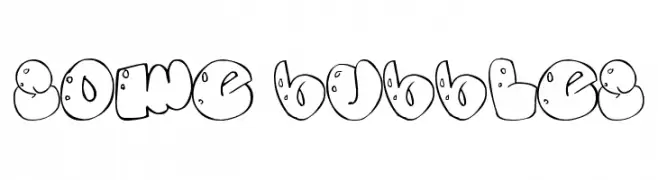
( aritogonzalez.blogspot.com.ar/ )
A playful, bubble-inspired font with rounded, cartoonish characters.
![Some bubbles font caratteri gratis]() Scaricare 418 Downloads@WebFont
Scaricare 418 Downloads@WebFont -
( Fonts by Chequered Ink )
A bold, geometric font with sharp edges and a modern look.
![Canvas Bags font caratteri gratis]() Scaricare 418 Downloads@WebFont
Scaricare 418 Downloads@WebFont -
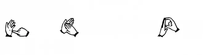
Caratteri di spideraysfonts. For commercial use please contact the owner.
![The Hands of Deaf font caratteri gratis]() Scaricare 418 Downloads@WebFont
Scaricare 418 Downloads@WebFont -
( Fonts by YOFonts - Yasuhiro Yamaoka - yoworks.com - Personal-use only. For commercial use please contact owner. )
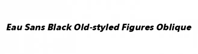
A bold, oblique font with strong, consistent strokes and a modern feel.
![Eau Sans Black Old-styled Figures Oblique font caratteri gratis]() Scaricare 418 Downloads@WebFont
Scaricare 418 Downloads@WebFont -
( Fonts by Aveni Letter Type )
A lively, hand-drawn script font with tall, narrow letters and playful loops.
![Amsterlands font caratteri gratis]() Scaricare 418 Downloads@WebFont
Scaricare 418 Downloads@WebFont -
( Iconian Fonts - Daniel Zadorozny - www.iconian.com )
A bold, italicized font with a futuristic and dynamic style.
![Drone Tracker Super-Italic font caratteri gratis]() Scaricare 418 Downloads@WebFont
Scaricare 418 Downloads@WebFont -
![Tesh font caratteri gratis]() Scaricare 418 Downloads@WebFont
Scaricare 418 Downloads@WebFont -
( Fonts by Fabrika De Typos - Marcio Hirosse - fabrikadetypos.blogspot.com )
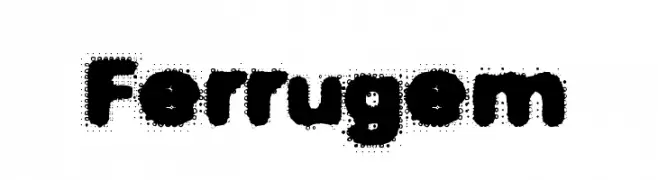
A bold, textured font with a playful, vintage feel.
![Ferrugem font caratteri gratis]() Scaricare 418 Downloads@WebFont
Scaricare 418 Downloads@WebFont -
( Fonts by Jose A. Calvo )
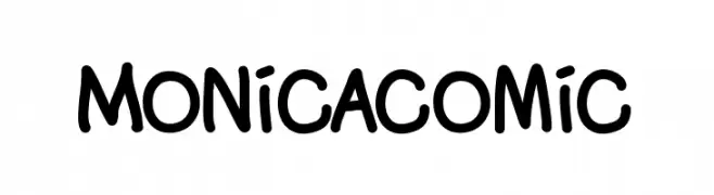
A playful, hand-drawn font with rounded, bold characters and a whimsical style.
![Monicacomic font caratteri gratis]() Scaricare 418 Downloads@WebFont
Scaricare 418 Downloads@WebFont


Quali sono i font più popolari adesso?
Poppins, Roboto, Montserrat, Open Sans e Lato sono molto usati per le forme pulite e l'ampia applicabilità — dall'identità di marca alle landing page e ai poster.
Quali font si usano spesso nei loghi?
Le sans serif geometriche (es. Poppins, famiglie in stile Gotham) sono scelte comuni per un branding pulito e scalabile. Per un tocco personale restano valide script e stili manoscritti. Abbina un display deciso per i titoli a un corpo testo neutro per riconoscibilità ed equilibrio.
Ogni quanto si aggiorna la lista?
Con regolarità, in base ai download e all'attività reale. Torna spesso per scoprire in anticipo le nuove preferite.
💡 Consiglio: aggiungi ai preferiti — le tendenze cambiano in fretta e i font top di oggi possono ispirare il rebranding di domani.