Benvenuto nelle Font Più Popolari — dove popolarità e qualità si incontrano. Qui trovi i font più scaricati e usati dell'anno. Se cerchi scelte sicure per logo, web o social, inizia da qui.
Ogni font top si distingue per equilibrio, leggibilità e versatilità. Troverai sans serif moderne, script eleganti, serif vintage e display minimalisti.
-
( Fonts by Jimtype Studio )
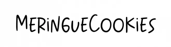
Playful handwritten font with a casual style.
 Scaricare 67 Downloads@WebFont
 -
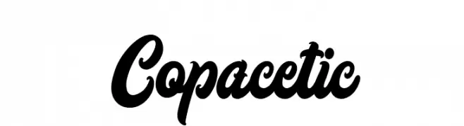
( Fonts by Askmewhy - Personal-use only. For commercial use please contact owner. )
A bold, cursive font with interconnected characters and a dynamic flow.
![Copacetic font caratteri gratis]() Scaricare 67 Downloads@WebFont
Scaricare 67 Downloads@WebFont -
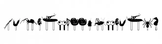
( Andrea Bartsch - www.fraubartsch.de )
A decorative dingbat font with jungle-themed silhouettes on popsicle sticks.
![JunglefoodRegular font caratteri gratis]() Scaricare 67 Downloads@WebFont
Scaricare 67 Downloads@WebFont -
( Lauren Harrison - gumroad.com/lrnrh )
A bold, geometric font with a retro aesthetic and playful design.
![RetroLights font caratteri gratis]() Scaricare 67 Downloads@WebFont
Scaricare 67 Downloads@WebFont -
![Hong Kong Hustle Expanded Expanded font caratteri gratis]() Scaricare 67 Downloads@WebFont
Scaricare 67 Downloads@WebFont -
-
( Fonts by Iconian Fonts )
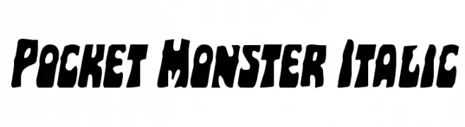
A bold, playful italic font with a dynamic and whimsical style.
![Pocket Monster Italic font caratteri gratis]() Scaricare 67 Downloads@WebFont
Scaricare 67 Downloads@WebFont -
( Fonts by Bolt Cutter - www.boltcutterdesign.com - Personal-use only. For commercial use please contact owner. )
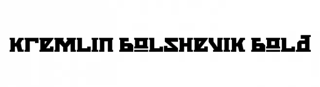
A bold, geometric font with a Soviet-era aesthetic and strong, angular lines.
![Kremlin Bolshevik Bold font caratteri gratis]() Scaricare 67 Downloads@WebFont
Scaricare 67 Downloads@WebFont -
( Fonts by Woodcutter )
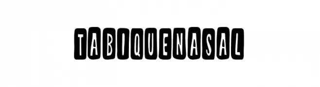
A bold, playful font with characters enclosed in rounded rectangles, offering a quirky and dynamic style.
![Tabique Nasal font caratteri gratis]() Scaricare 67 Downloads@WebFont
Scaricare 67 Downloads@WebFont -
( Fonts by kotakkuning - Personal-use only. For commercial use please contact owner. )
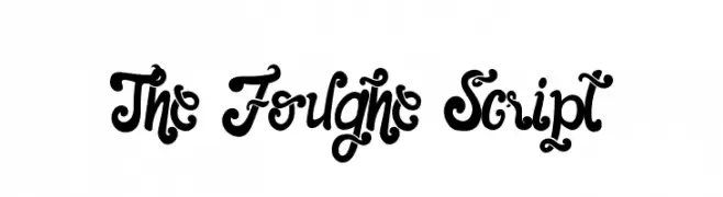
A bold, decorative script with intricate swirls and loops.
![The Foughe Script font caratteri gratis]() Scaricare 67 Downloads@WebFont
Scaricare 67 Downloads@WebFont -
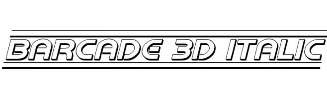
![Barcade 3D Italic font caratteri gratis]() Scaricare 67 Downloads@WebFont
Scaricare 67 Downloads@WebFont

Quali sono i font più popolari adesso?
Poppins, Roboto, Montserrat, Open Sans e Lato sono molto usati per le forme pulite e l'ampia applicabilità — dall'identità di marca alle landing page e ai poster.
Quali font si usano spesso nei loghi?
Le sans serif geometriche (es. Poppins, famiglie in stile Gotham) sono scelte comuni per un branding pulito e scalabile. Per un tocco personale restano valide script e stili manoscritti. Abbina un display deciso per i titoli a un corpo testo neutro per riconoscibilità ed equilibrio.
Ogni quanto si aggiorna la lista?
Con regolarità, in base ai download e all'attività reale. Torna spesso per scoprire in anticipo le nuove preferite.
💡 Consiglio: aggiungi ai preferiti — le tendenze cambiano in fretta e i font top di oggi possono ispirare il rebranding di domani.