Benvenuto nelle Font Più Popolari — dove popolarità e qualità si incontrano. Qui trovi i font più scaricati e usati dell'anno. Se cerchi scelte sicure per logo, web o social, inizia da qui.
Ogni font top si distingue per equilibrio, leggibilità e versatilità. Troverai sans serif moderne, script eleganti, serif vintage e display minimalisti.
-
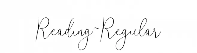
( Mega Type - creativemarket.com/megatype )
A graceful, handwritten script font with elongated, flowing strokes.
 Scaricare 399 Downloads@WebFont
 -
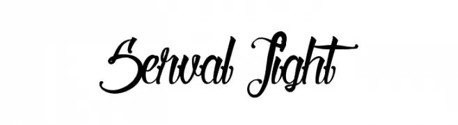
( Fonts by Maelle.K - Thomas Boucherie )
An elegant and decorative script font with intricate swirls and loops.
![Serval Light font caratteri gratis]() Scaricare 399 Downloads@WebFont
Scaricare 399 Downloads@WebFont -
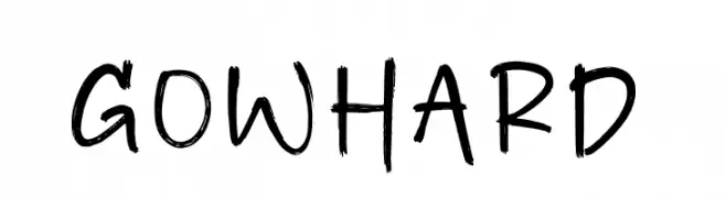
( Fonts by Perspectype Studio - Letterena.com - Personal-use only. For commercial use please contact owner. )
A bold, expressive handwritten font with dynamic strokes.
![Gowhard font caratteri gratis]() Scaricare 399 Downloads@WebFont
Scaricare 399 Downloads@WebFont -
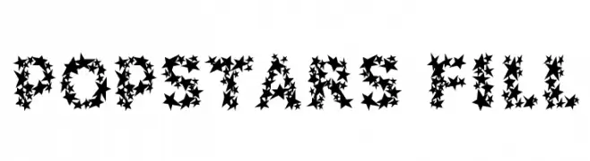
( Fonts by www.haroldsfonts.com )
A playful, star-filled font perfect for vibrant and creative projects.
![Popstars Fill font caratteri gratis]() Scaricare 399 Downloads@WebFont
Scaricare 399 Downloads@WebFont -
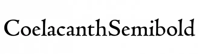
( Personal-use only. For commercial use please contact owner. )
A classic serif font with an artistic, hand-crafted appearance.
![Coelacanth Semibold font caratteri gratis]() Scaricare 399 Downloads@WebFont
Scaricare 399 Downloads@WebFont -
-
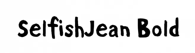
( Demetri Martin - www.selfishjean.com/ )
A playful, hand-drawn font with an informal and dynamic style.
![SelfishJean Bold font caratteri gratis]() Scaricare 399 Downloads@WebFont
Scaricare 399 Downloads@WebFont -
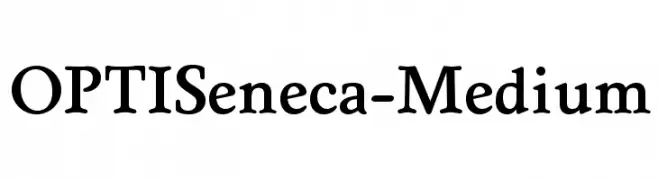
( Fonts by Castcraft Software - OPTI Fonts Archive - opti.netii.net - Personal-use only. For commercial use please contact owner. )
A classic serif font with balanced elegance and moderate stroke contrast.
![OPTISeneca-Medium font caratteri gratis]() Scaricare 399 Downloads@WebFont
Scaricare 399 Downloads@WebFont -
( Fonts by Daniel Zadorozny - www.iconian.com - Free for personal use )
A bold, 3D outlined font with a futuristic and dynamic style.
![Airstrike 3D Regular font caratteri gratis]() Scaricare 399 Downloads@WebFont
Scaricare 399 Downloads@WebFont -
Caratteri di typotopia. For commercial use please contact the owner.
( Fonts by Typotopia - Typotopia.co - Personal Use Only, for Commercial Use, please contact us )
A bold, angular font with a gothic influence and pointed serifs.
![Astaroth font caratteri gratis]() Scaricare 399 Downloads@WebFont
Scaricare 399 Downloads@WebFont -
![Camaraderie font caratteri gratis]() Scaricare 399 Downloads@WebFont
Scaricare 399 Downloads@WebFont -
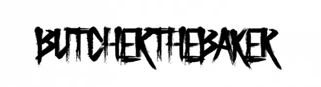
( Fonts by www.chequered.ink - Chequered Ink - Personal-use only. For commercial use please contact owner. )
A bold, distressed font with a hand-painted, brush-like texture.
![Butcher the Baker font caratteri gratis]() Scaricare 399 Downloads@WebFont
Scaricare 399 Downloads@WebFont -
![LibreBodoni-BoldItalic font caratteri gratis]() Scaricare 399 Downloads@WebFont
Scaricare 399 Downloads@WebFont -
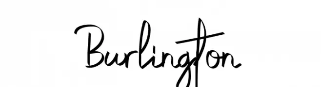
( Fonts by Nashru Studio )
Casual handwritten font with a playful style.
![Burlington font caratteri gratis]() Scaricare 399 Downloads@WebFont
Scaricare 399 Downloads@WebFont -
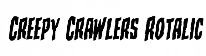
( Fonts by Iconian Fonts )
A bold, jagged, and eerie font with a slanted, horror-inspired style.
![Creepy Crawlers Rotalic font caratteri gratis]() Scaricare 399 Downloads@WebFont
Scaricare 399 Downloads@WebFont -
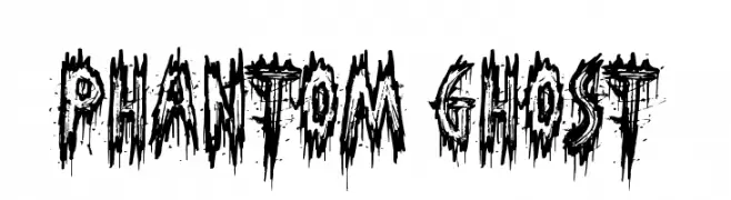
( Fonts by Jonathan S. Harris - www.tattoowoo.com. Personal-use only. For commercial use please contact owner. )
A jagged, distressed font with a spooky, horror-themed aesthetic.
![Phantom Ghost font caratteri gratis]() Scaricare 399 Downloads@WebFont
Scaricare 399 Downloads@WebFont -
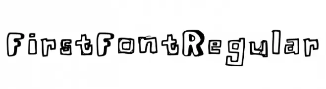
( Fonts by mxnsi )
A playful, hand-drawn font with bold, outlined characters.
![First Font Regular font caratteri gratis]() Scaricare 399 Downloads@WebFont
Scaricare 399 Downloads@WebFont -
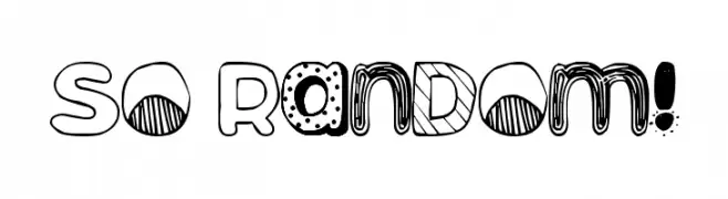
![So Random! font caratteri gratis]() Scaricare 399 Downloads@WebFont
Scaricare 399 Downloads@WebFont -
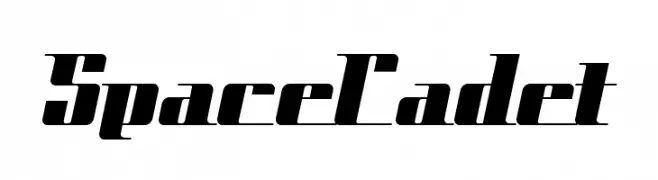
( Fonts by Nick Curtis - www.nicksfonts.com )
A futuristic, angular font with bold, elongated characters and a dynamic slant.
![SpaceCadet font caratteri gratis]() Scaricare 399 Downloads
Scaricare 399 Downloads -
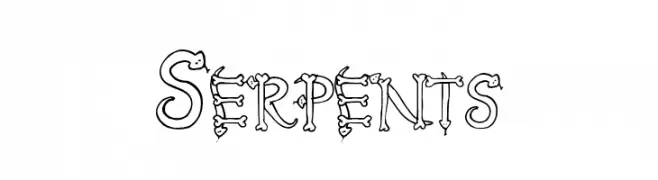
( Fonts by Matthew Austin Petty - www.disturbed.com )
A decorative font with characters formed by intertwining serpents.
![Serpents font caratteri gratis]() Scaricare 399 Downloads@WebFont
Scaricare 399 Downloads@WebFont -
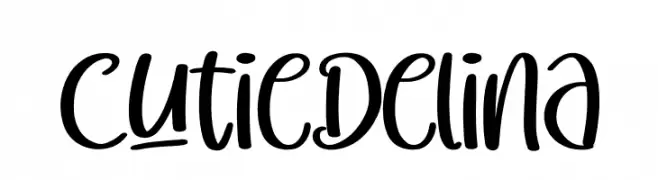
( Fonts by Perspectype Studio )
A playful handwritten font with smooth curves and a casual, friendly appearance.
![Cutie Delina font caratteri gratis]() Scaricare 399 Downloads@WebFont
Scaricare 399 Downloads@WebFont -
( Copyright (c) 2012, Sergey Steblina (sergey@steblina.com), Jovanny Lemonad (lemonad@jovanny.ru), with Reserved Font Name 'Underdog' )
A bold, angular font with a modern, edgy style.
![Underdog font caratteri gratis]() Scaricare 399 Downloads@WebFont
Scaricare 399 Downloads@WebFont -
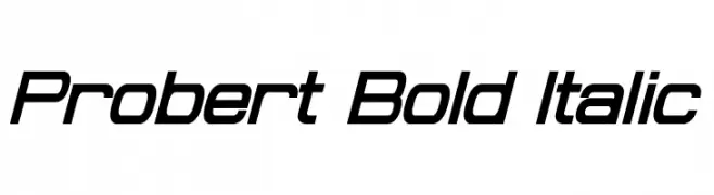
( Fonts by a Neale Davidson - www.pixelsagas.com. Personal-use only. For commercial use please contact owner. )
A bold, italic, modern font with a sleek and dynamic appearance.
![Probert Bold Italic font caratteri gratis]() Scaricare 399 Downloads@WebFont
Scaricare 399 Downloads@WebFont -
( Fonts by Andi Moz )
A whimsical and decorative font with playful, elongated serifs and curves.
![Disneb Club font caratteri gratis]() Scaricare 399 Downloads@WebFont
Scaricare 399 Downloads@WebFont -
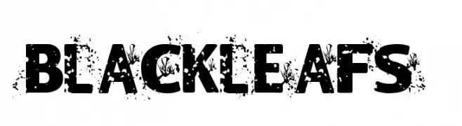
![Blackleafs font caratteri gratis]() Scaricare 399 Downloads@WebFont
Scaricare 399 Downloads@WebFont -
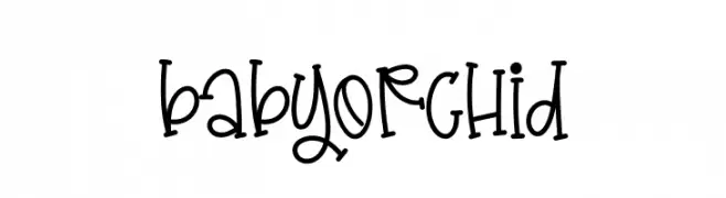
( Fonts by Creative Zone )
A playful, handwritten font with a whimsical and quirky style.
![Baby Orchid font caratteri gratis]() Scaricare 399 Downloads@WebFont
Scaricare 399 Downloads@WebFont -
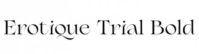
( Fonts by Zetafonts - Personal-use only. For commercial use please contact owner. )
An elegant serif font with high contrast and sharp serifs.
![Erotique Trial Bold font caratteri gratis]() Scaricare 399 Downloads@WebFont
Scaricare 399 Downloads@WebFont -
![Nu Sans Mono Demo font caratteri gratis]() Scaricare 399 Downloads@WebFont
Scaricare 399 Downloads@WebFont -
![BM sly A10 font caratteri gratis]() Scaricare 399 Downloads@WebFont
Scaricare 399 Downloads@WebFont -
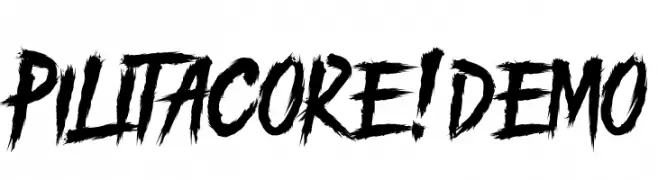
( Fonts by Knackpack Studio - www.knackpack.studio - Personal-use only. For commercial use please contact owner. )
A bold, brush-style font with a dynamic and energetic appearance.
![PILITACORE! DEMO font caratteri gratis]() Scaricare 399 Downloads@WebFont
Scaricare 399 Downloads@WebFont -
( Fonts by Mozarella Art )
A decorative font with intricate floral patterns within bold uppercase letters.
![KEYZHA font caratteri gratis]() Scaricare 399 Downloads@WebFont
Scaricare 399 Downloads@WebFont -
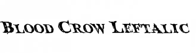
( Fonts by Daniel Zadorozny - www.iconian.com )
A bold, grunge-style font with distressed, jagged edges.
![Blood Crow Leftalic font caratteri gratis]() Scaricare 399 Downloads@WebFont
Scaricare 399 Downloads@WebFont -
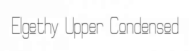
( Fonts by Graham Meade - GemFonts )
A modern, geometric, and condensed font with thin lines and a minimalist style.
![Elgethy Upper Condensed font caratteri gratis]() Scaricare 399 Downloads@WebFont
Scaricare 399 Downloads@WebFont -
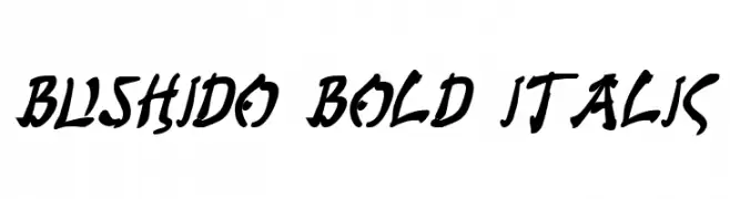
( Fonts by Daniel Zadorozny - www.iconian.com - Free for personal use )
A bold, italicized font with a dynamic, brush-like style.
![Bushido Bold Italic font caratteri gratis]() Scaricare 399 Downloads@WebFont
Scaricare 399 Downloads@WebFont -
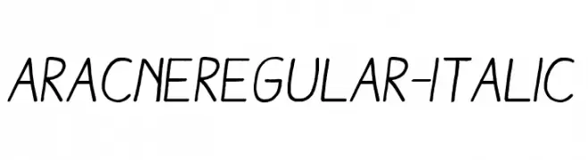
Caratteri di antipixel. For commercial use please contact the owner.
![AracneRegular-Italic font caratteri gratis]() Scaricare 399 Downloads@WebFont
Scaricare 399 Downloads@WebFont -
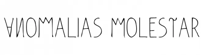
( Fonts by Edu Curosio )
A playful, hand-drawn font with tall, narrow characters and a whimsical style.
![Anomalias Molestar font caratteri gratis]() Scaricare 399 Downloads@WebFont
Scaricare 399 Downloads@WebFont


Quali sono i font più popolari adesso?
Poppins, Roboto, Montserrat, Open Sans e Lato sono molto usati per le forme pulite e l'ampia applicabilità — dall'identità di marca alle landing page e ai poster.
Quali font si usano spesso nei loghi?
Le sans serif geometriche (es. Poppins, famiglie in stile Gotham) sono scelte comuni per un branding pulito e scalabile. Per un tocco personale restano valide script e stili manoscritti. Abbina un display deciso per i titoli a un corpo testo neutro per riconoscibilità ed equilibrio.
Ogni quanto si aggiorna la lista?
Con regolarità, in base ai download e all'attività reale. Torna spesso per scoprire in anticipo le nuove preferite.
💡 Consiglio: aggiungi ai preferiti — le tendenze cambiano in fretta e i font top di oggi possono ispirare il rebranding di domani.