Benvenuto nelle Font Più Popolari — dove popolarità e qualità si incontrano. Qui trovi i font più scaricati e usati dell'anno. Se cerchi scelte sicure per logo, web o social, inizia da qui.
Ogni font top si distingue per equilibrio, leggibilità e versatilità. Troverai sans serif moderne, script eleganti, serif vintage e display minimalisti.
-
( Fonts by Paul Vincent - Personal-use only. For commercial use please contact owner. )
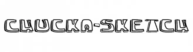
A playful, hand-drawn style font with bold, sketch-like outlines.
 Scaricare 66 Downloads@WebFont
 -
( Fonts by Daniel Zadorozny - www.iconian.com - Free for personal use )
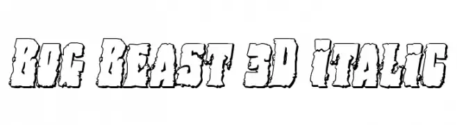
A bold, 3D italic font with a rugged, textured appearance.
![Bog Beast 3D Italic font caratteri gratis]() Scaricare 66 Downloads@WebFont
Scaricare 66 Downloads@WebFont -
( Fonts by Font People - Personal-use only. For commercial use please contact owner. )
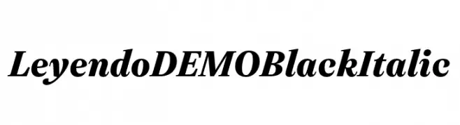
A bold, italic serif font with high contrast and dynamic style.
![Leyendo DEMO Black Italic font caratteri gratis]() Scaricare 66 Downloads@WebFont
Scaricare 66 Downloads@WebFont -
( Fonts by www.studiotypo.com - Personal-use only. For commercial use please contact owner. )
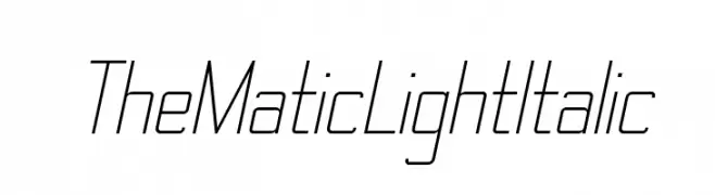
A sleek, modern italic font with thin strokes and a geometric structure.
![TheMatic Light Italic font caratteri gratis]() Scaricare 66 Downloads@WebFont
Scaricare 66 Downloads@WebFont -
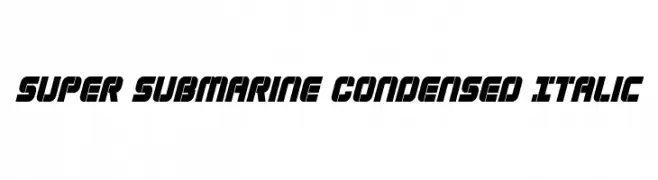
( Iconian Fonts - Daniel Zadorozny - www.iconian.com )
A bold, condensed, and italicized font with a futuristic and dynamic style.
![Super Submarine Condensed Italic font caratteri gratis]() Scaricare 66 Downloads@WebFont
Scaricare 66 Downloads@WebFont -
-
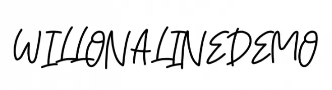
( Fonts by Elbanadha Creative - Personal-use only. For commercial use please contact owner. )
A casual, handwritten font with smooth, flowing lines and a personal touch.
![WILLONALINE DEMO font caratteri gratis]() Scaricare 66 Downloads@WebFont
Scaricare 66 Downloads@WebFont -
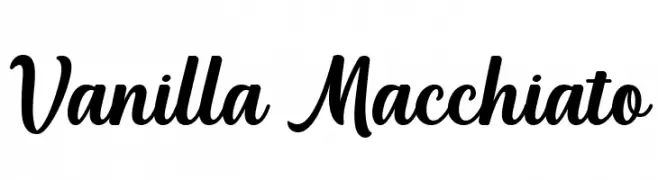
( Fonts by Manjali Studio - Personal-use only. For commercial use please contact owner. )
A bold, flowing script font with elegant curves and smooth strokes.
![Vanilla Macchiato font caratteri gratis]() Scaricare 66 Downloads@WebFont
Scaricare 66 Downloads@WebFont -
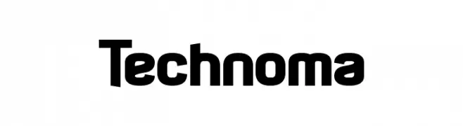
( Fonts by www.chequered.ink - Chequered Ink - Personal-use only. For commercial use please contact owner. )
A bold, modern font with a strong geometric structure and rounded edges.
![Technoma font caratteri gratis]() Scaricare 66 Downloads@WebFont
Scaricare 66 Downloads@WebFont -
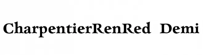
( Fonts by ingoFonts - Ingo Zimmermann - Personal-use only. For commercial use please contact owner. )
A classic serif font with elegant curves and moderate contrast.
![CharpentierRenRed-Demi font caratteri gratis]() Scaricare 66 Downloads@WebFont
Scaricare 66 Downloads@WebFont -
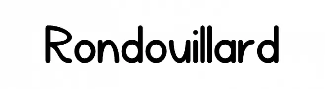
( Fonts by Gaël Chrétien - Personal-use only. For commercial use please contact owner. )
A playful, rounded font with smooth curves and consistent stroke width.
![Rondouillard font caratteri gratis]() Scaricare 66 Downloads@WebFont
Scaricare 66 Downloads@WebFont
Quali sono i font più popolari adesso?
Poppins, Roboto, Montserrat, Open Sans e Lato sono molto usati per le forme pulite e l'ampia applicabilità — dall'identità di marca alle landing page e ai poster.
Quali font si usano spesso nei loghi?
Le sans serif geometriche (es. Poppins, famiglie in stile Gotham) sono scelte comuni per un branding pulito e scalabile. Per un tocco personale restano valide script e stili manoscritti. Abbina un display deciso per i titoli a un corpo testo neutro per riconoscibilità ed equilibrio.
Ogni quanto si aggiorna la lista?
Con regolarità, in base ai download e all'attività reale. Torna spesso per scoprire in anticipo le nuove preferite.
💡 Consiglio: aggiungi ai preferiti — le tendenze cambiano in fretta e i font top di oggi possono ispirare il rebranding di domani.