Benvenuto nelle Font Più Popolari — dove popolarità e qualità si incontrano. Qui trovi i font più scaricati e usati dell'anno. Se cerchi scelte sicure per logo, web o social, inizia da qui.
Ogni font top si distingue per equilibrio, leggibilità e versatilità. Troverai sans serif moderne, script eleganti, serif vintage e display minimalisti.
-
 Scaricare 411 Downloads@WebFont
 -
( Fonts by Peter Wiegel - www.peter-wiegel.de )
A modern, angular font with a futuristic and sleek design.
![CasaSans-Regular font caratteri gratis]() Scaricare 411 Downloads@WebFont
Scaricare 411 Downloads@WebFont -
![DejaVu Sans Mono Bold Oblique font caratteri gratis]() Scaricare 411 Downloads@WebFont
Scaricare 411 Downloads@WebFont -
( Free for non-commercial use. For commercial use please buy a license. http://www.cape-arcona.com )
A bold, retro-inspired font with dynamic geometric shapes.
![CACasinoStardust-Regular font caratteri gratis]() Scaricare 411 Downloads@WebFont
Scaricare 411 Downloads@WebFont -
( Copyright (c) 2015, Cadson Demak (info@cadsondemak.com) )
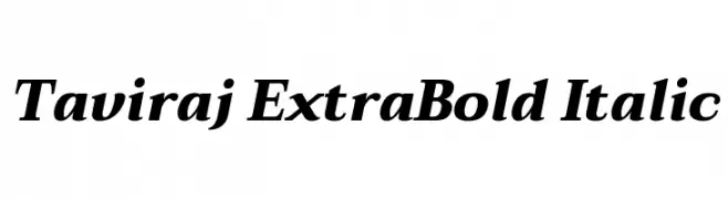
A bold, italic serif font with strong strokes and elegant slant.
![Taviraj ExtraBold Italic font caratteri gratis]() Scaricare 411 Downloads@WebFont
Scaricare 411 Downloads@WebFont -
( Fonts by FontFuror )
A modern, clean sans-serif font with balanced characters and consistent stroke width.
![Magra font caratteri gratis]() Scaricare 411 Downloads@WebFont
Scaricare 411 Downloads@WebFont -
( Fonts by Allouse Studio - Personal-use only. For commercial use please contact owner. )
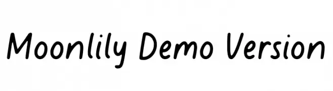
A playful, casual handwritten font with smooth, rounded letterforms.
![Moonlily Demo Version font caratteri gratis]() Scaricare 411 Downloads@WebFont
Scaricare 411 Downloads@WebFont -
( Fonts by Typodermic Fonts )
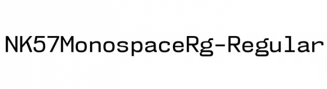
A modern, monospaced font with geometric precision and uniformity.
![NK57MonospaceRg-Regular font caratteri gratis]() Scaricare 411 Downloads@WebFont
Scaricare 411 Downloads@WebFont -
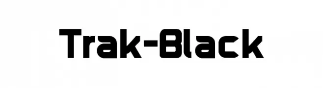
Caratteri di HammerBro101. For commercial use please contact the owner.
![Trak-Black font caratteri gratis]() Scaricare 411 Downloads@WebFont
Scaricare 411 Downloads@WebFont -
( Gia Bagratuni )
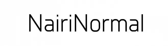
A clean, modern sans-serif font with uniform stroke width and versatile design.
![Nairi Normal font caratteri gratis]() Scaricare 411 Downloads@WebFont
Scaricare 411 Downloads@WebFont -
( Fonts by www.peter-wiegel.de. Personal-use only. For commercial use please contact owner. )
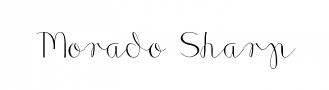
A cursive font with sharp, angular elements and elegant flow.
![Morado Sharp font caratteri gratis]() Scaricare 411 Downloads@WebFont
Scaricare 411 Downloads@WebFont -
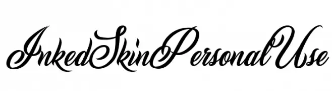
![Inked Skin Personal Use font caratteri gratis]() Scaricare 410 Downloads@WebFont
Scaricare 410 Downloads@WebFont -
( Fonts by exe.vis.ne.jp )
A sleek, modern font with a slightly italicized and condensed design.
![Registration Number ANA I L.ttf font caratteri gratis]() Scaricare 410 Downloads@WebFont
Scaricare 410 Downloads@WebFont -
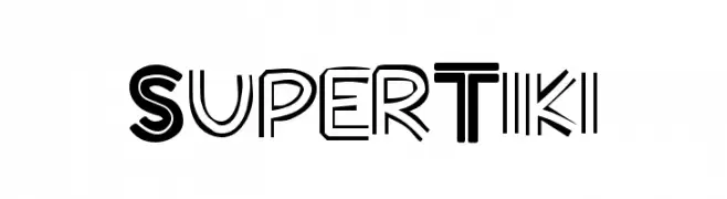
![SuperTiki font caratteri gratis]() Scaricare 410 Downloads@WebFont
Scaricare 410 Downloads@WebFont -
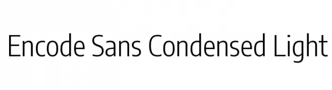
( Copyright 2012 The Encode Project Authors (impallari@gmail.com), with Reserved Font Name "Encode Sansâ€. )
A modern, condensed sans-serif font with a light weight and clean design.
![Encode Sans Condensed Light font caratteri gratis]() Scaricare 410 Downloads@WebFont
Scaricare 410 Downloads@WebFont -
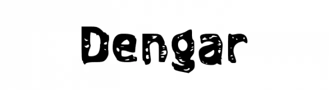
( Fonts by Wahyu Eka Prasetya - wepfont.com - Personal-use only. For commercial use please contact owner. )
A bold, playful font with a distressed, hand-crafted look.
![Dengar font caratteri gratis]() Scaricare 410 Downloads@WebFont
Scaricare 410 Downloads@WebFont -
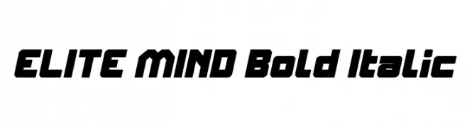
![ELITE MIND Bold Italic font caratteri gratis]() Scaricare 410 Downloads@WebFont
Scaricare 410 Downloads@WebFont -
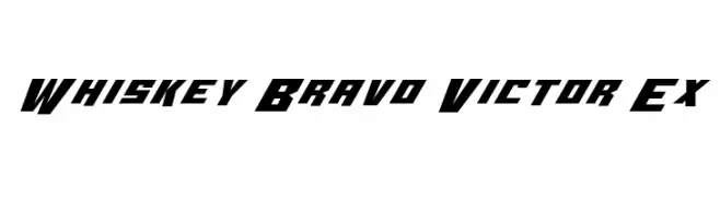
( Fonts by Iconian Fonts - Daniel Zadorozny )
A bold, angular font with a modern, geometric style.
![Whiskey Bravo Victor Ex font caratteri gratis]() Scaricare 410 Downloads@WebFont
Scaricare 410 Downloads@WebFont -
( Fonts by Castcraft Software - OPTI Fonts Archive - opti.netii.net - Personal-use only. For commercial use please contact owner. )
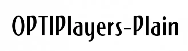
A modern vintage font with tall, narrow letterforms and art deco influences.
![OPTIPlayers-Plain font caratteri gratis]() Scaricare 410 Downloads@WebFont
Scaricare 410 Downloads@WebFont -
( Fonts by Zetafonts - Personal-use only. For commercial use please contact owner. )
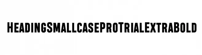
A bold, modern font with thick, uniform strokes and a strong visual impact.
![Heading Smallcase Pro Trial ExtraBold font caratteri gratis]() Scaricare 410 Downloads@WebFont
Scaricare 410 Downloads@WebFont -
( Alternatype - akufadhl.tumblr.com )
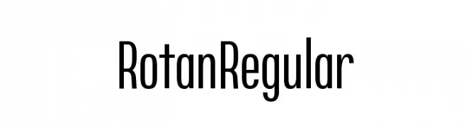
A modern, tall, and narrow sans-serif font with consistent stroke widths.
![Rotan Regular font caratteri gratis]() Scaricare 410 Downloads@WebFont
Scaricare 410 Downloads@WebFont -
( Fonts by Douglas Vitkauskas - www.vtksdesign.com. Personal-use only. For commercial use please contact owner. )
A decorative, distressed font with a chaotic, hand-drawn style.
![minus font caratteri gratis]() Scaricare 410 Downloads@WebFont
Scaricare 410 Downloads@WebFont -
( Fonts by Iconian Fonts )
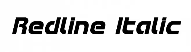
A bold, italic font with a modern, dynamic style and consistent stroke width.
![Redline Italic font caratteri gratis]() Scaricare 410 Downloads@WebFont
Scaricare 410 Downloads@WebFont -
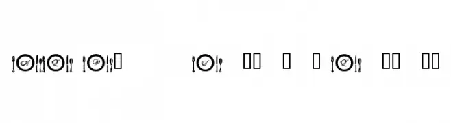
![AL Place Settings Letters font caratteri gratis]() Scaricare 410 Downloads@WebFont
Scaricare 410 Downloads@WebFont -
( Fonts by Typodermic Fonts )
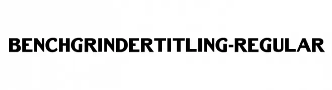
A bold, modern font with strong geometric shapes and consistent stroke width.
![BenchGrinderTitling-Regular font caratteri gratis]() Scaricare 410 Downloads@WebFont
Scaricare 410 Downloads@WebFont -
( Fonts by Google - Personal-use only. For commercial use please contact owner. )
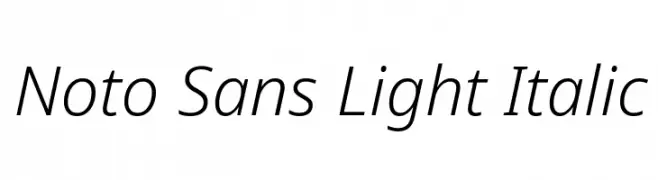
A modern, light, italic sans-serif font with clean lines and excellent legibility.
![Noto Sans Light Italic font caratteri gratis]() Scaricare 410 Downloads@WebFont
Scaricare 410 Downloads@WebFont -
( Iconian Fonts - Daniel Zadorozny - www.iconian.com )
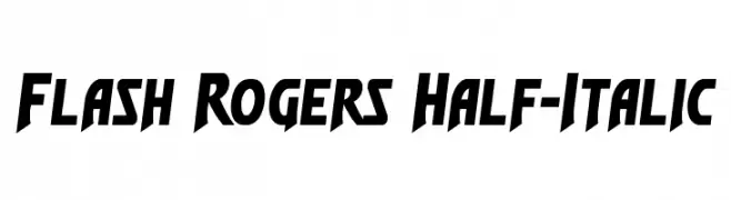
A bold, dynamic font with sharp angles and a slanted, energetic style.
![Flash Rogers Half-Italic font caratteri gratis]() Scaricare 410 Downloads@WebFont
Scaricare 410 Downloads@WebFont -
( Fonts by a Max Infeld - XEROGRAPHER FONTS - xerographer.blogspot.com . Personal-use only. For commercial use please contact owner. )
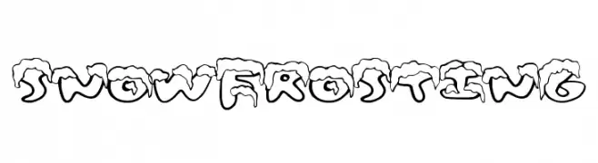
A playful, snow-capped font perfect for winter-themed designs.
![SnowFrosting font caratteri gratis]() Scaricare 410 Downloads@WebFont
Scaricare 410 Downloads@WebFont -
( Fonts by Graham Meade - GemFonts )
A rugged, textured font with a vintage, organic feel.
![Old Oak font caratteri gratis]() Scaricare 410 Downloads@WebFont
Scaricare 410 Downloads@WebFont -
( Fonts by Billy Argel )
A bold, cursive script font with elegant, flowing curves.
![Waking Stones Personal Use font caratteri gratis]() Scaricare 410 Downloads@WebFont
Scaricare 410 Downloads@WebFont -
( truefonts.blogspot.com )
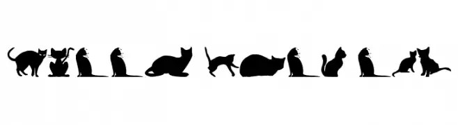
Whimsical cat silhouette dingbat font.
![kitty cats tfb font caratteri gratis]() Scaricare 410 Downloads@WebFont
Scaricare 410 Downloads@WebFont -
( Fonts by Darrell Flood )
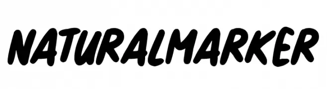
A bold, marker-style handwritten font with a playful and casual appearance.
![Natural Marker font caratteri gratis]() Scaricare 410 Downloads@WebFont
Scaricare 410 Downloads@WebFont -
( Fonts by www.peter-wiegel.de. Personal-use only. For commercial use please contact owner. )
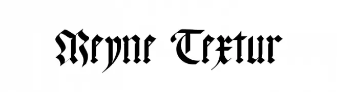
A bold and intricate Blackletter font with ornate, angular letterforms.
![Meyne Textur font caratteri gratis]() Scaricare 410 Downloads@WebFont
Scaricare 410 Downloads@WebFont -
( Fonts by AEnigma - www.aenigmafonts.com )
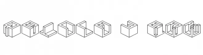
A 3D isometric font with bold, geometric cube-like characters.
![Qbicle 3 BRK font caratteri gratis]() Scaricare 410 Downloads@WebFont
Scaricare 410 Downloads@WebFont -
( Fonts by Mr Fisk - Mike Larsson - fontorama.net )
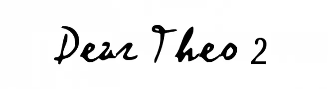
Expressive handwritten font with fluid, cursive strokes.
![Dear Theo 2 font caratteri gratis]() Scaricare 410 Downloads@WebFont
Scaricare 410 Downloads@WebFont


Quali sono i font più popolari adesso?
Poppins, Roboto, Montserrat, Open Sans e Lato sono molto usati per le forme pulite e l'ampia applicabilità — dall'identità di marca alle landing page e ai poster.
Quali font si usano spesso nei loghi?
Le sans serif geometriche (es. Poppins, famiglie in stile Gotham) sono scelte comuni per un branding pulito e scalabile. Per un tocco personale restano valide script e stili manoscritti. Abbina un display deciso per i titoli a un corpo testo neutro per riconoscibilità ed equilibrio.
Ogni quanto si aggiorna la lista?
Con regolarità, in base ai download e all'attività reale. Torna spesso per scoprire in anticipo le nuove preferite.
💡 Consiglio: aggiungi ai preferiti — le tendenze cambiano in fretta e i font top di oggi possono ispirare il rebranding di domani.