Benvenuto nelle Font Più Popolari — dove popolarità e qualità si incontrano. Qui trovi i font più scaricati e usati dell'anno. Se cerchi scelte sicure per logo, web o social, inizia da qui.
Ogni font top si distingue per equilibrio, leggibilità e versatilità. Troverai sans serif moderne, script eleganti, serif vintage e display minimalisti.
-
( Fonts by gluk )
Intricate decorative patterns unsuitable for text.
 Scaricare 65 Downloads@WebFont
 -
( Fonts by Galdino Otten - Personal-use only. For commercial use please contact owner. )
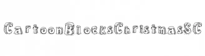
A playful, cartoonish block font with festive snow accents.
![Cartoon Blocks Christmas SC font caratteri gratis]() Scaricare 65 Downloads@WebFont
Scaricare 65 Downloads@WebFont -
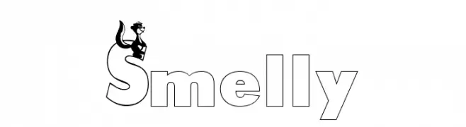
![Smelly font caratteri gratis]() Scaricare 65 Downloads@WebFont
Scaricare 65 Downloads@WebFont -
( Fonts by Peter Wiegel - www.peter-wiegel.de - Personal-use only. For commercial use please contact owner. )
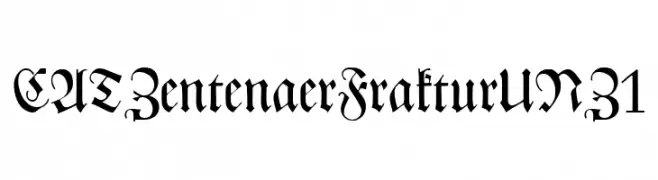
A decorative Blackletter font with high contrast and ornate details.
![CATZentenaerFrakturUNZ1 font caratteri gratis]() Scaricare 65 Downloads@WebFont
Scaricare 65 Downloads@WebFont -
( Font Nook - www.geocities.com/weakestlink11/ )
A festive, candy cane-inspired font with bold, striped characters.
![Cane Pillars font caratteri gratis]() Scaricare 65 Downloads@WebFont
Scaricare 65 Downloads@WebFont -
-
( Shadowsantos )
A hieroglyphic, pictorial font mimicking ancient Egyptian script.
![Off_Ancient_Egyptian font caratteri gratis]() Scaricare 65 Downloads@WebFont
Scaricare 65 Downloads@WebFont -
( Fonts by Daniel Zadorozny - www.iconian.com )
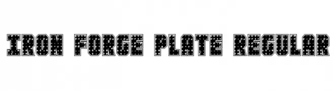
A bold, industrial font with a metallic, riveted design.
![Iron Forge Plate Regular font caratteri gratis]() Scaricare 65 Downloads@WebFont
Scaricare 65 Downloads@WebFont -
( Fonts by Khurasan - Syaf Rizal - Personal-use only. For commercial use please contact owner. )
A bold, playful font with coffee-themed elements, perfect for creative and fun designs.
![Love Coffee font caratteri gratis]() Scaricare 65 Downloads@WebFont
Scaricare 65 Downloads@WebFont -
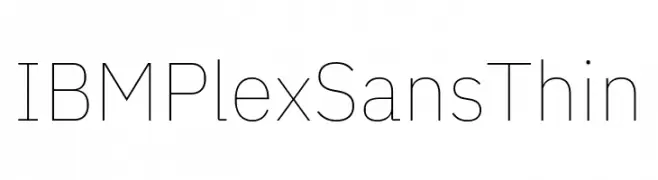
( Fonts by IBM )
A modern, thin sans-serif font with a clean and minimalist design.
![IBM Plex Sans Thin font caratteri gratis]() Scaricare 65 Downloads@WebFont
Scaricare 65 Downloads@WebFont -
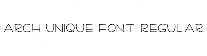
( Fonts by Sabrina Teduh Alami )
Playful handwritten-style font.
![Arch Unique Font Regular font caratteri gratis]() Scaricare 65 Downloads@WebFont
Scaricare 65 Downloads@WebFont


Quali sono i font più popolari adesso?
Poppins, Roboto, Montserrat, Open Sans e Lato sono molto usati per le forme pulite e l'ampia applicabilità — dall'identità di marca alle landing page e ai poster.
Quali font si usano spesso nei loghi?
Le sans serif geometriche (es. Poppins, famiglie in stile Gotham) sono scelte comuni per un branding pulito e scalabile. Per un tocco personale restano valide script e stili manoscritti. Abbina un display deciso per i titoli a un corpo testo neutro per riconoscibilità ed equilibrio.
Ogni quanto si aggiorna la lista?
Con regolarità, in base ai download e all'attività reale. Torna spesso per scoprire in anticipo le nuove preferite.
💡 Consiglio: aggiungi ai preferiti — le tendenze cambiano in fretta e i font top di oggi possono ispirare il rebranding di domani.