Benvenuto nelle Font Più Popolari — dove popolarità e qualità si incontrano. Qui trovi i font più scaricati e usati dell'anno. Se cerchi scelte sicure per logo, web o social, inizia da qui.
Ogni font top si distingue per equilibrio, leggibilità e versatilità. Troverai sans serif moderne, script eleganti, serif vintage e display minimalisti.
-
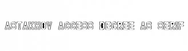
( Fonts by Dmitry Astakhov - www.behance.net/adonis-abe1e - Personal-use only. For commercial use please contact owner. )
A bold, playful font with wavy outlines and a retro-modern vibe.
 Scaricare 64 Downloads@WebFont
 -
( Gaelleing )
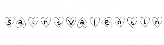
A playful, heart-themed font with bold, rounded characters enclosed in heart shapes.
![SaintValentin font caratteri gratis]() Scaricare 64 Downloads@WebFont
Scaricare 64 Downloads@WebFont -
( Fonts by WDfont - WD font - Personal-use only. For commercial use please contact owner. )
A sophisticated script font with elegant, flowing cursive letterforms.
![Hunter font caratteri gratis]() Scaricare 64 Downloads@WebFont
Scaricare 64 Downloads@WebFont -
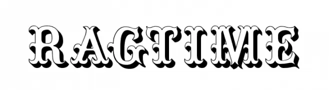
( Fonts by Thor Christopher Arisland - Personal-use only. For commercial use please contact owner. )
A bold, decorative font with vintage, ornate detailing and shadow effects.
![Ragtime font caratteri gratis]() Scaricare 64 Downloads@WebFont
Scaricare 64 Downloads@WebFont -
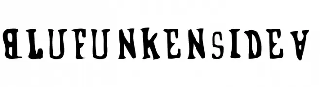
( Casa Phunk Phonts - www.muraldivision.co.uk/ )
A bold, playful font with whimsical curves and thick strokes.
![BlufunkensideA font caratteri gratis]() Scaricare 64 Downloads@WebFont
Scaricare 64 Downloads@WebFont -
-
( Fonts by Font Bundles )
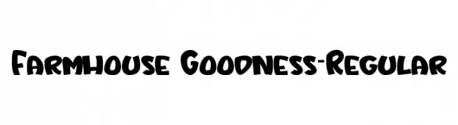
A playful, bold font with rounded, thick strokes and a hand-drawn feel.
![Farmhouse Goodness-Regular font caratteri gratis]() Scaricare 64 Downloads@WebFont
Scaricare 64 Downloads@WebFont -
( Nght's Place - www.crosswinds.net/~nghtmvs/font/fonts1.html )
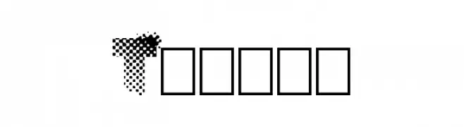
A decorative, dagger-inspired font with a gothic and medieval aesthetic.
![101! Dagger 'Bet font caratteri gratis]() Scaricare 64 Downloads@WebFont
Scaricare 64 Downloads@WebFont -
![Tramix font caratteri gratis]() Scaricare 64 Downloads@WebFont
Scaricare 64 Downloads@WebFont -
( André Felipe - www.behance.net/andfelcaslop )
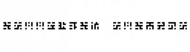
A geometric, pixelated font with a digital, futuristic aesthetic.
![Greetings Regular font caratteri gratis]() Scaricare 64 Downloads@WebFont
Scaricare 64 Downloads@WebFont -
( Fonts by Satire Artwork )
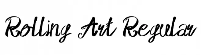
Bold, artistic script font with a handwritten style.
![Rolling Art Regular font caratteri gratis]() Scaricare 64 Downloads@WebFont
Scaricare 64 Downloads@WebFont


Quali sono i font più popolari adesso?
Poppins, Roboto, Montserrat, Open Sans e Lato sono molto usati per le forme pulite e l'ampia applicabilità — dall'identità di marca alle landing page e ai poster.
Quali font si usano spesso nei loghi?
Le sans serif geometriche (es. Poppins, famiglie in stile Gotham) sono scelte comuni per un branding pulito e scalabile. Per un tocco personale restano valide script e stili manoscritti. Abbina un display deciso per i titoli a un corpo testo neutro per riconoscibilità ed equilibrio.
Ogni quanto si aggiorna la lista?
Con regolarità, in base ai download e all'attività reale. Torna spesso per scoprire in anticipo le nuove preferite.
💡 Consiglio: aggiungi ai preferiti — le tendenze cambiano in fretta e i font top di oggi possono ispirare il rebranding di domani.