Benvenuto nelle Font Più Popolari — dove popolarità e qualità si incontrano. Qui trovi i font più scaricati e usati dell'anno. Se cerchi scelte sicure per logo, web o social, inizia da qui.
Ogni font top si distingue per equilibrio, leggibilità e versatilità. Troverai sans serif moderne, script eleganti, serif vintage e display minimalisti.
-
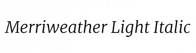
( Copyright 2016 The Merriweather Project Authors (https://github.com/EbenSorkin/Merriweather), with Reserved Font Name "Merriweather". )
A refined, light, and italic serif font with medium contrast and a modern aesthetic.
 Scaricare 393 Downloads@WebFont
 -
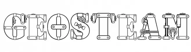
![geosteam font caratteri gratis]() Scaricare 393 Downloads@WebFont
Scaricare 393 Downloads@WebFont -
( Bhavika Malhotra - www.creativemarket.com/theinkaffair/?u=theinkaffair )
A bold, handwritten font with a playful and energetic style.
![Wild Wanderlust Personal font caratteri gratis]() Scaricare 393 Downloads@WebFont
Scaricare 393 Downloads@WebFont -
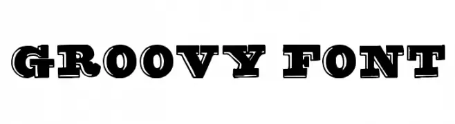
( truefonts.blogspot.com )
A bold, vintage-style font with a three-dimensional shadow effect.
![groovy font font caratteri gratis]() Scaricare 393 Downloads@WebFont
Scaricare 393 Downloads@WebFont -
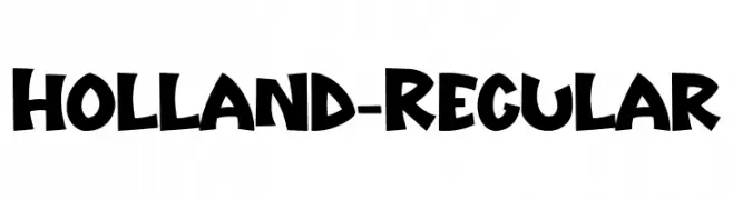
( Fonts by Hatf Type )
A bold, playful font with a hand-drawn, whimsical style.
![Holland-Regular font caratteri gratis]() Scaricare 393 Downloads@WebFont
Scaricare 393 Downloads@WebFont -
![DKOkiku font caratteri gratis]() Scaricare 393 Downloads@WebFont
Scaricare 393 Downloads@WebFont -
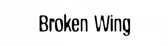
![Broken Wing font caratteri gratis]() Scaricare 393 Downloads@WebFont
Scaricare 393 Downloads@WebFont -
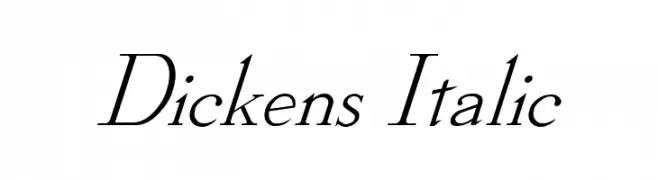
![Dickens Italic font caratteri gratis]() Scaricare 393 Downloads@WebFont
Scaricare 393 Downloads@WebFont -
( Fonts by www.gliphmaker.com. Personal-use only. For commercial use please contact owner. )
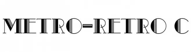
A bold, retro-inspired font with vertical stripes and geometric shapes.
![Metro-Retro C font caratteri gratis]() Scaricare 393 Downloads@WebFont
Scaricare 393 Downloads@WebFont -
( Fonts by Mr Fisk - Mike Larsson - fontorama.net )
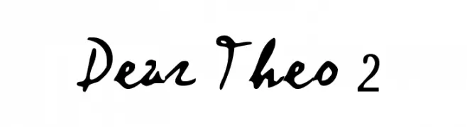
Expressive handwritten font with fluid, cursive strokes.
![Dear Theo 2 font caratteri gratis]() Scaricare 393 Downloads@WebFont
Scaricare 393 Downloads@WebFont -
( Fonts by www.tylerfinck.com - Personal-use only. For commercial use please contact owner. )
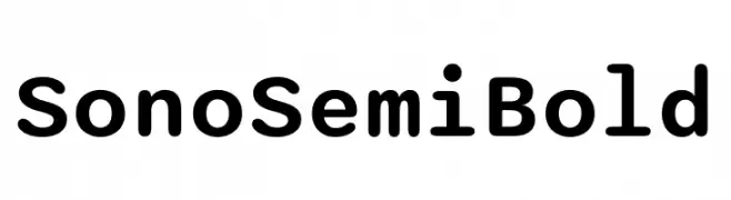
A modern, rounded font with a friendly and approachable style.
![Sono SemiBold font caratteri gratis]() Scaricare 393 Downloads@WebFont
Scaricare 393 Downloads@WebFont -
( www.facebook.com/darkoarts )
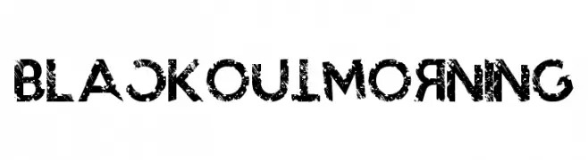
A bold, distressed font with a grunge aesthetic and textured appearance.
![BlackoutMorning font caratteri gratis]() Scaricare 393 Downloads@WebFont
Scaricare 393 Downloads@WebFont -
( Fonts by Altsys Metamorphosis )
A modern, geometric font with circular elements and a futuristic style.
![Zirkle font caratteri gratis]() Scaricare 393 Downloads@WebFont
Scaricare 393 Downloads@WebFont -
( Fonts by Blue Vinyl - Jess Latham - www.bvfonts.com )
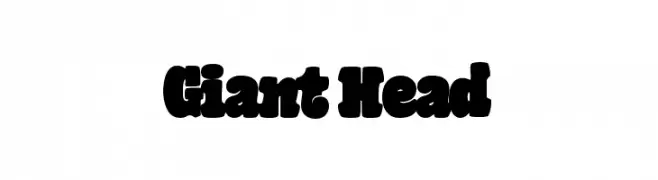
A bold, playful font with thick, rounded letters and a bubbly appearance.
![Giant Head font caratteri gratis]() Scaricare 393 Downloads@WebFont
Scaricare 393 Downloads@WebFont -
( Fonts by Daniel Zadorozny - www.iconian.com - Free for personal use )
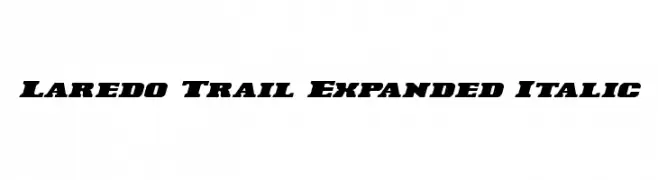
Bold, italic, and expanded font with a dynamic and modern style.
![Laredo Trail Expanded Italic font caratteri gratis]() Scaricare 393 Downloads@WebFont
Scaricare 393 Downloads@WebFont -
( Fonts by Mr Fisk - Mike Larsson - fontorama.net )
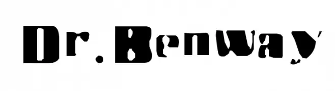
A bold, stencil-like font with a rugged, industrial feel.
![Dr.Benway font caratteri gratis]() Scaricare 393 Downloads@WebFont
Scaricare 393 Downloads@WebFont -
( Fonts by Din Studio - Donis Miftahudin - Personal-use only. For commercial use please contact owner. )
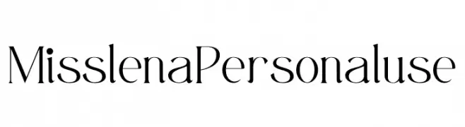
A sophisticated and elegant font with high contrast and modern flair.
![Misslena Personal use font caratteri gratis]() Scaricare 393 Downloads@WebFont
Scaricare 393 Downloads@WebFont -
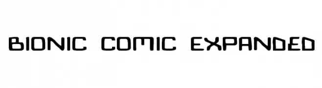
![Bionic Comic Expanded font caratteri gratis]() Scaricare 393 Downloads
Scaricare 393 Downloads -
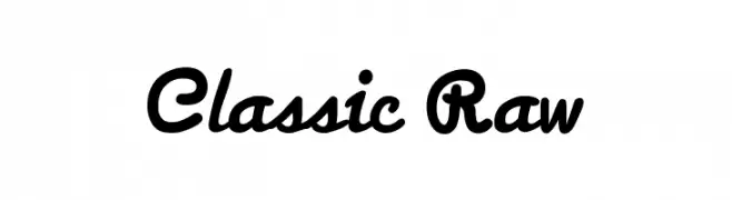
( RAW inc - www.hearusraw.com )
A bold, cursive font with a playful and dynamic handwritten style.
![Classic Raw font caratteri gratis]() Scaricare 393 Downloads@WebFont
Scaricare 393 Downloads@WebFont -
( Fonts by Thomas Ledin - tomledin.com )
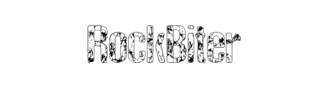
A bold, textured font with a rugged, distressed appearance.
![RockBiter font caratteri gratis]() Scaricare 393 Downloads@WebFont
Scaricare 393 Downloads@WebFont -
( Fonts by www.comicneue.com - Personal-use only. For commercial use please contact owner. )
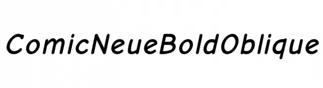
A bold, playful, and slightly slanted font with a comic-inspired style.
![Comic Neue Bold Oblique font caratteri gratis]() Scaricare 393 Downloads@WebFont
Scaricare 393 Downloads@WebFont -
( Fonts by Kong Font - https://fontkong.com/ - Personal-use only. For commercial use please contact owner. )
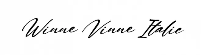
A flowing, elegant script font with an italic slant.
![Winne Vinne Italic font caratteri gratis]() Scaricare 393 Downloads@WebFont
Scaricare 393 Downloads@WebFont -
( Fonts by Vladimir Nikolic - https://www.creativefabrica.com/product/educated-deers/ref/144265/ - Personal-use only. For commercial use please contact owner. )
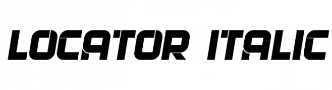
A bold, italicized font with a futuristic and dynamic design.
![Locator Italic font caratteri gratis]() Scaricare 393 Downloads@WebFont
Scaricare 393 Downloads@WebFont -
( Peter Olexa - www.dealjumbo.com )
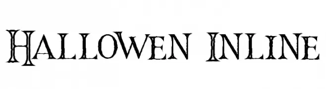
A decorative font with whimsical swirls and intricate inline details.
![Hallowen Inline font caratteri gratis]() Scaricare 393 Downloads@WebFont
Scaricare 393 Downloads@WebFont -
( Fonts by Apostrophic Lab )
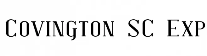
A modern serif font with elegant, elongated letterforms and sharp serifs.
![Covington SC Exp font caratteri gratis]() Scaricare 393 Downloads@WebFont
Scaricare 393 Downloads@WebFont -
( Copyright (c) 2011, wmk69 (wmk69@o2.pl) )
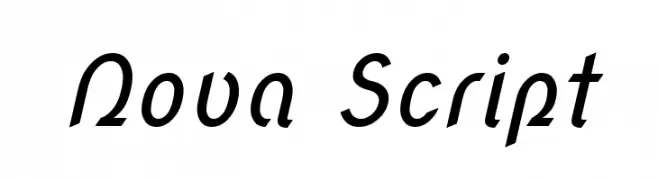
A dynamic script font with elegant curves and fluid strokes.
![Nova Script font caratteri gratis]() Scaricare 393 Downloads@WebFont
Scaricare 393 Downloads@WebFont -
( Fonts by Syaf Rizal - www.creativefabrica.com/ref/53/ - Personal-use only. For commercial use please contact owner. )
A bold, energetic script font with a hand-drawn, dynamic style.
![Makcex font caratteri gratis]() Scaricare 393 Downloads@WebFont
Scaricare 393 Downloads@WebFont -
( Fonts by Aqeela Studio - Muhammad Nasir - Personal-use only. For commercial use please contact owner. )
A delicate and flowing script font with elegant, thin strokes.
![England font caratteri gratis]() Scaricare 393 Downloads@WebFont
Scaricare 393 Downloads@WebFont -
( Fonts by Altsys Metamorphosis )
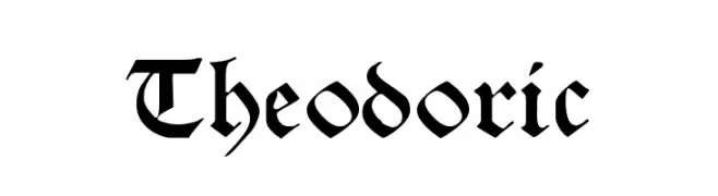
A decorative blackletter font with bold, angular strokes and a medieval aesthetic.
![Theodoric font caratteri gratis]() Scaricare 393 Downloads@WebFont
Scaricare 393 Downloads@WebFont -
( Fonts by Levi Halmos )
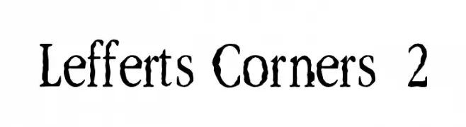
A rustic, hand-drawn font with uneven strokes and a whimsical touch.
![Lefferts Corners 2 font caratteri gratis]() Scaricare 393 Downloads@WebFont
Scaricare 393 Downloads@WebFont -
( Fonts by Rob Dobi - Toxic Type - www.dobi.nu )
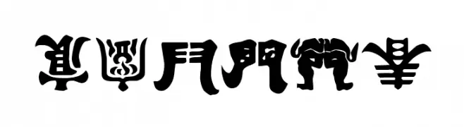
An intricate, decorative font with an ancient, hieroglyphic style.
![Kemuri font caratteri gratis]() Scaricare 393 Downloads@WebFont
Scaricare 393 Downloads@WebFont -
( Fonts by PremiereGraphics )
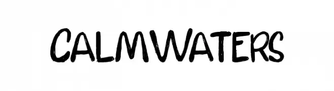
A bold, hand-drawn font with a playful and informal style.
![CalmWaters font caratteri gratis]() Scaricare 393 Downloads@WebFont
Scaricare 393 Downloads@WebFont -
( Fonts by Daniel Zadorozny - www.iconian.com )
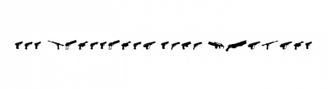
A display font using firearm silhouettes as letterforms.
![2nd Amendment 2050 Rotated font caratteri gratis]() Scaricare 393 Downloads@WebFont
Scaricare 393 Downloads@WebFont -
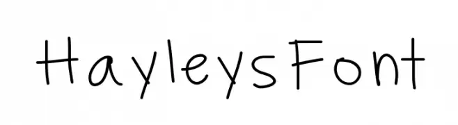
![HayleysFont font caratteri gratis]() Scaricare 393 Downloads@WebFont
Scaricare 393 Downloads@WebFont -
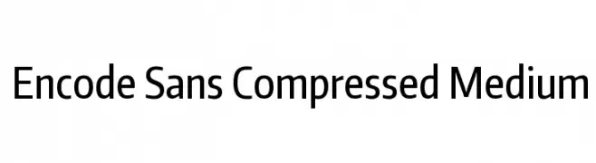
( Copyright (c) 2012, Impallari Type (www.impallari.com), with Reserved Font Name Encode Sans. )
A modern, compressed sans-serif font with medium weight and tight spacing.
![Encode Sans Compressed Medium font caratteri gratis]() Scaricare 393 Downloads@WebFont
Scaricare 393 Downloads@WebFont


Quali sono i font più popolari adesso?
Poppins, Roboto, Montserrat, Open Sans e Lato sono molto usati per le forme pulite e l'ampia applicabilità — dall'identità di marca alle landing page e ai poster.
Quali font si usano spesso nei loghi?
Le sans serif geometriche (es. Poppins, famiglie in stile Gotham) sono scelte comuni per un branding pulito e scalabile. Per un tocco personale restano valide script e stili manoscritti. Abbina un display deciso per i titoli a un corpo testo neutro per riconoscibilità ed equilibrio.
Ogni quanto si aggiorna la lista?
Con regolarità, in base ai download e all'attività reale. Torna spesso per scoprire in anticipo le nuove preferite.
💡 Consiglio: aggiungi ai preferiti — le tendenze cambiano in fretta e i font top di oggi possono ispirare il rebranding di domani.