Benvenuto nelle Font Più Popolari — dove popolarità e qualità si incontrano. Qui trovi i font più scaricati e usati dell'anno. Se cerchi scelte sicure per logo, web o social, inizia da qui.
Ogni font top si distingue per equilibrio, leggibilità e versatilità. Troverai sans serif moderne, script eleganti, serif vintage e display minimalisti.
-
 Scaricare 402 Downloads@WebFont
 -
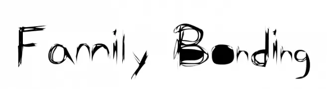
( Font by Jonathan Harris - www.tattoowoo.com )
A whimsical, flowing script font with elongated, irregular letterforms.
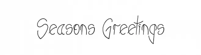
![Seasons Greetings font caratteri gratis]() Scaricare 402 Downloads@WebFont
Scaricare 402 Downloads@WebFont -
( Fonts by Billy Argel - www.billyargel.com - Personal-use only. For commercial use please contact owner. )
A bold, distressed font with a grunge aesthetic and textured edges.
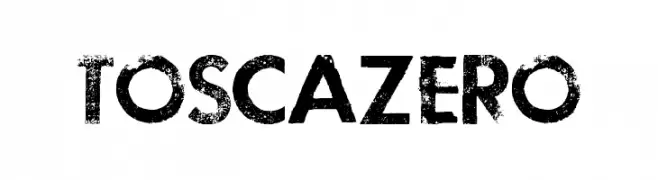
![TOSCA ZERO font caratteri gratis]() Scaricare 402 Downloads@WebFont
Scaricare 402 Downloads@WebFont -
( Fonts by Style-7 - www.styleseven.com - Personal-use only. For commercial use please contact owner. )
A modern, geometric font with clean, rounded edges and consistent stroke width.
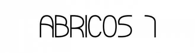
![ABRICOS 7 font caratteri gratis]() Scaricare 402 Downloads@WebFont
Scaricare 402 Downloads@WebFont -
![Quattro font caratteri gratis]() Scaricare 402 Downloads@WebFont
Scaricare 402 Downloads@WebFont -
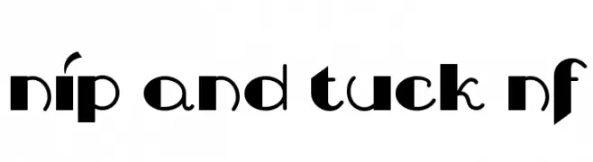
( Fonts by Nick Curtis - www.nicksfonts.com )
A bold, decorative font with geometric and playful elements.
![Nip And Tuck NF font caratteri gratis]() Scaricare 402 Downloads@WebFont
Scaricare 402 Downloads@WebFont -
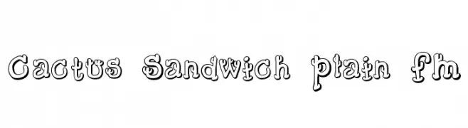
![Cactus Sandwich Plain FM font caratteri gratis]() Scaricare 402 Downloads@WebFont
Scaricare 402 Downloads@WebFont -
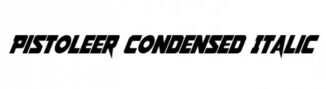
( Fonts by Daniel Zadorozny - www.iconian.com )
A bold, condensed, and italic font with sharp, angular edges and a modern, dynamic style.
![Pistoleer Condensed Italic font caratteri gratis]() Scaricare 402 Downloads@WebFont
Scaricare 402 Downloads@WebFont -
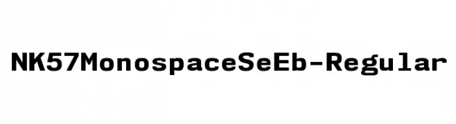
( Fonts by Typodermic Fonts )
A bold, monospaced typeface ideal for coding and technical documents.
![NK57MonospaceSeEb-Regular font caratteri gratis]() Scaricare 402 Downloads@WebFont
Scaricare 402 Downloads@WebFont -
( Fonts by Syauqiyyah Alyaa Hamsya - Personal-use only. For commercial use please contact owner. )
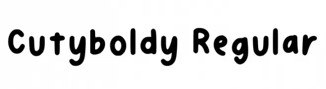
A playful, rounded font with bold, smooth strokes and a whimsical touch.
![Cutyboldy Regular font caratteri gratis]() Scaricare 402 Downloads@WebFont
Scaricare 402 Downloads@WebFont -
( Copyright (c) 2013, Natanael Gama (www.ndiscovered.com . info(at)ndiscovered.com), with Reserved Font Name 'Exo' )
A sleek, thin, and modern font with a geometric and minimalist design.
![Exo 2 Thin font caratteri gratis]() Scaricare 402 Downloads@WebFont
Scaricare 402 Downloads@WebFont -
( Fonts by Gyom Seguin - last-soundtrack.daportfolio.com )
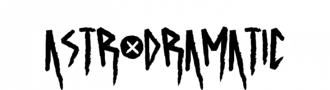
A bold, jagged, and dramatic font with a hand-drawn appearance.
![ASTRODRAMATIC font caratteri gratis]() Scaricare 402 Downloads@WebFont
Scaricare 402 Downloads@WebFont -
( Fonts by Press Gang Studios - Andeh Pinkard - www.pressgang-studios.com )
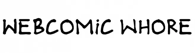
A playful, hand-drawn style font with bold, irregular characters.
![Webcomic whore font caratteri gratis]() Scaricare 402 Downloads@WebFont
Scaricare 402 Downloads@WebFont -
( Fonts by Apostrophic Lab )
A bold, geometric font with Art Deco influences, ideal for modern and stylish designs.
![Wazoo font caratteri gratis]() Scaricare 402 Downloads@WebFont
Scaricare 402 Downloads@WebFont -
( Fonts by Dharmas Studio - Jamaludin Ahmad - Personal-use only. For commercial use please contact owner. )
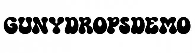
A playful, bubbly font with bold, rounded characters.
![GUNYDROPS DEMO font caratteri gratis]() Scaricare 402 Downloads@WebFont
Scaricare 402 Downloads@WebFont -
( Fonts by weknow - Wino S Kadir )
A modern, geometric font with bold, rounded shapes and consistent stroke widths.
![funrecord font caratteri gratis]() Scaricare 402 Downloads@WebFont
Scaricare 402 Downloads@WebFont -
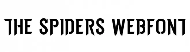
Caratteri di spideraysfonts. For commercial use please contact the owner.
![THE SPIDERS WEBFONT font caratteri gratis]() Scaricare 402 Downloads@WebFont
Scaricare 402 Downloads@WebFont -
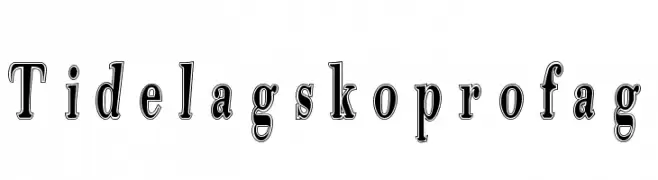
( Fonts by TarmSaft Font Factory - http://www.aska.nu/tarmsaft/ )
A bold, decorative font with a three-dimensional outline and shadow effect.
![Tidelagskoprofag font caratteri gratis]() Scaricare 402 Downloads
Scaricare 402 Downloads -
( Fonts by Zetafonts - Personal-use only. For commercial use please contact owner. )
An elegant script font with ornate flourishes and a sophisticated style.
![HelloScriptTrial font caratteri gratis]() Scaricare 402 Downloads@WebFont
Scaricare 402 Downloads@WebFont -
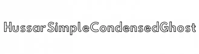
( Fonts by CannotIntoSpaceFonts - KineticPlasma Fonts - Personal-use only. For commercial use please contact owner. )
A modern, condensed sans-serif font with a ghostly outline style.
![Hussar Simple Condensed Ghost font caratteri gratis]() Scaricare 402 Downloads@WebFont
Scaricare 402 Downloads@WebFont -
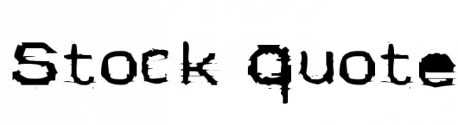
( Fonts by Andy Krahling - Sunwalk )
A bold, distressed font with a grunge, hand-drawn aesthetic.
![Stock Quote font caratteri gratis]() Scaricare 402 Downloads@WebFont
Scaricare 402 Downloads@WebFont -
( JapanYoshi - Harry Wakamatsu - behance.net/japanyoshi )
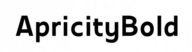
A bold, modern sans-serif font with clean lines and strong presence.
![Apricity Bold font caratteri gratis]() Scaricare 402 Downloads@WebFont
Scaricare 402 Downloads@WebFont -
![Barlow by Thunderpanda ver 01 font caratteri gratis]() Scaricare 402 Downloads@WebFont
Scaricare 402 Downloads@WebFont -
( Typodermic Fonts - Ray Larabie - www.typodermicfonts.com/ )
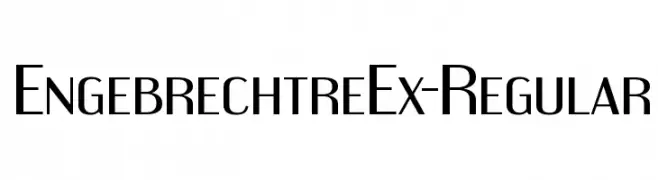
A modern, geometric font with a sleek, condensed style.
![EngebrechtreEx-Regular font caratteri gratis]() Scaricare 402 Downloads@WebFont
Scaricare 402 Downloads@WebFont -
( Fonts by Thomas Ledin - tomledin.com )
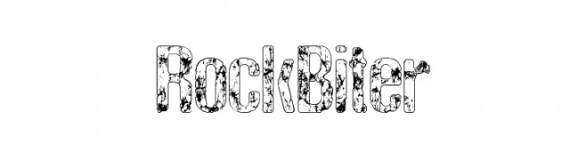
A bold, textured font with a rugged, distressed appearance.
![RockBiter font caratteri gratis]() Scaricare 402 Downloads@WebFont
Scaricare 402 Downloads@WebFont -
![Bluefish_ERODED DEMO font caratteri gratis]() Scaricare 402 Downloads@WebFont
Scaricare 402 Downloads@WebFont -
Caratteri di Fancyfontsname. For commercial use please contact the owner.
( For License: By installing or using this font, you agree to the Product Use Agreement: – If you need CUSTOM or COMMERCIAL LICENSE please visit (https://fancyfontsname.com/) – This font has a FULL VERSION and is ONLY for PERSONAL USE. NO COMMERCIAL USE! )
An elegant, calligraphic font with dynamic contrast and fluid strokes.
![AlluriaFancy font caratteri gratis]() Scaricare 402 Downloads@WebFont
Scaricare 402 Downloads@WebFont -
![AntKiller font caratteri gratis]() Scaricare 402 Downloads@WebFont
Scaricare 402 Downloads@WebFont -
![Futurama-Alien-Alphabet-Two font caratteri gratis]() Scaricare 402 Downloads@WebFont
Scaricare 402 Downloads@WebFont -
( Fonts by Michael Tension - www.TensionType.com )
A playful, hand-drawn font with bold, irregular strokes.
![Chinese Ruler font caratteri gratis]() Scaricare 402 Downloads@WebFont
Scaricare 402 Downloads@WebFont -
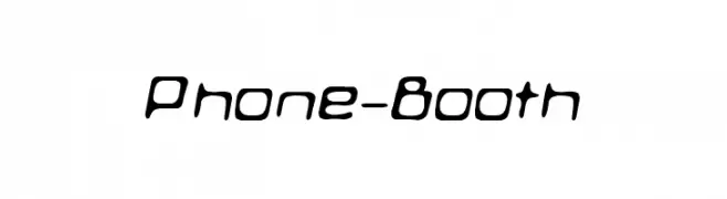
( Fonts by Jens R. Ziehn - www.filmhimmel.com )
A futuristic, rounded font with a sleek and modern design.
![Phone-Booth font caratteri gratis]() Scaricare 402 Downloads@WebFont
Scaricare 402 Downloads@WebFont -
( Fonts by Syaf Rizal - www.creativefabrica.com/ref/53/ - Personal-use only. For commercial use please contact owner. )
A bold, energetic script font with a hand-drawn, dynamic style.
![Makcex font caratteri gratis]() Scaricare 402 Downloads@WebFont
Scaricare 402 Downloads@WebFont -
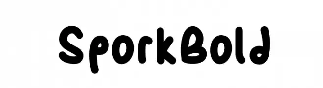
( Fonts by Shara Weber )
A playful, bold font with rounded, thick strokes and a whimsical style.
![SporkBold font caratteri gratis]() Scaricare 402 Downloads@WebFont
Scaricare 402 Downloads@WebFont -
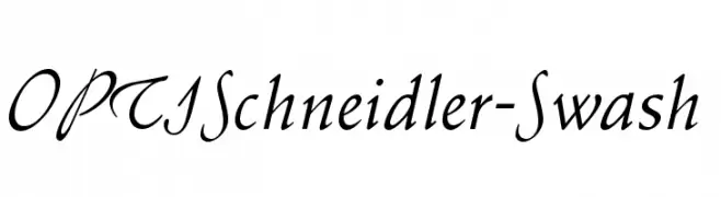
( Fonts by Castcraft Software - OPTI Fonts Archive - opti.netii.net - Personal-use only. For commercial use please contact owner. )
An elegant cursive font with swash elements, perfect for adding sophistication.
![OPTISchneidler-Swash font caratteri gratis]() Scaricare 402 Downloads@WebFont
Scaricare 402 Downloads@WebFont -
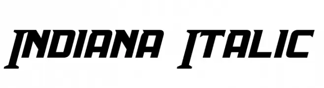
( Fonts by a Neale Davidson - www.pixelsagas.com. Personal-use only. For commercial use please contact owner. )
A bold, italic font with geometric shapes and sharp angles, exuding energy and movement.
![Indiana Italic font caratteri gratis]() Scaricare 402 Downloads@WebFont
Scaricare 402 Downloads@WebFont


Quali sono i font più popolari adesso?
Poppins, Roboto, Montserrat, Open Sans e Lato sono molto usati per le forme pulite e l'ampia applicabilità — dall'identità di marca alle landing page e ai poster.
Quali font si usano spesso nei loghi?
Le sans serif geometriche (es. Poppins, famiglie in stile Gotham) sono scelte comuni per un branding pulito e scalabile. Per un tocco personale restano valide script e stili manoscritti. Abbina un display deciso per i titoli a un corpo testo neutro per riconoscibilità ed equilibrio.
Ogni quanto si aggiorna la lista?
Con regolarità, in base ai download e all'attività reale. Torna spesso per scoprire in anticipo le nuove preferite.
💡 Consiglio: aggiungi ai preferiti — le tendenze cambiano in fretta e i font top di oggi possono ispirare il rebranding di domani.