Benvenuto nelle Font Più Popolari — dove popolarità e qualità si incontrano. Qui trovi i font più scaricati e usati dell'anno. Se cerchi scelte sicure per logo, web o social, inizia da qui.
Ogni font top si distingue per equilibrio, leggibilità e versatilità. Troverai sans serif moderne, script eleganti, serif vintage e display minimalisti.
-
 Scaricare 4633 Downloads@WebFont
 -
![Paddington font caratteri gratis]() Scaricare 4633 Downloads@WebFont
Scaricare 4633 Downloads@WebFont -
( Fonts by Castcraft Software - opti.netii.net - check the website before use )
A bold, outlined font with geometric precision and modern appeal.
![OPTIJaffaGothicBold-Outline font caratteri gratis]() Scaricare 4632 Downloads@WebFont
Scaricare 4632 Downloads@WebFont -
( Fonts by Castcraft Software - opti.netii.net - check the website before use )
A bold, italicized font with strong, angular lines and a dynamic slant.
![OPTICristeta-BoldItalic font caratteri gratis]() Scaricare 4632 Downloads@WebFont
Scaricare 4632 Downloads@WebFont -
( Copyright (c) 2010-2012, Vernon Adams (vern@newtypography.co.uk), with Reserved Font Name Nobile. )
A modern sans-serif font with balanced proportions and smooth curves.
![Nobile Medium font caratteri gratis]() Scaricare 4632 Downloads@WebFont
Scaricare 4632 Downloads@WebFont -
( Copyright (c) 2011, Pablo Impallari (www.impallari.com|impallari@gmail.com) )
A bold, playful script font with a vintage flair and strong decorative elements.
![Lobster Two Bold font caratteri gratis]() Scaricare 4632 Downloads@WebFont
Scaricare 4632 Downloads@WebFont -
![xscale font caratteri gratis]() Scaricare 4631 Downloads@WebFont
Scaricare 4631 Downloads@WebFont -
![Amrboli font caratteri gratis]() Scaricare 4629 Downloads@WebFont
Scaricare 4629 Downloads@WebFont -
( Fonts by Rajesh Rajput - gumroad.com/rajputrajesh_448 - Personal-use only. For commercial use please contact owner. )
A tall, condensed sans-serif font with a modern and clean design.
![Morganite Book font caratteri gratis]() Scaricare 4628 Downloads@WebFont
Scaricare 4628 Downloads@WebFont -
![NBA Hornets font caratteri gratis]() Scaricare 4628 Downloads@WebFont
Scaricare 4628 Downloads@WebFont -
( Fonts by Jurgen Geiger - www.geigerartwork.de )
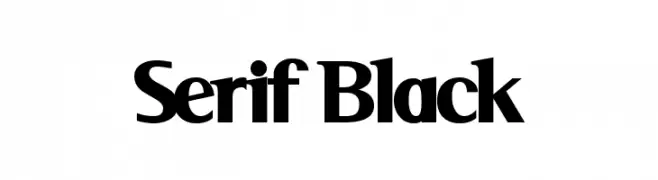
A bold serif font with strong strokes and pronounced serifs, ideal for impactful designs.
![Serif Black font caratteri gratis]() Scaricare 4628 Downloads@WebFont
Scaricare 4628 Downloads@WebFont -
( Fonts by Alphabet & Type: Typography & Graphic - Paolo Vannucci - www.alphabetype.it )
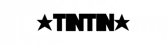
A bold, uppercase font with a strong, modern presence.
![*TINTIN* font caratteri gratis]() Scaricare 4625 Downloads@WebFont
Scaricare 4625 Downloads@WebFont -
![Ravenscroft font caratteri gratis]() Scaricare 4624 Downloads@WebFont
Scaricare 4624 Downloads@WebFont -
( Fonts by Paul Reid - tracertong.co.uk )
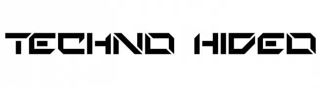
A bold, futuristic font with sharp angles and geometric shapes.
![Techno Hideo font caratteri gratis]() Scaricare 4621 Downloads@WebFont
Scaricare 4621 Downloads@WebFont -
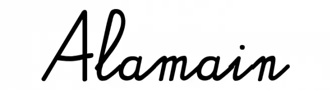
![Alamain font caratteri gratis]() Scaricare 4621 Downloads@WebFont
Scaricare 4621 Downloads@WebFont -
( Fonts by Altsys Metamorphosis )
A tall, narrow font with high contrast, ideal for elegant and sophisticated designs.
![Edition Regular font caratteri gratis]() Scaricare 4621 Downloads@WebFont
Scaricare 4621 Downloads@WebFont -
![TR-909 font caratteri gratis]() Scaricare 4620 Downloads@WebFont
Scaricare 4620 Downloads@WebFont -
![Vertexio font caratteri gratis]() Scaricare 4619 Downloads@WebFont
Scaricare 4619 Downloads@WebFont -
( Fonts by Marco Ugolini - www.jesuismonreve.org )
A modern, geometric sans-serif font with clean lines and balanced proportions.
![Biko font caratteri gratis]() Scaricare 4617 Downloads@WebFont
Scaricare 4617 Downloads@WebFont -
( Copyright (c) 2011, Font Diner, Inc (diner@fontdiner.com) )
A spooky, playful font with jagged, uneven letters ideal for Halloween themes.
![Creepster font caratteri gratis]() Scaricare 4617 Downloads@WebFont
Scaricare 4617 Downloads@WebFont -
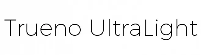
![Trueno UltraLight font caratteri gratis]() Scaricare 4616 Downloads@WebFont
Scaricare 4616 Downloads@WebFont -
( Fonts by Kevin Christopher - www.kcfonts.com. Personal-use only. For commercial use please contact owner. )
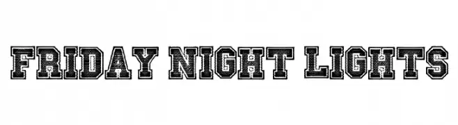
A bold, varsity-style font with a textured, dotted interior and strong outlines.
![Friday Night Lights font caratteri gratis]() Scaricare 4615 Downloads@WebFont
Scaricare 4615 Downloads@WebFont -
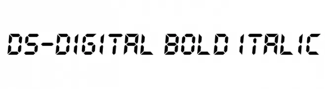
![DS-Digital Bold Italic font caratteri gratis]() Scaricare 4615 Downloads@WebFont
Scaricare 4615 Downloads@WebFont -
( Fonts by MadeType - Personal-use only. For commercial use please contact owner. )
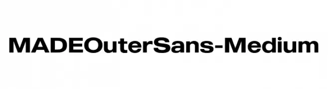
A bold, modern sans-serif font with clean lines and excellent legibility.
![MADEOuterSans-Medium font caratteri gratis]() Scaricare 4614 Downloads@WebFont
Scaricare 4614 Downloads@WebFont -
( Fonts by The League of Moveable Type - Personal-use only. For commercial use please contact owner. )
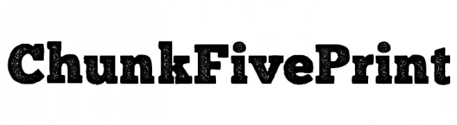
A bold, textured slab serif font with a vintage, distressed look.
![ChunkFive Print font caratteri gratis]() Scaricare 4614 Downloads@WebFont
Scaricare 4614 Downloads@WebFont -
( Fonts by Tup Wanders - www.tupwanders.nl )
A bold, dynamic script font with a playful and energetic style.
![Snickles font caratteri gratis]() Scaricare 4614 Downloads@WebFont
Scaricare 4614 Downloads@WebFont -
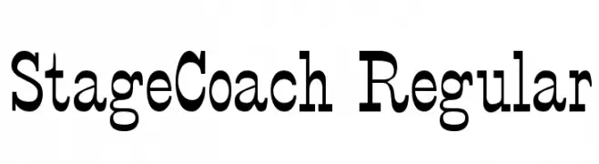
![StageCoach Regular font caratteri gratis]() Scaricare 4612 Downloads@WebFont
Scaricare 4612 Downloads@WebFont -
( Fonts by www.typodermicfonts.com - Ray Larabie )
A bold, playful font with rounded, whimsical characters.
![Foo-Regular font caratteri gratis]() Scaricare 4610 Downloads@WebFont
Scaricare 4610 Downloads@WebFont -
( Copyright (c) 2011, Cyreal (www.cyreal.org) )
A clean, modern typeface with elegant proportions and balanced strokes.
![Federo font caratteri gratis]() Scaricare 4609 Downloads@WebFont
Scaricare 4609 Downloads@WebFont -
![Deloise font caratteri gratis]() Scaricare 4609 Downloads@WebFont
Scaricare 4609 Downloads@WebFont -
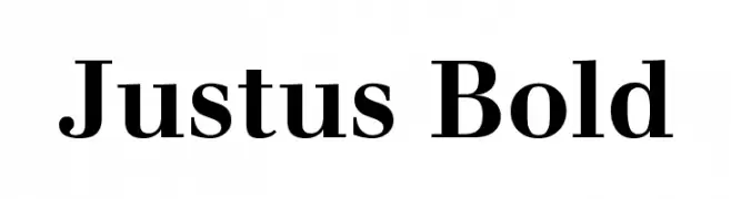
![Justus Bold font caratteri gratis]() Scaricare 4608 Downloads@WebFont
Scaricare 4608 Downloads@WebFont -
( Fonts by ShyFonts )
A bold, playful font with comic-style, exaggerated letterforms.
![SF Slapstick Comic Bold font caratteri gratis]() Scaricare 4608 Downloads@WebFont
Scaricare 4608 Downloads@WebFont -
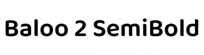
( Copyright (c) 2015 Ek Type (www.ektype.in) )
A playful, rounded font with bold, smooth curves and a friendly appearance.
![Baloo 2 SemiBold font caratteri gratis]() Scaricare 4607 Downloads@WebFont
Scaricare 4607 Downloads@WebFont -
( Fonts by Clement Nicolle - www.stereo-type.fr - Personal-use only. For commercial use please contact owner. )
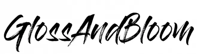
A bold, brush script font with a dynamic, hand-painted style.
![GlossAndBloom font caratteri gratis]() Scaricare 4606 Downloads@WebFont
Scaricare 4606 Downloads@WebFont -
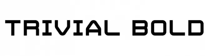
![Trivial Bold font caratteri gratis]() Scaricare 4606 Downloads@WebFont
Scaricare 4606 Downloads@WebFont


Quali sono i font più popolari adesso?
Poppins, Roboto, Montserrat, Open Sans e Lato sono molto usati per le forme pulite e l'ampia applicabilità — dall'identità di marca alle landing page e ai poster.
Quali font si usano spesso nei loghi?
Le sans serif geometriche (es. Poppins, famiglie in stile Gotham) sono scelte comuni per un branding pulito e scalabile. Per un tocco personale restano valide script e stili manoscritti. Abbina un display deciso per i titoli a un corpo testo neutro per riconoscibilità ed equilibrio.
Ogni quanto si aggiorna la lista?
Con regolarità, in base ai download e all'attività reale. Torna spesso per scoprire in anticipo le nuove preferite.
💡 Consiglio: aggiungi ai preferiti — le tendenze cambiano in fretta e i font top di oggi possono ispirare il rebranding di domani.