Benvenuto nelle Font Più Popolari — dove popolarità e qualità si incontrano. Qui trovi i font più scaricati e usati dell'anno. Se cerchi scelte sicure per logo, web o social, inizia da qui.
Ogni font top si distingue per equilibrio, leggibilità e versatilità. Troverai sans serif moderne, script eleganti, serif vintage e display minimalisti.
-
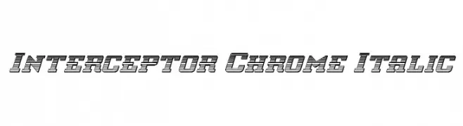
( Iconian Fonts - Daniel Zadorozny - www.iconian.com )
A bold, italicized font with a chrome-like, three-dimensional appearance.
 Scaricare 61 Downloads@WebFont
 -
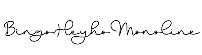
( Fonts by Bearytype )
Playful monoline script with a handwritten style.
![Bingo Heyho Monoline font caratteri gratis]() Scaricare 61 Downloads@WebFont
Scaricare 61 Downloads@WebFont -
( Fonts by Iconian Fonts - Daniel Zadorozny - Personal-use only. For commercial use please contact owner. )
A sleek, italicized font with a futuristic and dynamic design.
![Ultra 911 Super-Italic font caratteri gratis]() Scaricare 61 Downloads@WebFont
Scaricare 61 Downloads@WebFont -
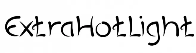
( weknow - Wino S Kadir - www.creativefabrica.com/designer/weknow/ )
A playful, handwritten-style font with fluid, curvy lines and a whimsical feel.
![ExtraHotLight font caratteri gratis]() Scaricare 61 Downloads@WebFont
Scaricare 61 Downloads@WebFont -
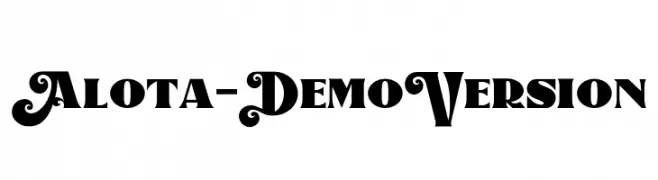
( Fonts by Burntilldead Typefoundry - Eric Kurniawan - Personal-use only. For commercial use please contact owner. )
A bold, decorative font with ornate swirls and high contrast.
![Alota-DemoVersion font caratteri gratis]() Scaricare 61 Downloads@WebFont
Scaricare 61 Downloads@WebFont -
-
( Fonts by Vladimir Nikolic )
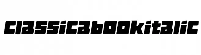
A bold, dynamic font with blocky, slanted characters and thick strokes.
![Classica Book Italic font caratteri gratis]() Scaricare 61 Downloads@WebFont
Scaricare 61 Downloads@WebFont -
( Fonts by Vunira Design - Personal-use only. For commercial use please contact owner. )
A bold, expressive brush-style font with dynamic strokes and a hand-painted look.
![Native Brush FREE font caratteri gratis]() Scaricare 61 Downloads@WebFont
Scaricare 61 Downloads@WebFont -
( Ryan Tempro )
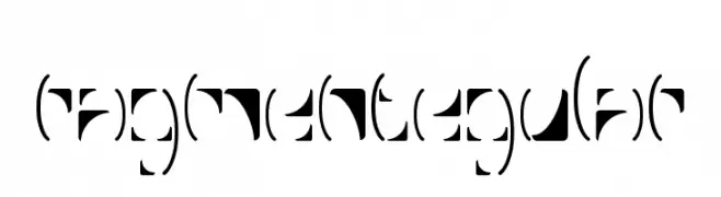
A fragmented, modern font with disjointed character segments for a unique visual effect.
![FragmentRegular font caratteri gratis]() Scaricare 61 Downloads@WebFont
Scaricare 61 Downloads@WebFont -
( Fonts on us )
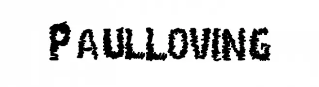
A bold, chaotic font with jagged, distressed edges and dynamic energy.
![Paul Loving font caratteri gratis]() Scaricare 61 Downloads@WebFont
Scaricare 61 Downloads@WebFont -
( Fonts by Peter Wiegel - www.peter-wiegel.de - Personal-use only. For commercial use please contact owner. )
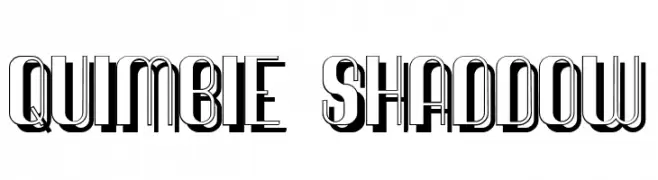
A bold, decorative font with a three-dimensional shadow effect.
![Quimbie Shaddow font caratteri gratis]() Scaricare 61 Downloads@WebFont
Scaricare 61 Downloads@WebFont


Quali sono i font più popolari adesso?
Poppins, Roboto, Montserrat, Open Sans e Lato sono molto usati per le forme pulite e l'ampia applicabilità — dall'identità di marca alle landing page e ai poster.
Quali font si usano spesso nei loghi?
Le sans serif geometriche (es. Poppins, famiglie in stile Gotham) sono scelte comuni per un branding pulito e scalabile. Per un tocco personale restano valide script e stili manoscritti. Abbina un display deciso per i titoli a un corpo testo neutro per riconoscibilità ed equilibrio.
Ogni quanto si aggiorna la lista?
Con regolarità, in base ai download e all'attività reale. Torna spesso per scoprire in anticipo le nuove preferite.
💡 Consiglio: aggiungi ai preferiti — le tendenze cambiano in fretta e i font top di oggi possono ispirare il rebranding di domani.