Benvenuto nelle Font Più Popolari — dove popolarità e qualità si incontrano. Qui trovi i font più scaricati e usati dell'anno. Se cerchi scelte sicure per logo, web o social, inizia da qui.
Ogni font top si distingue per equilibrio, leggibilità e versatilità. Troverai sans serif moderne, script eleganti, serif vintage e display minimalisti.
-
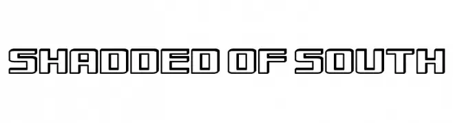
( Southype - Rodrigo Gonzalez - www.southype.com )
A bold, geometric outline font with a modern, futuristic style.
 Scaricare 61 Downloads@WebFont
 -
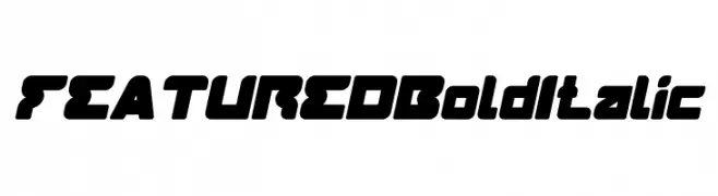
( weknow - Wino S Kadir - www.creativefabrica.com/designer/weknow/ )
A bold, italic, and modern typeface with thick, rounded strokes and tight spacing.
![FEATURED Bold Italic font caratteri gratis]() Scaricare 61 Downloads@WebFont
Scaricare 61 Downloads@WebFont -
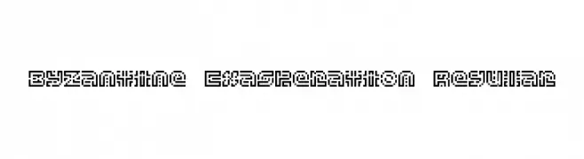
![Byzantine Exasperation Regular font caratteri gratis]() Scaricare 61 Downloads@WebFont
Scaricare 61 Downloads@WebFont -
( Fonts by Al Ghul )
Playful handwritten script font.
![Pillowtalk font caratteri gratis]() Scaricare 61 Downloads@WebFont
Scaricare 61 Downloads@WebFont -
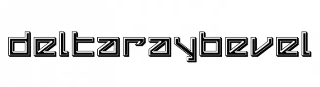
![Delta Ray Bevel font caratteri gratis]() Scaricare 61 Downloads@WebFont
Scaricare 61 Downloads@WebFont -
-
( Fonts by Manjali Studio - Personal-use only. For commercial use please contact owner. )
An elegant and flowing script font with graceful curves and a sophisticated style.
![belitha font caratteri gratis]() Scaricare 61 Downloads@WebFont
Scaricare 61 Downloads@WebFont -
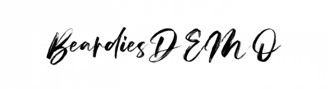
( Fonts by Vz Type - Personal-use only. For commercial use please contact owner. )
A bold, brush-style font with dynamic and expressive strokes.
![Beardies DEMO font caratteri gratis]() Scaricare 61 Downloads@WebFont
Scaricare 61 Downloads@WebFont -
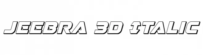
( Iconian Fonts - Daniel Zadorozny - www.iconian.com )
A bold, 3D italic font with a futuristic and dynamic style.
![Jeebra 3D Italic font caratteri gratis]() Scaricare 61 Downloads@WebFont
Scaricare 61 Downloads@WebFont -
( Fonts by Moove Studio )
A lively handwritten font with elegant, flowing characters and medium contrast.
![Enchant font caratteri gratis]() Scaricare 61 Downloads@WebFont
Scaricare 61 Downloads@WebFont -
( Fonts by Kimberly Geswein - Personal-use only. For commercial use please contact owner. )
A playful, handwritten font with a casual and dynamic style.
![Waiting for the Sunrise font caratteri gratis]() Scaricare 61 Downloads@WebFont
Scaricare 61 Downloads@WebFont


Quali sono i font più popolari adesso?
Poppins, Roboto, Montserrat, Open Sans e Lato sono molto usati per le forme pulite e l'ampia applicabilità — dall'identità di marca alle landing page e ai poster.
Quali font si usano spesso nei loghi?
Le sans serif geometriche (es. Poppins, famiglie in stile Gotham) sono scelte comuni per un branding pulito e scalabile. Per un tocco personale restano valide script e stili manoscritti. Abbina un display deciso per i titoli a un corpo testo neutro per riconoscibilità ed equilibrio.
Ogni quanto si aggiorna la lista?
Con regolarità, in base ai download e all'attività reale. Torna spesso per scoprire in anticipo le nuove preferite.
💡 Consiglio: aggiungi ai preferiti — le tendenze cambiano in fretta e i font top di oggi possono ispirare il rebranding di domani.