Benvenuto nelle Font Più Popolari — dove popolarità e qualità si incontrano. Qui trovi i font più scaricati e usati dell'anno. Se cerchi scelte sicure per logo, web o social, inizia da qui.
Ogni font top si distingue per equilibrio, leggibilità e versatilità. Troverai sans serif moderne, script eleganti, serif vintage e display minimalisti.
-
 Scaricare 60 Downloads@WebFont
 -
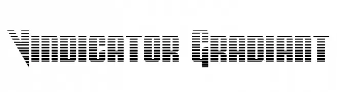
( Véronique Callait - www.verocallait.fr )
![townsfolk font caratteri gratis]() Scaricare 60 Downloads@WebFont
Scaricare 60 Downloads@WebFont -
( weknow - Wino S Kadir - www.creativefabrica.com/designer/weknow/ )
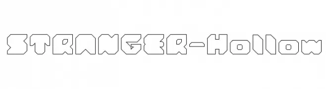
A bold, geometric font with hollow interiors and a futuristic style.
![STRANGER-Hollow font caratteri gratis]() Scaricare 60 Downloads@WebFont
Scaricare 60 Downloads@WebFont -
( Fonts by Vladimir Nikolic - https://www.creativefabrica.com/product/educated-deers/ref/144265/ - Personal-use only. For commercial use please contact owner. )
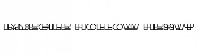
A bold, geometric font with hollow interiors and a modern, futuristic style.
![Imbecile Hollow Heavy font caratteri gratis]() Scaricare 60 Downloads@WebFont
Scaricare 60 Downloads@WebFont -
( Iconian Fonts - Daniel Zadorozny - www.iconian.com )
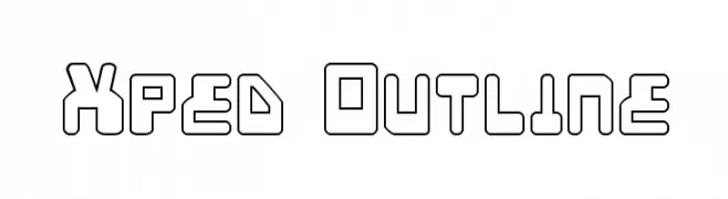
A bold, outlined geometric font with a futuristic style.
![Xped Outline font caratteri gratis]() Scaricare 60 Downloads@WebFont
Scaricare 60 Downloads@WebFont -
-
( gluk - Grzegorz l - www.glukfonts.pl )
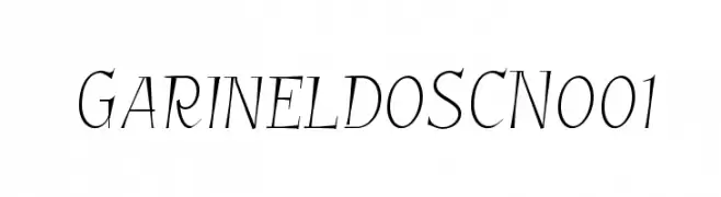
A sophisticated and flowing font with thin, graceful strokes and a slight slant.
![GarineldoSCNo01 font caratteri gratis]() Scaricare 60 Downloads@WebFont
Scaricare 60 Downloads@WebFont -
( Fonts by Darrell Flood )
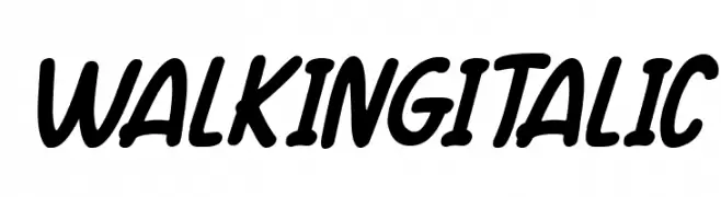
A bold, italic script font with smooth curves and dynamic flow.
![Walking Italic font caratteri gratis]() Scaricare 60 Downloads@WebFont
Scaricare 60 Downloads@WebFont -
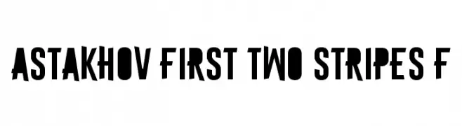
( Fonts by Dmitry Astakhov - www.behance.net/adonis-abe1e - Personal-use only. For commercial use please contact owner. )
A bold, modern font with thick strokes and tight spacing, perfect for impactful designs.
![Astakhov First Two Stripes F font caratteri gratis]() Scaricare 60 Downloads@WebFont
Scaricare 60 Downloads@WebFont -
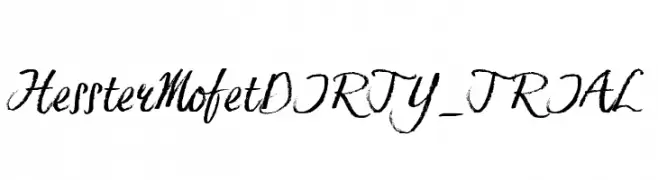
( JOEBOB graphics - Joe vanderHam - www.joebob.nl )
A dynamic, brush-style font with textured, cursive strokes.
![Hesster Mofet DIRTY_TRIAL font caratteri gratis]() Scaricare 60 Downloads@WebFont
Scaricare 60 Downloads@WebFont -
( Fonts by typeformerstudio.com - Personal-use only. For commercial use please contact owner. )
A bold, rounded sans-serif font with smooth curves and uniform strokes.
![Glennia font caratteri gratis]() Scaricare 60 Downloads@WebFont
Scaricare 60 Downloads@WebFont

Quali sono i font più popolari adesso?
Poppins, Roboto, Montserrat, Open Sans e Lato sono molto usati per le forme pulite e l'ampia applicabilità — dall'identità di marca alle landing page e ai poster.
Quali font si usano spesso nei loghi?
Le sans serif geometriche (es. Poppins, famiglie in stile Gotham) sono scelte comuni per un branding pulito e scalabile. Per un tocco personale restano valide script e stili manoscritti. Abbina un display deciso per i titoli a un corpo testo neutro per riconoscibilità ed equilibrio.
Ogni quanto si aggiorna la lista?
Con regolarità, in base ai download e all'attività reale. Torna spesso per scoprire in anticipo le nuove preferite.
💡 Consiglio: aggiungi ai preferiti — le tendenze cambiano in fretta e i font top di oggi possono ispirare il rebranding di domani.