Benvenuto nelle Font Più Popolari — dove popolarità e qualità si incontrano. Qui trovi i font più scaricati e usati dell'anno. Se cerchi scelte sicure per logo, web o social, inizia da qui.
Ogni font top si distingue per equilibrio, leggibilità e versatilità. Troverai sans serif moderne, script eleganti, serif vintage e display minimalisti.
-
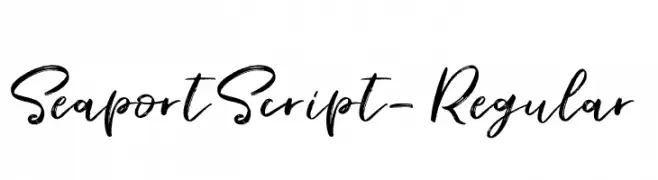
Caratteri di FontForestry. For commercial use please contact the owner.
( Introduction of Seaport Font here is another gorgeous and artistical typeface that is known as Seaport font, designed and shared by a great type designer Fontforestry, who is a dominant name in the designing field. It is the first but extremely Wonderful. )
A dynamic, handwritten font with bold, fluid strokes and a creative flair.
 Scaricare 397 Downloads@WebFont
 -
( Demo font. To purchase the full version, you can order it online at www.schoolhousefonts.com )
A dotted cursive font designed for handwriting practice.
![DmoZBCursiveDotLine font caratteri gratis]() Scaricare 397 Downloads@WebFont
Scaricare 397 Downloads@WebFont -
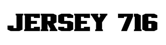
( Fonts by Jayde Garrow - Personal-use only. For commercial use please contact owner. )
A bold, geometric font with a strong, blocky appearance.
![Jersey 716 font caratteri gratis]() Scaricare 397 Downloads@WebFont
Scaricare 397 Downloads@WebFont -
![Gadolinium Rounded font caratteri gratis]() Scaricare 397 Downloads@WebFont
Scaricare 397 Downloads@WebFont -
![alienwarping font caratteri gratis]() Scaricare 397 Downloads@WebFont
Scaricare 397 Downloads@WebFont -
![Street Voice!! font caratteri gratis]() Scaricare 397 Downloads@WebFont
Scaricare 397 Downloads@WebFont -
![DEEnoch font caratteri gratis]() Scaricare 397 Downloads@WebFont
Scaricare 397 Downloads@WebFont -
( Fonts by a Neale Davidson - www.pixelsagas.com. Personal-use only. For commercial use please contact owner. )
A bold, geometric font with sharp angles and a futuristic style.
![Phoenixians Bold font caratteri gratis]() Scaricare 397 Downloads@WebFont
Scaricare 397 Downloads@WebFont -
( Fonts by Fabien Despinoy - Personal-use only. For commercial use please contact owner. )
A modern, minimalist font with tall, narrow characters and consistent stroke width.
![Fabiolo Light Regular font caratteri gratis]() Scaricare 397 Downloads@WebFont
Scaricare 397 Downloads@WebFont -
( Fonts by Woodcutter Manero - www.woodcutter.es - Personal-use only. For commercial use please contact owner. )
An ornate and decorative font with elaborate swirls, perfect for festive designs.
![Wood Xmas font caratteri gratis]() Scaricare 397 Downloads@WebFont
Scaricare 397 Downloads@WebFont -
( Free for personal use - Fonts by Markus Schroppel. For commercial license please donate to http://www.die-gute-schrift.de/donation.html )
A bold, hand-drawn font with an artistic and playful style.
![LLChina font caratteri gratis]() Scaricare 397 Downloads@WebFont
Scaricare 397 Downloads@WebFont -
( Rahmat Hidayat )
An elegant, flowing script font with intricate, decorative letterforms.
![Glorious Free font caratteri gratis]() Scaricare 397 Downloads@WebFont
Scaricare 397 Downloads@WebFont -
( Fonts by Apostrophic Lab )
A bold, rounded font with a playful, futuristic style.
![Futurex Distro font caratteri gratis]() Scaricare 397 Downloads@WebFont
Scaricare 397 Downloads@WebFont -
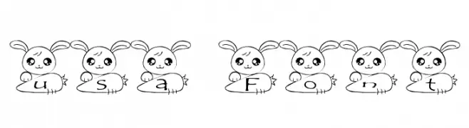
![usa Font font caratteri gratis]() Scaricare 397 Downloads@WebFont
Scaricare 397 Downloads@WebFont -
![PrintedCircuitBoard-Italic font caratteri gratis]() Scaricare 397 Downloads@WebFont
Scaricare 397 Downloads@WebFont -
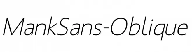
( Fonts by Manfred Klein - manfred-klein.ina-mar.com )
A modern, oblique sans-serif font with clean lines and consistent stroke width.
![MankSans-Oblique font caratteri gratis]() Scaricare 397 Downloads@WebFont
Scaricare 397 Downloads@WebFont -
( Fonts by a kmzero font foundry - www.zetafonts.com. Personal-use only. For commercial use please contact owner. )
A tall, narrow font with low contrast and tight spacing, ideal for modern designs.
![tallest font caratteri gratis]() Scaricare 397 Downloads@WebFont
Scaricare 397 Downloads@WebFont -
![Winter font caratteri gratis]() Scaricare 397 Downloads@WebFont
Scaricare 397 Downloads@WebFont -
( Fonts by Weape Studio )
A playful, bold font with rounded, thick strokes and a friendly appearance.
![Mochido font caratteri gratis]() Scaricare 397 Downloads@WebFont
Scaricare 397 Downloads@WebFont -
![A Journey font caratteri gratis]() Scaricare 397 Downloads@WebFont
Scaricare 397 Downloads@WebFont -
( Fonts by Dikas Studio - Andika Setiawan - Personal-use only. For commercial use please contact owner. )
A bold, blocky font with a vintage-modern style, perfect for impactful designs.
![Chillow Personal Use font caratteri gratis]() Scaricare 397 Downloads@WebFont
Scaricare 397 Downloads@WebFont -
![SF-notebook font caratteri gratis]() Scaricare 397 Downloads@WebFont
Scaricare 397 Downloads@WebFont -
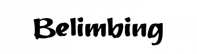
( Fonts by wep - Wahyu Eka Prasetya - Personal-use only. For commercial use please contact owner. )
A bold, brush-style font with dynamic curves and a hand-drawn appearance.
![Belimbing font caratteri gratis]() Scaricare 397 Downloads@WebFont
Scaricare 397 Downloads@WebFont -
( Fonts by Alejo Bergmann )
A bold, geometric font with a modern and clean design.
![Cunia font caratteri gratis]() Scaricare 397 Downloads@WebFont
Scaricare 397 Downloads@WebFont -
![RIOLO font caratteri gratis]() Scaricare 397 Downloads@WebFont
Scaricare 397 Downloads@WebFont -
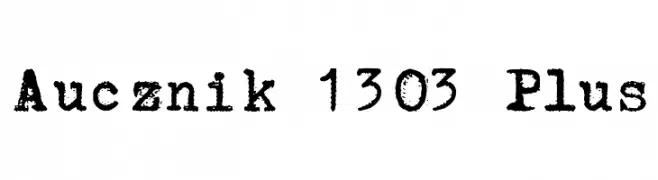
![Aucznik 1303 Plus font caratteri gratis]() Scaricare 397 Downloads@WebFont
Scaricare 397 Downloads@WebFont -
( www.arketipostudio.com )
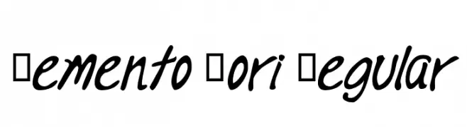
A fluid, handwritten script font with smooth, flowing curves.
![Memento Mori Regular font caratteri gratis]() Scaricare 397 Downloads@WebFont
Scaricare 397 Downloads@WebFont -
![Warszawa Kursywa font caratteri gratis]() Scaricare 397 Downloads@WebFont
Scaricare 397 Downloads@WebFont -
( Fonts by Apostrophic Lab )
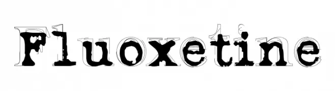
A bold, distressed serif font with a vintage, artistic style.
![Fluoxetine font caratteri gratis]() Scaricare 397 Downloads@WebFont
Scaricare 397 Downloads@WebFont -
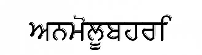
![AnmolUbhri font caratteri gratis]() Scaricare 397 Downloads@WebFont
Scaricare 397 Downloads@WebFont -
( Fonts by Apostrophic Lab )
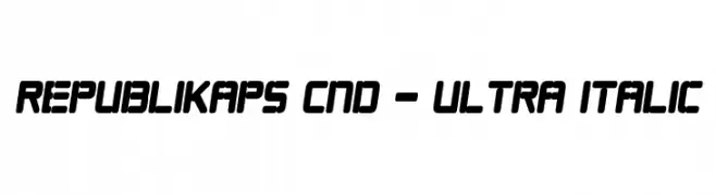
A bold, condensed, and italicized font with a modern and dynamic style.
![Republikaps Cnd - Ultra Italic font caratteri gratis]() Scaricare 397 Downloads@WebFont
Scaricare 397 Downloads@WebFont -
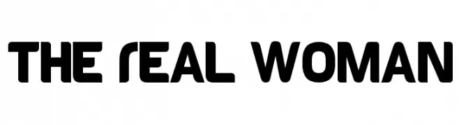
( Fonts by Dan P. Lyons - Personal-use only. For commercial use please contact owner. )
A bold, rounded font with smooth curves and a modern, friendly appearance.
![The Real Woman font caratteri gratis]() Scaricare 397 Downloads@WebFont
Scaricare 397 Downloads@WebFont -
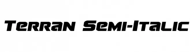
( Fonts by Daniel Zadorozny - www.iconian.com - Free for personal use )
A bold, semi-italic font with a futuristic and sporty style.
![Terran Semi-Italic font caratteri gratis]() Scaricare 397 Downloads@WebFont
Scaricare 397 Downloads@WebFont -
( Fonts by a www.fontfabric.com. Personal-use only. For commercial use please contact owner. )
A sleek, modern, light italic sans-serif typeface with smooth curves.
![Blogger Sans Light Italic font caratteri gratis]() Scaricare 397 Downloads@WebFont
Scaricare 397 Downloads@WebFont -
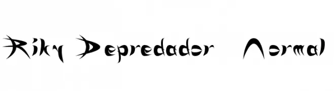
![Riky Depredador Normal font caratteri gratis]() Scaricare 397 Downloads@WebFont
Scaricare 397 Downloads@WebFont


Quali sono i font più popolari adesso?
Poppins, Roboto, Montserrat, Open Sans e Lato sono molto usati per le forme pulite e l'ampia applicabilità — dall'identità di marca alle landing page e ai poster.
Quali font si usano spesso nei loghi?
Le sans serif geometriche (es. Poppins, famiglie in stile Gotham) sono scelte comuni per un branding pulito e scalabile. Per un tocco personale restano valide script e stili manoscritti. Abbina un display deciso per i titoli a un corpo testo neutro per riconoscibilità ed equilibrio.
Ogni quanto si aggiorna la lista?
Con regolarità, in base ai download e all'attività reale. Torna spesso per scoprire in anticipo le nuove preferite.
💡 Consiglio: aggiungi ai preferiti — le tendenze cambiano in fretta e i font top di oggi possono ispirare il rebranding di domani.