Benvenuto nelle Font Più Popolari — dove popolarità e qualità si incontrano. Qui trovi i font più scaricati e usati dell'anno. Se cerchi scelte sicure per logo, web o social, inizia da qui.
Ogni font top si distingue per equilibrio, leggibilità e versatilità. Troverai sans serif moderne, script eleganti, serif vintage e display minimalisti.
-
( Murizar - www.rizky-ariesto.blogspot.com )
A playful, handwritten font with irregular, whimsical strokes.
 Scaricare 60 Downloads@WebFont
 -
( Fonts by 177Studio )
A bold, futuristic font with geometric shapes and high contrast.
![Beannie Owners Demo Regular font caratteri gratis]() Scaricare 60 Downloads@WebFont
Scaricare 60 Downloads@WebFont -
( Fonts by Khusnul Ulum )
A geometric, grid-based font with a modern, minimalistic style.
![Square Space font caratteri gratis]() Scaricare 60 Downloads@WebFont
Scaricare 60 Downloads@WebFont -
( Fonts by Dayton Miller - Personal-use only. For commercial use please contact owner. )
A bold, pixelated font with a retro, 8-bit video game aesthetic.
![Retro Land Mayhem Regular font caratteri gratis]() Scaricare 60 Downloads@WebFont
Scaricare 60 Downloads@WebFont -
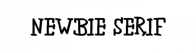
( 'Sanz Fonts - sanzclouds.blogspot.com )
A playful, handwritten-style font with quirky, uneven strokes.
![newbie serif font caratteri gratis]() Scaricare 60 Downloads@WebFont
Scaricare 60 Downloads@WebFont -
-
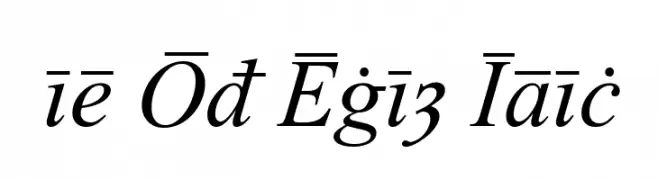
( Peter S. Baker - faculty.virginia.edu/oldenglish/ )
An elegant italic font with classic calligraphic influences and modern refinement.
![Times Old English Italic font caratteri gratis]() Scaricare 60 Downloads@WebFont
Scaricare 60 Downloads@WebFont -
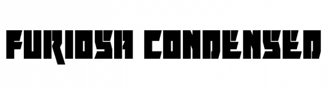
![Furiosa Condensed font caratteri gratis]() Scaricare 60 Downloads@WebFont
Scaricare 60 Downloads@WebFont -
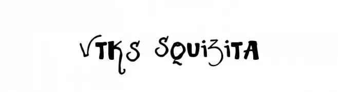
( Fonts by Douglas Vitkauskas - www.vtksdesign.com. Personal-use only. For commercial use please contact owner. )
A playful and artistic font with dynamic, hand-drawn letterforms.
![Vtks Squizita font caratteri gratis]() Scaricare 60 Downloads@WebFont
Scaricare 60 Downloads@WebFont -
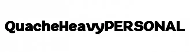
( Fonts by Mans Greback - Personal-use only. For commercial use please contact owner. )
A bold, modern font with thick, uniform strokes and a slightly rounded appearance.
![QuacheHeavyPERSONAL font caratteri gratis]() Scaricare 60 Downloads@WebFont
Scaricare 60 Downloads@WebFont -
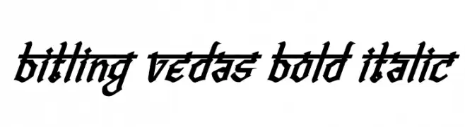
( Rajendra Bitling - www.rbitling.com )
A bold, italicized font with sharp angles and a dynamic, modern style.
![Bitling vedas Bold Italic font caratteri gratis]() Scaricare 60 Downloads@WebFont
Scaricare 60 Downloads@WebFont
Quali sono i font più popolari adesso?
Poppins, Roboto, Montserrat, Open Sans e Lato sono molto usati per le forme pulite e l'ampia applicabilità — dall'identità di marca alle landing page e ai poster.
Quali font si usano spesso nei loghi?
Le sans serif geometriche (es. Poppins, famiglie in stile Gotham) sono scelte comuni per un branding pulito e scalabile. Per un tocco personale restano valide script e stili manoscritti. Abbina un display deciso per i titoli a un corpo testo neutro per riconoscibilità ed equilibrio.
Ogni quanto si aggiorna la lista?
Con regolarità, in base ai download e all'attività reale. Torna spesso per scoprire in anticipo le nuove preferite.
💡 Consiglio: aggiungi ai preferiti — le tendenze cambiano in fretta e i font top di oggi possono ispirare il rebranding di domani.