Benvenuto nelle Font Più Popolari — dove popolarità e qualità si incontrano. Qui trovi i font più scaricati e usati dell'anno. Se cerchi scelte sicure per logo, web o social, inizia da qui.
Ogni font top si distingue per equilibrio, leggibilità e versatilità. Troverai sans serif moderne, script eleganti, serif vintage e display minimalisti.
-
( Fonts by LeFly Fonts - lefly.vepar.nl )
A bold, angular font with a rugged, geometric design.
 Scaricare 392 Downloads@WebFont
 -
( Fonts by Manfred Klein. Free for private and charity use. Free for commercial with donation to organizations )
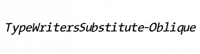
A modern oblique typewriter-style font with clean lines and excellent readability.
![TypeWritersSubstitute-Oblique font caratteri gratis]() Scaricare 392 Downloads@WebFont
Scaricare 392 Downloads@WebFont -
![Vahika font caratteri gratis]() Scaricare 392 Downloads@WebFont
Scaricare 392 Downloads@WebFont -
( Fonts by Chris Vile )
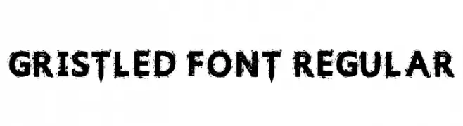
A bold, distressed font with a grunge texture and rugged appearance.
![Gristled Font Regular font caratteri gratis]() Scaricare 392 Downloads@WebFont
Scaricare 392 Downloads@WebFont -
( Fonts by Apostrophic Lab )
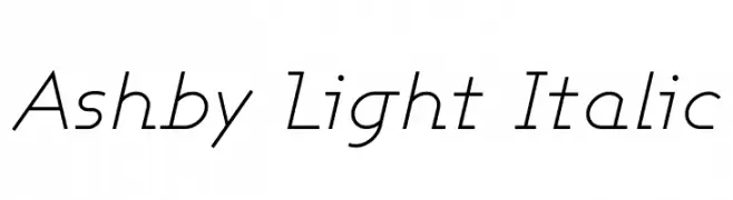
A sleek, light, and italicized font with a modern and elegant style.
![Ashby Light Italic font caratteri gratis]() Scaricare 392 Downloads@WebFont
Scaricare 392 Downloads@WebFont -
( Fonts by Chequered Ink - chequered.ink - Personal-use only. For commercial use please contact owner. )
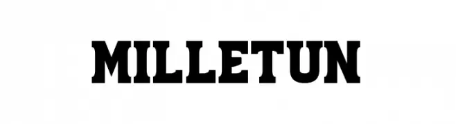
A bold, vintage-style serif font with strong, squared serifs.
![Milletun font caratteri gratis]() Scaricare 392 Downloads@WebFont
Scaricare 392 Downloads@WebFont -
( Font by Eric Wirjanata. All of my font are donation based. You can support by buying something from here. http://society6.com/EricWirjanata )
A playful, bold, hand-drawn font with a three-dimensional outline.
![Tweedy_Erc_01 font caratteri gratis]() Scaricare 392 Downloads@WebFont
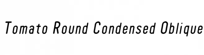
Scaricare 392 Downloads@WebFont -
![Tomato Round Condensed Oblique font caratteri gratis]() Scaricare 392 Downloads@WebFont
Scaricare 392 Downloads@WebFont -
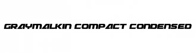
( Fonts by Daniel Zadorozny - www.iconian.com )
A bold, futuristic, and condensed font with sharp angles and a geometric style.
![Graymalkin Compact Condensed font caratteri gratis]() Scaricare 392 Downloads@WebFont
Scaricare 392 Downloads@WebFont -
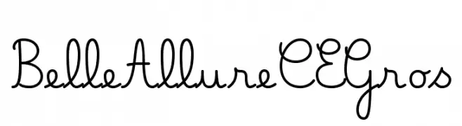
( JBFoundry - Jean Boyault - jean.boyault.pagesperso-orange.fr/ )
A playful, handwritten script font with fluid, connected letters.
![Belle Allure CE Gros font caratteri gratis]() Scaricare 392 Downloads@WebFont
Scaricare 392 Downloads@WebFont -
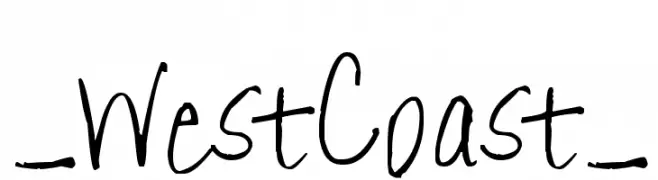
( Fonts by www.fontpanda.com. Personal-use only. For commercial use please contact owner. )
A playful, handwritten font with varied stroke thickness and a casual style.
![_WestCoast_ font caratteri gratis]() Scaricare 392 Downloads@WebFont
Scaricare 392 Downloads@WebFont -
( Fonts by MuraKnockout Media + Design - muraknockout.com. Personal-use only. For commercial use please contact owner. )
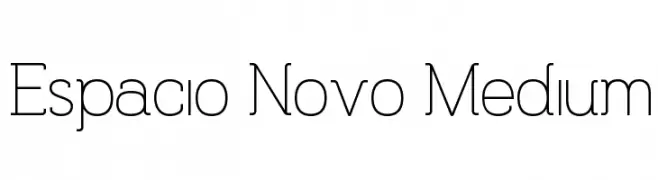
A modern, geometric sans-serif font with clean lines and balanced spacing.
![Espacio Novo Medium font caratteri gratis]() Scaricare 392 Downloads@WebFont
Scaricare 392 Downloads@WebFont -
( Fonts by Typhoon Type - Suthi Srisopha - www.typhoontype.net - Personal-use only. For commercial use please contact owner. )
A playful, bold, and whimsical handwritten font with retro flair.
![AllTheRollPersonalUse font caratteri gratis]() Scaricare 392 Downloads@WebFont
Scaricare 392 Downloads@WebFont -
( Fonts by www.dcoxy.com )
A playful, whimsical font with rounded, elongated letterforms and creative details.
![Magic Kiss font caratteri gratis]() Scaricare 392 Downloads@WebFont
Scaricare 392 Downloads@WebFont -
![Conero font caratteri gratis]() Scaricare 392 Downloads@WebFont
Scaricare 392 Downloads@WebFont -
![Academiury-ITV Italic font caratteri gratis]() Scaricare 392 Downloads
Scaricare 392 Downloads -
( Fonts by Apostrophic Lab )
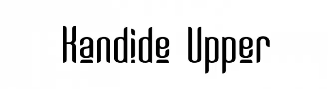
A modern, elongated font with narrow characters and rounded edges.
![Kandide Upper font caratteri gratis]() Scaricare 391 Downloads@WebFont
Scaricare 391 Downloads@WebFont -
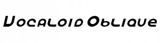
![Vocaloid Oblique font caratteri gratis]() Scaricare 391 Downloads@WebFont
Scaricare 391 Downloads@WebFont -
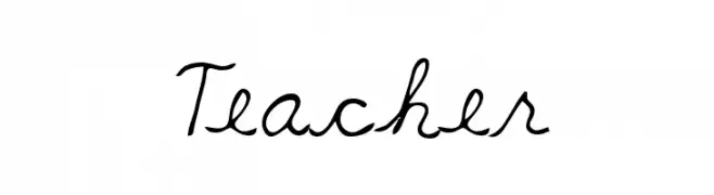
![Teacher font caratteri gratis]() Scaricare 391 Downloads@WebFont
Scaricare 391 Downloads@WebFont -
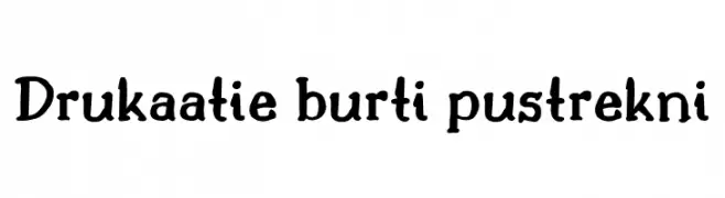
( Fonts by KÄrlis KalviÅ¡kis . For commercial use please contact owner. )
A playful, handwritten font with bold, rounded strokes and a whimsical style.
![Drukaatie burti pustrekni font caratteri gratis]() Scaricare 391 Downloads@WebFont
Scaricare 391 Downloads@WebFont -
( Fonts by www.fontalicious.com )
A bold, modern font with geometric elements and playful curves.
![Fidelle font caratteri gratis]() Scaricare 391 Downloads@WebFont
Scaricare 391 Downloads@WebFont -
( Daniel Nagura - )
A pixelated, retro-style font inspired by classic 8-bit video games.
![8-bit font caratteri gratis]() Scaricare 391 Downloads@WebFont
Scaricare 391 Downloads@WebFont -
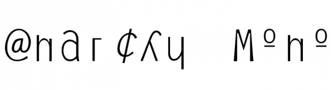
![Anarchy Mono font caratteri gratis]() Scaricare 391 Downloads@WebFont
Scaricare 391 Downloads@WebFont -
( Fonts by Paige Lyon )
A playful and whimsical font with curly, swirling elements.
![Summer Swirl Demo font caratteri gratis]() Scaricare 391 Downloads@WebFont
Scaricare 391 Downloads@WebFont -
( Fonts by www.houseoflime.com )
A bold, splatter-effect font with a dynamic and artistic style.
![Splatter Caps font caratteri gratis]() Scaricare 391 Downloads@WebFont
Scaricare 391 Downloads@WebFont -
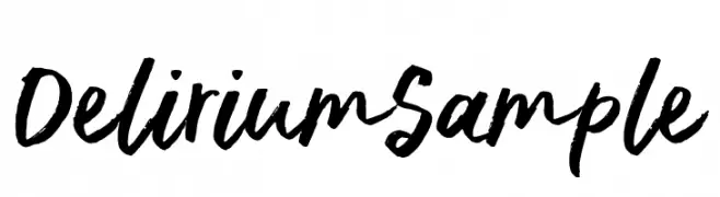
( Fonts by Ana )
A bold, expressive brush script font with a dynamic, hand-painted style.
![DeliriumSample font caratteri gratis]() Scaricare 391 Downloads@WebFont
Scaricare 391 Downloads@WebFont -
( Iconian Fonts - Daniel Zadorozny - www.iconian.com )
Bold, italicized font with a dynamic and impactful style.
![Uglier Things Staggered Italic font caratteri gratis]() Scaricare 391 Downloads@WebFont
Scaricare 391 Downloads@WebFont -
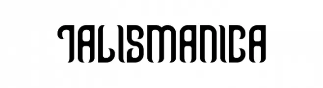
( THESE ARE SHAREWARE FONTS ! NOT FREEWARE ! PLEASE VISIT www.fuelfonts.com )
A bold, modern font with tall, narrow characters and a unique blend of angles and curves.
![Talismanica font caratteri gratis]() Scaricare 391 Downloads@WebFont
Scaricare 391 Downloads@WebFont -
( Fonts by Zetafonts - Personal-use only. For commercial use please contact owner. )
A bold, modern font with strong, geometric characters and minimal contrast.
![Altair Ultra font caratteri gratis]() Scaricare 391 Downloads@WebFont
Scaricare 391 Downloads@WebFont -
Caratteri di defharo. For commercial use please contact the owner.
![Disoluta-Regular font caratteri gratis]() Scaricare 391 Downloads@WebFont
Scaricare 391 Downloads@WebFont -
( Fonts by a Adrian Candela - http://www.behance.net/takuminokami . Personal-use only. For commercial use please contact owner. )
A bold, geometric font with a three-dimensional shadow effect.
![AC Framed font caratteri gratis]() Scaricare 391 Downloads@WebFont
Scaricare 391 Downloads@WebFont -
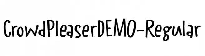
( Fonts by Hanoded )
A playful, handwritten font with a casual and friendly style.
![CrowdPleaserDEMO-Regular font caratteri gratis]() Scaricare 391 Downloads@WebFont
Scaricare 391 Downloads@WebFont -
( Fonts by Excellent Ritma Florendia )
A playful, rounded, and handwritten-style font with a friendly vibe.
![Sugar Recipe font caratteri gratis]() Scaricare 391 Downloads@WebFont
Scaricare 391 Downloads@WebFont -
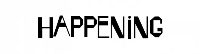
( Fonts by Daniel Gauthier )
A bold, geometric font with sharp angles and a modern aesthetic.
![Happening font caratteri gratis]() Scaricare 391 Downloads@WebFont
Scaricare 391 Downloads@WebFont -
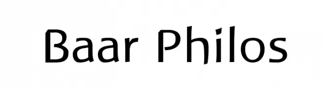
( Lutz Baar - baar.se/aidfonts/ )
A modern sans-serif font with a clean, geometric style.
![Baar Philos font caratteri gratis]() Scaricare 391 Downloads@WebFont
Scaricare 391 Downloads@WebFont


Quali sono i font più popolari adesso?
Poppins, Roboto, Montserrat, Open Sans e Lato sono molto usati per le forme pulite e l'ampia applicabilità — dall'identità di marca alle landing page e ai poster.
Quali font si usano spesso nei loghi?
Le sans serif geometriche (es. Poppins, famiglie in stile Gotham) sono scelte comuni per un branding pulito e scalabile. Per un tocco personale restano valide script e stili manoscritti. Abbina un display deciso per i titoli a un corpo testo neutro per riconoscibilità ed equilibrio.
Ogni quanto si aggiorna la lista?
Con regolarità, in base ai download e all'attività reale. Torna spesso per scoprire in anticipo le nuove preferite.
💡 Consiglio: aggiungi ai preferiti — le tendenze cambiano in fretta e i font top di oggi possono ispirare il rebranding di domani.