Benvenuto nelle Font Più Popolari — dove popolarità e qualità si incontrano. Qui trovi i font più scaricati e usati dell'anno. Se cerchi scelte sicure per logo, web o social, inizia da qui.
Ogni font top si distingue per equilibrio, leggibilità e versatilità. Troverai sans serif moderne, script eleganti, serif vintage e display minimalisti.
-
( Fonts by wep - Wahyu Eka Prasetya - Personal-use only. For commercial use please contact owner. )
A bold, brush-textured font with an energetic and expressive style.
 Scaricare 63 Downloads@WebFont
 -
( London's Letters - www.londonsletters.com/ )
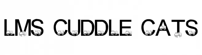
A playful font with bold letters and integrated cat illustrations.
![LMS Cuddle Cats font caratteri gratis]() Scaricare 63 Downloads@WebFont
Scaricare 63 Downloads@WebFont -
( Fonts by I Shofyan - Personal-use only. For commercial use please contact owner. )
A bold, geometric font with sharp angles and a modern aesthetic.
![REBA font caratteri gratis]() Scaricare 63 Downloads@WebFont
Scaricare 63 Downloads@WebFont -
( Fonts by Kat`s Fun Fonts - Personal-use only. For commercial use please contact owner. )
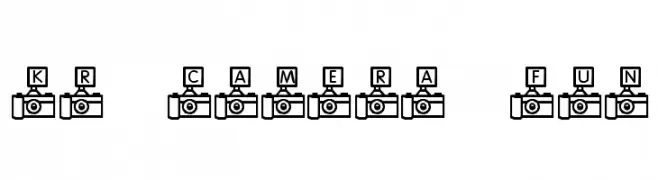
A decorative font with letters inside camera icons, perfect for photography themes.
![KR Camera Fun font caratteri gratis]() Scaricare 63 Downloads@WebFont
Scaricare 63 Downloads@WebFont -
( weknow - Wino S Kadir - www.creativefabrica.com/designer/weknow/ )
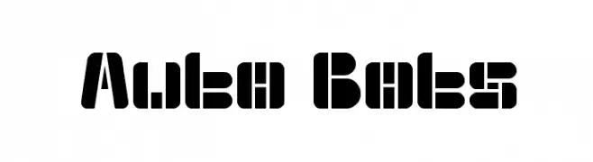
A bold, geometric font with a futuristic and industrial aesthetic.
![Auto Bots font caratteri gratis]() Scaricare 63 Downloads@WebFont
Scaricare 63 Downloads@WebFont -
-
( Iconian Fonts - Daniel Zadorozny - www.iconian.com )
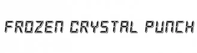
A futuristic, digital-style font with a three-dimensional, crystal-like appearance.
![Frozen Crystal Punch font caratteri gratis]() Scaricare 63 Downloads@WebFont
Scaricare 63 Downloads@WebFont -
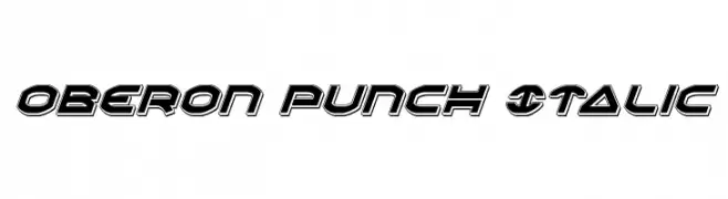
( Iconian Fonts - Daniel Zadorozny - www.iconian.com )
A bold, italicized font with a futuristic and dynamic style.
![Oberon Punch Italic font caratteri gratis]() Scaricare 63 Downloads@WebFont
Scaricare 63 Downloads@WebFont -
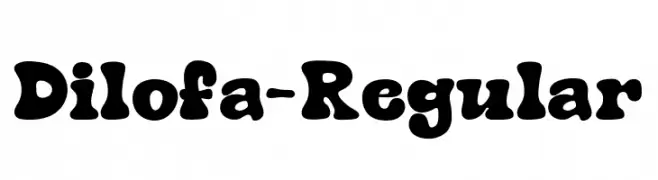
( Fonts by Type on Studio )
A playful, bold font with rounded, bubbly characters and a whimsical style.
![Dilofa-Regular font caratteri gratis]() Scaricare 63 Downloads@WebFont
Scaricare 63 Downloads@WebFont -
( Fonts by Winter Design Studio - winty5.wixsite.com/noahtheawesome/ - Personal-use only. For commercial use please contact owner. )
A dynamic handwritten font with fluid, expressive strokes.
![Skribal font caratteri gratis]() Scaricare 63 Downloads@WebFont
Scaricare 63 Downloads@WebFont -
( Fonts by The Branded Quotes )
Dynamic handwritten script with a modern edge.
![Future Surfing (Personal Use) font caratteri gratis]() Scaricare 63 Downloads@WebFont
Scaricare 63 Downloads@WebFont


Quali sono i font più popolari adesso?
Poppins, Roboto, Montserrat, Open Sans e Lato sono molto usati per le forme pulite e l'ampia applicabilità — dall'identità di marca alle landing page e ai poster.
Quali font si usano spesso nei loghi?
Le sans serif geometriche (es. Poppins, famiglie in stile Gotham) sono scelte comuni per un branding pulito e scalabile. Per un tocco personale restano valide script e stili manoscritti. Abbina un display deciso per i titoli a un corpo testo neutro per riconoscibilità ed equilibrio.
Ogni quanto si aggiorna la lista?
Con regolarità, in base ai download e all'attività reale. Torna spesso per scoprire in anticipo le nuove preferite.
💡 Consiglio: aggiungi ai preferiti — le tendenze cambiano in fretta e i font top di oggi possono ispirare il rebranding di domani.