Benvenuto nelle Font Più Popolari — dove popolarità e qualità si incontrano. Qui trovi i font più scaricati e usati dell'anno. Se cerchi scelte sicure per logo, web o social, inizia da qui.
Ogni font top si distingue per equilibrio, leggibilità e versatilità. Troverai sans serif moderne, script eleganti, serif vintage e display minimalisti.
-
( Free for a personal use. For a commercial use please visit www.kevinandamanda.com )
A playful, handwritten font with uneven strokes and a casual, dynamic style.
 Scaricare 389 Downloads@WebFont
 -
( Fonts by www.movefont .com - Personal-use only. For commercial use please contact owner. )
A lively handwritten font with dynamic strokes and playful curves.
![Bettie font caratteri gratis]() Scaricare 389 Downloads@WebFont
Scaricare 389 Downloads@WebFont -
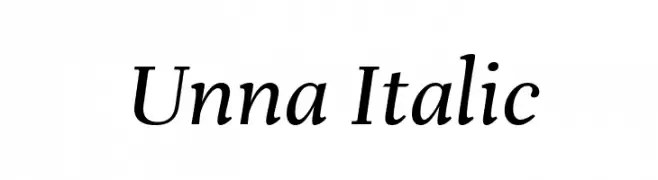
( Copyright 2016 The Unna Project Authors (omnibus.type@gmail.com) )
Elegant serif font with an italic slant and moderate contrast.
![Unna Italic font caratteri gratis]() Scaricare 389 Downloads@WebFont
Scaricare 389 Downloads@WebFont -
( Fonts by Galdino Otten - galdinootten.com )
Whimsical, illustrated font with various quirky car drawings.
![Ugly Cars font caratteri gratis]() Scaricare 388 Downloads@WebFont
Scaricare 388 Downloads@WebFont -
( Haris Prawoto - graphicriver.net/user/selawe/portfolio )
A bold, energetic script font with fluid, connected strokes and a handwritten style.
![TEGAS font caratteri gratis]() Scaricare 388 Downloads@WebFont
Scaricare 388 Downloads@WebFont -
![Dunkin Bold Italic font caratteri gratis]() Scaricare 388 Downloads@WebFont
Scaricare 388 Downloads@WebFont -
( Fonts by Phillip Cavette )
A playful, bold font with an organic and whimsical design.
![Olopus font caratteri gratis]() Scaricare 388 Downloads@WebFont
Scaricare 388 Downloads@WebFont -
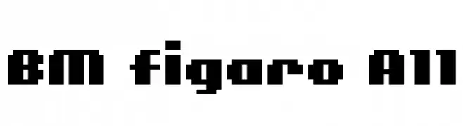
![BM figaro A11 font caratteri gratis]() Scaricare 388 Downloads@WebFont
Scaricare 388 Downloads@WebFont -
![JessFont font caratteri gratis]() Scaricare 388 Downloads@WebFont
Scaricare 388 Downloads@WebFont -
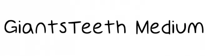
( www.GiantsTeeth.com )
A playful, handwritten-style font with consistent stroke thickness and a casual appearance.
![GiantsTeeth Medium font caratteri gratis]() Scaricare 388 Downloads@WebFont
Scaricare 388 Downloads@WebFont -
Caratteri di defharo. For commercial use please contact the owner.
![Pabellona [A] Símplex font caratteri gratis]() Scaricare 388 Downloads@WebFont
Scaricare 388 Downloads@WebFont -
![Guilty gardens font caratteri gratis]() Scaricare 388 Downloads@WebFont
Scaricare 388 Downloads@WebFont -
![Sayonara Beveled font caratteri gratis]() Scaricare 388 Downloads@WebFont
Scaricare 388 Downloads@WebFont -
( Fonts by a Max Infeld - XEROGRAPHER FONTS - xerographer.blogspot.com . Personal-use only. For commercial use please contact owner. )
A bold, industrial font with a gritty, metallic texture.
![metalblocktango font caratteri gratis]() Scaricare 388 Downloads@WebFont
Scaricare 388 Downloads@WebFont -
( Fonts by www.peter-wiegel.de. Personal-use only. For commercial use please contact owner. )
A bold, playful font with rounded, curvy strokes and high contrast.
![NeptunCAT font caratteri gratis]() Scaricare 388 Downloads@WebFont
Scaricare 388 Downloads@WebFont -
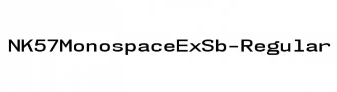
( Fonts by Typodermic Fonts )
A clean, structured monospaced font with consistent stroke thickness and clear character definition.
![NK57MonospaceExSb-Regular font caratteri gratis]() Scaricare 388 Downloads@WebFont
Scaricare 388 Downloads@WebFont -
![Discombobulated font caratteri gratis]() Scaricare 388 Downloads@WebFont
Scaricare 388 Downloads@WebFont -
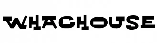
Caratteri di NicholasJudy456. For commercial use please contact the owner.
![Whachouse font caratteri gratis]() Scaricare 388 Downloads@WebFont
Scaricare 388 Downloads@WebFont -
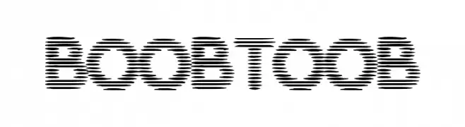
( Fonts by Daniel Gauthier )
A futuristic, segmented font with a digital glitch effect.
![BoobToob font caratteri gratis]() Scaricare 388 Downloads@WebFont
Scaricare 388 Downloads@WebFont -
( new.myfonts.com/foundry/Intellecta_Design/?refby=paulow )
An ornate, baroque-style decorative font with intricate frames around bold serif letters.
![Barocque Capitals font caratteri gratis]() Scaricare 388 Downloads@WebFont
Scaricare 388 Downloads@WebFont -
![Fh_Perception font caratteri gratis]() Scaricare 388 Downloads@WebFont
Scaricare 388 Downloads@WebFont -
![SF Digital Readout Medium Oblique font caratteri gratis]() Scaricare 388 Downloads@WebFont
Scaricare 388 Downloads@WebFont -
![handwriting-draft-shaded demo font caratteri gratis]() Scaricare 388 Downloads@WebFont
Scaricare 388 Downloads@WebFont -
![Ugly Rumor font caratteri gratis]() Scaricare 388 Downloads
Scaricare 388 Downloads -
![bad bold college Regular font caratteri gratis]() Scaricare 388 Downloads@WebFont
Scaricare 388 Downloads@WebFont -
![Janmeja2000H font caratteri gratis]() Scaricare 388 Downloads@WebFont
Scaricare 388 Downloads@WebFont -
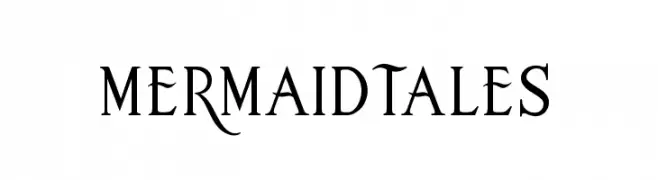
( Fonts by JoannaVu - https://ioannaladopoulou.design - Personal-use only. For commercial use please contact owner. )
A classic serif font with elegant curves and distinctive character designs.
![mermaidtales font caratteri gratis]() Scaricare 388 Downloads@WebFont
Scaricare 388 Downloads@WebFont -
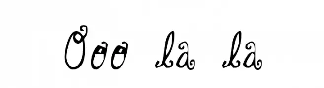
![Ooo la la font caratteri gratis]() Scaricare 388 Downloads@WebFont
Scaricare 388 Downloads@WebFont -
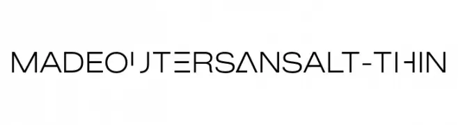
( Fonts by MadeType - Personal-use only. For commercial use please contact owner. )
A modern, thin, geometric sans-serif font with clean lines and even spacing.
![MADEOuterSansAlt-Thin font caratteri gratis]() Scaricare 388 Downloads@WebFont
Scaricare 388 Downloads@WebFont -
( Fonts by Nick Curtis - www.nicksfonts.com )
A bold, geometric font with angular, block-like characters.
![Indochine NF font caratteri gratis]() Scaricare 388 Downloads@WebFont
Scaricare 388 Downloads@WebFont -
( Fonts by Mikko Sumulong )
A bold, brush-style font with an energetic and artistic flair.
![MixBrush font caratteri gratis]() Scaricare 388 Downloads@WebFont
Scaricare 388 Downloads@WebFont -
![120000volt Kana font caratteri gratis]() Scaricare 388 Downloads@WebFont
Scaricare 388 Downloads@WebFont -
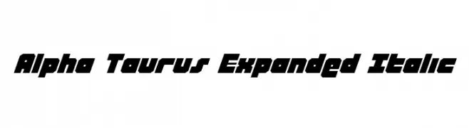
( Fonts by Daniel Zadorozny - www.iconian.com - Free for personal use )
A bold, expanded italic font with a modern, geometric style.
![Alpha Taurus Expanded Italic font caratteri gratis]() Scaricare 388 Downloads@WebFont
Scaricare 388 Downloads@WebFont -
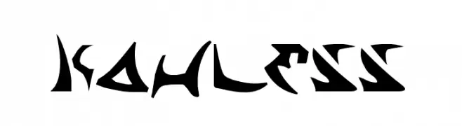
( Fonts by Daniel Zadorozny - www.iconian.com )
A bold, angular font with a futuristic and aggressive style.
![Kahless font caratteri gratis]() Scaricare 388 Downloads@WebFont
Scaricare 388 Downloads@WebFont -
( Fonts by Pablo Impallari, Andres Torresi, & Cristiano Sobral - Personal-use only. For commercial use please contact owner. )
A bold, italicized sans-serif font with a modern and dynamic style.
![Plata Sans Bold Italic font caratteri gratis]() Scaricare 388 Downloads@WebFont
Scaricare 388 Downloads@WebFont


![Pabellona [A] Símplex font caratteri gratis](https://d144mzi0q5mijx.cloudfront.net/img/P/A/Pabellona-A-Smplex.webp)


Quali sono i font più popolari adesso?
Poppins, Roboto, Montserrat, Open Sans e Lato sono molto usati per le forme pulite e l'ampia applicabilità — dall'identità di marca alle landing page e ai poster.
Quali font si usano spesso nei loghi?
Le sans serif geometriche (es. Poppins, famiglie in stile Gotham) sono scelte comuni per un branding pulito e scalabile. Per un tocco personale restano valide script e stili manoscritti. Abbina un display deciso per i titoli a un corpo testo neutro per riconoscibilità ed equilibrio.
Ogni quanto si aggiorna la lista?
Con regolarità, in base ai download e all'attività reale. Torna spesso per scoprire in anticipo le nuove preferite.
💡 Consiglio: aggiungi ai preferiti — le tendenze cambiano in fretta e i font top di oggi possono ispirare il rebranding di domani.