Benvenuto nelle Font Più Popolari — dove popolarità e qualità si incontrano. Qui trovi i font più scaricati e usati dell'anno. Se cerchi scelte sicure per logo, web o social, inizia da qui.
Ogni font top si distingue per equilibrio, leggibilità e versatilità. Troverai sans serif moderne, script eleganti, serif vintage e display minimalisti.
-
( Fonts by Niskala Huruf - Personal-use only. For commercial use please contact owner. )
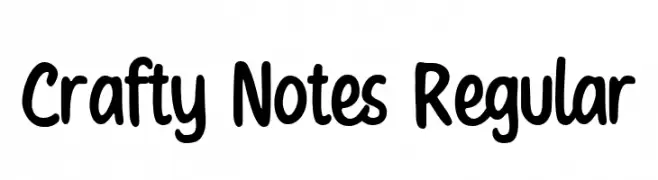
A playful, hand-drawn font with bold, rounded characters.
 Scaricare 60 Downloads@WebFont
 -
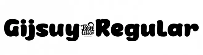
( Fonts by twinletter )
A bold, playful font with rounded edges and a cohesive design.
![Gijsuy-Regular font caratteri gratis]() Scaricare 60 Downloads@WebFont
Scaricare 60 Downloads@WebFont -
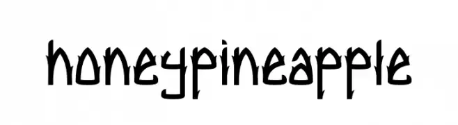
( Fonts by Febrian Nugroho )
A bold, angular font with a geometric and edgy style.
![honey pineapple font caratteri gratis]() Scaricare 60 Downloads@WebFont
Scaricare 60 Downloads@WebFont -
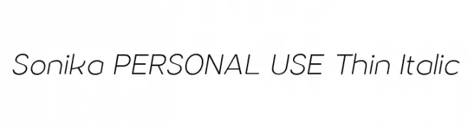
( Måns Grebäck - www.mansgreback.com )
A sleek, modern thin italic font with elegant, elongated letterforms.
![Sonika PERSONAL USE Thin Italic font caratteri gratis]() Scaricare 60 Downloads@WebFont
Scaricare 60 Downloads@WebFont -
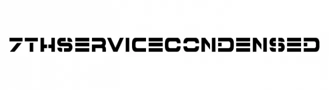
( Fonts by Iconian Fonts - Daniel Zadorozny - Personal-use only. For commercial use please contact owner. )
A bold, geometric, and futuristic font with a condensed style.
![7th Service Condensed font caratteri gratis]() Scaricare 60 Downloads@WebFont
Scaricare 60 Downloads@WebFont -
-
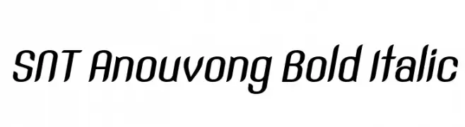
( Sengkeo Vangxiengvue - www.facebook.com/vangxiengvue )
A bold, italicized font with smooth curves and a modern, condensed style.
![SNT Anouvong Bold Italic font caratteri gratis]() Scaricare 60 Downloads@WebFont
Scaricare 60 Downloads@WebFont -
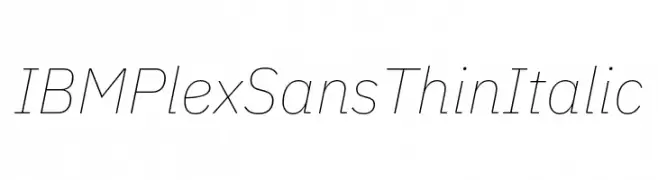
( Fonts by IBM )
A thin, italicized sans-serif font with a modern and elegant style.
![IBM Plex Sans Thin Italic font caratteri gratis]() Scaricare 60 Downloads@WebFont
Scaricare 60 Downloads@WebFont -
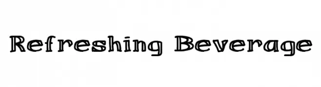
( Font Monkey - www.fontmonkey.com )
A playful, hand-drawn font with bold, rounded characters.
![Refreshing Beverage font caratteri gratis]() Scaricare 60 Downloads@WebFont
Scaricare 60 Downloads@WebFont -
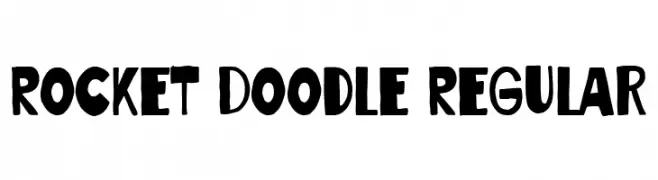
( Fonts by Blankids )
Playful, hand-drawn, bold font.
![Rocket Doodle Regular font caratteri gratis]() Scaricare 60 Downloads@WebFont
Scaricare 60 Downloads@WebFont -
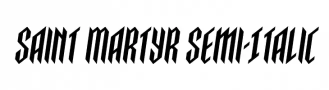
( Fonts by Daniel Zadorozny - www.iconian.com - Personal-use only. For commercial use please contact owner. )
A bold, slanted font with sharp angles and thick strokes for a dynamic look.
![Saint Martyr Semi-Italic font caratteri gratis]() Scaricare 60 Downloads@WebFont
Scaricare 60 Downloads@WebFont
Quali sono i font più popolari adesso?
Poppins, Roboto, Montserrat, Open Sans e Lato sono molto usati per le forme pulite e l'ampia applicabilità — dall'identità di marca alle landing page e ai poster.
Quali font si usano spesso nei loghi?
Le sans serif geometriche (es. Poppins, famiglie in stile Gotham) sono scelte comuni per un branding pulito e scalabile. Per un tocco personale restano valide script e stili manoscritti. Abbina un display deciso per i titoli a un corpo testo neutro per riconoscibilità ed equilibrio.
Ogni quanto si aggiorna la lista?
Con regolarità, in base ai download e all'attività reale. Torna spesso per scoprire in anticipo le nuove preferite.
💡 Consiglio: aggiungi ai preferiti — le tendenze cambiano in fretta e i font top di oggi possono ispirare il rebranding di domani.