Benvenuto nelle Font Più Popolari — dove popolarità e qualità si incontrano. Qui trovi i font più scaricati e usati dell'anno. Se cerchi scelte sicure per logo, web o social, inizia da qui.
Ogni font top si distingue per equilibrio, leggibilità e versatilità. Troverai sans serif moderne, script eleganti, serif vintage e display minimalisti.
-
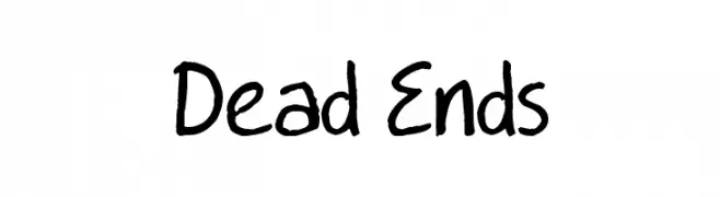
( www.deadendscomic.net )
A playful, casual handwritten font with uneven strokes and a natural flow.
 Scaricare 379 Downloads@WebFont
 -
( Fonts by Nick Curtis - www.nicksfonts.com )
A bold, playful serif font with exaggerated serifs and a strong presence.
![OurGang font caratteri gratis]() Scaricare 379 Downloads
Scaricare 379 Downloads -
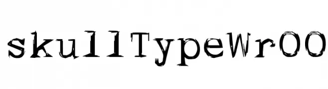
![skullTypeWr00 font caratteri gratis]() Scaricare 379 Downloads@WebFont
Scaricare 379 Downloads@WebFont -
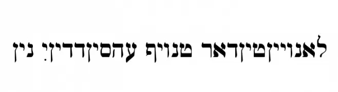
![Ain Yiddishe Font Traditional font caratteri gratis]() Scaricare 379 Downloads
Scaricare 379 Downloads -
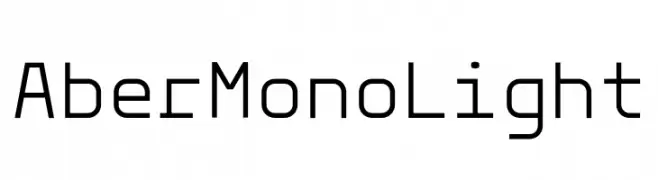
( Fonts by Tom Robin Karlsson - tomrobin.co - Personal-use only. For commercial use please contact owner. )
A clean, geometric monospaced font with a modern aesthetic.
![Aber Mono Light font caratteri gratis]() Scaricare 379 Downloads@WebFont
Scaricare 379 Downloads@WebFont -
( ingoFonts - Ingo Zimmermann - www.ingofonts.com )
A clean, modern sans-serif font with consistent stroke width and elegant curvature.
![AugustSansReduced-Regular font caratteri gratis]() Scaricare 379 Downloads@WebFont
Scaricare 379 Downloads@WebFont -
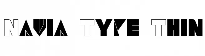
![Navia Type Thin font caratteri gratis]() Scaricare 379 Downloads@WebFont
Scaricare 379 Downloads@WebFont -
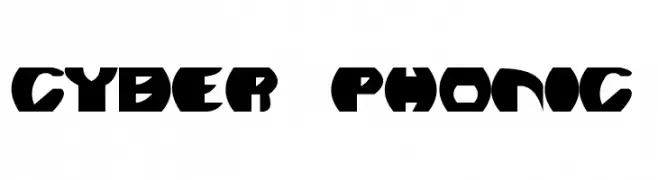
![Cyber Phonic font caratteri gratis]() Scaricare 379 Downloads@WebFont
Scaricare 379 Downloads@WebFont -
![Baklava font caratteri gratis]() Scaricare 379 Downloads@WebFont
Scaricare 379 Downloads@WebFont -
( Fonts by Bangkit Tri Setiadi )
A bold, rounded, and playful font with a graffiti-like style.
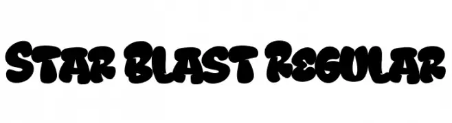
![Star Blast Regular font caratteri gratis]() Scaricare 379 Downloads@WebFont
Scaricare 379 Downloads@WebFont -
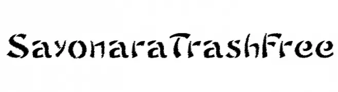
![SayonaraTrashFree font caratteri gratis]() Scaricare 379 Downloads@WebFont
Scaricare 379 Downloads@WebFont -
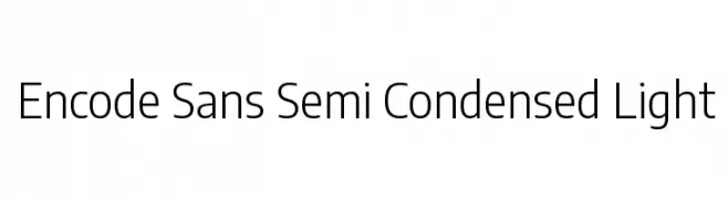
( Copyright 2012 The Encode Project Authors (impallari@gmail.com), with Reserved Font Name "Encode Sansâ€. )
A modern, semi-condensed sans-serif font with a light weight and excellent legibility.
![Encode Sans Semi Condensed Light font caratteri gratis]() Scaricare 379 Downloads@WebFont
Scaricare 379 Downloads@WebFont -
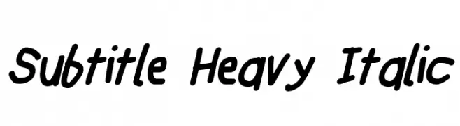
![Subtitle Heavy Italic font caratteri gratis]() Scaricare 379 Downloads@WebFont
Scaricare 379 Downloads@WebFont -
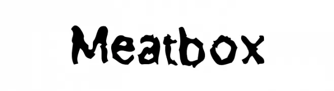
![Meatbox font caratteri gratis]() Scaricare 379 Downloads@WebFont
Scaricare 379 Downloads@WebFont -
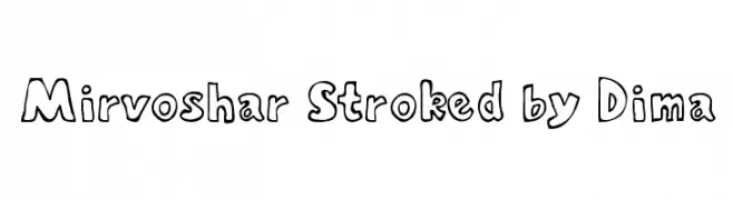
![Mirvoshar Stroked by Dima font caratteri gratis]() Scaricare 379 Downloads@WebFont
Scaricare 379 Downloads@WebFont -
( Fonts by www.feorag.com )
A classic serif font with elegant flared strokes and a modern appeal.
![StrangeNewes Medium font caratteri gratis]() Scaricare 379 Downloads@WebFont
Scaricare 379 Downloads@WebFont -
( Fonts by HungLan Design - www.hunglandesign.com )
A bold, expressive handwritten font with a graffiti-like style.
![HL Freewrite font caratteri gratis]() Scaricare 379 Downloads@WebFont
Scaricare 379 Downloads@WebFont -
![carolynsprint font caratteri gratis]() Scaricare 379 Downloads@WebFont
Scaricare 379 Downloads@WebFont -
( Måns Grebäck - www.mansgreback.com )
A bold, modern font with strong geometric shapes and uniform strokes.
![Duera PERSONAL USE Normal Medium font caratteri gratis]() Scaricare 379 Downloads@WebFont
Scaricare 379 Downloads@WebFont -
( NimaVisual - Nima Visual - nimavisual.tumblr.com/ )
A modern, geometric font with clean lines and a balanced structure.
![Quango font caratteri gratis]() Scaricare 379 Downloads@WebFont
Scaricare 379 Downloads@WebFont -
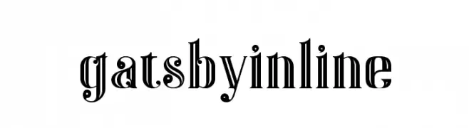
( Fonts by Peter Olexa - www.dealjumbo.com - Personal-use only. For commercial use please contact owner. )
A bold, decorative font with vintage Art Deco influences and inline detailing.
![Gatsby Inline font caratteri gratis]() Scaricare 379 Downloads@WebFont
Scaricare 379 Downloads@WebFont -
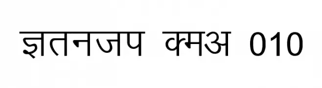
Caratteri di abhishek7. For commercial use please contact the owner.
![Kruti Dev 010 font caratteri gratis]() Scaricare 379 Downloads@WebFont
Scaricare 379 Downloads@WebFont -
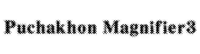
( - www.puchakhon.com )
A bold, dotted font with a unique and textured appearance.
![Puchakhon Magnifier3 font caratteri gratis]() Scaricare 379 Downloads@WebFont
Scaricare 379 Downloads@WebFont -
( Fonts by a cenz qobbal - www.facebook.com/cenzqobbalfonts. Personal-use only. For commercial use please contact owner. )
A decorative font featuring intricate batik patterns within each character.
![Batik Indo font caratteri gratis]() Scaricare 379 Downloads@WebFont
Scaricare 379 Downloads@WebFont -
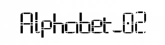
![Alphabet_02 font caratteri gratis]() Scaricare 379 Downloads@WebFont
Scaricare 379 Downloads@WebFont -
( Google Web Fonts )
A bold, modern sans-serif font with clean lines and Thai script support.
![Droid Sans Thai Bold font caratteri gratis]() Scaricare 379 Downloads@WebFont
Scaricare 379 Downloads@WebFont -
( Fonts by Blue Vinyl - Jess Latham - www.bvfonts.com )
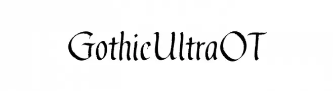
A bold Gothic-style font with sharp, angular strokes and medieval influences.
![GothicUltraOT font caratteri gratis]() Scaricare 379 Downloads@WebFont
Scaricare 379 Downloads@WebFont -
( Fonts by David Espinosa [Type Sailor] - www.facebook.com/typesailor - Personal-use only. For commercial use please contact owner. )
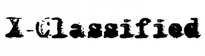
A bold, distressed font with a grunge, textured style.
![X-Classified font caratteri gratis]() Scaricare 379 Downloads@WebFont
Scaricare 379 Downloads@WebFont -
( Fonts by Andi Moz )
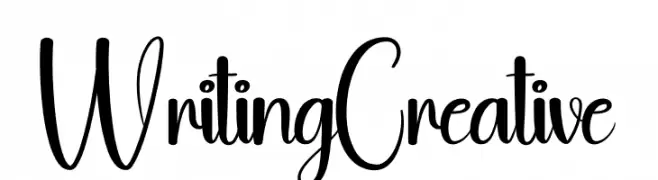
A playful, handwritten-style font with dynamic uppercase and bold lowercase letters.
![Writing Creative font caratteri gratis]() Scaricare 379 Downloads@WebFont
Scaricare 379 Downloads@WebFont -
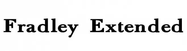
( Roger White - web.archive.org/web/20120416090521/www.rogersfonts.org.uk/ )
A classic serif font with bold, elegant serifs and a modern touch.
![Fradley Extended font caratteri gratis]() Scaricare 379 Downloads@WebFont
Scaricare 379 Downloads@WebFont -
( Fonts by Daniel Zadorozny - www.iconian.com - Free for personal use )
A bold, playful font with thick, rounded strokes and a hand-drawn appearance.
![Miss Amanda Jones font caratteri gratis]() Scaricare 379 Downloads@WebFont
Scaricare 379 Downloads@WebFont -
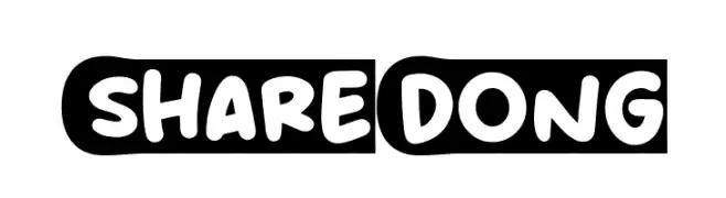
( Fonts by Khurasan )
A playful, bold font with rounded, bubble-like characters.
![Share Dong font caratteri gratis]() Scaricare 379 Downloads@WebFont
Scaricare 379 Downloads@WebFont -
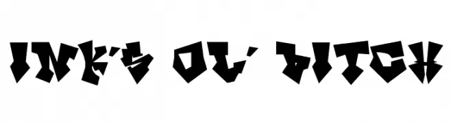
( Fonts by Rob Dobi - Toxic Type - www.dobi.nu )
A bold, angular font with a geometric, edgy style reminiscent of graffiti.
![InK's ol' Bitch font caratteri gratis]() Scaricare 379 Downloads@WebFont
Scaricare 379 Downloads@WebFont -
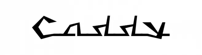
( Fonts by Levi Halmos )
A bold, angular font with a futuristic and edgy design.
![Caddy font caratteri gratis]() Scaricare 379 Downloads@WebFont
Scaricare 379 Downloads@WebFont -
( Fonts by Apostrophic Lab )
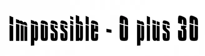
A bold, condensed font with high contrast and a modern, dynamic style.
![Impossible - 0 plus 30 font caratteri gratis]() Scaricare 379 Downloads@WebFont
Scaricare 379 Downloads@WebFont


Quali sono i font più popolari adesso?
Poppins, Roboto, Montserrat, Open Sans e Lato sono molto usati per le forme pulite e l'ampia applicabilità — dall'identità di marca alle landing page e ai poster.
Quali font si usano spesso nei loghi?
Le sans serif geometriche (es. Poppins, famiglie in stile Gotham) sono scelte comuni per un branding pulito e scalabile. Per un tocco personale restano valide script e stili manoscritti. Abbina un display deciso per i titoli a un corpo testo neutro per riconoscibilità ed equilibrio.
Ogni quanto si aggiorna la lista?
Con regolarità, in base ai download e all'attività reale. Torna spesso per scoprire in anticipo le nuove preferite.
💡 Consiglio: aggiungi ai preferiti — le tendenze cambiano in fretta e i font top di oggi possono ispirare il rebranding di domani.