Benvenuto nelle Font Più Popolari — dove popolarità e qualità si incontrano. Qui trovi i font più scaricati e usati dell'anno. Se cerchi scelte sicure per logo, web o social, inizia da qui.
Ogni font top si distingue per equilibrio, leggibilità e versatilità. Troverai sans serif moderne, script eleganti, serif vintage e display minimalisti.
-
( Zetafonts - www.zetafonts.com )
A bold, rounded, and italicized font with a playful and friendly style.
 Scaricare 55 Downloads@WebFont
 -
( Fonts by Letterena Studios )
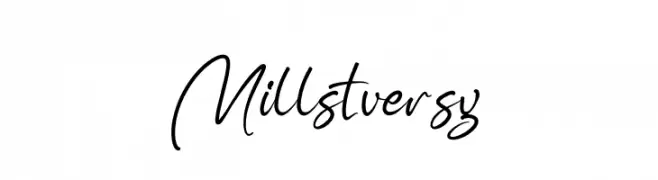
A flowing, elegant cursive font with graceful curves and artistic flair.
![Millstversy font caratteri gratis]() Scaricare 55 Downloads@WebFont
Scaricare 55 Downloads@WebFont -
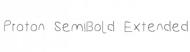
![Proton SemiBold Extended font caratteri gratis]() Scaricare 55 Downloads@WebFont
Scaricare 55 Downloads@WebFont -
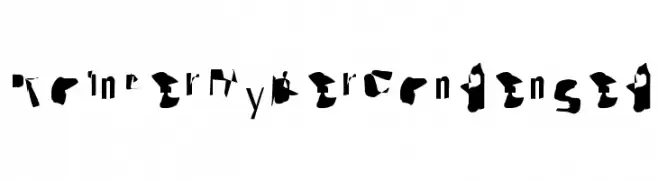
![Pointer HyperCondensed font caratteri gratis]() Scaricare 55 Downloads@WebFont
Scaricare 55 Downloads@WebFont -
( Me )
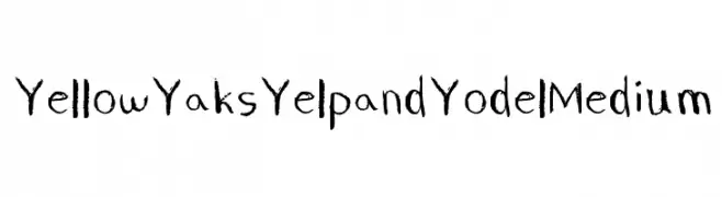
A playful, hand-drawn font with uneven strokes and a whimsical style.
![Yellow Yaks Yelp and Yodel Medium font caratteri gratis]() Scaricare 55 Downloads@WebFont
Scaricare 55 Downloads@WebFont -
-
( Fonts by www.junkohanhero.com - Personal-use only. For commercial use please contact owner. )
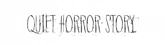
A haunting, distressed font with tall, narrow letterforms and a scratchy texture.
![Quiet Horror Story font caratteri gratis]() Scaricare 55 Downloads@WebFont
Scaricare 55 Downloads@WebFont -
( Fonts by Rémi Godefroid - Personal-use only. For commercial use please contact owner. )
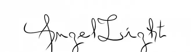
An elegant, flowing script font with smooth, continuous strokes.
![Angel Light font caratteri gratis]() Scaricare 55 Downloads@WebFont
Scaricare 55 Downloads@WebFont -
( Fonts by Out of Step Font Company - Dan Steinbok - outofstepfontco.com - Personal-use only. For commercial use please contact owner. )
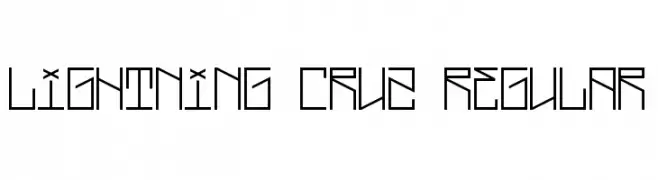
A geometric, angular font with a futuristic and modern design.
![Lightning Cruz Regular font caratteri gratis]() Scaricare 55 Downloads@WebFont
Scaricare 55 Downloads@WebFont -
( Fonts by Wino S Kadir - weknow - www.revolge.com/shop/weknow/ - Personal-use only. For commercial use please contact owner. )
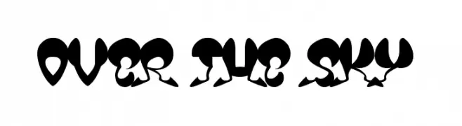
A bold, whimsical font with high contrast and playful, artistic elements.
![OVER THE SKY font caratteri gratis]() Scaricare 55 Downloads@WebFont
Scaricare 55 Downloads@WebFont -
( Floodfonts - www.floodfonts.com )
A bold, gothic-style font with sharp angles and thick strokes, ideal for dramatic headlines.
![Multikultur ExtraBold font caratteri gratis]() Scaricare 55 Downloads@WebFont
Scaricare 55 Downloads@WebFont

Quali sono i font più popolari adesso?
Poppins, Roboto, Montserrat, Open Sans e Lato sono molto usati per le forme pulite e l'ampia applicabilità — dall'identità di marca alle landing page e ai poster.
Quali font si usano spesso nei loghi?
Le sans serif geometriche (es. Poppins, famiglie in stile Gotham) sono scelte comuni per un branding pulito e scalabile. Per un tocco personale restano valide script e stili manoscritti. Abbina un display deciso per i titoli a un corpo testo neutro per riconoscibilità ed equilibrio.
Ogni quanto si aggiorna la lista?
Con regolarità, in base ai download e all'attività reale. Torna spesso per scoprire in anticipo le nuove preferite.
💡 Consiglio: aggiungi ai preferiti — le tendenze cambiano in fretta e i font top di oggi possono ispirare il rebranding di domani.