Benvenuto nelle Font Più Popolari — dove popolarità e qualità si incontrano. Qui trovi i font più scaricati e usati dell'anno. Se cerchi scelte sicure per logo, web o social, inizia da qui.
Ogni font top si distingue per equilibrio, leggibilità e versatilità. Troverai sans serif moderne, script eleganti, serif vintage e display minimalisti.
-
( Projeto Tipo da Fonte - Eduardo Novais - tipodafonte.wordpress.com )
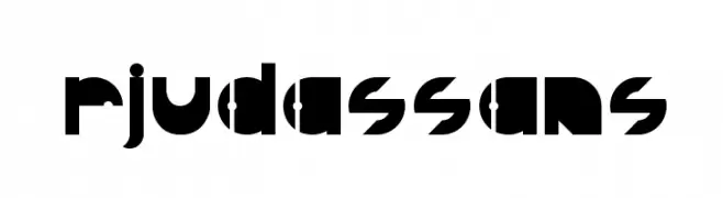
A bold, geometric font with modern cut-out elements and a futuristic style.
 Scaricare 54 Downloads@WebFont
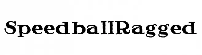
 -
![Speedball Ragged font caratteri gratis]() Scaricare 54 Downloads@WebFont
Scaricare 54 Downloads@WebFont -
( Fonts by Geranium Space - Megi Satyo Widodo - Personal-use only. For commercial use please contact owner. )
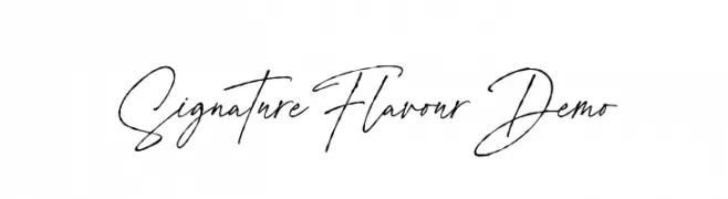
A sophisticated, elegant handwritten font with fluid, cursive letterforms.
![Signature Flavour Demo font caratteri gratis]() Scaricare 54 Downloads@WebFont
Scaricare 54 Downloads@WebFont -
( Fonts by Letternun - Saeful Bahri - Personal-use only. For commercial use please contact owner. )
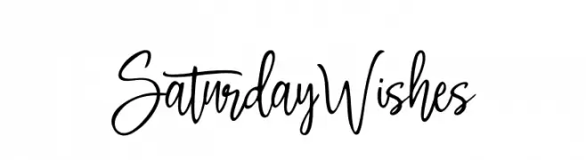
A playful, handwritten font with flowing, connected letterforms and expressive style.
![Saturday Wishes font caratteri gratis]() Scaricare 54 Downloads@WebFont
Scaricare 54 Downloads@WebFont -
( softhunterdevil - Saptarshi Bagchi )
A futuristic, angular font with a sleek, slanted design.
![roboscript Regular font caratteri gratis]() Scaricare 54 Downloads@WebFont
Scaricare 54 Downloads@WebFont -
-
( Fonts by James Moulton - Personal-use only. For commercial use please contact owner. )
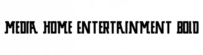
A bold, geometric font with strong, uniform strokes and a modern style.
![Media Home Entertainment Bold font caratteri gratis]() Scaricare 54 Downloads@WebFont
Scaricare 54 Downloads@WebFont -
( Fonts by benoitsjoholm.blogspot.com - Benoit Sjoholm - Personal-use only. For commercial use please contact owner. )
A bold, rounded, and modern font with a playful and approachable style.
![Kabys font caratteri gratis]() Scaricare 54 Downloads@WebFont
Scaricare 54 Downloads@WebFont -
( Fonts by erlosDESIGN - Erlangga Suherman - Personal-use only. For commercial use please contact owner. )
An elegant, flowing script font with ornate, cursive letterforms.
![Tamora font caratteri gratis]() Scaricare 54 Downloads@WebFont
Scaricare 54 Downloads@WebFont -
( JLH Fonts - jlhfonts.blogspot.com/ )
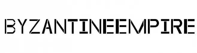
A modern, geometric stencil font with bold, clean lines and sharp angles.
![ByzantineEmpire font caratteri gratis]() Scaricare 54 Downloads@WebFont
Scaricare 54 Downloads@WebFont -
( Fonts by LogoBee )
A bold, geometric font with a modern, industrial aesthetic.
![Doxiva font caratteri gratis]() Scaricare 54 Downloads@WebFont
Scaricare 54 Downloads@WebFont


Quali sono i font più popolari adesso?
Poppins, Roboto, Montserrat, Open Sans e Lato sono molto usati per le forme pulite e l'ampia applicabilità — dall'identità di marca alle landing page e ai poster.
Quali font si usano spesso nei loghi?
Le sans serif geometriche (es. Poppins, famiglie in stile Gotham) sono scelte comuni per un branding pulito e scalabile. Per un tocco personale restano valide script e stili manoscritti. Abbina un display deciso per i titoli a un corpo testo neutro per riconoscibilità ed equilibrio.
Ogni quanto si aggiorna la lista?
Con regolarità, in base ai download e all'attività reale. Torna spesso per scoprire in anticipo le nuove preferite.
💡 Consiglio: aggiungi ai preferiti — le tendenze cambiano in fretta e i font top di oggi possono ispirare il rebranding di domani.