Benvenuto nelle Font Più Popolari — dove popolarità e qualità si incontrano. Qui trovi i font più scaricati e usati dell'anno. Se cerchi scelte sicure per logo, web o social, inizia da qui.
Ogni font top si distingue per equilibrio, leggibilità e versatilità. Troverai sans serif moderne, script eleganti, serif vintage e display minimalisti.
-
( Noto is a trademark of Google Inc. Noto fonts are open source. All Noto fonts are published under the SIL Open Font License, Version 1.1 )
Not a valid font sample for analysis.
 Scaricare 54 Downloads@WebFont
 -
( Fonts by Allouse Studio - Personal-use only. For commercial use please contact owner. )
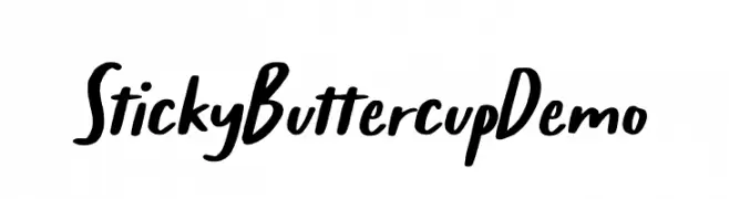
A playful, bold handwritten font with smooth, fluid strokes.
![Sticky Buttercup Demo font caratteri gratis]() Scaricare 54 Downloads@WebFont
Scaricare 54 Downloads@WebFont -
( Fonts by Mans Greback - Personal-use only. For commercial use please contact owner. )
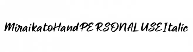
A bold, italicized handwritten font with a dynamic and artistic style.
![Miraikato Hand PERSONAL USE Italic font caratteri gratis]() Scaricare 54 Downloads@WebFont
Scaricare 54 Downloads@WebFont -
( Fonts by Omaikraf Studio - Omaikraf - Personal-use only. For commercial use please contact owner. )
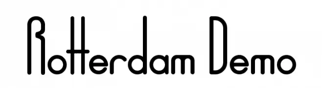
A modern, geometric font with tall, narrow uppercase letters and balanced lowercase characters.
![Rotterdam Demo font caratteri gratis]() Scaricare 54 Downloads@WebFont
Scaricare 54 Downloads@WebFont -
( Sudar Moko )
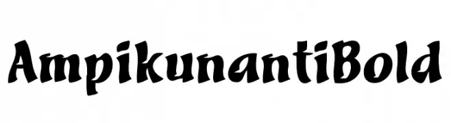
A bold, brush-like decorative font with dynamic and energetic characters.
![Ampikunanti Bold font caratteri gratis]() Scaricare 54 Downloads@WebFont
Scaricare 54 Downloads@WebFont -
-
( Levi Szekeres - www.loremipsum.ro )
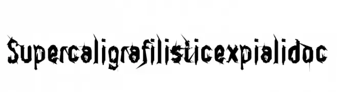
A bold, jagged font with sharp, angular edges and high contrast.
![Supercaligrafilisticexpialidoc font caratteri gratis]() Scaricare 54 Downloads@WebFont
Scaricare 54 Downloads@WebFont -
( imagex - www.imagex-fonts.com )
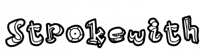
A bold, playful font with a 3D effect and hand-drawn style.
![Strokewith font caratteri gratis]() Scaricare 54 Downloads@WebFont
Scaricare 54 Downloads@WebFont -
( Fonts by Letterhend Studio )
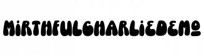
A playful, bold font with rounded, bubbly characters and a vintage feel.
![MirthfulCharlieDemo font caratteri gratis]() Scaricare 54 Downloads@WebFont
Scaricare 54 Downloads@WebFont -
( Fonts by Rune Bjørnerås )
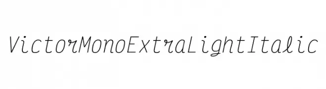
A modern, monospaced, extra light italic font with elegant curves.
![Victor Mono ExtraLight Italic font caratteri gratis]() Scaricare 54 Downloads@WebFont
Scaricare 54 Downloads@WebFont -
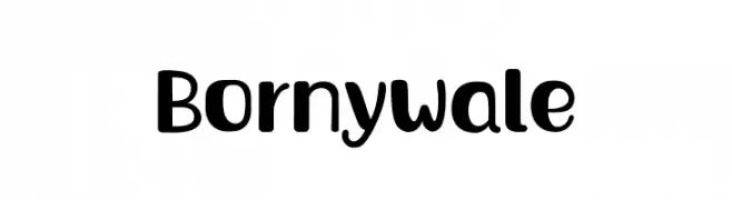
( Fonts by Adevio Studio - Personal-use only. For commercial use please contact owner. )
A playful, bold font with rounded edges and a modern, approachable style.
![Bornywale font caratteri gratis]() Scaricare 54 Downloads@WebFont
Scaricare 54 Downloads@WebFont
Quali sono i font più popolari adesso?
Poppins, Roboto, Montserrat, Open Sans e Lato sono molto usati per le forme pulite e l'ampia applicabilità — dall'identità di marca alle landing page e ai poster.
Quali font si usano spesso nei loghi?
Le sans serif geometriche (es. Poppins, famiglie in stile Gotham) sono scelte comuni per un branding pulito e scalabile. Per un tocco personale restano valide script e stili manoscritti. Abbina un display deciso per i titoli a un corpo testo neutro per riconoscibilità ed equilibrio.
Ogni quanto si aggiorna la lista?
Con regolarità, in base ai download e all'attività reale. Torna spesso per scoprire in anticipo le nuove preferite.
💡 Consiglio: aggiungi ai preferiti — le tendenze cambiano in fretta e i font top di oggi possono ispirare il rebranding di domani.