Benvenuto nelle Font Più Popolari — dove popolarità e qualità si incontrano. Qui trovi i font più scaricati e usati dell'anno. Se cerchi scelte sicure per logo, web o social, inizia da qui.
Ogni font top si distingue per equilibrio, leggibilità e versatilità. Troverai sans serif moderne, script eleganti, serif vintage e display minimalisti.
-
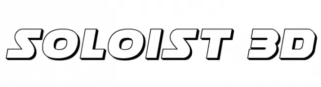
( Iconian Fonts - Daniel Zadorozny - www.iconian.com )
A bold, three-dimensional font with a modern, dynamic style.
 Scaricare 368 Downloads@WebFont
 -
( Fonts by Bluestype Studio )
A playful, bold, handwritten font with a whimsical and inviting style.
![Happy Memories font caratteri gratis]() Scaricare 368 Downloads@WebFont
Scaricare 368 Downloads@WebFont -
Caratteri di TGIFStudio. For commercial use please contact the owner.
( Thank you for downloading this font This font is free for PERSONAL USE ONLY! Commercial license for this font can be purchased at: http://bit.ly/2xYRdEB )
An elegant script font with flowing, interconnected characters and a sophisticated style.
![Camille Script font caratteri gratis]() Scaricare 368 Downloads@WebFont
Scaricare 368 Downloads@WebFont -
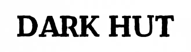
( Fonts by Khurasan )
A bold, rugged font with a handcrafted, vintage appearance.
![Dark Hut font caratteri gratis]() Scaricare 368 Downloads@WebFont
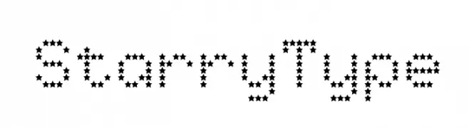
Scaricare 368 Downloads@WebFont -
![StarryType font caratteri gratis]() Scaricare 368 Downloads@WebFont
Scaricare 368 Downloads@WebFont -
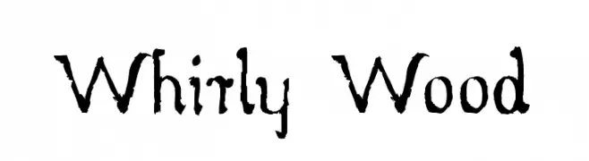
( myhandwritings.com )
A rustic, distressed font with a handcrafted, vintage feel.
![Whirly Wood font caratteri gratis]() Scaricare 368 Downloads@WebFont
Scaricare 368 Downloads@WebFont -
( Free - https://www.behance.net/string4 )
A classic serif font with elegant strokes and balanced readability.
![Kraskario font caratteri gratis]() Scaricare 368 Downloads@WebFont
Scaricare 368 Downloads@WebFont -
( Fonts by Manfred Klein. Free for private and charity use. Free for commercial with donation to organizations )
Book and reading-themed decorative dingbat font.
![Books font caratteri gratis]() Scaricare 368 Downloads@WebFont
Scaricare 368 Downloads@WebFont -
![Backyard Camping font caratteri gratis]() Scaricare 368 Downloads@WebFont
Scaricare 368 Downloads@WebFont -
( Fonts by Wahyu Eka Prasetya - wepfont.com - Personal-use only. For commercial use please contact owner. )
A bold, expressive brush-style font with dynamic strokes.
![Eh Iyo font caratteri gratis]() Scaricare 368 Downloads@WebFont
Scaricare 368 Downloads@WebFont -
( Fonts by Basni.std )
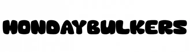
A bold, rounded, and playful font with smooth curves and thick strokes.
![MondayBulkers font caratteri gratis]() Scaricare 368 Downloads@WebFont
Scaricare 368 Downloads@WebFont -
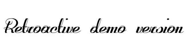
![Retroactive_demo-version font caratteri gratis]() Scaricare 368 Downloads@WebFont
Scaricare 368 Downloads@WebFont -
![Temple Regular font caratteri gratis]() Scaricare 368 Downloads@WebFont
Scaricare 368 Downloads@WebFont -
( Fonts by Twicolabs Fontdation - Fahrizal Tawakkal - Personal-use only. For commercial use please contact owner. )
A bold, high-contrast serif font with dramatic strokes and elegant curves.
![Baisteach font caratteri gratis]() Scaricare 368 Downloads@WebFont
Scaricare 368 Downloads@WebFont -
![Anne font caratteri gratis]() Scaricare 368 Downloads@WebFont
Scaricare 368 Downloads@WebFont -
( Fonts by Kreative Korporation - www.kreativekorp.com )
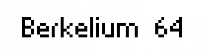
A pixelated, blocky font with a retro digital vibe.
![Berkelium 64 font caratteri gratis]() Scaricare 368 Downloads@WebFont
Scaricare 368 Downloads@WebFont -
( Fonts by Situjuh Nazara - 7ntypes.com - Personal-use only. For commercial use please contact owner. )
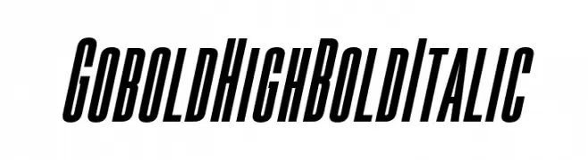
A bold, italicized font with a tall, narrow, and high-contrast design.
![Gobold High Bold Italic font caratteri gratis]() Scaricare 368 Downloads@WebFont
Scaricare 368 Downloads@WebFont -
( Fonts by ndiscovered - Personal-use only. For commercial use please contact owner. )
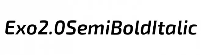
A modern, semi-bold italic font with medium contrast and a sleek, dynamic style.
![Exo 2.0 Semi Bold Italic font caratteri gratis]() Scaricare 368 Downloads@WebFont
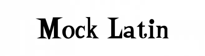
Scaricare 368 Downloads@WebFont -
![Mock Latin font caratteri gratis]() Scaricare 368 Downloads@WebFont
Scaricare 368 Downloads@WebFont -
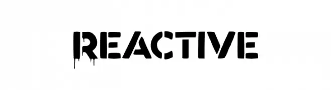
( Fonts by Hendra Pratama - HPTypework - https://hptypework.com - Personal-use only. For commercial use please contact owner. )
A bold, dripping font with a stencil-like design, ideal for edgy and horror-themed projects.
![Reactive font caratteri gratis]() Scaricare 368 Downloads@WebFont
Scaricare 368 Downloads@WebFont -
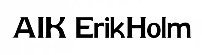
( www.k21.no )
A bold, modern font with clean lines and a strong presence.
![AIK-ErikHolm font caratteri gratis]() Scaricare 368 Downloads@WebFont
Scaricare 368 Downloads@WebFont -
( Free for Personal Use. To use commercially please visit the http://www.nymFont.com )
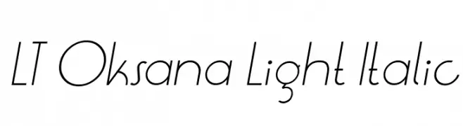
A sleek, light, and italicized font with a modern and elegant style.
![LT Oksana Light Italic font caratteri gratis]() Scaricare 368 Downloads@WebFont
Scaricare 368 Downloads@WebFont -
( Måns Grebäck - www.mansgreback.com )
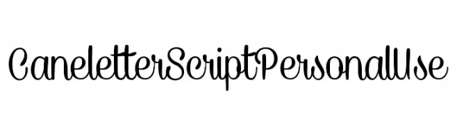
A playful and flowing script font with smooth, connected letters.
![CaneletterScriptPersonalUse font caratteri gratis]() Scaricare 368 Downloads@WebFont
Scaricare 368 Downloads@WebFont -
![FrailLight font caratteri gratis]() Scaricare 368 Downloads@WebFont
Scaricare 368 Downloads@WebFont -
( Fonts by Maulana Creative )
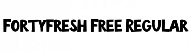
A bold, playful font with a hand-drawn, whimsical style.
![Fortyfresh Free Regular font caratteri gratis]() Scaricare 368 Downloads@WebFont
Scaricare 368 Downloads@WebFont -
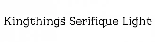
( Font by kingthingsfonts.co.uk )
A light, elegant serif font with classic curves and modern appeal.
![Kingthings Serifique Light font caratteri gratis]() Scaricare 368 Downloads@WebFont
Scaricare 368 Downloads@WebFont -
( Fonts by Alfareaniy )
A playful, grapevine-themed decorative font with bold, rounded characters.
![Grape font caratteri gratis]() Scaricare 368 Downloads@WebFont
Scaricare 368 Downloads@WebFont -
( Fonts by Iconian Fonts )
A bold, italic font with a modern, geometric style.
![Illumino Super-Italic font caratteri gratis]() Scaricare 368 Downloads@WebFont
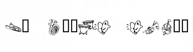
Scaricare 368 Downloads@WebFont -
![KR Music Class font caratteri gratis]() Scaricare 368 Downloads@WebFont
Scaricare 368 Downloads@WebFont -
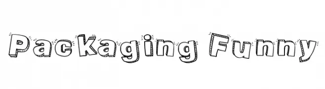
( Fonts by Galdino Otten )
A playful, hand-drawn font with bold, cartoon-like characters and decorative elements.
![Packaging Funny font caratteri gratis]() Scaricare 368 Downloads@WebFont
Scaricare 368 Downloads@WebFont -
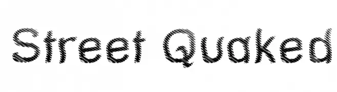
( Fonts by Graham Meade - GemFonts )
A bold, textured font with a dynamic, vibrating effect.
![Street Quaked font caratteri gratis]() Scaricare 368 Downloads@WebFont
Scaricare 368 Downloads@WebFont -
( Fonts by Brithos Type )
A playful, hand-drawn font with tall, narrow characters and a whimsical style.
![Rounstac font caratteri gratis]() Scaricare 368 Downloads@WebFont
Scaricare 368 Downloads@WebFont -
( Fonts by Dan P. Lyons - Personal-use only. For commercial use please contact owner. )
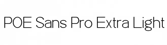
A modern, extra-light sans-serif font with a clean and minimalist design.
![POE Sans Pro Extra Light font caratteri gratis]() Scaricare 368 Downloads@WebFont
Scaricare 368 Downloads@WebFont -
( Fonts by Jecko Development - www.jeckodevelopment.com )
A playful, handwritten font with fluid strokes and a casual style.
![JDHands font caratteri gratis]() Scaricare 368 Downloads@WebFont
Scaricare 368 Downloads@WebFont -
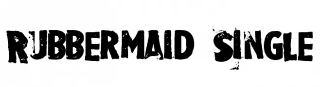
![Rubbermaid Single font caratteri gratis]() Scaricare 368 Downloads@WebFont
Scaricare 368 Downloads@WebFont


Quali sono i font più popolari adesso?
Poppins, Roboto, Montserrat, Open Sans e Lato sono molto usati per le forme pulite e l'ampia applicabilità — dall'identità di marca alle landing page e ai poster.
Quali font si usano spesso nei loghi?
Le sans serif geometriche (es. Poppins, famiglie in stile Gotham) sono scelte comuni per un branding pulito e scalabile. Per un tocco personale restano valide script e stili manoscritti. Abbina un display deciso per i titoli a un corpo testo neutro per riconoscibilità ed equilibrio.
Ogni quanto si aggiorna la lista?
Con regolarità, in base ai download e all'attività reale. Torna spesso per scoprire in anticipo le nuove preferite.
💡 Consiglio: aggiungi ai preferiti — le tendenze cambiano in fretta e i font top di oggi possono ispirare il rebranding di domani.