Benvenuto nelle Font Più Popolari — dove popolarità e qualità si incontrano. Qui trovi i font più scaricati e usati dell'anno. Se cerchi scelte sicure per logo, web o social, inizia da qui.
Ogni font top si distingue per equilibrio, leggibilità e versatilità. Troverai sans serif moderne, script eleganti, serif vintage e display minimalisti.
-
 Scaricare 366 Downloads@WebFont
 -
( Fonts by Typodermic Fonts )
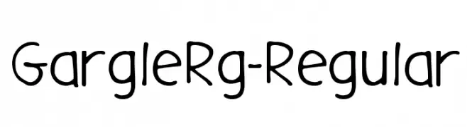
A playful, hand-drawn font with rounded edges and a friendly appearance.
![GargleRg-Regular font caratteri gratis]() Scaricare 366 Downloads@WebFont
Scaricare 366 Downloads@WebFont -
( Fonts by blambot.com- Personal-use only. For commercial use please contact owner. )
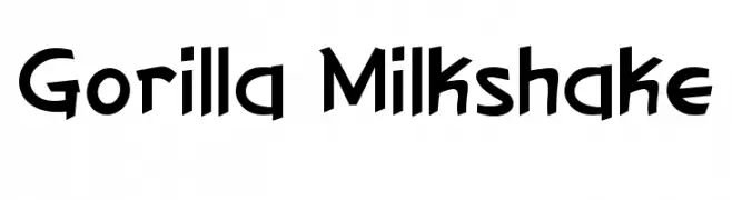
A playful, bold font with a hand-drawn, energetic style.
![Gorilla Milkshake font caratteri gratis]() Scaricare 366 Downloads@WebFont
Scaricare 366 Downloads@WebFont -
![SkinnyDrip font caratteri gratis]() Scaricare 366 Downloads@WebFont
Scaricare 366 Downloads@WebFont -
![justfist2 font caratteri gratis]() Scaricare 366 Downloads@WebFont
Scaricare 366 Downloads@WebFont -
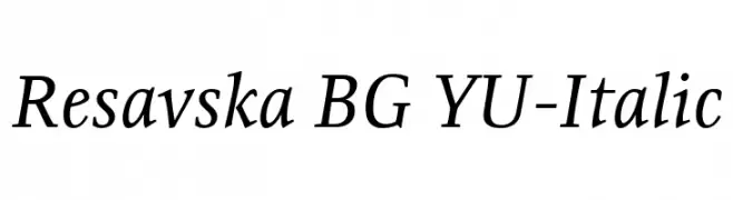
( Fonts by www.tipometar.org )
An elegant serif italic font with moderate contrast and a classic style.
![Resavska BG YU-Italic font caratteri gratis]() Scaricare 366 Downloads@WebFont
Scaricare 366 Downloads@WebFont -
![Jellodings font caratteri gratis]() Scaricare 366 Downloads@WebFont
Scaricare 366 Downloads@WebFont -
( Fonts by Joe .C - Personal-use only. For commercial use please contact owner. )
A modern, playful font with rounded edges and a tall, narrow structure.
![Centi font caratteri gratis]() Scaricare 366 Downloads@WebFont
Scaricare 366 Downloads@WebFont -
![Avaza font caratteri gratis]() Scaricare 366 Downloads
Scaricare 366 Downloads -
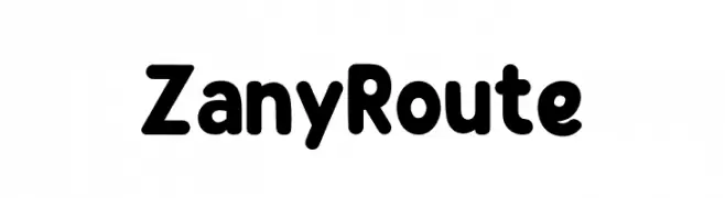
( Fonts by PutraCetol Studio )
A playful, bold font with rounded edges and a bubbly appearance.
![Zany Route font caratteri gratis]() Scaricare 366 Downloads@WebFont
Scaricare 366 Downloads@WebFont -
![IJ19 90 font caratteri gratis]() Scaricare 366 Downloads@WebFont
Scaricare 366 Downloads@WebFont -
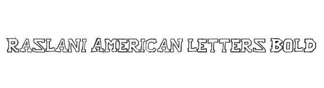
![Raslani American letters Bold font caratteri gratis]() Scaricare 366 Downloads@WebFont
Scaricare 366 Downloads@WebFont -
( Fonts by Graphix Line Studio )
A playful and whimsical font with rounded, slightly irregular letterforms.
![Dear Dreamer font caratteri gratis]() Scaricare 366 Downloads@WebFont
Scaricare 366 Downloads@WebFont -
( Fonts by Hanna Bie )
A bold, playful font with rounded, hand-drawn characters.
![Pitbull font caratteri gratis]() Scaricare 366 Downloads@WebFont
Scaricare 366 Downloads@WebFont -
( Fonts by Wahyu Eka Prasetya - wepfont.com - Personal-use only. For commercial use please contact owner. )
A playful, bold font with rounded, hand-drawn characters.
![Heal font caratteri gratis]() Scaricare 366 Downloads@WebFont
Scaricare 366 Downloads@WebFont -
![Ice Sans Compressed Regular font caratteri gratis]() Scaricare 366 Downloads@WebFont
Scaricare 366 Downloads@WebFont -
( Fonts by www.fontalicious.com )
A bold, decorative font with unique cut-out elements for a playful and edgy look.
![Mikey Jax font caratteri gratis]() Scaricare 366 Downloads@WebFont
Scaricare 366 Downloads@WebFont -
![Wonder Boy In Monster World font caratteri gratis]() Scaricare 366 Downloads@WebFont
Scaricare 366 Downloads@WebFont -
![blox Regular font caratteri gratis]() Scaricare 366 Downloads@WebFont
Scaricare 366 Downloads@WebFont -
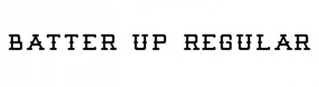
![Batter Up Regular font caratteri gratis]() Scaricare 366 Downloads@WebFont
Scaricare 366 Downloads@WebFont -
( Fonts by Mr Fisk - Mike Larsson - fontorama.net )
A playful, hand-drawn font with bold, uneven strokes and a whimsical style.
![Sinking Ship font caratteri gratis]() Scaricare 366 Downloads@WebFont
Scaricare 366 Downloads@WebFont -
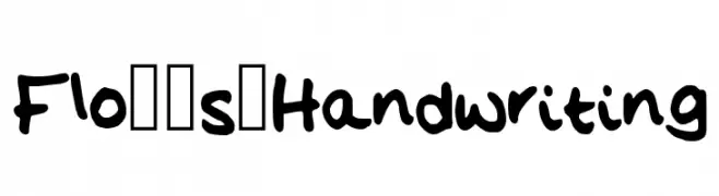
![Flo__s_Handwriting font caratteri gratis]() Scaricare 366 Downloads@WebFont
Scaricare 366 Downloads@WebFont -
( Fonts by Daniel Zadorozny - www.iconian.com )
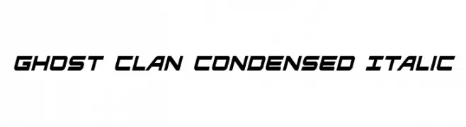
A dynamic, condensed italic font with a modern, sporty look.
![Ghost Clan Condensed Italic font caratteri gratis]() Scaricare 366 Downloads@WebFont
Scaricare 366 Downloads@WebFont -
![LaPierre font caratteri gratis]() Scaricare 366 Downloads@WebFont
Scaricare 366 Downloads@WebFont -
![Rascal font caratteri gratis]() Scaricare 366 Downloads@WebFont
Scaricare 366 Downloads@WebFont -
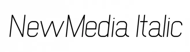
![NewMedia Italic font caratteri gratis]() Scaricare 366 Downloads@WebFont
Scaricare 366 Downloads@WebFont -
( Fonts by Graham Meade - GemFonts )
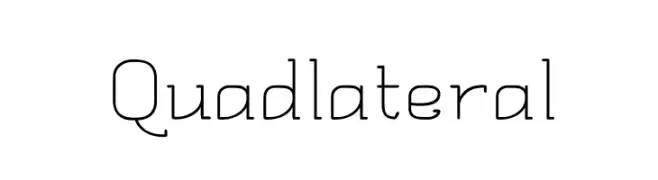
A geometric, modern font with clean lines and excellent legibility.
![Quadlateral font caratteri gratis]() Scaricare 366 Downloads@WebFont
Scaricare 366 Downloads@WebFont -
( Måns Grebäck - www.mansgreback.com )
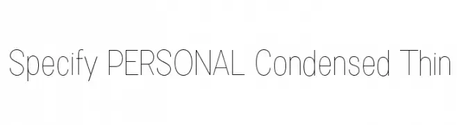
A sleek, modern, and condensed thin font with a minimalistic design.
![Specify PERSONAL Condensed Thin font caratteri gratis]() Scaricare 366 Downloads@WebFont
Scaricare 366 Downloads@WebFont -
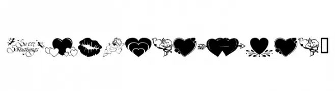
![wmvalentine1 font caratteri gratis]() Scaricare 366 Downloads@WebFont
Scaricare 366 Downloads@WebFont -
( Fonts by Daniel Zadorozny - www.iconian.com - Free for personal use )
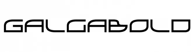
A futuristic, geometric font with clean lines and angular shapes.
![GalgaBold font caratteri gratis]() Scaricare 366 Downloads@WebFont
Scaricare 366 Downloads@WebFont -
( Fonts by Bobistheowl - Personal-use only. For commercial use please contact owner. )
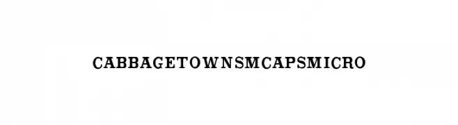
A bold, classic serif font with strong, well-defined characters.
![CabbagetownSmCapsMicro font caratteri gratis]() Scaricare 366 Downloads@WebFont
Scaricare 366 Downloads@WebFont -
( Fonts by www.legacyofdefeat.com )
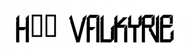
A bold, angular font with a futuristic and industrial design.
![H74 Valkyrie font caratteri gratis]() Scaricare 365 Downloads@WebFont
Scaricare 365 Downloads@WebFont -
( Robin Boast )
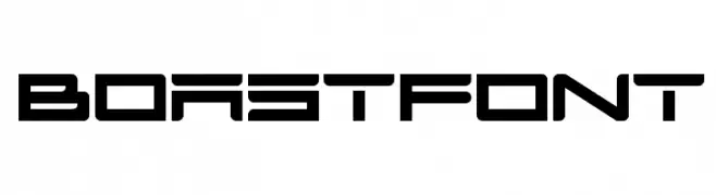
A bold, futuristic font with geometric shapes and tight spacing, ideal for tech themes.
![BOASTfont font caratteri gratis]() Scaricare 365 Downloads@WebFont
Scaricare 365 Downloads@WebFont -
( Fonts by Daniel Zadorozny - www.iconian.com - Free for personal use )
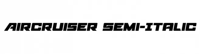
A bold, semi-italic font with a geometric and dynamic style.
![Aircruiser Semi-Italic font caratteri gratis]() Scaricare 365 Downloads@WebFont
Scaricare 365 Downloads@WebFont -
( Fonts by Daniel Zadorozny - www.iconian.com - Free for personal use )
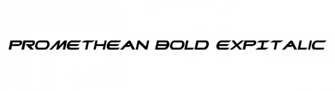
A bold, expansive italic font with a dynamic and futuristic style.
![Promethean Bold ExpItalic font caratteri gratis]() Scaricare 365 Downloads@WebFont
Scaricare 365 Downloads@WebFont


Quali sono i font più popolari adesso?
Poppins, Roboto, Montserrat, Open Sans e Lato sono molto usati per le forme pulite e l'ampia applicabilità — dall'identità di marca alle landing page e ai poster.
Quali font si usano spesso nei loghi?
Le sans serif geometriche (es. Poppins, famiglie in stile Gotham) sono scelte comuni per un branding pulito e scalabile. Per un tocco personale restano valide script e stili manoscritti. Abbina un display deciso per i titoli a un corpo testo neutro per riconoscibilità ed equilibrio.
Ogni quanto si aggiorna la lista?
Con regolarità, in base ai download e all'attività reale. Torna spesso per scoprire in anticipo le nuove preferite.
💡 Consiglio: aggiungi ai preferiti — le tendenze cambiano in fretta e i font top di oggi possono ispirare il rebranding di domani.