Benvenuto nelle Font Più Popolari — dove popolarità e qualità si incontrano. Qui trovi i font più scaricati e usati dell'anno. Se cerchi scelte sicure per logo, web o social, inizia da qui.
Ogni font top si distingue per equilibrio, leggibilità e versatilità. Troverai sans serif moderne, script eleganti, serif vintage e display minimalisti.
-
 Scaricare 359 Downloads@WebFont
 -
Caratteri di danny91194. For commercial use please contact the owner.
( 5 )
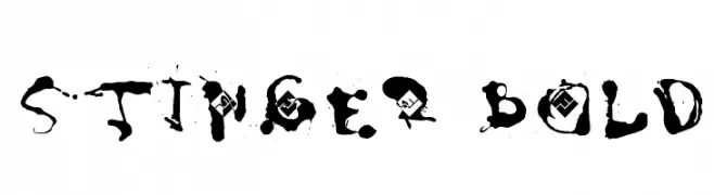
A bold, grunge-style font with splattered ink effects and dynamic strokes.
![Stinger Bold font caratteri gratis]() Scaricare 359 Downloads@WebFont
Scaricare 359 Downloads@WebFont -
( Fonts by www.kimberlygeswein.com - Kimberly Geswein )
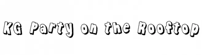
A bold, textured, and playful font with a hand-drawn appearance.
![KG Party on the Rooftop font caratteri gratis]() Scaricare 359 Downloads@WebFont
Scaricare 359 Downloads@WebFont -
( Fonts by CannotIntoSpaceFonts - KineticPlasma Fonts - Personal-use only. For commercial use please contact owner. )
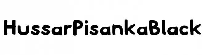
A bold, playful font with rounded edges and a hand-drawn look.
![Hussar Pisanka Black font caratteri gratis]() Scaricare 359 Downloads@WebFont
Scaricare 359 Downloads@WebFont -
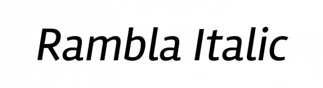
( Copyright (c) 2011-2012, Martin Sommaruga (martin@estudiotrama.com), with Reserved Font Name 'Rambla' )
A modern, italic font with clean lines and balanced proportions.
![Rambla Italic font caratteri gratis]() Scaricare 359 Downloads@WebFont
Scaricare 359 Downloads@WebFont -
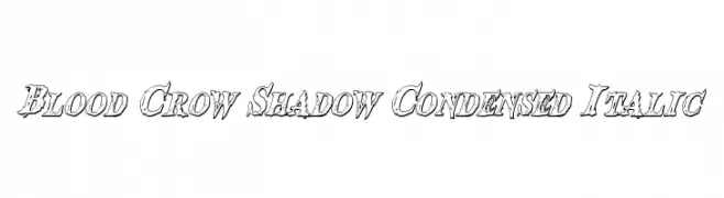
( Fonts by Daniel Zadorozny - www.iconian.com )
A bold, distressed, and italicized font with a shadowed, condensed style.
![Blood Crow Shadow Condensed Italic font caratteri gratis]() Scaricare 359 Downloads@WebFont
Scaricare 359 Downloads@WebFont -
( Fonts by Syaf Rizal - https://creativemarket.com/khurasan - Personal-use only. For commercial use please contact owner. )
A bold, geometric font with a modern and edgy design.
![Lexlox font caratteri gratis]() Scaricare 359 Downloads@WebFont
Scaricare 359 Downloads@WebFont -
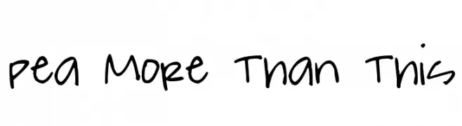
( Free for a personal use. For a commercial use please visit www.kevinandamanda.com )
A playful, casual handwritten font with a dynamic and friendly style.
![Pea More Than This font caratteri gratis]() Scaricare 359 Downloads@WebFont
Scaricare 359 Downloads@WebFont -
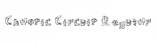
( Fonts by or from www.graffitifonts.net )
A complex, circuit-inspired font with a bold, industrial style.
![Chaotic Circuit Regular font caratteri gratis]() Scaricare 359 Downloads@WebFont
Scaricare 359 Downloads@WebFont -
![My Pleasure font caratteri gratis]() Scaricare 359 Downloads@WebFont
Scaricare 359 Downloads@WebFont -
( Fonts by www.aka-acid.com )
A bold, pixelated font with a digital, geometric style.
![Aka-AcidGR-SystemTronical font caratteri gratis]() Scaricare 359 Downloads@WebFont
Scaricare 359 Downloads@WebFont -
( Fonts by weknow - Wino S Kadir )
A modern, playful font with smooth, rounded edges and creative character designs.
![star constellation font caratteri gratis]() Scaricare 359 Downloads@WebFont
Scaricare 359 Downloads@WebFont -
![usagi font caratteri gratis]() Scaricare 359 Downloads@WebFont
Scaricare 359 Downloads@WebFont -
( Fonts by Peax Webdesign - www.peax-webdesign.com. Personal-use only. For commercial use please contact owner. )
A playful, rounded font with bold, bubble-like characters and thick outlines.
![SimpleRounded font caratteri gratis]() Scaricare 359 Downloads@WebFont
Scaricare 359 Downloads@WebFont -
![Skadir font caratteri gratis]() Scaricare 359 Downloads@WebFont
Scaricare 359 Downloads@WebFont -
( Fonts by Vladimir Nikolic - Personal-use only. For commercial use please contact owner. )
A bold, italicized font with a dynamic and modern style.
![Rethinked Italic font caratteri gratis]() Scaricare 359 Downloads@WebFont
Scaricare 359 Downloads@WebFont -
( Fonts by xpeehdroox )
A dynamic and fluid handwritten script with elegant, sweeping curves.
![trueblue font caratteri gratis]() Scaricare 359 Downloads@WebFont
Scaricare 359 Downloads@WebFont -
![D'ni Script Angular font caratteri gratis]() Scaricare 359 Downloads@WebFont
Scaricare 359 Downloads@WebFont -
( Fonts by Gilar Studio )
A playful and whimsical font with lively curves and angles.
![Nona Manis Regular font caratteri gratis]() Scaricare 359 Downloads@WebFont
Scaricare 359 Downloads@WebFont -
( Fonts by www.stimuleyefonts.com )
A bold, tightly spaced font with thick, rounded strokes and a strong visual impact.
![Vanilla Boys font caratteri gratis]() Scaricare 359 Downloads@WebFont
Scaricare 359 Downloads@WebFont -
( Fonts by Apostrophic Lab )
A modern, rounded sans-serif font with clean lines and balanced spacing.
![Street Corner Upper font caratteri gratis]() Scaricare 359 Downloads@WebFont
Scaricare 359 Downloads@WebFont -
Caratteri di glyphstyle. For commercial use please contact the owner.
( NOTE: This demo font is for PERSONAL USE ONLY! But any donation are very appreciated. Paypal account for donation : https://www.paypal.me/dimasardhi full version: https://www.glyphstyle.net/solustion/ contact us at styleglyph@gmail.com And follow my )
A clean, modern sans-serif font with uniform stroke width.
![Solustion Demo font caratteri gratis]() Scaricare 359 Downloads@WebFont
Scaricare 359 Downloads@WebFont -
Caratteri di joorgemoron. For commercial use please contact the owner.
( Free for personal use )
A bold, ornate Blackletter font with a gothic and medieval style.
![JMHMorenetaDivine font caratteri gratis]() Scaricare 359 Downloads@WebFont
Scaricare 359 Downloads@WebFont -
( Fonts by Graham Meade - GemFonts )
An elegant and whimsical font with a blend of classic and modern elements.
![Czaristite font caratteri gratis]() Scaricare 359 Downloads@WebFont
Scaricare 359 Downloads@WebFont -
![CleanStephanieee font caratteri gratis]() Scaricare 359 Downloads@WebFont
Scaricare 359 Downloads@WebFont -
![BM mini A8 font caratteri gratis]() Scaricare 359 Downloads@WebFont
Scaricare 359 Downloads@WebFont -
( Fonts by Castcraft Software - OPTI Fonts Archive - opti.netii.net - Personal-use only. For commercial use please contact owner. )
A distinctive serif font with sharp angles and flowing curves, blending traditional and modern styles.
![OPTISkjald font caratteri gratis]() Scaricare 358 Downloads@WebFont
Scaricare 358 Downloads@WebFont -
( Copyright 2017 The Archivo Black Project Authors (https://github.com/Omnibus-Type/ArchivoBlack) )
A modern, semi-bold, italic font with a slightly condensed style.
![Archivo Narrow SemiBold Italic font caratteri gratis]() Scaricare 358 Downloads@WebFont
Scaricare 358 Downloads@WebFont -
![GypsyRose font caratteri gratis]() Scaricare 358 Downloads@WebFont
Scaricare 358 Downloads@WebFont -
![Jungle Juice font caratteri gratis]() Scaricare 358 Downloads@WebFont
Scaricare 358 Downloads@WebFont -
( Fonts by Typetemp Studio )
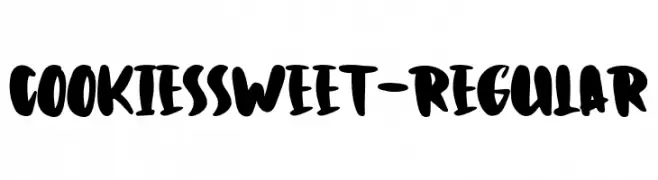
A playful, bold font with thick, rounded strokes and a hand-drawn style.
![CookiesSweet-Regular font caratteri gratis]() Scaricare 358 Downloads@WebFont
Scaricare 358 Downloads@WebFont -
![NovaCut font caratteri gratis]() Scaricare 358 Downloads@WebFont
Scaricare 358 Downloads@WebFont -
![Gasrock font caratteri gratis]() Scaricare 358 Downloads@WebFont
Scaricare 358 Downloads@WebFont -
( Fonts by www.peter-wiegel.de - Personal-use only. For commercial use please contact owner. )
A distinctive serif font combining sharp angles and subtle curves for a classic yet modern look.
![Gaeilge font caratteri gratis]() Scaricare 358 Downloads@WebFont
Scaricare 358 Downloads@WebFont -
( Fonts by Misti`s Fonts - mistifonts.com - Personal-use only. For commercial use please contact owner. )
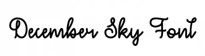
A playful, handwritten script font with flowing, interconnected strokes.
![December Sky Font font caratteri gratis]() Scaricare 358 Downloads@WebFont
Scaricare 358 Downloads@WebFont


Quali sono i font più popolari adesso?
Poppins, Roboto, Montserrat, Open Sans e Lato sono molto usati per le forme pulite e l'ampia applicabilità — dall'identità di marca alle landing page e ai poster.
Quali font si usano spesso nei loghi?
Le sans serif geometriche (es. Poppins, famiglie in stile Gotham) sono scelte comuni per un branding pulito e scalabile. Per un tocco personale restano valide script e stili manoscritti. Abbina un display deciso per i titoli a un corpo testo neutro per riconoscibilità ed equilibrio.
Ogni quanto si aggiorna la lista?
Con regolarità, in base ai download e all'attività reale. Torna spesso per scoprire in anticipo le nuove preferite.
💡 Consiglio: aggiungi ai preferiti — le tendenze cambiano in fretta e i font top di oggi possono ispirare il rebranding di domani.