Benvenuto nelle Font Più Popolari — dove popolarità e qualità si incontrano. Qui trovi i font più scaricati e usati dell'anno. Se cerchi scelte sicure per logo, web o social, inizia da qui.
Ogni font top si distingue per equilibrio, leggibilità e versatilità. Troverai sans serif moderne, script eleganti, serif vintage e display minimalisti.
-
( گالری فانت فارسی پژوهش آريانا - only compatible with Farsi and Arabic )
A classic serif font with elegant curves and a traditional appearance.
 Scaricare 357 Downloads@WebFont
 -
![Galactic Bold font caratteri gratis]() Scaricare 357 Downloads@WebFont
Scaricare 357 Downloads@WebFont -
![umop font caratteri gratis]() Scaricare 357 Downloads@WebFont
Scaricare 357 Downloads@WebFont -
( truefonts.blogspot.com )
A playful, doodle-patterned font with bold, rounded characters.
![FONTESDA TFB font caratteri gratis]() Scaricare 357 Downloads@WebFont
Scaricare 357 Downloads@WebFont -
( Fonts by Roland Huse - rolandhuse.com )
A sleek, ultra-thin font with a modern, geometric design.
![Slim Extreme font caratteri gratis]() Scaricare 357 Downloads@WebFont
Scaricare 357 Downloads@WebFont -
( Fonts by Yai Salinas )
A bold, ornate blackletter font with high contrast and decorative flourishes.
![Ethelvina_Regular font caratteri gratis]() Scaricare 357 Downloads@WebFont
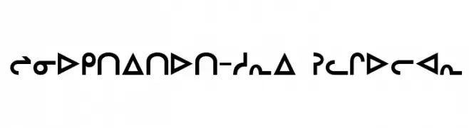
Scaricare 357 Downloads@WebFont -
![Inuktitut-Sri Regular font caratteri gratis]() Scaricare 357 Downloads@WebFont
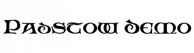
Scaricare 357 Downloads@WebFont -
![Padstow Demo font caratteri gratis]() Scaricare 357 Downloads@WebFont
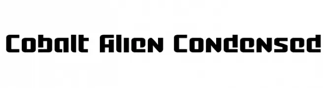
Scaricare 357 Downloads@WebFont -
![Cobalt Alien Condensed font caratteri gratis]() Scaricare 357 Downloads@WebFont
Scaricare 357 Downloads@WebFont -
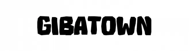
( Fonts by Tokopress )
A bold, rugged, hand-drawn font with thick, blocky characters.
![GIBATOWN font caratteri gratis]() Scaricare 357 Downloads@WebFont
Scaricare 357 Downloads@WebFont -
![Philadelphia Italic Light font caratteri gratis]() Scaricare 357 Downloads@WebFont
Scaricare 357 Downloads@WebFont -
![Atchy font caratteri gratis]() Scaricare 357 Downloads@WebFont
Scaricare 357 Downloads@WebFont -
( Fonts by Endri Sulistyawan - Personal-use only. For commercial use please contact owner. )
A playful and elegant script font with flowing, cursive letterforms.
![Maylove font caratteri gratis]() Scaricare 357 Downloads@WebFont
Scaricare 357 Downloads@WebFont -
![Wolverine's Pseudo font caratteri gratis]() Scaricare 357 Downloads@WebFont
Scaricare 357 Downloads@WebFont -
( Free for personal use - marketplace.inspirationhut.net )
A playful, casual handwritten font with smooth, flowing letterforms.
![GrahamHand font caratteri gratis]() Scaricare 357 Downloads@WebFont
Scaricare 357 Downloads@WebFont -
![Hello Heartache font caratteri gratis]() Scaricare 357 Downloads@WebFont
Scaricare 357 Downloads@WebFont -
( Fonts by Mans Greback - Personal-use only. For commercial use please contact owner. )
A bold, modern font with strong geometric shapes and clean lines.
![Famiar PERSONAL USE ONLY Black font caratteri gratis]() Scaricare 357 Downloads@WebFont
Scaricare 357 Downloads@WebFont -
( Fonts by Johan Wibisono )
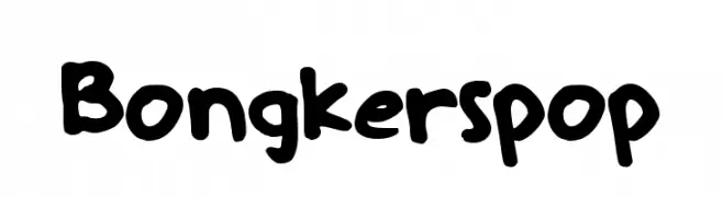
A playful, handwritten font with a bold and friendly appearance.
![Bongkerspop font caratteri gratis]() Scaricare 357 Downloads@WebFont
Scaricare 357 Downloads@WebFont -
( charmingcharlie.co.nr/ )
A playful, handwritten font with uneven strokes and a casual style.
![Messen font caratteri gratis]() Scaricare 357 Downloads@WebFont
Scaricare 357 Downloads@WebFont -
( Fonts by Chris Vile )
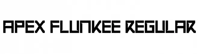
A bold, geometric font with a futuristic and structured design.
![Apex Flunkee Regular font caratteri gratis]() Scaricare 357 Downloads@WebFont
Scaricare 357 Downloads@WebFont -
![Tiny Box BlackBitA8 font caratteri gratis]() Scaricare 357 Downloads@WebFont
Scaricare 357 Downloads@WebFont -
( Fonts by Des Gomez )
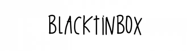
A playful, handwritten font with tall, narrow letters and a casual, whimsical style.
![BlackTinBox font caratteri gratis]() Scaricare 357 Downloads@WebFont
Scaricare 357 Downloads@WebFont -
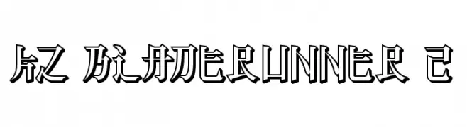
![KZ BLADERUNNER 2 font caratteri gratis]() Scaricare 357 Downloads@WebFont
Scaricare 357 Downloads@WebFont -
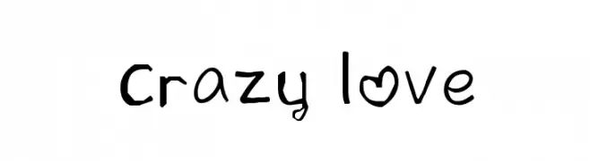
![crazy love font caratteri gratis]() Scaricare 357 Downloads@WebFont
Scaricare 357 Downloads@WebFont -
( Fonts by Ardana Creative - Personal-use only. For commercial use please contact owner. )
A bold, modern sans-serif font with clean lines and a slightly condensed style.
![Singo Sans font caratteri gratis]() Scaricare 357 Downloads@WebFont
Scaricare 357 Downloads@WebFont -
( Fonts by Manfred Klein. Free for private and charity use. Free for commercial with donation to organizations )
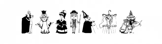
A decorative font with theatrical and whimsical character illustrations.
![OnStage font caratteri gratis]() Scaricare 357 Downloads@WebFont
Scaricare 357 Downloads@WebFont -
( Fonts by Graham Meade - GemFonts )
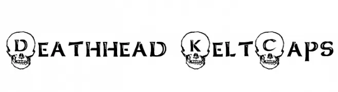
A bold, gothic font with skull-themed letters and dramatic flair.
![Deathhead KeltCaps font caratteri gratis]() Scaricare 357 Downloads@WebFont
Scaricare 357 Downloads@WebFont -
![Ænigma Scrawl 3 BRK font caratteri gratis]() Scaricare 357 Downloads@WebFont
Scaricare 357 Downloads@WebFont -
( Fonts by Castcraft Software - opti.netii.net - check the website before use )
A bold, dynamic font with modern and classic elements, featuring sharp angles and smooth curves.
![OPTILignier-Caps font caratteri gratis]() Scaricare 357 Downloads@WebFont
Scaricare 357 Downloads@WebFont -
![Peregrine font caratteri gratis]() Scaricare 357 Downloads
Scaricare 357 Downloads -
![Tardy Kid font caratteri gratis]() Scaricare 357 Downloads@WebFont
Scaricare 357 Downloads@WebFont -
( Martin Sørensen )
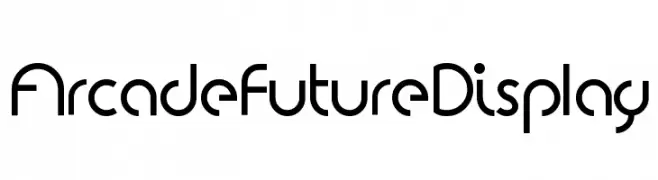
A futuristic, geometric font with clean lines and rounded edges.
![Arcade Future Display font caratteri gratis]() Scaricare 357 Downloads@WebFont
Scaricare 357 Downloads@WebFont -
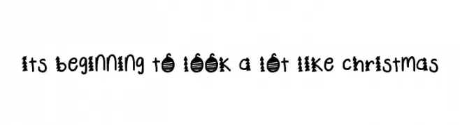
![its beginning to look a lot like christmas font caratteri gratis]() Scaricare 357 Downloads@WebFont
Scaricare 357 Downloads@WebFont -
( Fonts by Wino S Kadir - weknow - www.revolge.com/shop/weknow/ - Personal-use only. For commercial use please contact owner. )
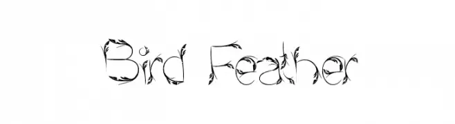
A decorative font with feather-like embellishments for a whimsical, nature-inspired look.
![Bird Feather font caratteri gratis]() Scaricare 357 Downloads@WebFont
Scaricare 357 Downloads@WebFont -
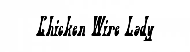
![Chicken Wire Lady font caratteri gratis]() Scaricare 357 Downloads@WebFont
Scaricare 357 Downloads@WebFont


Quali sono i font più popolari adesso?
Poppins, Roboto, Montserrat, Open Sans e Lato sono molto usati per le forme pulite e l'ampia applicabilità — dall'identità di marca alle landing page e ai poster.
Quali font si usano spesso nei loghi?
Le sans serif geometriche (es. Poppins, famiglie in stile Gotham) sono scelte comuni per un branding pulito e scalabile. Per un tocco personale restano valide script e stili manoscritti. Abbina un display deciso per i titoli a un corpo testo neutro per riconoscibilità ed equilibrio.
Ogni quanto si aggiorna la lista?
Con regolarità, in base ai download e all'attività reale. Torna spesso per scoprire in anticipo le nuove preferite.
💡 Consiglio: aggiungi ai preferiti — le tendenze cambiano in fretta e i font top di oggi possono ispirare il rebranding di domani.