Benvenuto nelle Font Più Popolari — dove popolarità e qualità si incontrano. Qui trovi i font più scaricati e usati dell'anno. Se cerchi scelte sicure per logo, web o social, inizia da qui.
Ogni font top si distingue per equilibrio, leggibilità e versatilità. Troverai sans serif moderne, script eleganti, serif vintage e display minimalisti.
-
( Fonts by www.aenigmafonts.com )
A bold, futuristic font with rounded edges and a modern, playful style.
 Scaricare 355 Downloads@WebFont
 -
( Psudo )
A bold, geometric font with a modern, tech-inspired aesthetic.
![Zairo font caratteri gratis]() Scaricare 355 Downloads@WebFont
Scaricare 355 Downloads@WebFont -
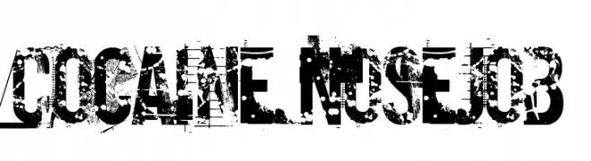
( Fonts by Pennyzine - www.thedevilinjasonramirez.com - Free for personal use )
A bold, distressed font with a grungy, weathered appearance.
![Cocaine Nosejob font caratteri gratis]() Scaricare 355 Downloads@WebFont
Scaricare 355 Downloads@WebFont -
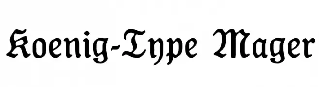
( Fonts by Dieter Steffmann )
A classic blackletter font with ornate, medieval-inspired letterforms.
![Koenig-Type Mager font caratteri gratis]() Scaricare 355 Downloads@WebFont
Scaricare 355 Downloads@WebFont -
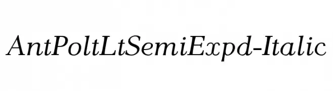
![AntPoltLtSemiExpd-Italic font caratteri gratis]() Scaricare 355 Downloads@WebFont
Scaricare 355 Downloads@WebFont -
( Fonts by www.fugit-tempus.de )
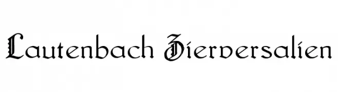
A decorative blackletter font with intricate and ornate uppercase letters.
![Lautenbach Zierversalien font caratteri gratis]() Scaricare 355 Downloads@WebFont
Scaricare 355 Downloads@WebFont -
![VI Tu Di font caratteri gratis]() Scaricare 355 Downloads
Scaricare 355 Downloads -
( Fonts by Manfred Klein - manfred-klein.ina-mar.com )
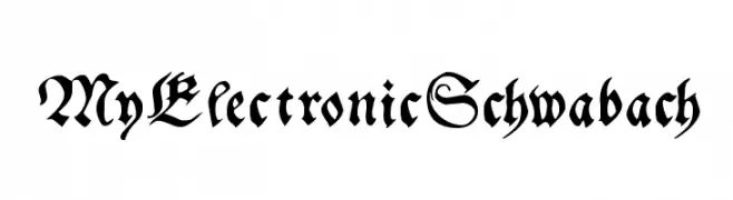
An ornate blackletter font with intricate, historical styling.
![MyElectronicSchwabach font caratteri gratis]() Scaricare 355 Downloads@WebFont
Scaricare 355 Downloads@WebFont -
( Fonts by Graham Meade - GemFonts )
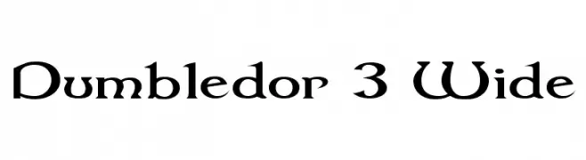
A medieval-inspired font with sharp serifs and dramatic letterforms.
![Dumbledor 3 Wide font caratteri gratis]() Scaricare 355 Downloads@WebFont
Scaricare 355 Downloads@WebFont -
( Fonts by www.kimberlygeswein.com - Kimberly Geswein )
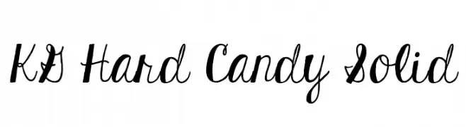
A playful and whimsical script font with smooth, flowing cursive letters.
![KG Hard Candy Solid font caratteri gratis]() Scaricare 355 Downloads@WebFont
Scaricare 355 Downloads@WebFont -
( Fonts by Dibujado )
A playful, bold font with a hand-drawn, whimsical style.
![oArbust font caratteri gratis]() Scaricare 355 Downloads@WebFont
Scaricare 355 Downloads@WebFont -
![Rabsy Regular font caratteri gratis]() Scaricare 355 Downloads@WebFont
Scaricare 355 Downloads@WebFont -
![TimeTrek font caratteri gratis]() Scaricare 355 Downloads@WebFont
Scaricare 355 Downloads@WebFont -
( Fonts by Khaidir Fajry - Personal-use only. For commercial use please contact owner. )
A playful, dynamic handwritten font with fluid strokes and elegant movement.
![Rayville Free Personal Use font caratteri gratis]() Scaricare 355 Downloads@WebFont
Scaricare 355 Downloads@WebFont -
( Fonts by Darko Bogdanov )
A playful, handwritten font with a casual and whimsical style.
![Darbog font caratteri gratis]() Scaricare 355 Downloads@WebFont
Scaricare 355 Downloads@WebFont -
( Fonts by www.lifewithouttaffy.com )
A modern, geometric font with rounded and angular elements, ideal for contemporary designs.
![Zaboodla font caratteri gratis]() Scaricare 355 Downloads@WebFont
Scaricare 355 Downloads@WebFont -
( Fonts by Martin He )
A playful, handwritten font with irregular, whimsical strokes.
![Royana font caratteri gratis]() Scaricare 355 Downloads@WebFont
Scaricare 355 Downloads@WebFont -
![VTCBelialsBlade Regular font caratteri gratis]() Scaricare 355 Downloads@WebFont
Scaricare 355 Downloads@WebFont -
( Fonts by Alex Tomlinson - Skyhaven Fonts - shfonts.com )
A bold, geometric font with a 3D shadow effect, ideal for retro and modern designs.
![MegaSans font caratteri gratis]() Scaricare 355 Downloads@WebFont
Scaricare 355 Downloads@WebFont -
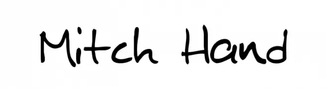
![Mitch Hand font caratteri gratis]() Scaricare 355 Downloads@WebFont
Scaricare 355 Downloads@WebFont -
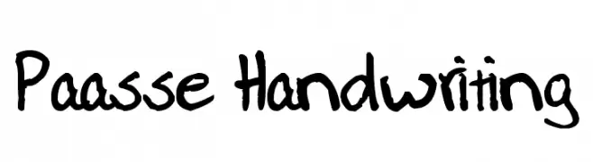
![Paasse Handwriting font caratteri gratis]() Scaricare 355 Downloads@WebFont
Scaricare 355 Downloads@WebFont -
( Fonts by Nirmala Creative - Personal-use only. For commercial use please contact owner. )
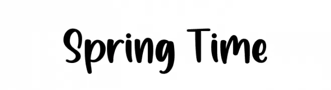
Playful handwritten font with bold strokes.
![Spring Time font caratteri gratis]() Scaricare 355 Downloads@WebFont
Scaricare 355 Downloads@WebFont -
( Fonts by The League of Moveable Type - theleagueofmoveabletype.com )
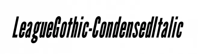
A bold, condensed, and italicized font with a modern and dynamic style.
![LeagueGothic-CondensedItalic font caratteri gratis]() Scaricare 355 Downloads@WebFont
Scaricare 355 Downloads@WebFont -
( Fonts by www.studiotypo.com - Personal-use only. For commercial use please contact owner. )
A modern, italicized font with a sleek and dynamic style.
![Bluefish Demo Italic font caratteri gratis]() Scaricare 355 Downloads@WebFont
Scaricare 355 Downloads@WebFont -
( Ydhra Studio - creativemarket.com/ydhra )
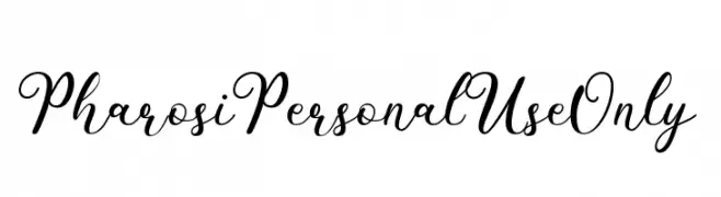
An elegant, flowing script font with ornate uppercase and smooth lowercase letters.
![PharosiPersonalUseOnly font caratteri gratis]() Scaricare 355 Downloads@WebFont
Scaricare 355 Downloads@WebFont -
( Fonts by Diego Gonzalez )
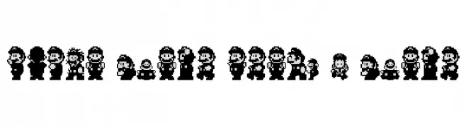
Retro 8-bit pixel art character sprites.
![Super Mario World - Mario font caratteri gratis]() Scaricare 355 Downloads@WebFont
Scaricare 355 Downloads@WebFont -
( Måns Grebäck - www.mansgreback.com )
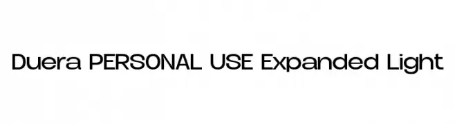
A modern sans-serif font with expanded, clean letterforms and a sleek appearance.
![Duera PERSONAL USE Expanded Light font caratteri gratis]() Scaricare 355 Downloads@WebFont
Scaricare 355 Downloads@WebFont -
Caratteri di typotopia. For commercial use please contact the owner.
( Fonts by Typotopia - Typotopia.co - Personal Use Only, for Commercial Use, please contact us )
A fluid, cursive script font with a natural handwritten appearance.
![La Nantes font caratteri gratis]() Scaricare 355 Downloads@WebFont
Scaricare 355 Downloads@WebFont -
( Fonts by Leonard Posavec - leosupply.co - Personal-use only. For commercial use please contact owner. )
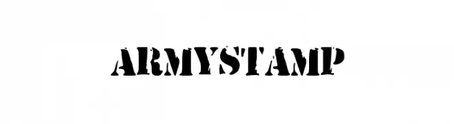
A bold, stencil-style font with a distressed, military-inspired look.
![ArmyStamp font caratteri gratis]() Scaricare 355 Downloads@WebFont
Scaricare 355 Downloads@WebFont -
( Fonts by Andrew Hart - dirt2.com )
A bold, distressed font with a grungy, vintage texture and shadow effect.
![Dirt2 Echo font caratteri gratis]() Scaricare 355 Downloads@WebFont
Scaricare 355 Downloads@WebFont -
( Fonts by www.houseoflime.com )
A religious-themed dingbat font with Christian illustrations.
![Faith font caratteri gratis]() Scaricare 355 Downloads@WebFont
Scaricare 355 Downloads@WebFont -
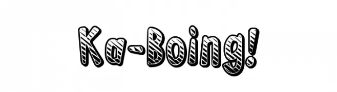
( www.redbubble.com/people/anfa/portfolio )
A bold, playful font with a 3D striped effect and thick outlines.
![Ka-Boing! font caratteri gratis]() Scaricare 355 Downloads@WebFont
Scaricare 355 Downloads@WebFont -
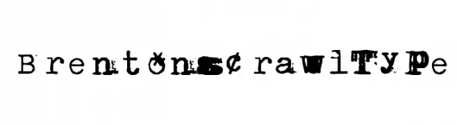
![BrentonscrawlType font caratteri gratis]() Scaricare 355 Downloads@WebFont
Scaricare 355 Downloads@WebFont -
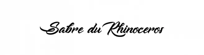
![Sabre du Rhinoceros font caratteri gratis]() Scaricare 355 Downloads@WebFont
Scaricare 355 Downloads@WebFont -
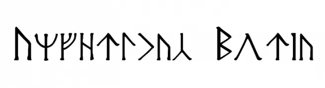
![Angerthas Moria font caratteri gratis]() Scaricare 355 Downloads@WebFont
Scaricare 355 Downloads@WebFont


Quali sono i font più popolari adesso?
Poppins, Roboto, Montserrat, Open Sans e Lato sono molto usati per le forme pulite e l'ampia applicabilità — dall'identità di marca alle landing page e ai poster.
Quali font si usano spesso nei loghi?
Le sans serif geometriche (es. Poppins, famiglie in stile Gotham) sono scelte comuni per un branding pulito e scalabile. Per un tocco personale restano valide script e stili manoscritti. Abbina un display deciso per i titoli a un corpo testo neutro per riconoscibilità ed equilibrio.
Ogni quanto si aggiorna la lista?
Con regolarità, in base ai download e all'attività reale. Torna spesso per scoprire in anticipo le nuove preferite.
💡 Consiglio: aggiungi ai preferiti — le tendenze cambiano in fretta e i font top di oggi possono ispirare il rebranding di domani.