Benvenuto nelle Font Più Popolari — dove popolarità e qualità si incontrano. Qui trovi i font più scaricati e usati dell'anno. Se cerchi scelte sicure per logo, web o social, inizia da qui.
Ogni font top si distingue per equilibrio, leggibilità e versatilità. Troverai sans serif moderne, script eleganti, serif vintage e display minimalisti.
-
( Fonts by Aqeela Studio - Muhammad Nasir - Personal-use only. For commercial use please contact owner. )
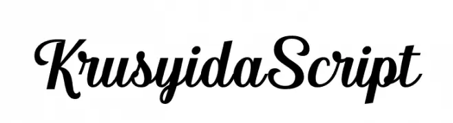
An elegant and fluid script font with graceful, connected letters.
 Scaricare 353 Downloads@WebFont
 -
![Sweden Funkis RegularOblique font caratteri gratis]() Scaricare 353 Downloads@WebFont
Scaricare 353 Downloads@WebFont -
![Clensey font caratteri gratis]() Scaricare 353 Downloads@WebFont
Scaricare 353 Downloads@WebFont -
( Fonts by a Max Infeld - XEROGRAPHER FONTS - xerographer.blogspot.com . Personal-use only. For commercial use please contact owner. )
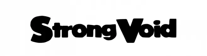
A bold, rounded font with a playful and chunky style.
![StrongVoid font caratteri gratis]() Scaricare 353 Downloads@WebFont
Scaricare 353 Downloads@WebFont -
( Free for a personal use. For a commercial use please visit www.kevinandamanda.com )
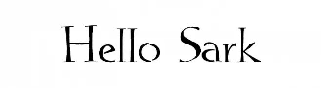
An artistic and elegant font with unique flair and smooth curves.
![Hello Sark font caratteri gratis]() Scaricare 353 Downloads@WebFont
Scaricare 353 Downloads@WebFont -
( Gulash - www.czcionki.com/gulash.html )
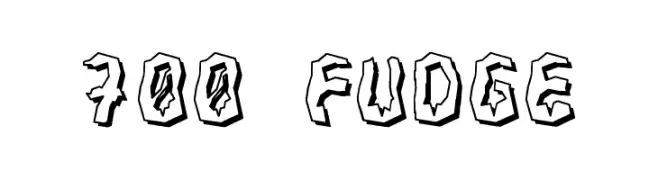
A bold, jagged, hand-drawn font with a rugged, three-dimensional effect.
![700 Fudge font caratteri gratis]() Scaricare 353 Downloads@WebFont
Scaricare 353 Downloads@WebFont -
![KFB font caratteri gratis]() Scaricare 353 Downloads@WebFont
Scaricare 353 Downloads@WebFont -
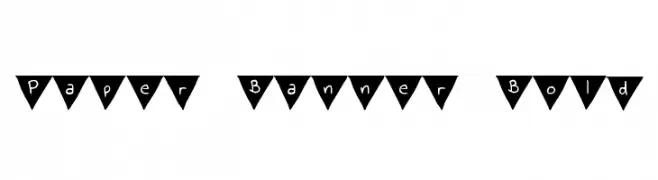
( Free for personal use - byjanam.blogspot.com )
A playful, decorative font with characters in triangular banners.
![Paper Banner Bold font caratteri gratis]() Scaricare 353 Downloads@WebFont
Scaricare 353 Downloads@WebFont -
![Sunny Spring Day font caratteri gratis]() Scaricare 353 Downloads@WebFont
Scaricare 353 Downloads@WebFont -
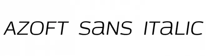
( Fonts by Azoft )
A modern, italic sans-serif font with a sleek and dynamic style.
![Azoft Sans Italic font caratteri gratis]() Scaricare 353 Downloads@WebFont
Scaricare 353 Downloads@WebFont -
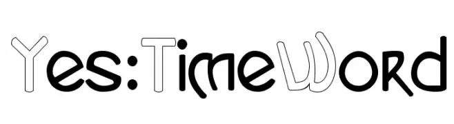
( Fonts by www.varian.net )
A playful, modern font with rounded and angular elements, offering a distinctive flair.
![Yes:TimeWord font caratteri gratis]() Scaricare 353 Downloads@WebFont
Scaricare 353 Downloads@WebFont -
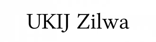
( Fonts by Alim Ahat, Memtimin (Alyar), Abdureshit (Qarlighach), Adiljan Abliz (Uchqur) - Personal-use only. For commercial use please contact owner. )
A classic serif font with elegant and well-proportioned characters.
![UKIJ Zilwa font caratteri gratis]() Scaricare 353 Downloads@WebFont
Scaricare 353 Downloads@WebFont -
( Fonts by Prioritype Co - Prio Nurokhim Aji - Personal-use only. For commercial use please contact owner. )
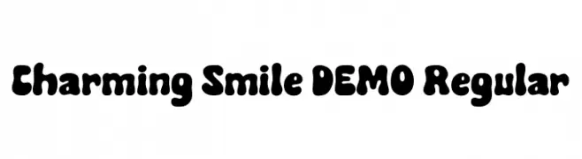
A playful, bold font with bubbly, rounded characters perfect for fun designs.
![Charming Smile DEMO Regular font caratteri gratis]() Scaricare 353 Downloads@WebFont
Scaricare 353 Downloads@WebFont -
( Noto is a trademark of Google Inc. Noto fonts are open source. All Noto fonts are published under the SIL Open Font License, Version 1.1 )
A modern sans-serif font with medium weight, ideal for user interfaces.
![Noto Sans Bengali UI Medium font caratteri gratis]() Scaricare 353 Downloads@WebFont
Scaricare 353 Downloads@WebFont -
( Fonts by Paul Lloyd )
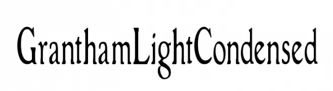
A classic, light serif font with a condensed width and medium contrast.
![GranthamLightCondensed font caratteri gratis]() Scaricare 353 Downloads
Scaricare 353 Downloads -
( Fonts by xpeehdroox )
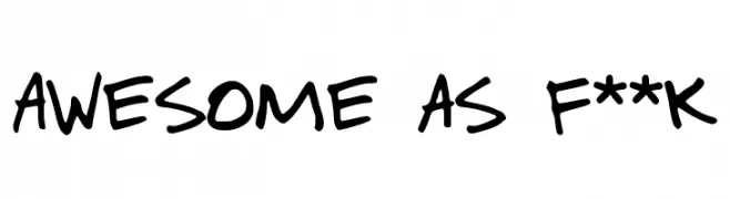
A playful, handwritten font with bold strokes and a casual, dynamic style.
![Awesome as f**k font caratteri gratis]() Scaricare 353 Downloads@WebFont
Scaricare 353 Downloads@WebFont -
( Fonts by Jonathan S. Harris - www.tattoowoo.com. Personal-use only. For commercial use please contact owner. )
An elegant, flowing script font with intricate, calligraphic letterforms.
![Fun Things font caratteri gratis]() Scaricare 353 Downloads@WebFont
Scaricare 353 Downloads@WebFont -
![Krash font caratteri gratis]() Scaricare 353 Downloads@WebFont
Scaricare 353 Downloads@WebFont -
![Pika Pika font caratteri gratis]() Scaricare 353 Downloads@WebFont
Scaricare 353 Downloads@WebFont -
![Ready for my Closeup font caratteri gratis]() Scaricare 353 Downloads@WebFont
Scaricare 353 Downloads@WebFont -
( Fonts by Zetafonts - Personal-use only. For commercial use please contact owner. )
A modern, medium-weight italic font with a sleek and slightly condensed style.
![HeadingNow Trial 55 Medium Italic font caratteri gratis]() Scaricare 353 Downloads@WebFont
Scaricare 353 Downloads@WebFont -
![Suburban Legends font caratteri gratis]() Scaricare 353 Downloads@WebFont
Scaricare 353 Downloads@WebFont -
( Fonts by Pracas Upreti )
A bold, playful handwritten font with rounded, slanted characters.
![Pracas font caratteri gratis]() Scaricare 353 Downloads@WebFont
Scaricare 353 Downloads@WebFont -
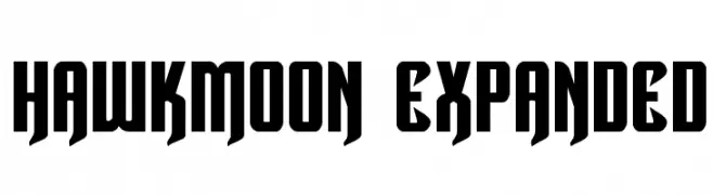
( Fonts by Daniel Zadorozny - www.iconian.com - Free for personal use )
A bold, Gothic-inspired font with sharp angles and dramatic presence.
![Hawkmoon Expanded font caratteri gratis]() Scaricare 353 Downloads@WebFont
Scaricare 353 Downloads@WebFont -
![Nymph font caratteri gratis]() Scaricare 353 Downloads@WebFont
Scaricare 353 Downloads@WebFont -
( Fonts by Jacob Fisher - www.pizzadude.dk )
A bold, geometric font with sharp angles and tight spacing.
![Ozone Layer font caratteri gratis]() Scaricare 353 Downloads@WebFont
Scaricare 353 Downloads@WebFont -
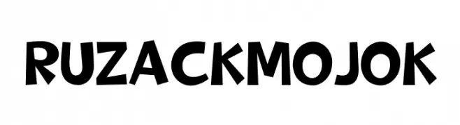
( Fonts by Storytype Studio )
A playful, bold font with a hand-drawn, whimsical style.
![RUZACK MOJOK font caratteri gratis]() Scaricare 353 Downloads@WebFont
Scaricare 353 Downloads@WebFont -
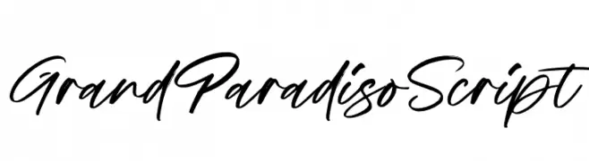
( Fonts by Damarletter )
A dynamic, cursive script font with a fluid, handwritten style.
![Grand Paradiso Script font caratteri gratis]() Scaricare 353 Downloads@WebFont
Scaricare 353 Downloads@WebFont -
![kallithea Regular font caratteri gratis]() Scaricare 353 Downloads@WebFont
Scaricare 353 Downloads@WebFont -
( Jef Triforce - Francisco Arellano - www.ixipcalli.com )
A modern, geometric sans-serif font with bold, clean lines.
![Coamei Bold font caratteri gratis]() Scaricare 353 Downloads@WebFont
Scaricare 353 Downloads@WebFont -
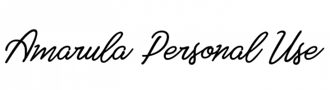
![Amarula Personal Use font caratteri gratis]() Scaricare 353 Downloads@WebFont
Scaricare 353 Downloads@WebFont -
![Perfect Pixel font caratteri gratis]() Scaricare 353 Downloads@WebFont
Scaricare 353 Downloads@WebFont -
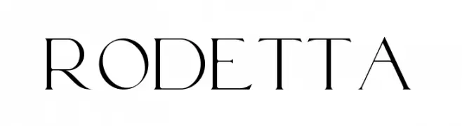
( Fonts by BrandSemut - A Sidiq - Personal-use only. For commercial use please contact owner. )
A modern, high-contrast font with elegant, sophisticated characters.
![Rodetta font caratteri gratis]() Scaricare 353 Downloads@WebFont
Scaricare 353 Downloads@WebFont -
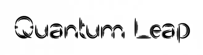
( Fonts by weknow - Wino S Kadir )
A dynamic, futuristic font with fragmented strokes and a sense of movement.
![Quantum Leap font caratteri gratis]() Scaricare 353 Downloads@WebFont
Scaricare 353 Downloads@WebFont -
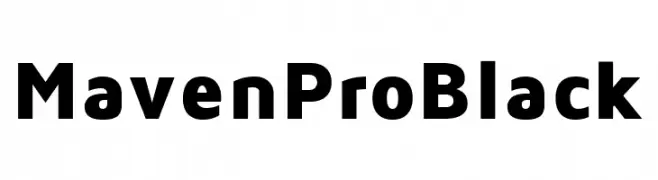
( Fonts by Vissol Ltd. )
A bold, modern sans-serif font with clean lines and strong presence.
![Maven Pro Black font caratteri gratis]() Scaricare 353 Downloads@WebFont
Scaricare 353 Downloads@WebFont


Quali sono i font più popolari adesso?
Poppins, Roboto, Montserrat, Open Sans e Lato sono molto usati per le forme pulite e l'ampia applicabilità — dall'identità di marca alle landing page e ai poster.
Quali font si usano spesso nei loghi?
Le sans serif geometriche (es. Poppins, famiglie in stile Gotham) sono scelte comuni per un branding pulito e scalabile. Per un tocco personale restano valide script e stili manoscritti. Abbina un display deciso per i titoli a un corpo testo neutro per riconoscibilità ed equilibrio.
Ogni quanto si aggiorna la lista?
Con regolarità, in base ai download e all'attività reale. Torna spesso per scoprire in anticipo le nuove preferite.
💡 Consiglio: aggiungi ai preferiti — le tendenze cambiano in fretta e i font top di oggi possono ispirare il rebranding di domani.