Benvenuto nelle Font Più Popolari — dove popolarità e qualità si incontrano. Qui trovi i font più scaricati e usati dell'anno. Se cerchi scelte sicure per logo, web o social, inizia da qui.
Ogni font top si distingue per equilibrio, leggibilità e versatilità. Troverai sans serif moderne, script eleganti, serif vintage e display minimalisti.
-
 Scaricare 349 Downloads@WebFont
 -
( Fonts by Daniel Zadorozny - www.iconian.com - Free for personal use )
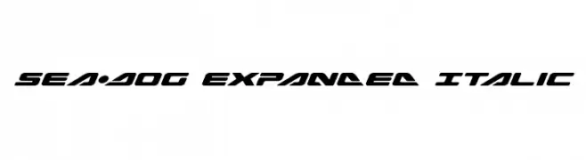
A bold, expanded italic font with a futuristic and dynamic style.
![Sea-Dog Expanded Italic font caratteri gratis]() Scaricare 349 Downloads@WebFont
Scaricare 349 Downloads@WebFont -
( Fonts by Sahrul Ramadhan )
Casual handwritten font with playful style.
![loretan font caratteri gratis]() Scaricare 349 Downloads@WebFont
Scaricare 349 Downloads@WebFont -
( Paul Lloyd Fonts )
A modern, bold, and italicized pattern of stylized letters.
![NewStyle Embossed font caratteri gratis]() Scaricare 349 Downloads@WebFont
Scaricare 349 Downloads@WebFont -
( Fonts by Woodcutter )
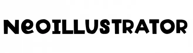
A bold, geometric font with playful, rounded characters.
![Neo Illustrator font caratteri gratis]() Scaricare 349 Downloads@WebFont
Scaricare 349 Downloads@WebFont -
( Fonts by Daniel Zadorozny - www.iconian.com )
A bold, geometric font with a three-dimensional shadow effect.
![Disco Deck Shadow font caratteri gratis]() Scaricare 349 Downloads@WebFont
Scaricare 349 Downloads@WebFont -
( Fonts by Daniel Zadorozny - www.iconian.com )
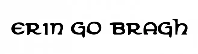
A bold, decorative font with Celtic-inspired curves and flourishes.
![Erin Go Bragh font caratteri gratis]() Scaricare 349 Downloads@WebFont
Scaricare 349 Downloads@WebFont -
( Fonts by Sabrcreative - Personal-use only. For commercial use please contact owner. )
A bold, impactful font with a vintage yet modern style, perfect for standout designs.
![Bonaro Clean Demo Clean font caratteri gratis]() Scaricare 349 Downloads@WebFont
Scaricare 349 Downloads@WebFont -
( Martin Sørensen )
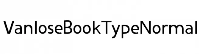
A modern sans-serif font with clean lines and balanced proportions.
![Vanlose BookType Normal font caratteri gratis]() Scaricare 349 Downloads@WebFont
Scaricare 349 Downloads@WebFont -
![KR Christmas Dings 2004 font caratteri gratis]() Scaricare 349 Downloads@WebFont
Scaricare 349 Downloads@WebFont -
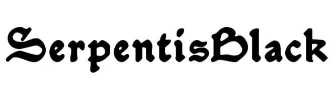
![SerpentisBlack font caratteri gratis]() Scaricare 349 Downloads@WebFont
Scaricare 349 Downloads@WebFont -
( Fonts by Achmad Yani )
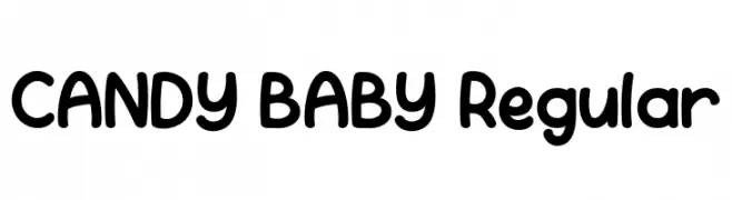
A playful, rounded font with a bold and whimsical style.
![CANDY BABY Regular font caratteri gratis]() Scaricare 349 Downloads@WebFont
Scaricare 349 Downloads@WebFont -
( Fonts by StringLabs - stringlabscreative.com - Personal-use only. For commercial use please contact owner. )
A bold, distressed serif font with a grunge aesthetic.
![Black Rose font caratteri gratis]() Scaricare 349 Downloads@WebFont
Scaricare 349 Downloads@WebFont -
( Fonts by Behnam - Personal-use only. For commercial use please contact owner. )
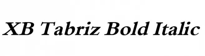
A bold, italic serif font with strong strokes and elegant slant.
![XB Tabriz Bold Italic font caratteri gratis]() Scaricare 349 Downloads@WebFont
Scaricare 349 Downloads@WebFont -
Caratteri di glyphstyle. For commercial use please contact the owner.
( NOTE: This demo font is for PERSONAL USE ONLY! But any donation are very appreciated. Paypal account for donation : https://www.paypal.me/dimasardhi full version: https://www.glyphstyle.net/qramesy/ contact us at styleglyph@gmail.com And follow my in )
A modern, sleek font with clean lines and geometric structure.
![Qramesy Demo font caratteri gratis]() Scaricare 349 Downloads@WebFont
Scaricare 349 Downloads@WebFont -
( Fonts by a Neale Davidson - www.pixelsagas.com. Personal-use only. For commercial use please contact owner. )
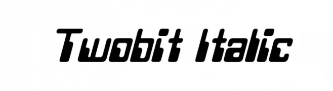
A bold, italicized font with a futuristic, digital aesthetic.
![Twobit Italic font caratteri gratis]() Scaricare 349 Downloads@WebFont
Scaricare 349 Downloads@WebFont -
![Zallia Free font caratteri gratis]() Scaricare 349 Downloads@WebFont
Scaricare 349 Downloads@WebFont -
![Biting My Nails Outline font caratteri gratis]() Scaricare 349 Downloads@WebFont
Scaricare 349 Downloads@WebFont -
![GoSheep font caratteri gratis]() Scaricare 349 Downloads@WebFont
Scaricare 349 Downloads@WebFont -
( Fonts by Arkandis Digital Foundry )
A classic serif typeface with an elegant italic slant and moderate stroke contrast.
![VenturisADFCdStyle-Italic font caratteri gratis]() Scaricare 349 Downloads@WebFont
Scaricare 349 Downloads@WebFont -
( www.davidpustansky.com/fonts )
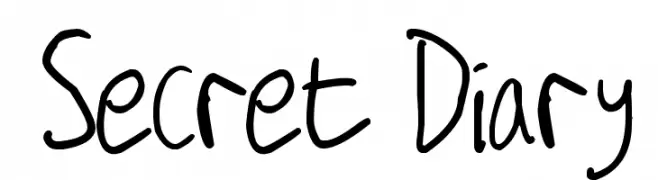
A playful, handwritten font with a casual and personal touch.
![Secret Diary font caratteri gratis]() Scaricare 349 Downloads@WebFont
Scaricare 349 Downloads@WebFont -
( Fonts by Eko Bimantara - Personal-use only. For commercial use please contact owner. )
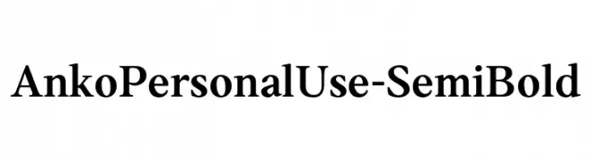
A classic serif font with semi-bold weight, offering elegance and readability.
![AnkoPersonalUse-SemiBold font caratteri gratis]() Scaricare 349 Downloads@WebFont
Scaricare 349 Downloads@WebFont -
( Fonts by Daniel Zadorozny - www.iconian.com - Free for personal use )
A bold, expanded, and futuristic font with geometric shapes and sharp angles.
![Free Agent Bold Expanded font caratteri gratis]() Scaricare 349 Downloads@WebFont
Scaricare 349 Downloads@WebFont -
( Fonts by Peter Wiegel - www.peter-wiegel.de )
A bold, playful font with thick strokes and rounded edges, ideal for impactful designs.
![WaschkuecheGrob-Ultra font caratteri gratis]() Scaricare 348 Downloads@WebFont
Scaricare 348 Downloads@WebFont -
( Fonts by Sharkshock - Personal-use only. For commercial use please contact owner. )
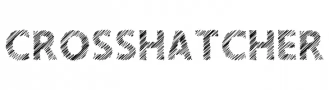
A bold, crosshatched font with a hand-drawn, artistic style.
![Crosshatcher font caratteri gratis]() Scaricare 348 Downloads@WebFont
Scaricare 348 Downloads@WebFont -
![Chinoiseries font caratteri gratis]() Scaricare 348 Downloads@WebFont
Scaricare 348 Downloads@WebFont -
( Fonts by Daniel Zadorozny - www.iconian.com )
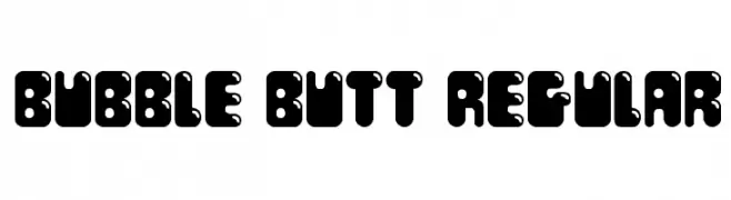
A bold, playful font with rounded, bubble-like characters and quirky cutouts.
![Bubble Butt Regular font caratteri gratis]() Scaricare 348 Downloads@WebFont
Scaricare 348 Downloads@WebFont -
( Fonts by Maelle.K - Thomas Boucherie )
A decorative dingbat font with cartoon character faces.
![Pictoserie 2 font caratteri gratis]() Scaricare 348 Downloads@WebFont
Scaricare 348 Downloads@WebFont -
( Font by Jonathan Harris - www.tattoowoo.com )
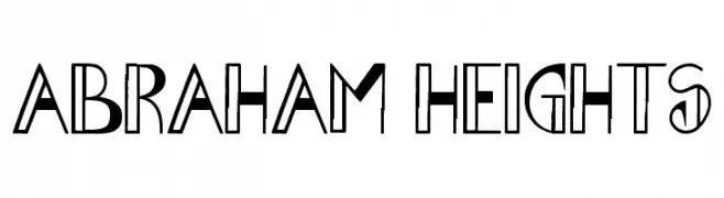
A bold, geometric font with a modern and decorative style.
![Abraham Heights font caratteri gratis]() Scaricare 348 Downloads@WebFont
Scaricare 348 Downloads@WebFont -
![Bluebird Light font caratteri gratis]() Scaricare 348 Downloads@WebFont
Scaricare 348 Downloads@WebFont -
![Tombstone Regular font caratteri gratis]() Scaricare 348 Downloads@WebFont
Scaricare 348 Downloads@WebFont -
( Fonts by Woodcutter Manero - http://www.woodcutter.es - Personal-use only. For commercial use please contact owner. )
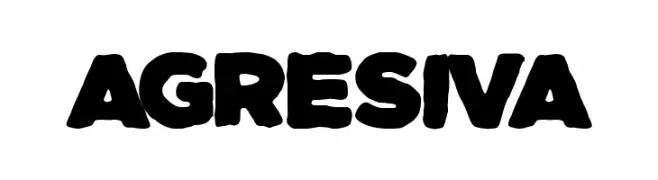
A bold, rounded font with a strong, playful presence.
![Agresiva font caratteri gratis]() Scaricare 348 Downloads@WebFont
Scaricare 348 Downloads@WebFont -
( Fonts by Darcy Baldwin - darcybaldwin.com. Free for personal use only )
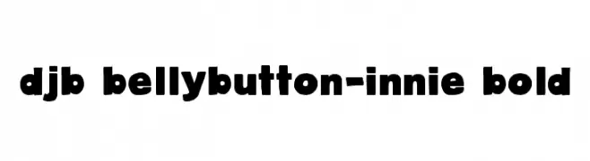
A bold, playful font with rounded edges and a chunky appearance.
![DJB BellyButton-Innie Bold font caratteri gratis]() Scaricare 348 Downloads@WebFont
Scaricare 348 Downloads@WebFont -
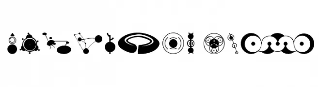
( Fonts by Astigmatic One Eye Typographic Institute - Brian J. Bonislawsky - astigmatic.com )
Abstract, crop circle-inspired dingbat font with bold geometric symbols.
![CropBats AOE font caratteri gratis]() Scaricare 348 Downloads@WebFont
Scaricare 348 Downloads@WebFont -
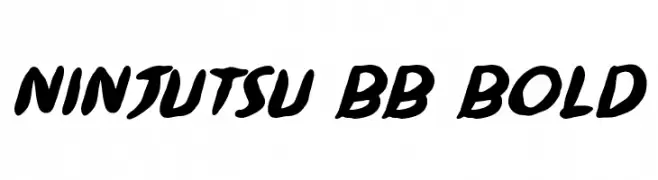
( Fonts by www.blambot.com )
A bold, brush-style font with dynamic, slanted characters and thick strokes.
![Ninjutsu BB Bold font caratteri gratis]() Scaricare 348 Downloads@WebFont
Scaricare 348 Downloads@WebFont


Quali sono i font più popolari adesso?
Poppins, Roboto, Montserrat, Open Sans e Lato sono molto usati per le forme pulite e l'ampia applicabilità — dall'identità di marca alle landing page e ai poster.
Quali font si usano spesso nei loghi?
Le sans serif geometriche (es. Poppins, famiglie in stile Gotham) sono scelte comuni per un branding pulito e scalabile. Per un tocco personale restano valide script e stili manoscritti. Abbina un display deciso per i titoli a un corpo testo neutro per riconoscibilità ed equilibrio.
Ogni quanto si aggiorna la lista?
Con regolarità, in base ai download e all'attività reale. Torna spesso per scoprire in anticipo le nuove preferite.
💡 Consiglio: aggiungi ai preferiti — le tendenze cambiano in fretta e i font top di oggi possono ispirare il rebranding di domani.