Benvenuto nelle Font Più Popolari — dove popolarità e qualità si incontrano. Qui trovi i font più scaricati e usati dell'anno. Se cerchi scelte sicure per logo, web o social, inizia da qui.
Ogni font top si distingue per equilibrio, leggibilità e versatilità. Troverai sans serif moderne, script eleganti, serif vintage e display minimalisti.
-
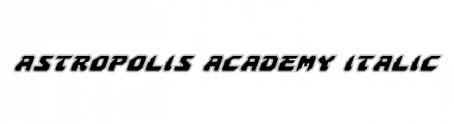
( Fonts by Daniel Zadorozny - www.iconian.com - Free for personal use )
A bold, futuristic italic font with geometric shapes and outlined characters.
 Scaricare 346 Downloads@WebFont
 -
( Iconian Fonts - Daniel Zadorozny - www.iconian.com )
A bold, expanded italic font with a modern and dynamic style.
![Classic Cobra Expanded Italic font caratteri gratis]() Scaricare 346 Downloads@WebFont
Scaricare 346 Downloads@WebFont -
( Fonts by Fillo Graphic )
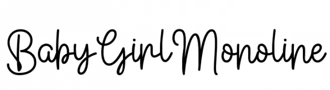
A playful and elegant monoline script font with smooth, continuous strokes.
![Baby Girl Monoline font caratteri gratis]() Scaricare 346 Downloads@WebFont
Scaricare 346 Downloads@WebFont -
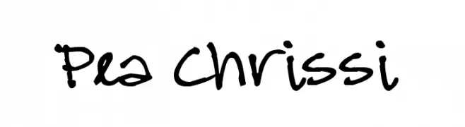
( Free for a personal use. For a commercial use please visit www.kevinandamanda.com )
A playful, casual handwritten font with irregular strokes and a lively feel.
![Pea Chrissi font caratteri gratis]() Scaricare 346 Downloads@WebFont
Scaricare 346 Downloads@WebFont -
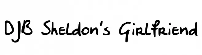
( Fonts by Darcy Baldwin - darcybaldwin.com. Free for personal use only )
A playful, casual handwritten font with a friendly vibe.
![DJB Sheldon's Girlfriend font caratteri gratis]() Scaricare 346 Downloads@WebFont
Scaricare 346 Downloads@WebFont -
![VOL font caratteri gratis]() Scaricare 346 Downloads@WebFont
Scaricare 346 Downloads@WebFont -
( Demo - www.joebob.nl )
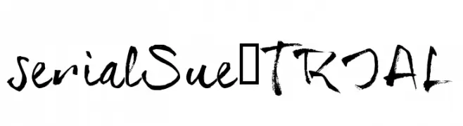
A bold, expressive handwritten font with brush-like strokes.
![serialSue_TRIAL font caratteri gratis]() Scaricare 346 Downloads@WebFont
Scaricare 346 Downloads@WebFont -
Caratteri di KongFont. For commercial use please contact the owner.
( Click the link below to purchase full version : https://creativemarket.com/kongfont https://pixelify.net/artist/kongfont/ https://www.creativefabrica.com/designer/fontkong/ )
A fluid, handwritten font with a cursive style and connected letters.
![spidol font caratteri gratis]() Scaricare 346 Downloads@WebFont
Scaricare 346 Downloads@WebFont -
( Fonts by Arkandis Digital Foundry )
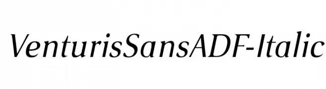
An elegant italic font with smooth curves and moderate contrast.
![VenturisSansADF-Italic font caratteri gratis]() Scaricare 346 Downloads@WebFont
Scaricare 346 Downloads@WebFont -
( Fonts by Galdino Otten Fonts - www.galdinootten.com - Personal-use only. For commercial use please contact owner. )
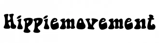
A bold, playful font with a retro, 1960s hippie vibe.
![Hippie movement font caratteri gratis]() Scaricare 346 Downloads@WebFont
Scaricare 346 Downloads@WebFont -
( Fonts by Darcy Baldwin - darcybaldwin.com. Free for personal use only )
A whimsical, hand-drawn font with a magical, playful style.
![DJB Im No Wizard font caratteri gratis]() Scaricare 346 Downloads@WebFont
Scaricare 346 Downloads@WebFont -
( Fonts by Mikael Santos )
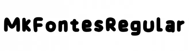
A playful, rounded font with bold, smooth curves and a friendly appearance.
![Mk Fontes Regular font caratteri gratis]() Scaricare 346 Downloads@WebFont
Scaricare 346 Downloads@WebFont -
( Fonts by Daniel Zadorozny - www.iconian.com )
A bold, blocky font with a strong geometric design.
![Interceptor Bold font caratteri gratis]() Scaricare 346 Downloads@WebFont
Scaricare 346 Downloads@WebFont -
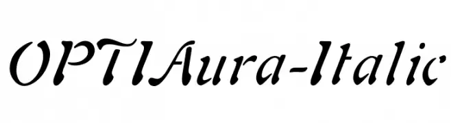
( Fonts by Castcraft Software - opti.netii.net - check the website before use )
An elegant italic font with flowing, cursive strokes and a moderate slant.
![OPTIAura-Italic font caratteri gratis]() Scaricare 346 Downloads@WebFont
Scaricare 346 Downloads@WebFont -
![HeartExplosion font caratteri gratis]() Scaricare 345 Downloads@WebFont
Scaricare 345 Downloads@WebFont -
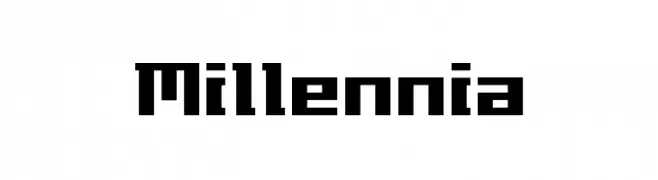
( Fonts by www.fonthead.com )
A bold, geometric font with a futuristic, digital design.
![Millennia font caratteri gratis]() Scaricare 345 Downloads@WebFont
Scaricare 345 Downloads@WebFont -
![Lower-WestSide font caratteri gratis]() Scaricare 345 Downloads
Scaricare 345 Downloads -
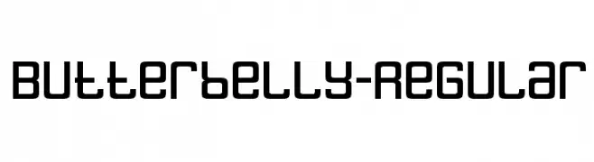
( Fonts by www.typodermicfonts.com - Ray Larabie )
A bold, geometric font with rounded edges and a modern, friendly appearance.
![Butterbelly-Regular font caratteri gratis]() Scaricare 345 Downloads@WebFont
Scaricare 345 Downloads@WebFont -
![Minami font caratteri gratis]() Scaricare 345 Downloads@WebFont
Scaricare 345 Downloads@WebFont -
( Zetafonts - www.zetafonts.com )
A bold, modern sans-serif font with a compressed width and clean, geometric design.
![Cocogoose Compressed Trial Semilight font caratteri gratis]() Scaricare 345 Downloads@WebFont
Scaricare 345 Downloads@WebFont -
( Fonts by Daniel Gauthier )
A playful, handwritten font with tall, narrow letters and bold strokes.
![Jenna font caratteri gratis]() Scaricare 345 Downloads@WebFont
Scaricare 345 Downloads@WebFont -
![A Childish Wonders font caratteri gratis]() Scaricare 345 Downloads@WebFont
Scaricare 345 Downloads@WebFont -
( Fonts by Woodcutter )
A playful, bold font with rounded edges and a hand-drawn appearance.
![Pop Summer Fest font caratteri gratis]() Scaricare 345 Downloads@WebFont
Scaricare 345 Downloads@WebFont -
( Fonts by Thais Trizoli - www.behance.net/thaistrizoli )
A modern, rounded font with uniform stroke width and excellent readability.
![Discreet SemiBold font caratteri gratis]() Scaricare 345 Downloads@WebFont
Scaricare 345 Downloads@WebFont -
( Fonts by MuraKnockout Media + Design - muraknockout.com. Personal-use only. For commercial use please contact owner. )
A modern, geometric font with clean lines and a minimalist aesthetic.
![Ciudad Nueva CAPS font caratteri gratis]() Scaricare 345 Downloads@WebFont
Scaricare 345 Downloads@WebFont -
( charmingcharlie.co.nr/ )
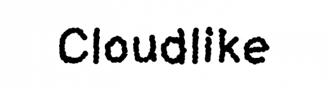
A playful, cloud-textured font with a whimsical and approachable style.
![Cloudlike font caratteri gratis]() Scaricare 345 Downloads@WebFont
Scaricare 345 Downloads@WebFont -
( Fonts by Dieter Steffmann )
A bold, dramatic Blackletter-style font with thick, angular strokes.
![Neptun font caratteri gratis]() Scaricare 345 Downloads@WebFont
Scaricare 345 Downloads@WebFont -
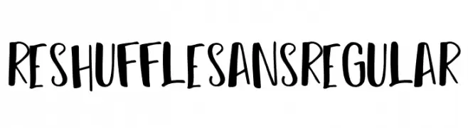
( Fonts by Dirtyline Studio )
A playful, hand-drawn font with bold, rounded strokes and a casual style.
![Reshuffle Sans Regular font caratteri gratis]() Scaricare 345 Downloads@WebFont
Scaricare 345 Downloads@WebFont -
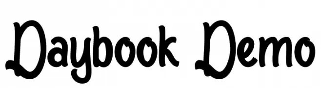
( Fonts by Noah Type - noahtype.com - Personal-use only. For commercial use please contact owner. )
A bold, playful handwritten font with thick strokes and rounded edges.
![Daybook Demo font caratteri gratis]() Scaricare 345 Downloads@WebFont
Scaricare 345 Downloads@WebFont -
( Fonts by wep )
A bold, handwritten font with a playful and energetic style.
![Imong font caratteri gratis]() Scaricare 345 Downloads@WebFont
Scaricare 345 Downloads@WebFont -
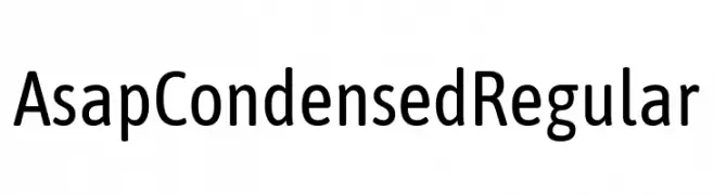
( Fonts by Omnibus Type )
A modern, condensed sans-serif font with excellent legibility and space efficiency.
![Asap Condensed Regular font caratteri gratis]() Scaricare 345 Downloads@WebFont
Scaricare 345 Downloads@WebFont -
( Fonts by Alde Saputro - aldedesign - https://www.creativefabrica.com/product/the-crafty-holiday-font-bundle/ref/125925/ - Personal-use only. For commercial use please contact owner. )
An elegant script font with flowing, ornate swashes and a romantic style.
![Arellia font caratteri gratis]() Scaricare 345 Downloads@WebFont
Scaricare 345 Downloads@WebFont -
( Fonts by Manfred Klein. Free for private and charity use. Free for commercial with donation to organizations )
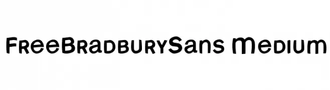
A playful, bold font with rounded edges and a hand-drawn feel.
![FreeBradburySans Medium font caratteri gratis]() Scaricare 345 Downloads@WebFont
Scaricare 345 Downloads@WebFont -
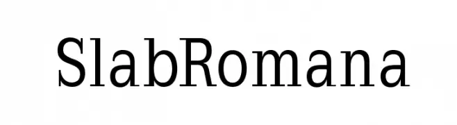
( Fonts by Manfred Klein - manfred-klein.ina-mar.com )
A bold, structured slab serif font with uniform stroke widths and block-like serifs.
![SlabRomana font caratteri gratis]() Scaricare 345 Downloads@WebFont
Scaricare 345 Downloads@WebFont -
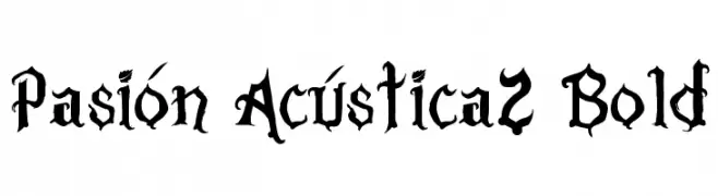
Caratteri di JuanCasco. For commercial use please contact the owner.
( Fonts by Juan Casco - www.juancasco.net )
A bold, gothic-style font with intricate, angular detailing.
![Pasión Acústica2 Bold font caratteri gratis]() Scaricare 345 Downloads@WebFont
Scaricare 345 Downloads@WebFont


Quali sono i font più popolari adesso?
Poppins, Roboto, Montserrat, Open Sans e Lato sono molto usati per le forme pulite e l'ampia applicabilità — dall'identità di marca alle landing page e ai poster.
Quali font si usano spesso nei loghi?
Le sans serif geometriche (es. Poppins, famiglie in stile Gotham) sono scelte comuni per un branding pulito e scalabile. Per un tocco personale restano valide script e stili manoscritti. Abbina un display deciso per i titoli a un corpo testo neutro per riconoscibilità ed equilibrio.
Ogni quanto si aggiorna la lista?
Con regolarità, in base ai download e all'attività reale. Torna spesso per scoprire in anticipo le nuove preferite.
💡 Consiglio: aggiungi ai preferiti — le tendenze cambiano in fretta e i font top di oggi possono ispirare il rebranding di domani.