Benvenuto nelle Font Più Popolari — dove popolarità e qualità si incontrano. Qui trovi i font più scaricati e usati dell'anno. Se cerchi scelte sicure per logo, web o social, inizia da qui.
Ogni font top si distingue per equilibrio, leggibilità e versatilità. Troverai sans serif moderne, script eleganti, serif vintage e display minimalisti.
-
( گالری فانت فارسی پژوهش آريانا - only compatible with Farsi and Arabic )
A bold, geometric font with a modern, industrial aesthetic.
 Scaricare 344 Downloads@WebFont
 -
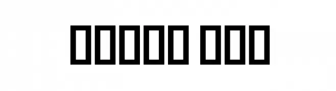
![JMHDecornaCaps-Regular font caratteri gratis]() Scaricare 344 Downloads@WebFont
Scaricare 344 Downloads@WebFont -
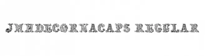
( Fonts by Steve Cloutier - www.cloutierfontes.ca )
A playful, handwritten font with a modern and clean appearance.
![CF Simeon Marchessault Regular font caratteri gratis]() Scaricare 344 Downloads@WebFont
Scaricare 344 Downloads@WebFont -
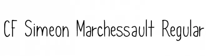
( Fonts by Philatype - Personal-use only. For commercial use please contact owner. )
A bold, angular font with a modern geometric style.
![Regalia Free Regular font caratteri gratis]() Scaricare 344 Downloads@WebFont
Scaricare 344 Downloads@WebFont -
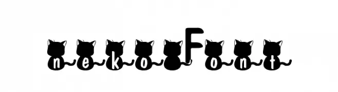
![nekoFont font caratteri gratis]() Scaricare 344 Downloads@WebFont
Scaricare 344 Downloads@WebFont -
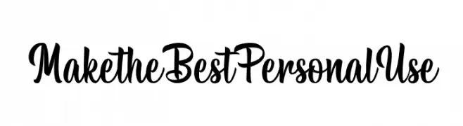
( Fonts by Typhoon Type - Suthi Srisopha - www.typhoontype.net - Personal-use only. For commercial use please contact owner. )
A playful and elegant script font with smooth, flowing curves.
![MaketheBestPersonalUse font caratteri gratis]() Scaricare 344 Downloads@WebFont
Scaricare 344 Downloads@WebFont -
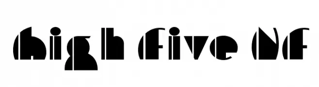
( Fonts by Nick Curtis - www.nicksfonts.com )
A bold, geometric font with Art Deco influences and unique cutout designs.
![High Five NF font caratteri gratis]() Scaricare 344 Downloads@WebFont
Scaricare 344 Downloads@WebFont -
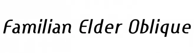
( Fonts by Hideki Katayama - com4t-fff.seesaa.net )
A modern, oblique font with clean lines and a dynamic style.
![Familian Elder Oblique font caratteri gratis]() Scaricare 344 Downloads@WebFont
Scaricare 344 Downloads@WebFont -
( Fonts by Daniel Zadorozny - www.iconian.com )
A futuristic, narrow font with consistent stroke widths and a modern aesthetic.
![Alien League Condensed font caratteri gratis]() Scaricare 344 Downloads@WebFont
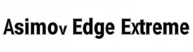
Scaricare 344 Downloads@WebFont -
![Asimov Edge Extreme font caratteri gratis]() Scaricare 344 Downloads@WebFont
Scaricare 344 Downloads@WebFont -
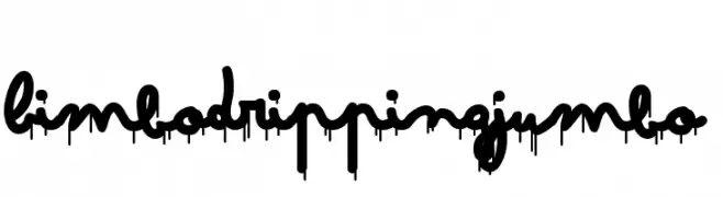
( Zetafonts - www.zetafonts.com )
A playful cursive font with a dripping effect, perfect for creative projects.
![Bimbo Dripping Jumbo font caratteri gratis]() Scaricare 344 Downloads@WebFont
Scaricare 344 Downloads@WebFont -
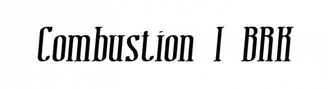
( Fonts by www.aenigmafonts.com )
A bold, dynamic font with a slant and sharp serifs, ideal for impactful designs.
![Combustion I BRK font caratteri gratis]() Scaricare 344 Downloads@WebFont
Scaricare 344 Downloads@WebFont -
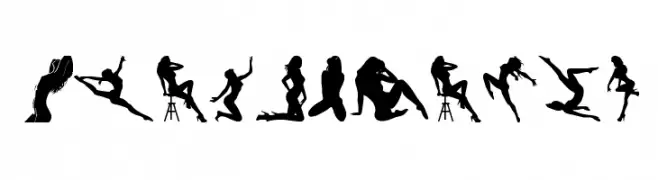
( Fonts by bob istheowl http://luc.devroye.org/bobistheowl.html )
A display font featuring artistic female silhouettes as characters.
![BeautyMarks font caratteri gratis]() Scaricare 344 Downloads@WebFont
Scaricare 344 Downloads@WebFont -
( Fonts by Arkandis Digital Foundry )
A classic serif font with elegant italic styling and moderate contrast.
![AccanthisADFStdNo2-BoldItalic font caratteri gratis]() Scaricare 344 Downloads@WebFont
Scaricare 344 Downloads@WebFont -
( Fonts by billyargel.blogspot.com - Billy Argel )
A casual, handwritten cursive font with smooth, connected strokes.
![BEER NOTE TRIAL font caratteri gratis]() Scaricare 344 Downloads@WebFont
Scaricare 344 Downloads@WebFont -
![Im Wunderland font caratteri gratis]() Scaricare 344 Downloads@WebFont
Scaricare 344 Downloads@WebFont -
( Fonts by Hanoded )
A bold, hand-drawn font with a rough, expressive style.
![DK Crowbar Regular font caratteri gratis]() Scaricare 344 Downloads@WebFont
Scaricare 344 Downloads@WebFont -
( Copyright (c) 2015, Cadson Demak (info@cadsondemak.com) )
A modern serif font with elegant proportions and balanced stroke contrast.
![Maitree Light font caratteri gratis]() Scaricare 344 Downloads@WebFont
Scaricare 344 Downloads@WebFont -
( Fonts by www.chequered.ink - Chequered Ink - Personal-use only. For commercial use please contact owner. )
A bold, geometric stencil font with a modern industrial style.
![Roll Accurate font caratteri gratis]() Scaricare 344 Downloads@WebFont
Scaricare 344 Downloads@WebFont -
![Ingleby Bold Italic font caratteri gratis]() Scaricare 344 Downloads@WebFont
Scaricare 344 Downloads@WebFont -
![Smally Rose Free font caratteri gratis]() Scaricare 344 Downloads@WebFont
Scaricare 344 Downloads@WebFont -
( Fonts by Eddy Goodboy )
Playful, bold handwritten font.
![Behind Scene font caratteri gratis]() Scaricare 344 Downloads@WebFont
Scaricare 344 Downloads@WebFont -
![Ice Sans Compressed Bold font caratteri gratis]() Scaricare 344 Downloads@WebFont
Scaricare 344 Downloads@WebFont -
( Fonts by Jacob Fisher - www.pizzadude.dk )
A bold, playful font with quirky, uneven characters.
![Massive Headache font caratteri gratis]() Scaricare 344 Downloads@WebFont
Scaricare 344 Downloads@WebFont -
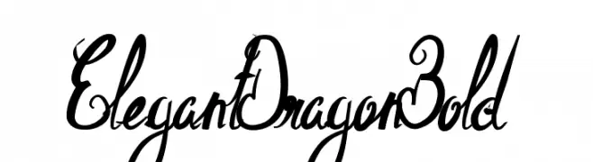
![ElegantDragonBold font caratteri gratis]() Scaricare 344 Downloads@WebFont
Scaricare 344 Downloads@WebFont -
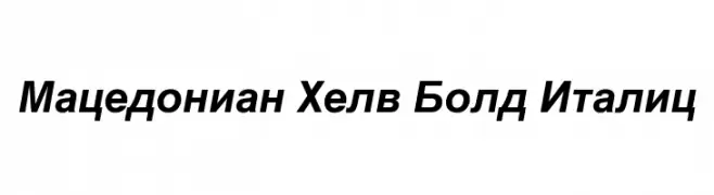
![Macedonian Helv Bold Italic font caratteri gratis]() Scaricare 344 Downloads@WebFont
Scaricare 344 Downloads@WebFont -
( Font by Jonathan Harris - www.tattoowoo.com )
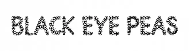
A playful, circular-themed font with a bubbly and dynamic appearance.
![Black Eye Peas font caratteri gratis]() Scaricare 344 Downloads@WebFont
Scaricare 344 Downloads@WebFont -
( Fonts by www.fontalicious.com )
A futuristic, geometric font with a bold, digital aesthetic.
![Digit Cube font caratteri gratis]() Scaricare 344 Downloads@WebFont
Scaricare 344 Downloads@WebFont -
( Fonts by Octotype - www.foundmyfont.com - Personal-use only. For commercial use please contact owner. )
A bold, vintage-style font with a strong, commanding presence.
![Bien dans mon Slip font caratteri gratis]() Scaricare 344 Downloads@WebFont
Scaricare 344 Downloads@WebFont -
![Springtime in April font caratteri gratis]() Scaricare 344 Downloads@WebFont
Scaricare 344 Downloads@WebFont -
( Fonts by Daniel Zadorozny - www.iconian.com - Free for personal use )
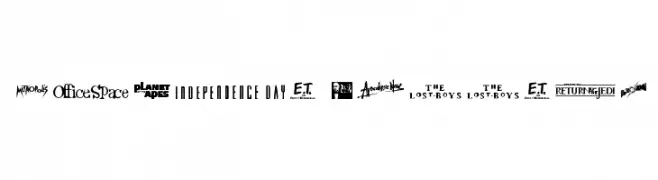
A display font where each character is styled after a famous movie logo.
![Movie Gallery font caratteri gratis]() Scaricare 344 Downloads@WebFont
Scaricare 344 Downloads@WebFont -
( Fonts by Graphicfresh - Personal-use only. For commercial use please contact owner. )
A bold, geometric sans-serif font with uniform strokes and a modern look.
![Edmund-Free font caratteri gratis]() Scaricare 344 Downloads@WebFont
Scaricare 344 Downloads@WebFont -
( Fonts by Scratchones )
Decorative script font with elegant, flowing lines.
![Olive Oil font caratteri gratis]() Scaricare 344 Downloads@WebFont
Scaricare 344 Downloads@WebFont -
( Fonts by Typographer Mediengestaltung - Personal-use only. For commercial use please contact owner. )
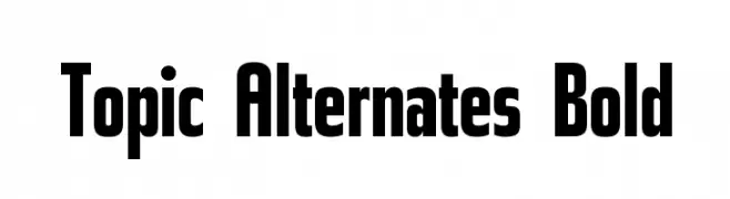
A bold, geometric sans-serif font with a modern and assertive style.
![Topic Alternates Bold font caratteri gratis]() Scaricare 344 Downloads@WebFont
Scaricare 344 Downloads@WebFont -
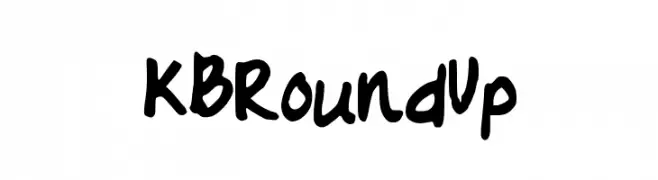
![KBRoundUp font caratteri gratis]() Scaricare 343 Downloads@WebFont
Scaricare 343 Downloads@WebFont


Quali sono i font più popolari adesso?
Poppins, Roboto, Montserrat, Open Sans e Lato sono molto usati per le forme pulite e l'ampia applicabilità — dall'identità di marca alle landing page e ai poster.
Quali font si usano spesso nei loghi?
Le sans serif geometriche (es. Poppins, famiglie in stile Gotham) sono scelte comuni per un branding pulito e scalabile. Per un tocco personale restano valide script e stili manoscritti. Abbina un display deciso per i titoli a un corpo testo neutro per riconoscibilità ed equilibrio.
Ogni quanto si aggiorna la lista?
Con regolarità, in base ai download e all'attività reale. Torna spesso per scoprire in anticipo le nuove preferite.
💡 Consiglio: aggiungi ai preferiti — le tendenze cambiano in fretta e i font top di oggi possono ispirare il rebranding di domani.