Benvenuto nelle Font Più Popolari — dove popolarità e qualità si incontrano. Qui trovi i font più scaricati e usati dell'anno. Se cerchi scelte sicure per logo, web o social, inizia da qui.
Ogni font top si distingue per equilibrio, leggibilità e versatilità. Troverai sans serif moderne, script eleganti, serif vintage e display minimalisti.
-
( Free for a personal use. For a commercial use please visit www.kevinandamanda.com )
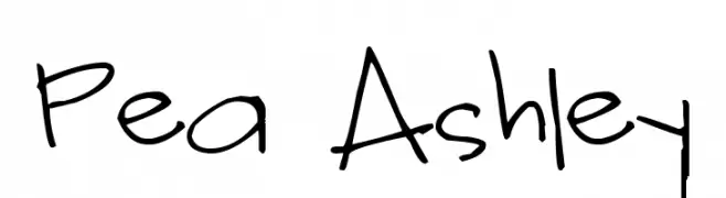
A playful, casual handwritten font with a lively and informal style.
 Scaricare 343 Downloads@WebFont
 -
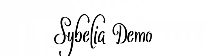
![Sybelia Demo font caratteri gratis]() Scaricare 343 Downloads@WebFont
Scaricare 343 Downloads@WebFont -
( James Barnardo )
A modern, geometric font with clean lines and uniform stroke width.
![Radiometry font caratteri gratis]() Scaricare 343 Downloads@WebFont
Scaricare 343 Downloads@WebFont -
( Fonts by Daniel Zadorozny - www.iconian.com )
A bold, military-inspired font with geometric, star-adorned characters.
![Army Rangers Expanded font caratteri gratis]() Scaricare 343 Downloads@WebFont
Scaricare 343 Downloads@WebFont -
( Thirtypath - www.thirtypath.com )
A flowing, cursive font with an elegant and sophisticated style.
![Rommantis font caratteri gratis]() Scaricare 343 Downloads@WebFont
Scaricare 343 Downloads@WebFont -
( Fonts by David Kerkhoff - www.hanodedphotography.com )
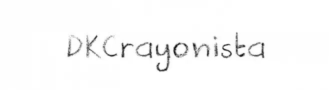
A playful, crayon-like font with a hand-drawn, textured appearance.
![DKCrayonista font caratteri gratis]() Scaricare 343 Downloads@WebFont
Scaricare 343 Downloads@WebFont -
( Fonts by Velvetyne Type Foundry - Personal-use only. For commercial use please contact owner. )
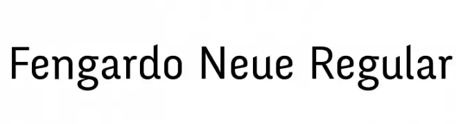
A clean, modern typeface with geometric structure and uniform stroke widths.
![Fengardo Neue Regular font caratteri gratis]() Scaricare 343 Downloads@WebFont
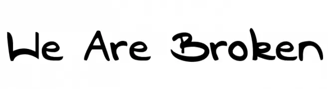
Scaricare 343 Downloads@WebFont -
![We Are Broken font caratteri gratis]() Scaricare 343 Downloads@WebFont
Scaricare 343 Downloads@WebFont -
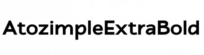
( Fonts by Situjuh Nazara - 7ntypes.com - Personal-use only. For commercial use please contact owner. )
A bold, modern sans-serif font with clean lines and geometric shapes.
![Atozimple ExtraBold font caratteri gratis]() Scaricare 343 Downloads@WebFont
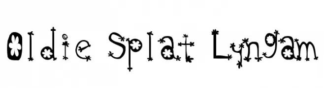
Scaricare 343 Downloads@WebFont -
![Oldie Splat Lyngam font caratteri gratis]() Scaricare 343 Downloads@WebFont
Scaricare 343 Downloads@WebFont -
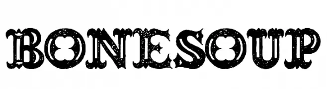
( billyargel.blogspot.com/ )
A bold, textured font with a rugged, distressed appearance.
![BONESOUP font caratteri gratis]() Scaricare 343 Downloads@WebFont
Scaricare 343 Downloads@WebFont -
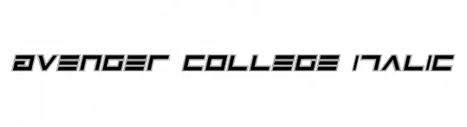
( Fonts by Daniel Zadorozny - www.iconian.com )
A bold, italicized font with a futuristic, dynamic style and three-dimensional effect.
![Avenger College Italic font caratteri gratis]() Scaricare 343 Downloads@WebFont
Scaricare 343 Downloads@WebFont -
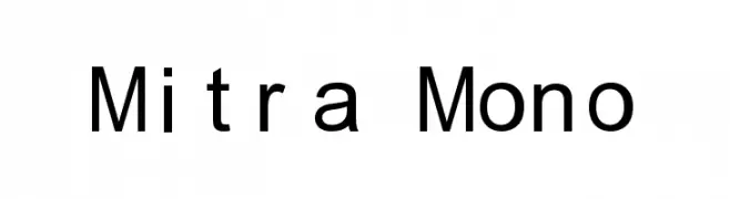
( Fonts by Dr Anirban Mitra - Personal-use only. For commercial use please contact owner. )
A clean, monospaced font ideal for coding and technical documents.
![Mitra Mono font caratteri gratis]() Scaricare 343 Downloads@WebFont
Scaricare 343 Downloads@WebFont -
( Archetype )
A bold, geometric font with angular, blocky characters.
![Tough Love Display font caratteri gratis]() Scaricare 343 Downloads@WebFont
Scaricare 343 Downloads@WebFont -
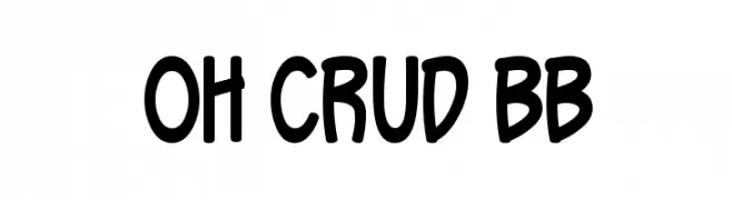
( Blambot - www.blambot.com )
A playful, bold font with rounded edges and a hand-drawn style.
![Oh Crud BB font caratteri gratis]() Scaricare 343 Downloads@WebFont
Scaricare 343 Downloads@WebFont -
( Michael Gaines )
A modern, geometric font with rounded edges and circular cutouts, offering a playful yet clean aesthetic.
![Lou Gramm font caratteri gratis]() Scaricare 343 Downloads@WebFont
Scaricare 343 Downloads@WebFont -
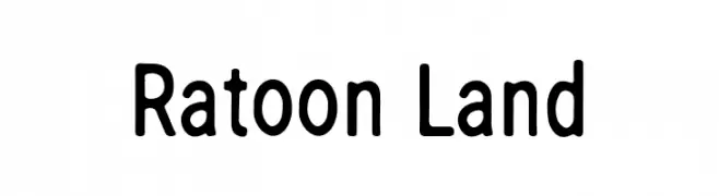
( Fonts by Raafi Hilmi - Eurieas - Personal-use only. For commercial use please contact owner. )
A playful, rounded font with smooth curves and a friendly appearance.
![Ratoon Land font caratteri gratis]() Scaricare 343 Downloads@WebFont
Scaricare 343 Downloads@WebFont -
![CartaMagna-Line font caratteri gratis]() Scaricare 343 Downloads@WebFont
Scaricare 343 Downloads@WebFont -
( Fonts by Rick Mueller )
A bold, decorative font with ocean-themed wave patterns and a 3D effect.
![Ocean View Initials font caratteri gratis]() Scaricare 343 Downloads@WebFont
Scaricare 343 Downloads@WebFont -
( imagex - www.imagex-fonts.com )
A bold, distressed font with jagged, irregular shapes for a dramatic effect.
![Blood'n Guts font caratteri gratis]() Scaricare 343 Downloads@WebFont
Scaricare 343 Downloads@WebFont -
( Fonts by www.blambot.com )
A bold, distressed font with a rugged, textured appearance.
![FireFight BB font caratteri gratis]() Scaricare 343 Downloads@WebFont
Scaricare 343 Downloads@WebFont -
( Fonts by Andre Berg. Personal-use only. For commercial use please contact owner. )
A modern, monospaced italic font with medium contrast and balanced spacing.
![Meslo LG M DZ Italic font caratteri gratis]() Scaricare 343 Downloads@WebFont
Scaricare 343 Downloads@WebFont -
( Fonts by D K )
A playful, hand-drawn font with bold, rounded characters and unique rabbit silhouettes.
![Brer Rabbit DEMO Regular font caratteri gratis]() Scaricare 343 Downloads@WebFont
Scaricare 343 Downloads@WebFont -
( Fonts by Hector Gatti & Omnibus-Type (original fonts) / Cristiano Sobral (main changes and remastering) - Personal-use only. For commercial use please contact owner. )
A modern sans-serif font with semi-bold weight and italic style, offering clarity and dynamic appeal.
![Azeri Sans SemiBold Italic font caratteri gratis]() Scaricare 343 Downloads@WebFont
Scaricare 343 Downloads@WebFont -
![io font caratteri gratis]() Scaricare 343 Downloads@WebFont
Scaricare 343 Downloads@WebFont -
( Fonts by TarmSaft Font Factory - http://www.aska.nu/tarmsaft/ )
A modern, rounded sans-serif font with a friendly and approachable style.
![Pungen font caratteri gratis]() Scaricare 343 Downloads@WebFont
Scaricare 343 Downloads@WebFont -
( Fonts by Vz Type )
A bold, playful font with a hand-drawn, cartoonish style.
![Mencran! font caratteri gratis]() Scaricare 343 Downloads@WebFont
Scaricare 343 Downloads@WebFont -
( Here Be Monsters - monsterswithin.com )
A bold, geometric font with diagonal stripes and a modern, futuristic look.
![Razed Trend font caratteri gratis]() Scaricare 343 Downloads@WebFont
Scaricare 343 Downloads@WebFont -
![612KosheyLine-Bold font caratteri gratis]() Scaricare 343 Downloads@WebFont
Scaricare 343 Downloads@WebFont -
( Fonts by Fikry Alif - Fikryal studio - https://www.creativefabrica.com/designer/mfikryalif/ref/222304/ - Personal-use only. For commercial use please contact owner. )
A lively handwritten font with fluid strokes and playful elegance.
![Reactin font caratteri gratis]() Scaricare 343 Downloads@WebFont
Scaricare 343 Downloads@WebFont -
( Fonts by Syaf Rizal - www.creativefabrica.com/ref/53/ - Personal-use only. For commercial use please contact owner. )
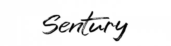
A dynamic, brush-style font with expressive and fluid strokes.
![Sentury font caratteri gratis]() Scaricare 343 Downloads@WebFont
Scaricare 343 Downloads@WebFont -
Caratteri di fontsnthings. For commercial use please contact the owner.
![Cut Outs for 3D FX font caratteri gratis]() Scaricare 343 Downloads@WebFont
Scaricare 343 Downloads@WebFont -
Caratteri di wowresponsivethemes_com. For commercial use please contact the owner.
![Leafs font caratteri gratis]() Scaricare 343 Downloads@WebFont
Scaricare 343 Downloads@WebFont -
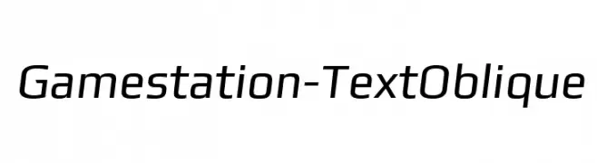
![Gamestation-TextOblique font caratteri gratis]() Scaricare 343 Downloads@WebFont
Scaricare 343 Downloads@WebFont -
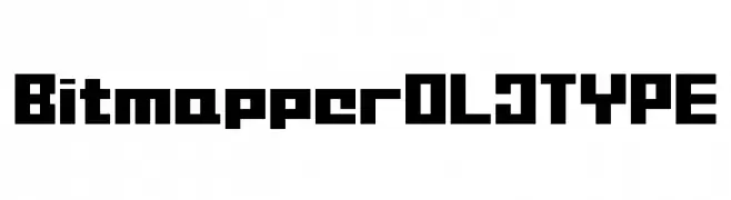
![BitmapperOLDTYPE font caratteri gratis]() Scaricare 343 Downloads@WebFont
Scaricare 343 Downloads@WebFont


Quali sono i font più popolari adesso?
Poppins, Roboto, Montserrat, Open Sans e Lato sono molto usati per le forme pulite e l'ampia applicabilità — dall'identità di marca alle landing page e ai poster.
Quali font si usano spesso nei loghi?
Le sans serif geometriche (es. Poppins, famiglie in stile Gotham) sono scelte comuni per un branding pulito e scalabile. Per un tocco personale restano valide script e stili manoscritti. Abbina un display deciso per i titoli a un corpo testo neutro per riconoscibilità ed equilibrio.
Ogni quanto si aggiorna la lista?
Con regolarità, in base ai download e all'attività reale. Torna spesso per scoprire in anticipo le nuove preferite.
💡 Consiglio: aggiungi ai preferiti — le tendenze cambiano in fretta e i font top di oggi possono ispirare il rebranding di domani.