Benvenuto nelle Font Più Popolari — dove popolarità e qualità si incontrano. Qui trovi i font più scaricati e usati dell'anno. Se cerchi scelte sicure per logo, web o social, inizia da qui.
Ogni font top si distingue per equilibrio, leggibilità e versatilità. Troverai sans serif moderne, script eleganti, serif vintage e display minimalisti.
-
( Fonts by Zetafonts - Personal-use only. For commercial use please contact owner. )
A modern, narrow, semilight italic font with clean lines and excellent readability.
 Scaricare 342 Downloads@WebFont
 -
( Fonts by Rick Mueller )
A bold, decorative font with ocean-themed wave patterns and a 3D effect.
![Ocean View Initials font caratteri gratis]() Scaricare 342 Downloads@WebFont
Scaricare 342 Downloads@WebFont -
( Fonts by www.junkohanhero.com - Personal-use only. For commercial use please contact owner. )
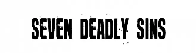
A bold, distressed font with a vintage, grunge aesthetic.
![Seven deadly sins font caratteri gratis]() Scaricare 342 Downloads@WebFont
Scaricare 342 Downloads@WebFont -
( imagex - www.imagex-fonts.com )
A bold, distressed font with jagged, irregular shapes for a dramatic effect.
![Blood'n Guts font caratteri gratis]() Scaricare 342 Downloads@WebFont
Scaricare 342 Downloads@WebFont -
( Fonts by www.gliphmaker.com. Personal-use only. For commercial use please contact owner. )
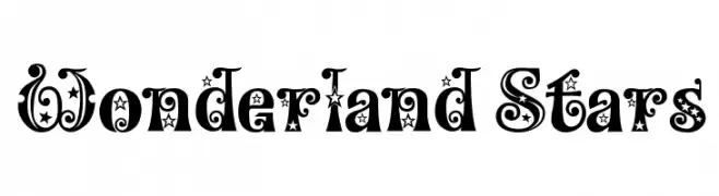
A whimsical, star-studded decorative font with bold, ornate characters.
![Wonderland Stars font caratteri gratis]() Scaricare 342 Downloads@WebFont
Scaricare 342 Downloads@WebFont -
( Zachary Lucier )
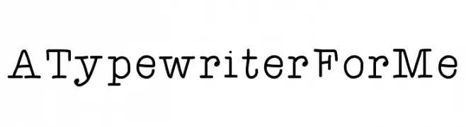
A classic typewriter-style font with monospaced, evenly spaced characters.
![ATypewriterForMe font caratteri gratis]() Scaricare 342 Downloads@WebFont
Scaricare 342 Downloads@WebFont -
( Fonts by Apostrophic Lab )
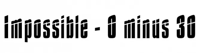
A bold, condensed font with a dynamic and striking appearance.
![Impossible - 0 minus 30 font caratteri gratis]() Scaricare 342 Downloads@WebFont
Scaricare 342 Downloads@WebFont -
( Fonts by TarmSaft Font Factory - http://www.aska.nu/tarmsaft/ )
A modern, rounded sans-serif font with a friendly and approachable style.
![Pungen font caratteri gratis]() Scaricare 342 Downloads@WebFont
Scaricare 342 Downloads@WebFont -
( Fonts by Muhammad Yafinuha )
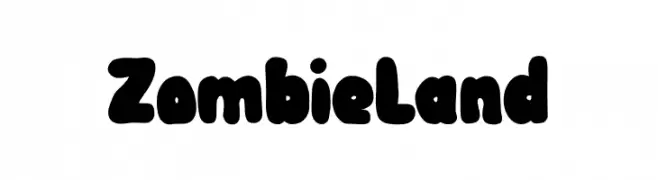
A bold, playful font with thick, rounded characters and a whimsical style.
![Zombie Land font caratteri gratis]() Scaricare 342 Downloads@WebFont
Scaricare 342 Downloads@WebFont -
![Fairland font caratteri gratis]() Scaricare 342 Downloads@WebFont
Scaricare 342 Downloads@WebFont -
( Fonts by Fikry Alif - Fikryal studio - https://www.creativefabrica.com/designer/mfikryalif/ref/222304/ - Personal-use only. For commercial use please contact owner. )
A lively handwritten font with fluid strokes and playful elegance.
![Reactin font caratteri gratis]() Scaricare 342 Downloads@WebFont
Scaricare 342 Downloads@WebFont -
( Fonts by Syaf Rizal - www.creativefabrica.com/ref/53/ - Personal-use only. For commercial use please contact owner. )
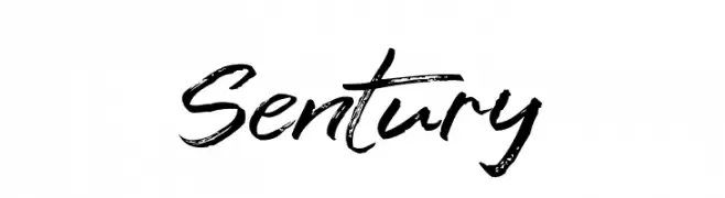
A dynamic, brush-style font with expressive and fluid strokes.
![Sentury font caratteri gratis]() Scaricare 342 Downloads@WebFont
Scaricare 342 Downloads@WebFont -
Caratteri di fontsnthings. For commercial use please contact the owner.
![Cut Outs for 3D FX font caratteri gratis]() Scaricare 342 Downloads@WebFont
Scaricare 342 Downloads@WebFont -
( Iconian Fonts - Daniel Zadorozny - www.iconian.com )
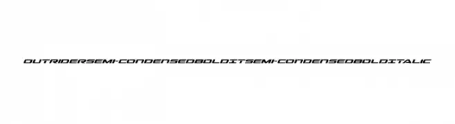
A bold, italicized, semi-condensed font with a modern and dynamic style.
![Outrider Semi-Condensed Bold It Semi-Condensed Bold Italic font caratteri gratis]() Scaricare 342 Downloads@WebFont
Scaricare 342 Downloads@WebFont -
( Fonts by Misti's Fonts )
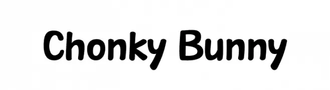
A playful, bold font with rounded edges and a friendly appearance.
![Chonky Bunny font caratteri gratis]() Scaricare 342 Downloads@WebFont
Scaricare 342 Downloads@WebFont -
![Geek Skinny font caratteri gratis]() Scaricare 342 Downloads@WebFont
Scaricare 342 Downloads@WebFont -
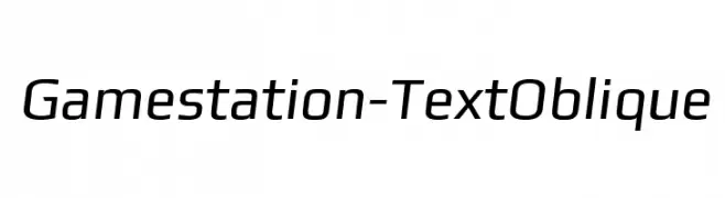
![Gamestation-TextOblique font caratteri gratis]() Scaricare 342 Downloads@WebFont
Scaricare 342 Downloads@WebFont -
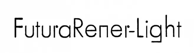
![FuturaRener-Light font caratteri gratis]() Scaricare 342 Downloads@WebFont
Scaricare 342 Downloads@WebFont -
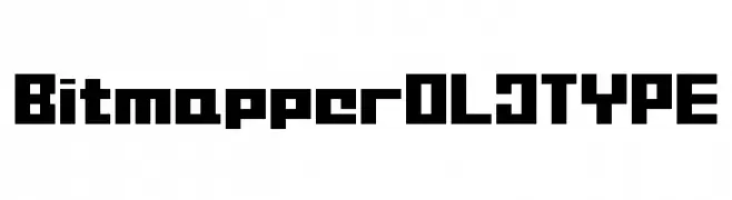
![BitmapperOLDTYPE font caratteri gratis]() Scaricare 342 Downloads@WebFont
Scaricare 342 Downloads@WebFont -
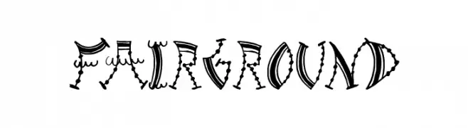
( Font by Jonathan Harris - www.tattoowoo.com )
A whimsical, decorative font inspired by vintage fairground signage.
![Fairground font caratteri gratis]() Scaricare 342 Downloads@WebFont
Scaricare 342 Downloads@WebFont -
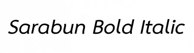
( Copyright (c) 2010-2013 by Software Industry Promotion Agency (Public Organization) (SIPA). All rights reserved. )
A bold, italic sans-serif font with a modern and dynamic style.
![Sarabun Bold Italic font caratteri gratis]() Scaricare 342 Downloads@WebFont
Scaricare 342 Downloads@WebFont -
( Free for a personal use. For a commercial use please visit www.kevinandamanda.com )
A playful, casual handwritten font with an organic and dynamic style.
![Pea Mandy font caratteri gratis]() Scaricare 342 Downloads@WebFont
Scaricare 342 Downloads@WebFont -
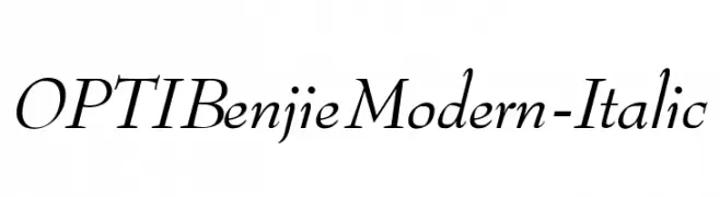
( Fonts by Castcraft Software - opti.netii.net - check the website before use )
A modern, elegant italic font with medium contrast and sharp serifs.
![OPTIBenjieModern-Italic font caratteri gratis]() Scaricare 342 Downloads@WebFont
Scaricare 342 Downloads@WebFont -
![mince font caratteri gratis]() Scaricare 342 Downloads@WebFont
Scaricare 342 Downloads@WebFont -
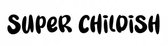
( Fonts by fsuarez913 )
A playful, bold font with rounded, bubbly characters and a hand-drawn feel.
![Super Childish font caratteri gratis]() Scaricare 342 Downloads@WebFont
Scaricare 342 Downloads@WebFont -
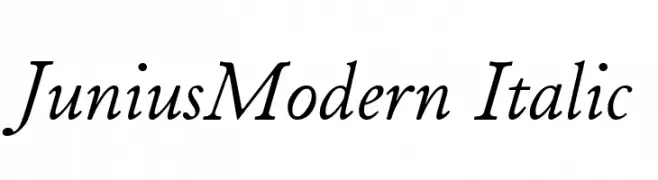
( Peter S. Baker - faculty.virginia.edu/oldenglish/ )
An elegant italic font with smooth, flowing lines and a refined appearance.
![JuniusModern Italic font caratteri gratis]() Scaricare 342 Downloads@WebFont
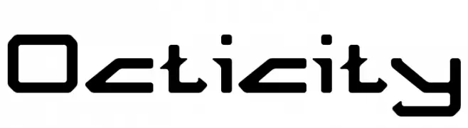
Scaricare 342 Downloads@WebFont -
![Octicity font caratteri gratis]() Scaricare 342 Downloads@WebFont
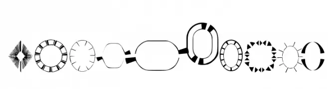
Scaricare 342 Downloads@WebFont -
( Fonts by www.4yeo.com )
Ornamental geometric font with abstract frames and patterns.
![4YEOframes font caratteri gratis]() Scaricare 342 Downloads@WebFont
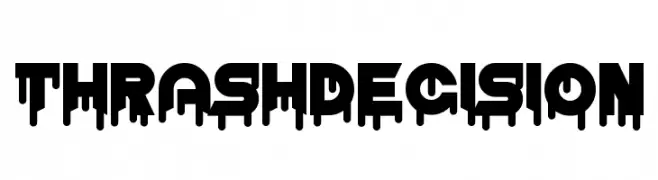
Scaricare 342 Downloads@WebFont -
( Fonts by www.chequered.ink - Chequered Ink - Personal-use only. For commercial use please contact owner. )
A bold, dripping font with a striking, edgy appearance.
![Thrash Decision font caratteri gratis]() Scaricare 342 Downloads@WebFont
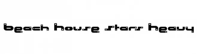
Scaricare 342 Downloads@WebFont -
![Beach House Stars Heavy font caratteri gratis]() Scaricare 342 Downloads@WebFont
Scaricare 342 Downloads@WebFont -
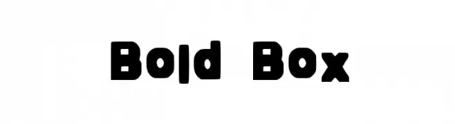
( Fonts by Socialh. Personal-use only. For commercial use please contact owner. )
A bold, boxy font with rounded edges and uniform strokes.
![Bold Box font caratteri gratis]() Scaricare 342 Downloads@WebFont
Scaricare 342 Downloads@WebFont -
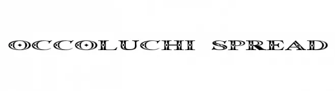
( Fonts by Graham Meade - GemFonts )
A decorative font with intricate patterns and bold, artistic characters.
![Occoluchi Spread font caratteri gratis]() Scaricare 342 Downloads@WebFont
Scaricare 342 Downloads@WebFont -
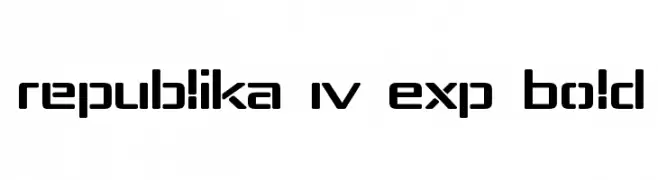
( Fonts by Apostrophic Lab )
A bold, modern font with geometric shapes and rounded corners.
![Republika IV Exp Bold font caratteri gratis]() Scaricare 342 Downloads@WebFont
Scaricare 342 Downloads@WebFont -
( Fonts by Daniel Zadorozny - www.iconian.com )
A bold, gothic-inspired font with sharp, angular lines and dramatic serifs.
![Xiphos font caratteri gratis]() Scaricare 342 Downloads@WebFont
Scaricare 342 Downloads@WebFont -
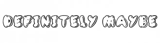
( Font by Jonathan Harris - www.tattoowoo.com )
A playful, bubble-like outlined font with bold, rounded characters.
![Definitely Maybe font caratteri gratis]() Scaricare 342 Downloads@WebFont
Scaricare 342 Downloads@WebFont


Quali sono i font più popolari adesso?
Poppins, Roboto, Montserrat, Open Sans e Lato sono molto usati per le forme pulite e l'ampia applicabilità — dall'identità di marca alle landing page e ai poster.
Quali font si usano spesso nei loghi?
Le sans serif geometriche (es. Poppins, famiglie in stile Gotham) sono scelte comuni per un branding pulito e scalabile. Per un tocco personale restano valide script e stili manoscritti. Abbina un display deciso per i titoli a un corpo testo neutro per riconoscibilità ed equilibrio.
Ogni quanto si aggiorna la lista?
Con regolarità, in base ai download e all'attività reale. Torna spesso per scoprire in anticipo le nuove preferite.
💡 Consiglio: aggiungi ai preferiti — le tendenze cambiano in fretta e i font top di oggi possono ispirare il rebranding di domani.