Benvenuto nelle Font Più Popolari — dove popolarità e qualità si incontrano. Qui trovi i font più scaricati e usati dell'anno. Se cerchi scelte sicure per logo, web o social, inizia da qui.
Ogni font top si distingue per equilibrio, leggibilità e versatilità. Troverai sans serif moderne, script eleganti, serif vintage e display minimalisti.
-
( Fontry - M.G. Adkins - www.thefontry.com/ )
A bold, geometric font with rounded edges and consistent stroke width.
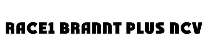 Scaricare 336 Downloads@WebFont
 -
![Beneath Your Beautiful font caratteri gratis]() Scaricare 336 Downloads@WebFont
Scaricare 336 Downloads@WebFont -
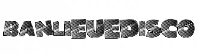
( Fonts by a Max Infeld - XEROGRAPHER FONTS - xerographer.blogspot.com . Personal-use only. For commercial use please contact owner. )
A bold, retro-inspired font with textured diagonal lines and a playful aesthetic.
![BanlieueDisco font caratteri gratis]() Scaricare 336 Downloads@WebFont
Scaricare 336 Downloads@WebFont -
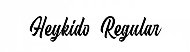
( Fonts by Bangkit Tri Setiadi - Personal-use only. For commercial use please contact owner. )
A dynamic and flowing script font with elegant cursive letterforms.
![Heykido Regular font caratteri gratis]() Scaricare 336 Downloads@WebFont
Scaricare 336 Downloads@WebFont -
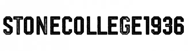
( Fonts by Woodcutter - woodcutter Manero - Personal-use only. For commercial use please contact owner. )
A bold, distressed font with a vintage collegiate style and textured appearance.
![stone college 1936 font caratteri gratis]() Scaricare 336 Downloads@WebFont
Scaricare 336 Downloads@WebFont -
( Fonts by Integritype Studio )
Elegant cursive script with a handwritten feel.
![Cestany font caratteri gratis]() Scaricare 336 Downloads@WebFont
Scaricare 336 Downloads@WebFont -
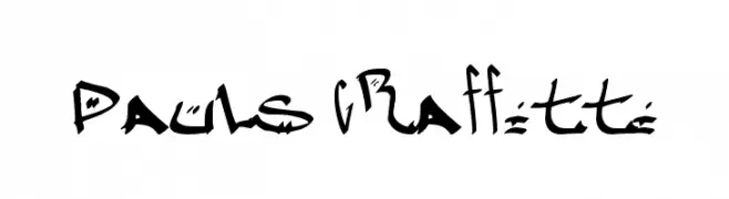
( Fonts by Paul - viciousink.net )
A bold, graffiti-inspired font with dynamic curves and sharp angles.
![Pauls Graffitti font caratteri gratis]() Scaricare 336 Downloads@WebFont
Scaricare 336 Downloads@WebFont -
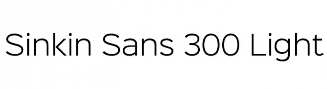
( K-Type - www.k-type.com )
A modern, light sans-serif font with clean lines and balanced spacing.
![Sinkin Sans 300 Light font caratteri gratis]() Scaricare 336 Downloads@WebFont
Scaricare 336 Downloads@WebFont -
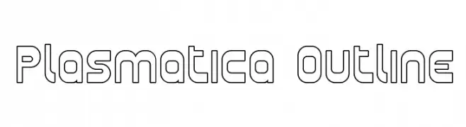
( Fonts by Apostrophic Lab )
A modern, geometric outline font with clean lines and rounded edges.
![Plasmatica Outline font caratteri gratis]() Scaricare 336 Downloads@WebFont
Scaricare 336 Downloads@WebFont -
![RSCanaith font caratteri gratis]() Scaricare 336 Downloads
Scaricare 336 Downloads -
( Fonts by Dieter Steffmann )
A classic serif font with modern, angular lines and decorative flourishes.
![Weiss Initialen Alternates font caratteri gratis]() Scaricare 336 Downloads@WebFont
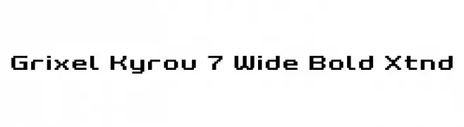
Scaricare 336 Downloads@WebFont -
![Grixel Kyrou 7 Wide Bold Xtnd font caratteri gratis]() Scaricare 336 Downloads@WebFont
Scaricare 336 Downloads@WebFont -
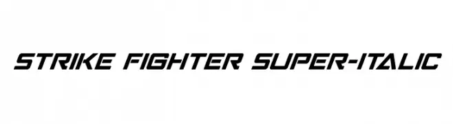
( Fonts by Iconian Fonts )
A bold, italicized font with angular, futuristic letterforms.
![Strike Fighter Super-Italic font caratteri gratis]() Scaricare 336 Downloads@WebFont
Scaricare 336 Downloads@WebFont -
( Fonts by Ben Runneboom )
A playful, hand-drawn font with a whimsical and informal style.
![HUMAN font caratteri gratis]() Scaricare 336 Downloads@WebFont
Scaricare 336 Downloads@WebFont -
( Fonts by Anke Arnold - www.anke-art.de )
A distressed, grunge-style font with a bold, stencil-like appearance.
![Cheap Ink killed my Printer font caratteri gratis]() Scaricare 336 Downloads@WebFont
Scaricare 336 Downloads@WebFont -
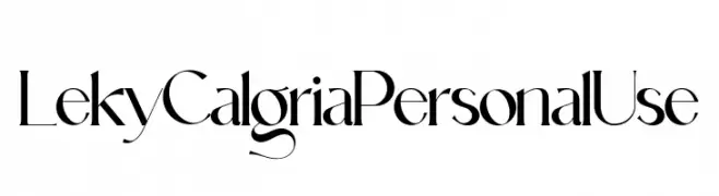
( Fonts by Hishand Studio - Personal-use only. For commercial use please contact owner. )
A modern, high-contrast font with elegant curves and decorative elements.
![Leky Calgria Personal Use font caratteri gratis]() Scaricare 336 Downloads@WebFont
Scaricare 336 Downloads@WebFont -
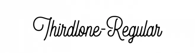
( Fonts by Letterhend Studio - Hendry Juanda - Personal-use only. For commercial use please contact owner. )
An elegant cursive font with flowing, handwritten style.
![Thirdlone-Regular font caratteri gratis]() Scaricare 336 Downloads@WebFont
Scaricare 336 Downloads@WebFont -
( Fonts by Kris Holmes and Charles Bigelow - Personal-use only. For commercial use please contact owner. )
A bold, modern sans-serif font with clean lines and strong visual impact.
![Go Bold font caratteri gratis]() Scaricare 336 Downloads@WebFont
Scaricare 336 Downloads@WebFont -
( Fonts by Hanna Bie )
Playful, bold, rounded hand-drawn font.
![Monkey Pie font caratteri gratis]() Scaricare 336 Downloads@WebFont
Scaricare 336 Downloads@WebFont -
![DS-Schmuck font caratteri gratis]() Scaricare 336 Downloads@WebFont
Scaricare 336 Downloads@WebFont -
![Radiated Pancake font caratteri gratis]() Scaricare 336 Downloads@WebFont
Scaricare 336 Downloads@WebFont -
( Pizzadude - Jakob Fischer - www.pizzadude.dk/ )
A playful, textured font with a hand-drawn, distressed look.
![Vigtigper DEMO Regular font caratteri gratis]() Scaricare 336 Downloads@WebFont
Scaricare 336 Downloads@WebFont -
( Free for a personal use. For a commercial use please visit www.kevinandamanda.com )
A whimsical, hand-drawn font with playful curls and swirls.
![Tingle Institute font caratteri gratis]() Scaricare 336 Downloads@WebFont
Scaricare 336 Downloads@WebFont -
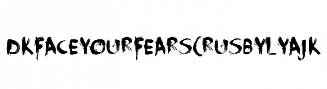
( Fonts by FONTS BY LYAJKA - Personal-use only. For commercial use please contact owner. )
A bold, distressed brushstroke font with an edgy, dramatic style.
![DK Face Your Fears(RUS BY LYAJK font caratteri gratis]() Scaricare 336 Downloads@WebFont
Scaricare 336 Downloads@WebFont -
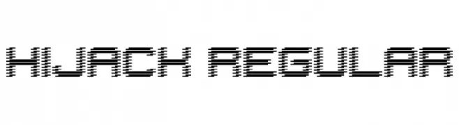
( Fonts by Geronimo )
A futuristic, pixelated font with a high-tech aesthetic.
![Hijack Regular font caratteri gratis]() Scaricare 336 Downloads@WebFont
Scaricare 336 Downloads@WebFont -
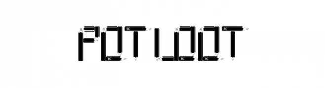
![POTLOOT font caratteri gratis]() Scaricare 336 Downloads@WebFont
Scaricare 336 Downloads@WebFont -
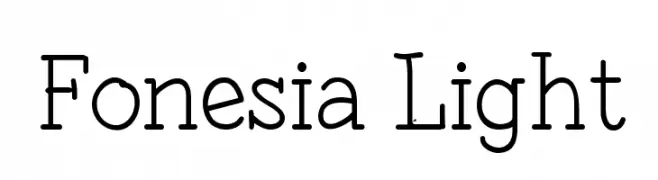
![Fonesia Light font caratteri gratis]() Scaricare 336 Downloads@WebFont
Scaricare 336 Downloads@WebFont -
![Paper Punch font caratteri gratis]() Scaricare 336 Downloads@WebFont
Scaricare 336 Downloads@WebFont -
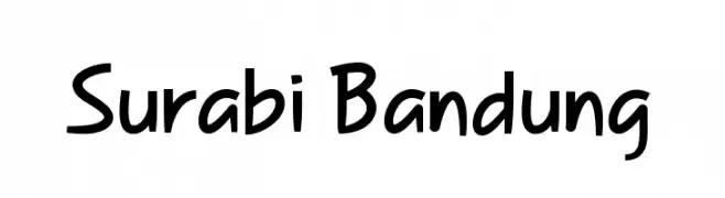
( Haris Gunawan - lewosdesign.com )
A playful, handwritten font with smooth curves and bold strokes.
![Surabi Bandung font caratteri gratis]() Scaricare 336 Downloads@WebFont
Scaricare 336 Downloads@WebFont -
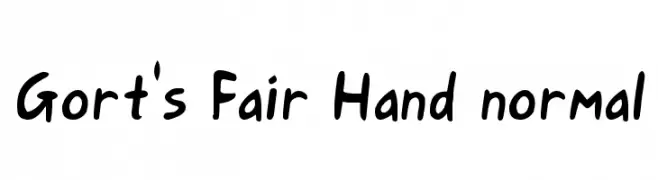
( Fonts by Bree Gorton )
A playful, bold handwritten font with a casual and friendly style.
![Gort's Fair Hand normal font caratteri gratis]() Scaricare 336 Downloads@WebFont
Scaricare 336 Downloads@WebFont -
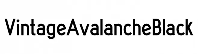
( Fonts by Abraham Plaza - behance.net/abrahamplazadelpino - For fully operational commercial use of any of my fonts please donate 12€ (10£/14$) via PayPal abrahamplapi(at)gmail.com - Personal-use only. )
A bold, geometric font with a modern and professional appearance.
![Vintage Avalanche Black font caratteri gratis]() Scaricare 336 Downloads@WebFont
Scaricare 336 Downloads@WebFont -
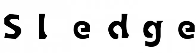
( Fonts by Apostrophic Lab )
A bold, playful font with a chunky, handcrafted appearance.
![Sledge font caratteri gratis]() Scaricare 335 Downloads@WebFont
Scaricare 335 Downloads@WebFont -
( [ )
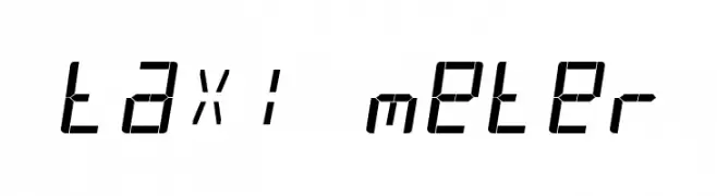
A segmented, digital-style font inspired by LED displays.
![taxi meter font caratteri gratis]() Scaricare 335 Downloads@WebFont
Scaricare 335 Downloads@WebFont -
( Fonts by Vladimir Nikolic )
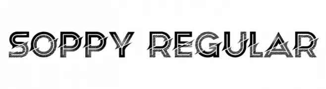
A bold, decorative font with a textured pattern overlay, perfect for impactful display use.
![Soppy Regular font caratteri gratis]() Scaricare 335 Downloads@WebFont
Scaricare 335 Downloads@WebFont -
( Fonts by Daniel Zadorozny - www.iconian.com )
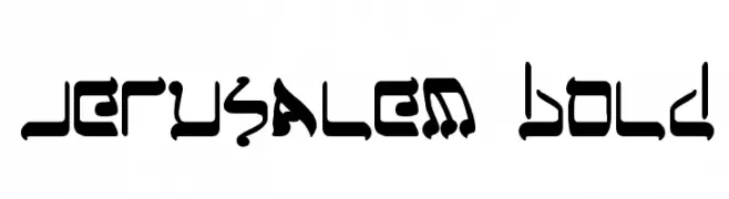
A bold, decorative font with intricate, angular designs.
![Jerusalem Bold font caratteri gratis]() Scaricare 335 Downloads@WebFont
Scaricare 335 Downloads@WebFont


Quali sono i font più popolari adesso?
Poppins, Roboto, Montserrat, Open Sans e Lato sono molto usati per le forme pulite e l'ampia applicabilità — dall'identità di marca alle landing page e ai poster.
Quali font si usano spesso nei loghi?
Le sans serif geometriche (es. Poppins, famiglie in stile Gotham) sono scelte comuni per un branding pulito e scalabile. Per un tocco personale restano valide script e stili manoscritti. Abbina un display deciso per i titoli a un corpo testo neutro per riconoscibilità ed equilibrio.
Ogni quanto si aggiorna la lista?
Con regolarità, in base ai download e all'attività reale. Torna spesso per scoprire in anticipo le nuove preferite.
💡 Consiglio: aggiungi ai preferiti — le tendenze cambiano in fretta e i font top di oggi possono ispirare il rebranding di domani.