Benvenuto nelle Font Più Popolari — dove popolarità e qualità si incontrano. Qui trovi i font più scaricati e usati dell'anno. Se cerchi scelte sicure per logo, web o social, inizia da qui.
Ogni font top si distingue per equilibrio, leggibilità e versatilità. Troverai sans serif moderne, script eleganti, serif vintage e display minimalisti.
-
( Fonts by Kris Holmes and Charles Bigelow - Personal-use only. For commercial use please contact owner. )
A bold, modern sans-serif font with clean lines and strong visual impact.
 Scaricare 336 Downloads@WebFont
 -
( Fonts by Hanna Bie )
Playful, bold, rounded hand-drawn font.
![Monkey Pie font caratteri gratis]() Scaricare 336 Downloads@WebFont
Scaricare 336 Downloads@WebFont -
![DS-Schmuck font caratteri gratis]() Scaricare 336 Downloads@WebFont
Scaricare 336 Downloads@WebFont -
![Ajay Normal Italic font caratteri gratis]() Scaricare 336 Downloads
Scaricare 336 Downloads -
![Radiated Pancake font caratteri gratis]() Scaricare 336 Downloads@WebFont
Scaricare 336 Downloads@WebFont -
( Fonts by David Rakowski )
A bold, condensed serif font with dramatic, angular serifs and a vintage-modern appeal.
![Zaleski Condensed font caratteri gratis]() Scaricare 336 Downloads@WebFont
Scaricare 336 Downloads@WebFont -
( Fonts by VPcreativeshop - Vladimir Fedotov - Personal-use only. For commercial use please contact owner. )
A bold, geometric sans-serif font with a modern, minimalistic design.
![Greenth font caratteri gratis]() Scaricare 336 Downloads@WebFont
Scaricare 336 Downloads@WebFont -
( Free for a personal use. For a commercial use please visit www.kevinandamanda.com )
A whimsical, hand-drawn font with playful curls and swirls.
![Tingle Institute font caratteri gratis]() Scaricare 336 Downloads@WebFont
Scaricare 336 Downloads@WebFont -
![POTLOOT font caratteri gratis]() Scaricare 336 Downloads@WebFont
Scaricare 336 Downloads@WebFont -
![Paper Punch font caratteri gratis]() Scaricare 336 Downloads@WebFont
Scaricare 336 Downloads@WebFont -
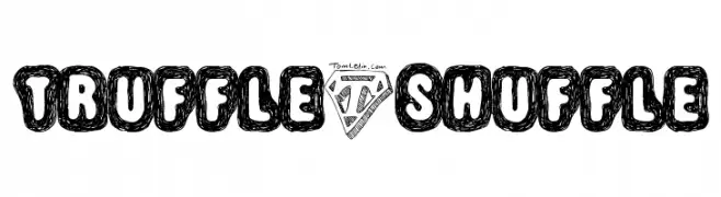
( Fonts by Thomas Ledin - tomledin.com )
A playful, hand-drawn font with bold, doodle-like characters enclosed in rounded outlines.
![Truffle-Shuffle font caratteri gratis]() Scaricare 336 Downloads@WebFont
Scaricare 336 Downloads@WebFont -
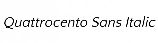
( Copyright (c) 2011, Pablo Impallari (www.impallari.com|impallari@gmail.com) )
A modern, elegant sans-serif font with a subtle italic slant.
![Quattrocento Sans Italic font caratteri gratis]() Scaricare 335 Downloads@WebFont
Scaricare 335 Downloads@WebFont -
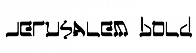
( Fonts by Daniel Zadorozny - www.iconian.com )
A bold, decorative font with intricate, angular designs.
![Jerusalem Bold font caratteri gratis]() Scaricare 335 Downloads@WebFont
Scaricare 335 Downloads@WebFont -
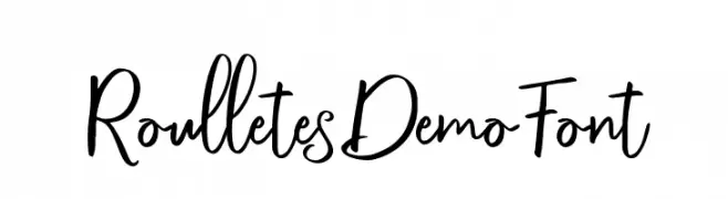
( Cochocib Std - bit.ly/saffatinmyfonts )
A playful and energetic script font with flowing cursive letterforms.
![RoulletesDemoFont font caratteri gratis]() Scaricare 335 Downloads@WebFont
Scaricare 335 Downloads@WebFont -
( Fonts by Paul Reid - tracertong.co.uk )
A sleek, modern italic font with a futuristic design.
![PhatBoySlim-Italic font caratteri gratis]() Scaricare 335 Downloads@WebFont
Scaricare 335 Downloads@WebFont -
( Frogii`s Fonts )
A bold, decorative font with characters enclosed in rectangular frames.
![AlphaWizard font caratteri gratis]() Scaricare 335 Downloads@WebFont
Scaricare 335 Downloads@WebFont -
( Fonts by Tursun Sultan - Personal-use only. For commercial use please contact owner. )
A bold, modern sans-serif font with clean, geometric lines.
![UKIJ Kufi Yay Bold font caratteri gratis]() Scaricare 335 Downloads@WebFont
Scaricare 335 Downloads@WebFont -
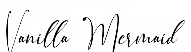
( aldedesign - Alde Saputro - creativemarket.com/aldedesign?u=aldedesign )
An elegant and flowing script font with intricate decorative letterforms.
![Vanilla Mermaid font caratteri gratis]() Scaricare 335 Downloads@WebFont
Scaricare 335 Downloads@WebFont -
( Fonts by Jordi Carreras )
A bold, textured font with a vintage, handcrafted appearance.
![Ohio Kraft font caratteri gratis]() Scaricare 335 Downloads@WebFont
Scaricare 335 Downloads@WebFont -
( Fonts by zamjump - Ahmad Zamzami - Personal-use only. For commercial use please contact owner. )
A bold, distressed font with a vintage, textured appearance.
![Jack Martine font caratteri gratis]() Scaricare 335 Downloads@WebFont
Scaricare 335 Downloads@WebFont -
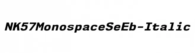
( Fonts by Typodermic Fonts )
A bold, monospaced italic font with a clean, structured design.
![NK57MonospaceSeEb-Italic font caratteri gratis]() Scaricare 335 Downloads@WebFont
Scaricare 335 Downloads@WebFont -
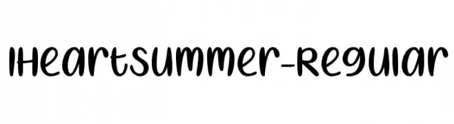
( Misti's Fonts - mistifonts.com/ )
A playful, handwritten font with heart-shaped accents and a bold, rounded style.
![IHeartSummer-Regular font caratteri gratis]() Scaricare 335 Downloads@WebFont
Scaricare 335 Downloads@WebFont -
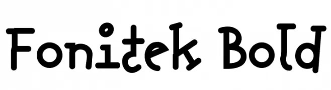
![Fonitek Bold font caratteri gratis]() Scaricare 335 Downloads@WebFont
Scaricare 335 Downloads@WebFont -
![G.I. JERK COM]() Scaricare 335 Downloads@WebFont
Scaricare 335 Downloads@WebFont -
![Begok font caratteri gratis]() Scaricare 335 Downloads@WebFont
Scaricare 335 Downloads@WebFont -
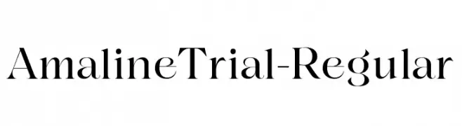
( Fonts by Eko Bimantara - Personal-use only. For commercial use please contact owner. )
A classic serif font with high contrast and elegant, sharp serifs.
![AmalineTrial-Regular font caratteri gratis]() Scaricare 335 Downloads@WebFont
Scaricare 335 Downloads@WebFont -
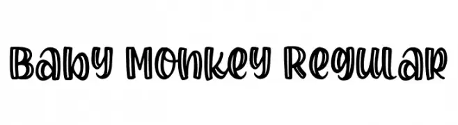
( Fonts by Bangkit Tri Setiadi )
A playful, bold, and rounded font with a hand-drawn, whimsical style.
![Baby Monkey Regular font caratteri gratis]() Scaricare 335 Downloads@WebFont
Scaricare 335 Downloads@WebFont -
![Fenotype dings # lego3 font caratteri gratis]() Scaricare 335 Downloads@WebFont
Scaricare 335 Downloads@WebFont -
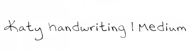
![Katy handwriting 1 Medium font caratteri gratis]() Scaricare 335 Downloads@WebFont
Scaricare 335 Downloads@WebFont -
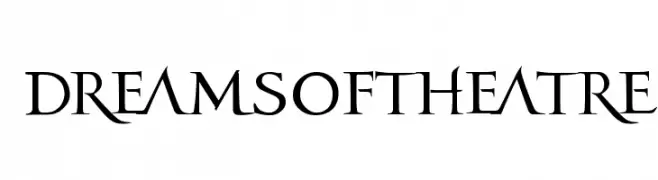
![dreamsoftheatre font caratteri gratis]() Scaricare 335 Downloads@WebFont
Scaricare 335 Downloads@WebFont -
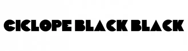
( Fonts by NowType - Claudio Rocha - Personal-use only. For commercial use please contact owner. )
A bold, geometric font with sharp edges and a modern style.
![Ciclope Black Black font caratteri gratis]() Scaricare 335 Downloads@WebFont
Scaricare 335 Downloads@WebFont -
( Fonts by Daniel Zadorozny - www.iconian.com - Free for personal use )
A bold, expanded, and italicized font with a modern, dynamic style.
![Iapetus Expanded Italic font caratteri gratis]() Scaricare 335 Downloads@WebFont
Scaricare 335 Downloads@WebFont -
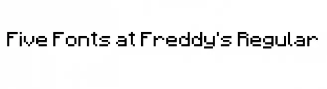
( Fonts by HaydieBoBotv - Personal-use only. For commercial use please contact owner. )
A pixelated, retro-style font with a blocky, 8-bit design.
![Five Fonts at Freddy's Regular font caratteri gratis]() Scaricare 335 Downloads@WebFont
Scaricare 335 Downloads@WebFont -
![InstantTunes font caratteri gratis]() Scaricare 335 Downloads@WebFont
Scaricare 335 Downloads@WebFont -
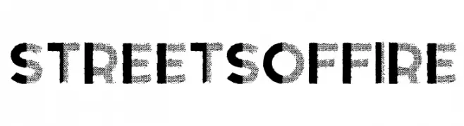
( Fonts by Alphabet & Type: Typography & Graphic - Paolo Vannucci - www.alphabetype.it )
A bold, distressed font with a halftone texture and urban flair.
![Streets of Fire font caratteri gratis]() Scaricare 335 Downloads@WebFont
Scaricare 335 Downloads@WebFont


Quali sono i font più popolari adesso?
Poppins, Roboto, Montserrat, Open Sans e Lato sono molto usati per le forme pulite e l'ampia applicabilità — dall'identità di marca alle landing page e ai poster.
Quali font si usano spesso nei loghi?
Le sans serif geometriche (es. Poppins, famiglie in stile Gotham) sono scelte comuni per un branding pulito e scalabile. Per un tocco personale restano valide script e stili manoscritti. Abbina un display deciso per i titoli a un corpo testo neutro per riconoscibilità ed equilibrio.
Ogni quanto si aggiorna la lista?
Con regolarità, in base ai download e all'attività reale. Torna spesso per scoprire in anticipo le nuove preferite.
💡 Consiglio: aggiungi ai preferiti — le tendenze cambiano in fretta e i font top di oggi possono ispirare il rebranding di domani.