Benvenuto nelle Font Più Popolari — dove popolarità e qualità si incontrano. Qui trovi i font più scaricati e usati dell'anno. Se cerchi scelte sicure per logo, web o social, inizia da qui.
Ogni font top si distingue per equilibrio, leggibilità e versatilità. Troverai sans serif moderne, script eleganti, serif vintage e display minimalisti.
-
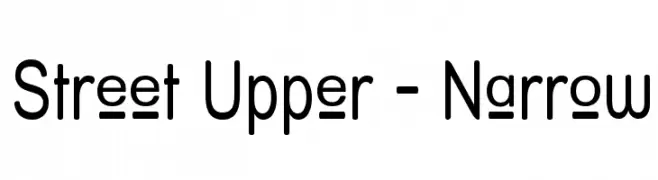
( Fonts by Apostrophic Lab )
A modern, narrow sans-serif font with a clean and geometric design.
 Scaricare 330 Downloads@WebFont
 -
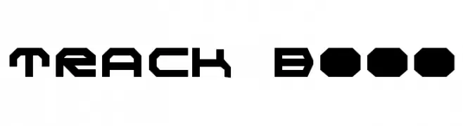
( Fonts by Daniel Zadorozny - www.iconian.com )
A bold, geometric font with a modern, industrial style.
![Realpolitik font caratteri gratis]() Scaricare 330 Downloads@WebFont
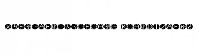
Scaricare 330 Downloads@WebFont -
![XperimentypoFourC RoundInvers font caratteri gratis]() Scaricare 330 Downloads@WebFont
Scaricare 330 Downloads@WebFont -
![Tiësto By Simón Barja Caride font caratteri gratis]() Scaricare 330 Downloads@WebFont
Scaricare 330 Downloads@WebFont -
![TRACK Bold font caratteri gratis]() Scaricare 330 Downloads@WebFont
Scaricare 330 Downloads@WebFont -
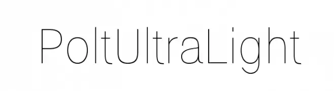
( Ariel Alvares )
A sleek, ultra-light font with a modern and minimalist design.
![Polt Ultra Light font caratteri gratis]() Scaricare 330 Downloads@WebFont
Scaricare 330 Downloads@WebFont -
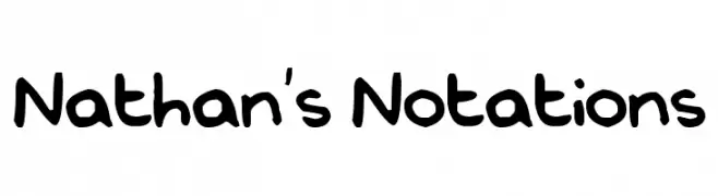
![Nathan's Notations font caratteri gratis]() Scaricare 330 Downloads@WebFont
Scaricare 330 Downloads@WebFont -
( Fonts by www.fontalicious.com )
A playful, hand-drawn font with bold, irregular strokes and quirky letterforms.
![Zodiastic font caratteri gratis]() Scaricare 330 Downloads@WebFont
Scaricare 330 Downloads@WebFont -
( Fonts by Kat`s Fun Fonts - Personal-use only. For commercial use please contact owner. )
A Halloween-themed decorative font with spooky icons.
![KR Bootown font caratteri gratis]() Scaricare 330 Downloads@WebFont
Scaricare 330 Downloads@WebFont -
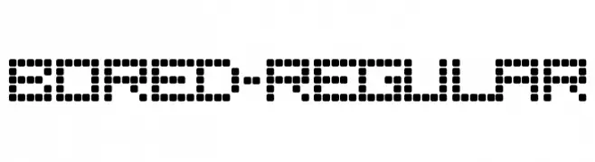
![Bored-Regular font caratteri gratis]() Scaricare 330 Downloads@WebFont
Scaricare 330 Downloads@WebFont -
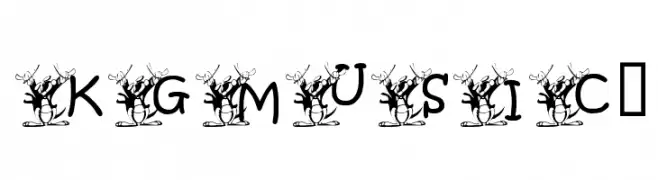
![KGMUSIC1 font caratteri gratis]() Scaricare 330 Downloads@WebFont
Scaricare 330 Downloads@WebFont -
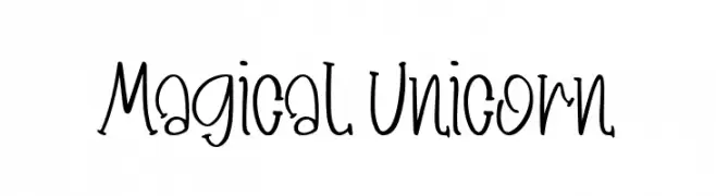
( Fonts by Booga Letter )
A whimsical, handwritten font with playful, irregular characters.
![Magical Unicorn font caratteri gratis]() Scaricare 330 Downloads@WebFont
Scaricare 330 Downloads@WebFont -
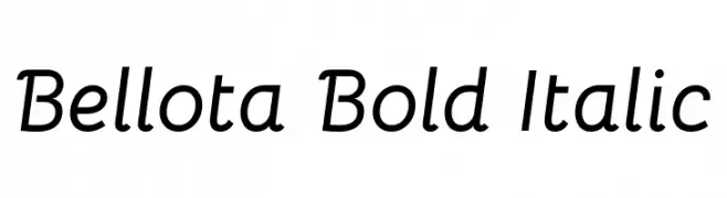
( Copyright 2019 The Bellota Project Authors (https://github.com/kemie/Bellota-Font) )
A bold, italic font with a playful and modern design.
![Bellota Bold Italic font caratteri gratis]() Scaricare 330 Downloads@WebFont
Scaricare 330 Downloads@WebFont -
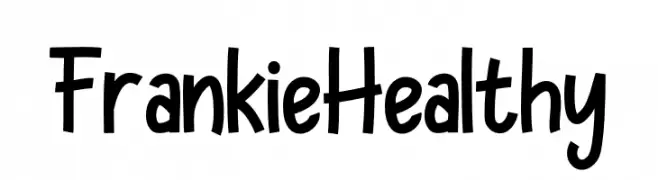
( Fonts by Pandan Wangi )
A playful, handwritten font with a bold and friendly style.
![Frankie Healthy font caratteri gratis]() Scaricare 330 Downloads@WebFont
Scaricare 330 Downloads@WebFont -
![MeganHand font caratteri gratis]() Scaricare 330 Downloads@WebFont
Scaricare 330 Downloads@WebFont -
( Fonts by Hanna Bie )
A playful, bold font with rounded, thick strokes and a hand-drawn feel.
![Pearch font caratteri gratis]() Scaricare 330 Downloads@WebFont
Scaricare 330 Downloads@WebFont -
![PrestonsWriting font caratteri gratis]() Scaricare 330 Downloads@WebFont
Scaricare 330 Downloads@WebFont -
( Iconian Fonts - Daniel Zadorozny - www.iconian.com )
A bold, geometric font with a modern and powerful aesthetic.
![Classic Cobra Bold font caratteri gratis]() Scaricare 330 Downloads@WebFont
Scaricare 330 Downloads@WebFont -
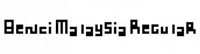
( Fonts by Adien Gunarta - fontasticindonesia.blogspot.com )
A bold, geometric font with a digital, pixelated style.
![Benci Malaysia Regular font caratteri gratis]() Scaricare 330 Downloads@WebFont
Scaricare 330 Downloads@WebFont -
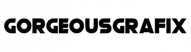
( Fonts by Darrell Flood - Personal-use only. For commercial use please contact owner. )
A bold, geometric font with a modern and impactful style.
![Gorgeous Grafix font caratteri gratis]() Scaricare 330 Downloads@WebFont
Scaricare 330 Downloads@WebFont -
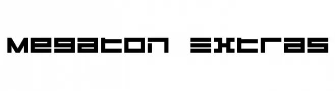
( Fonts by dustBUST - Andreas Nylin )
A bold, geometric font with a futuristic and industrial style.
![Megaton Extras font caratteri gratis]() Scaricare 330 Downloads@WebFont
Scaricare 330 Downloads@WebFont -
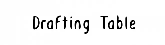
( Fonts by Daniel Zadorozny - www.iconian.com )
A playful, hand-drawn style font with whimsical and artistic flair.
![Drafting Table font caratteri gratis]() Scaricare 330 Downloads@WebFont
Scaricare 330 Downloads@WebFont -
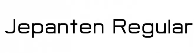
( Khoe Roni )
A modern, geometric sans-serif font with a clean and professional look.
![Jepanten Regular font caratteri gratis]() Scaricare 330 Downloads@WebFont
Scaricare 330 Downloads@WebFont -
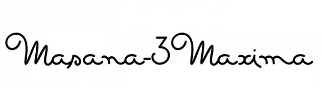
![Masana-3Maxima font caratteri gratis]() Scaricare 330 Downloads@WebFont
Scaricare 330 Downloads@WebFont -
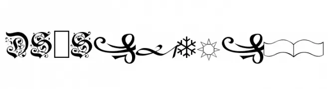
![DS-Schmuck font caratteri gratis]() Scaricare 330 Downloads@WebFont
Scaricare 330 Downloads@WebFont -
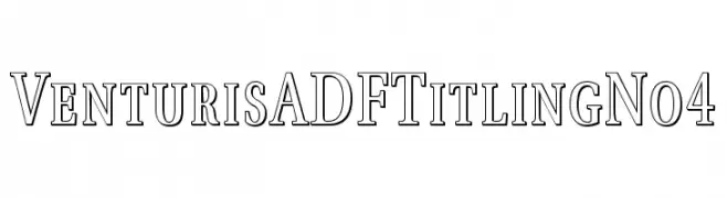
( Fonts by Arkandis Digital Foundry )
A classic serif font with modern elegance and medium contrast.
![VenturisADFTitlingNo4 font caratteri gratis]() Scaricare 330 Downloads@WebFont
Scaricare 330 Downloads@WebFont -
![Ajay Normal Italic font caratteri gratis]() Scaricare 330 Downloads
Scaricare 330 Downloads -
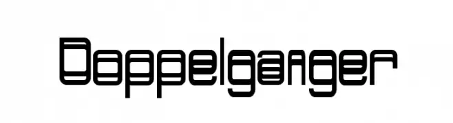
( Intellecta Design - new.myfonts.com/search/intellecta/fonts/?sort=sales?refby=paulow )
A modern, geometric font with consistent stroke width and a futuristic feel.
![Doppelganger font caratteri gratis]() Scaricare 330 Downloads@WebFont
Scaricare 330 Downloads@WebFont -
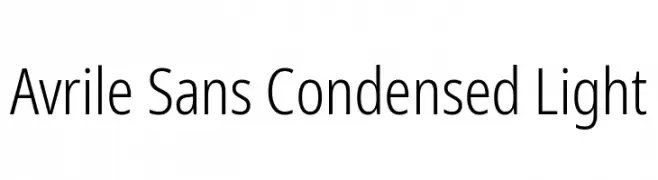
( Fonts by Monotype Design Team - Personal-use only. For commercial use please contact owner. )
A modern, condensed sans-serif font with a light weight and low contrast.
![Avrile Sans Condensed Light font caratteri gratis]() Scaricare 330 Downloads@WebFont
Scaricare 330 Downloads@WebFont -
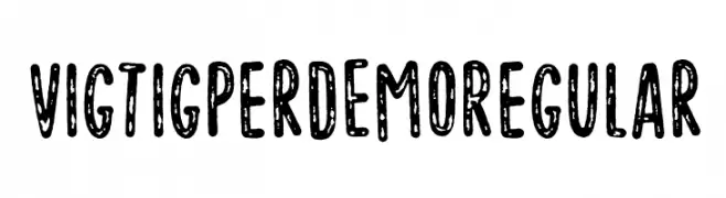
( Pizzadude - Jakob Fischer - www.pizzadude.dk/ )
A playful, textured font with a hand-drawn, distressed look.
![Vigtigper DEMO Regular font caratteri gratis]() Scaricare 330 Downloads@WebFont
Scaricare 330 Downloads@WebFont -
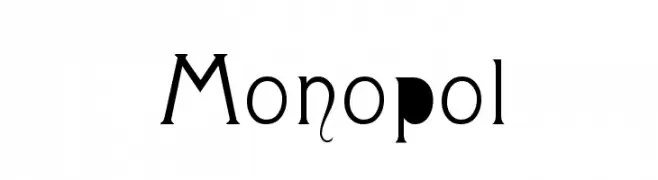
( George Williams - web.archive.org/web/20051223080638/bibliofile.mc.duke.edu/gww/fonts/fonts.html )
A stylish and artistic font with modern and vintage elements, featuring unique decorative flourishes.
![Monopol font caratteri gratis]() Scaricare 330 Downloads@WebFont
Scaricare 330 Downloads@WebFont -
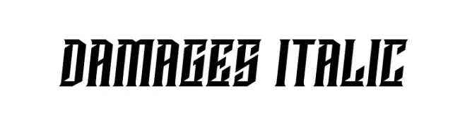
( Vladimir Nikolic - www.coroflot.com/vladimirnikolic )
A bold, italicized font with sharp, angular edges and tight spacing.
![Damages Italic font caratteri gratis]() Scaricare 330 Downloads@WebFont
Scaricare 330 Downloads@WebFont -
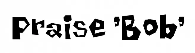
( Fonts by Spork Thug Typography - Josh Wilhelm - www.lifewithouttaffy.com/taffy/blog )
A bold, playful font with an irregular, jagged design.
![Praise 'Bob' font caratteri gratis]() Scaricare 330 Downloads@WebFont
Scaricare 330 Downloads@WebFont -
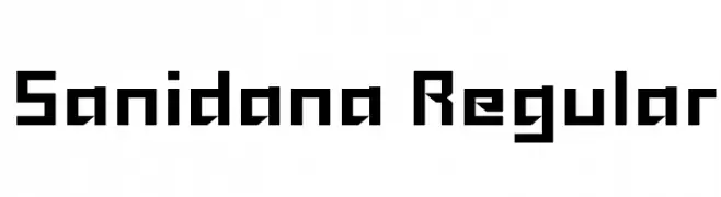
( grandchaos9000.deviantart.com )
A bold, geometric font with a modern, futuristic style.
![Sanidana Regular font caratteri gratis]() Scaricare 330 Downloads@WebFont
Scaricare 330 Downloads@WebFont -
Caratteri di JuanCasco. For commercial use please contact the owner.
( Fonts by Juan Casco - www.juancasco.net )
A whimsical and decorative font with playful curls and elegant flourishes.
![Lejana font caratteri gratis]() Scaricare 330 Downloads@WebFont
Scaricare 330 Downloads@WebFont


Quali sono i font più popolari adesso?
Poppins, Roboto, Montserrat, Open Sans e Lato sono molto usati per le forme pulite e l'ampia applicabilità — dall'identità di marca alle landing page e ai poster.
Quali font si usano spesso nei loghi?
Le sans serif geometriche (es. Poppins, famiglie in stile Gotham) sono scelte comuni per un branding pulito e scalabile. Per un tocco personale restano valide script e stili manoscritti. Abbina un display deciso per i titoli a un corpo testo neutro per riconoscibilità ed equilibrio.
Ogni quanto si aggiorna la lista?
Con regolarità, in base ai download e all'attività reale. Torna spesso per scoprire in anticipo le nuove preferite.
💡 Consiglio: aggiungi ai preferiti — le tendenze cambiano in fretta e i font top di oggi possono ispirare il rebranding di domani.