Benvenuto nelle Font Più Popolari — dove popolarità e qualità si incontrano. Qui trovi i font più scaricati e usati dell'anno. Se cerchi scelte sicure per logo, web o social, inizia da qui.
Ogni font top si distingue per equilibrio, leggibilità e versatilità. Troverai sans serif moderne, script eleganti, serif vintage e display minimalisti.
-
( Fonts by dustBUST - Andreas Nylin )
A bold, industrial font with geometric shapes and a blocky appearance.
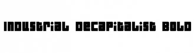 Scaricare 331 Downloads@WebFont
 -
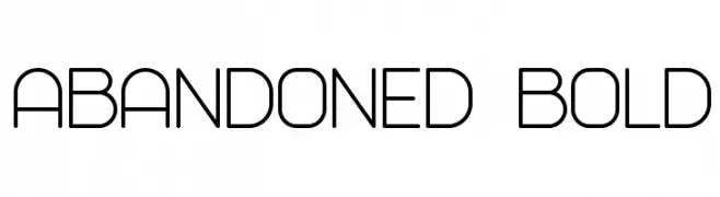
( Vladimir Nikolic - www.coroflot.com/vladimirnikolic )
A modern, geometric font with clean lines and uniform stroke widths.
![Abandoned Bold font caratteri gratis]() Scaricare 331 Downloads@WebFont
Scaricare 331 Downloads@WebFont -
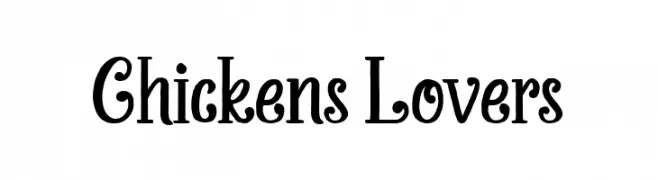
( Fonts by Almarkhatype Studio )
A playful and whimsical font with decorative curls and loops.
![Chickens Lovers font caratteri gratis]() Scaricare 331 Downloads@WebFont
Scaricare 331 Downloads@WebFont -
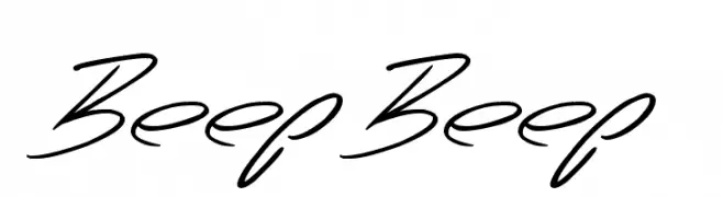
( www.tattoowoo.com )
A fluid and elegant script font with a modern touch.
![Beep Beep font caratteri gratis]() Scaricare 331 Downloads@WebFont
Scaricare 331 Downloads@WebFont -
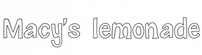
( monkeyroodlesfonts.weebly.com/ )
A playful, hand-drawn font with a whimsical and casual style.
![Macy's lemonade font caratteri gratis]() Scaricare 331 Downloads@WebFont
Scaricare 331 Downloads@WebFont -
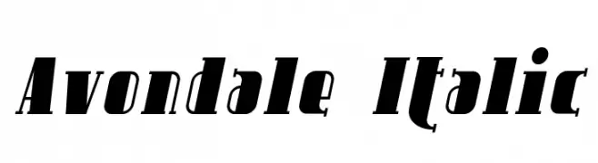
( Fonts by Apostrophic Lab )
A bold, italic serif font with strong forward slant and striking visual impact.
![Avondale Italic font caratteri gratis]() Scaricare 331 Downloads@WebFont
Scaricare 331 Downloads@WebFont -
( Nirmana Visual - Sigit Dwipa - www.instagram.com/nirmanavisual/ )
A dynamic and expressive script font with elongated, flowing letterforms and high contrast.
![Ballistick Demo font caratteri gratis]() Scaricare 331 Downloads@WebFont
Scaricare 331 Downloads@WebFont -
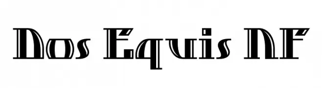
( Fonts by Nick Curtis - www.nicksfonts.com )
A bold, geometric font with Art Deco influences and high contrast strokes.
![Dos Equis NF font caratteri gratis]() Scaricare 331 Downloads@WebFont
Scaricare 331 Downloads@WebFont -
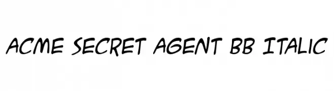
( Fonts by www.blambot.com )
A playful, italicized handwritten font with smooth, rounded strokes.
![ACME Secret Agent BB Italic font caratteri gratis]() Scaricare 331 Downloads@WebFont
Scaricare 331 Downloads@WebFont -
( Fonts by Noah Type - noahtype.com - Personal-use only. For commercial use please contact owner. )
A bold, geometric font with a futuristic and modern design.
![Hey You font caratteri gratis]() Scaricare 331 Downloads@WebFont
Scaricare 331 Downloads@WebFont -
( Fonts by TypeType Foundry )
A modern, monospaced italic font with geometric shapes and uniform stroke widths.
![TT Interphases Pro Mono Trl Italic font caratteri gratis]() Scaricare 331 Downloads@WebFont
Scaricare 331 Downloads@WebFont -
( Fonts by Almarkhatype - Abdul Malik Wisnu - Personal-use only. For commercial use please contact owner. )
A playful and expressive handwritten font with fluid strokes.
![Lovely Sweetie font caratteri gratis]() Scaricare 331 Downloads@WebFont
Scaricare 331 Downloads@WebFont -
( Fonts by Skiiller Studio )
A bold, handwritten font with a playful and energetic style.
![Amsyong font caratteri gratis]() Scaricare 331 Downloads@WebFont
Scaricare 331 Downloads@WebFont -
( Fonts by Origin Type )
Bold, playful handwritten font.
![Black Matcha font caratteri gratis]() Scaricare 331 Downloads@WebFont
Scaricare 331 Downloads@WebFont -
( Fonts by Noah Type )
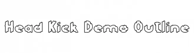
A bold, outlined font with a playful, geometric style.
![Head Kick Demo Outline font caratteri gratis]() Scaricare 331 Downloads@WebFont
Scaricare 331 Downloads@WebFont -
![Shithead font caratteri gratis]() Scaricare 331 Downloads@WebFont
Scaricare 331 Downloads@WebFont -
( Fonts by Daniel Zadorozny - www.iconian.com )
A pixelated, grid-based italic font with a retro digital style.
![X-Grid Italic font caratteri gratis]() Scaricare 331 Downloads@WebFont
Scaricare 331 Downloads@WebFont -
( Fonts by erik5541 )
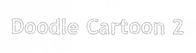
A playful, hand-drawn font with a doodle-like, cartoonish style.
![Doodle Cartoon 2 font caratteri gratis]() Scaricare 331 Downloads@WebFont
Scaricare 331 Downloads@WebFont -
![fanfarone font caratteri gratis]() Scaricare 331 Downloads@WebFont
Scaricare 331 Downloads@WebFont -
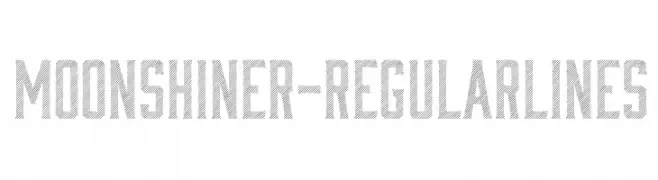
![Moonshiner-RegularLines font caratteri gratis]() Scaricare 331 Downloads@WebFont
Scaricare 331 Downloads@WebFont -
( Free for Personal Use. To use commercially please visit the http://dirt2.com )
A bold, distressed blackletter font with a grunge effect.
![HacjiuzaDirty font caratteri gratis]() Scaricare 331 Downloads@WebFont
Scaricare 331 Downloads@WebFont -
( Free - www.ingofonts.com )
A dynamic brush-style font with expressive, fluid strokes and artistic flair.
![DeBorstelBrushReduced font caratteri gratis]() Scaricare 331 Downloads@WebFont
Scaricare 331 Downloads@WebFont -
![Mapmaker Thin font caratteri gratis]() Scaricare 331 Downloads
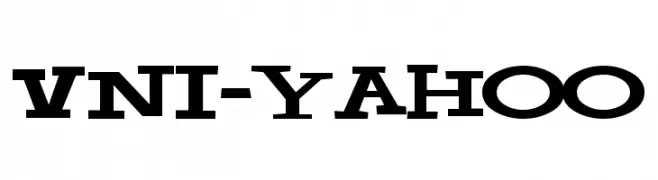
Scaricare 331 Downloads -
![VNI-Yahoo font caratteri gratis]() Scaricare 331 Downloads
Scaricare 331 Downloads -
( Fonts by HENRIavecunK )
A classic serif font with elegant, slender characters and distinct serifs.
![Camargue Serif Regular font caratteri gratis]() Scaricare 331 Downloads@WebFont
Scaricare 331 Downloads@WebFont -
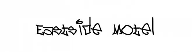
( Fonts by or from www.graffitifonts.net )
A bold, graffiti-inspired font with sharp angles and urban flair.
![Eastside Motel font caratteri gratis]() Scaricare 331 Downloads@WebFont
Scaricare 331 Downloads@WebFont -
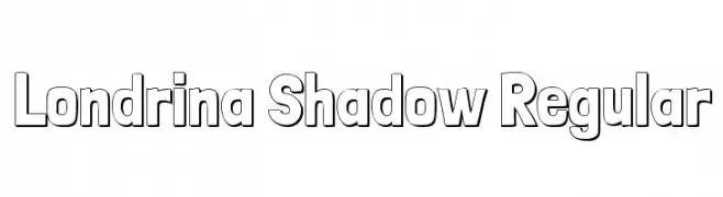
( Copyright 2011 The Londrina Shadow Authors (https://github.com/marcelommp/Londrina-Typeface), with Reserved Font Name "Londrina Shadow" )
A bold, playful font with a unique shadow effect and outlined characters.
![Londrina Shadow Regular font caratteri gratis]() Scaricare 331 Downloads@WebFont
Scaricare 331 Downloads@WebFont -
![Hermia!]() Scaricare 331 Downloads@WebFont
Scaricare 331 Downloads@WebFont -
![Beedey font caratteri gratis]() Scaricare 331 Downloads@WebFont
Scaricare 331 Downloads@WebFont -
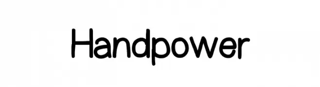
( Fonts by Dan P. Lyons - Personal-use only. For commercial use please contact owner. )
A playful, handwritten font with rounded edges and consistent stroke width.
![Handpower font caratteri gratis]() Scaricare 331 Downloads@WebFont
Scaricare 331 Downloads@WebFont -
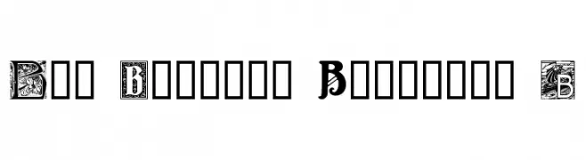
( Fonts by www.houseoflime.com )
An ornate, decorative font inspired by Art Nouveau, featuring intricate floral motifs.
![Art Nouveau Initials B font caratteri gratis]() Scaricare 331 Downloads@WebFont
Scaricare 331 Downloads@WebFont -
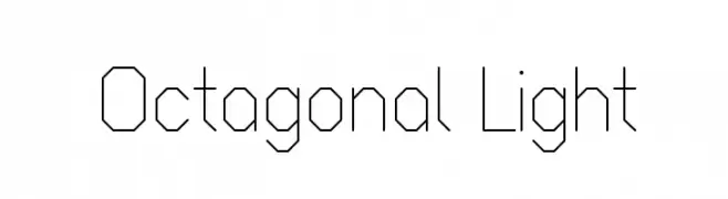
( Fonts by Vít Čondák )
A geometric, octagonal font with a modern and technical style.
![Octagonal Light font caratteri gratis]() Scaricare 331 Downloads@WebFont
Scaricare 331 Downloads@WebFont -
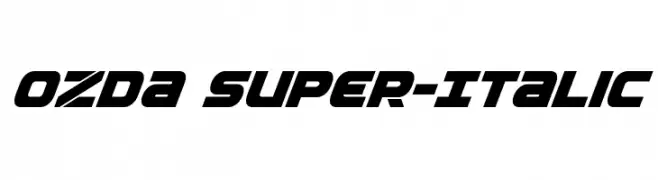
( Iconian Fonts - Daniel Zadorozny - www.iconian.com )
A bold, italic font with a modern and dynamic style, ideal for headlines.
![Ozda Super-Italic font caratteri gratis]() Scaricare 331 Downloads@WebFont
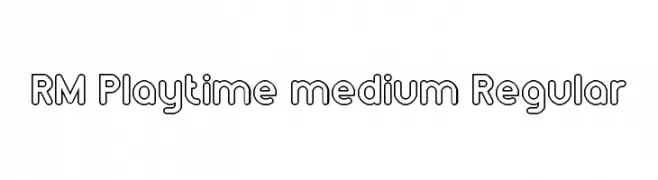
Scaricare 331 Downloads@WebFont -
![RM Playtime medium Regular font caratteri gratis]() Scaricare 331 Downloads@WebFont
Scaricare 331 Downloads@WebFont -
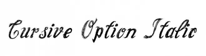
( Fonts by Galdino Otten - galdinootten.com )
Elegant cursive font with an italic slant and artistic flair.
![Cursive Option Italic font caratteri gratis]() Scaricare 331 Downloads@WebFont
Scaricare 331 Downloads@WebFont


Quali sono i font più popolari adesso?
Poppins, Roboto, Montserrat, Open Sans e Lato sono molto usati per le forme pulite e l'ampia applicabilità — dall'identità di marca alle landing page e ai poster.
Quali font si usano spesso nei loghi?
Le sans serif geometriche (es. Poppins, famiglie in stile Gotham) sono scelte comuni per un branding pulito e scalabile. Per un tocco personale restano valide script e stili manoscritti. Abbina un display deciso per i titoli a un corpo testo neutro per riconoscibilità ed equilibrio.
Ogni quanto si aggiorna la lista?
Con regolarità, in base ai download e all'attività reale. Torna spesso per scoprire in anticipo le nuove preferite.
💡 Consiglio: aggiungi ai preferiti — le tendenze cambiano in fretta e i font top di oggi possono ispirare il rebranding di domani.