Benvenuto nelle Font Più Popolari — dove popolarità e qualità si incontrano. Qui trovi i font più scaricati e usati dell'anno. Se cerchi scelte sicure per logo, web o social, inizia da qui.
Ogni font top si distingue per equilibrio, leggibilità e versatilità. Troverai sans serif moderne, script eleganti, serif vintage e display minimalisti.
-
( Fonts by Daniel Zadorozny - www.iconian.com - Free for personal use )
A bold, angular font with a futuristic and powerful design.
 Scaricare 316 Downloads@WebFont
 -
( Fonts by Google )
A bold, handwritten font with dynamic and fluid letterforms.
![Sedgwick Ave Regular font caratteri gratis]() Scaricare 316 Downloads@WebFont
Scaricare 316 Downloads@WebFont -
( Fonts by Rony Setya Siswadi )
A bold, geometric monospaced font with uniform character spacing.
![' Mono Bold font caratteri gratis]() Scaricare 316 Downloads@WebFont
Scaricare 316 Downloads@WebFont -
![GlitzyJewel Regular font caratteri gratis]() Scaricare 316 Downloads@WebFont
Scaricare 316 Downloads@WebFont -
![Spawned font caratteri gratis]() Scaricare 316 Downloads@WebFont
Scaricare 316 Downloads@WebFont -
-
( Fonts by Michele Vannucchi MKT )
A playful, bold outline font with rounded edges and uniform strokes.
![Just Another Courier font caratteri gratis]() Scaricare 316 Downloads@WebFont
Scaricare 316 Downloads@WebFont -
( Personal-use only. For commercial use please contact owner. )
A modern, monospaced font with a clean and geometric design.
![Funtauna Regular font caratteri gratis]() Scaricare 316 Downloads@WebFont
Scaricare 316 Downloads@WebFont -
![Techno 'Til Dawn font caratteri gratis]() Scaricare 316 Downloads@WebFont
Scaricare 316 Downloads@WebFont -
( Fonts by a Situjuh Nazara - c7n1.wordpress.com. Personal-use only. For commercial use please contact owner. )
A bold, rounded sans-serif font with a modern and friendly appearance.
![Yaahowu Bold font caratteri gratis]() Scaricare 316 Downloads@WebFont
Scaricare 316 Downloads@WebFont -
( Fonts by www.studiotypo.com - Personal-use only. For commercial use please contact owner. )
A bold, textured font with a distressed, vintage look.
![Typo College Dusty Demo font caratteri gratis]() Scaricare 316 Downloads@WebFont
Scaricare 316 Downloads@WebFont -
( Fonts by Nick Curtis - www.nicksfonts.com )
A bold, decorative font with a three-dimensional shadow effect.
![Herald Square Two NF font caratteri gratis]() Scaricare 316 Downloads@WebFont
Scaricare 316 Downloads@WebFont -
( Fonts by HaydieBoBotv - Personal-use only. For commercial use please contact owner. )
A pixelated, retro-style font with a blocky, 8-bit design.
![Five Fonts at Freddy's Regular font caratteri gratis]() Scaricare 316 Downloads@WebFont
Scaricare 316 Downloads@WebFont -
( Fonts by 50Fox Studio - www.50fox.com - Personal-use only. For commercial use please contact owner. )
A modern, angular font with geometric shapes and a dynamic slant.
![IdulFitri-Regular font caratteri gratis]() Scaricare 316 Downloads@WebFont
Scaricare 316 Downloads@WebFont -
( Fonts by www.blambot.com )
A bold, angular font with sharp edges and a dynamic, energetic style.
![BlamBlamHeavyBB font caratteri gratis]() Scaricare 316 Downloads@WebFont
Scaricare 316 Downloads@WebFont -
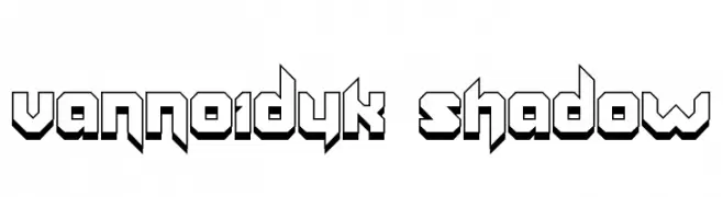
( Fonts by Paul Reid - tracertong.co.uk )
Bold, geometric font with a three-dimensional shadow effect.
![Vannoidyk Shadow font caratteri gratis]() Scaricare 316 Downloads@WebFont
Scaricare 316 Downloads@WebFont -
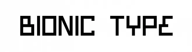
( Fonts by Daniel Zadorozny - www.iconian.com - Free for personal use )
A futuristic, geometric font with angular, blocky letterforms.
![Bionic Type font caratteri gratis]() Scaricare 316 Downloads
Scaricare 316 Downloads -
![NBP Readout font caratteri gratis]() Scaricare 316 Downloads@WebFont
Scaricare 316 Downloads@WebFont -
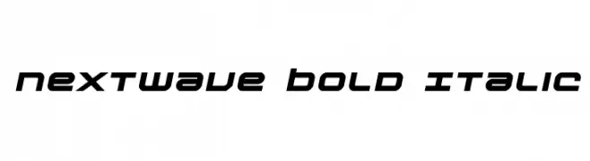
( Fonts by Daniel Zadorozny - www.iconian.com - Free for personal use )
A bold, italicized font with a futuristic and dynamic style.
![Nextwave Bold Italic font caratteri gratis]() Scaricare 316 Downloads@WebFont
Scaricare 316 Downloads@WebFont -
( Fonts by Abo Daniel Studio )
A playful, bold script font with a handwritten, flowing style.
![Bettermilk font caratteri gratis]() Scaricare 316 Downloads@WebFont
Scaricare 316 Downloads@WebFont -
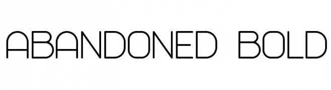
( Vladimir Nikolic - www.coroflot.com/vladimirnikolic )
A modern, geometric font with clean lines and uniform stroke widths.
![Abandoned Bold font caratteri gratis]() Scaricare 316 Downloads@WebFont
Scaricare 316 Downloads@WebFont -
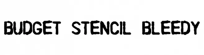
( Fonts by a Colm Clafferty - colmfonts.hol.es. Personal-use only. For commercial use please contact owner. )
A bold, stencil-style font with a rugged, bleedy texture.
![Budget Stencil Bleedy font caratteri gratis]() Scaricare 316 Downloads@WebFont
Scaricare 316 Downloads@WebFont -
( Fonts by www.studiotypo.com - Personal-use only. For commercial use please contact owner. )
A bold, shadowed font with a playful, three-dimensional style.
![SUPER SEVEN Shadowed Demo font caratteri gratis]() Scaricare 316 Downloads@WebFont
Scaricare 316 Downloads@WebFont -
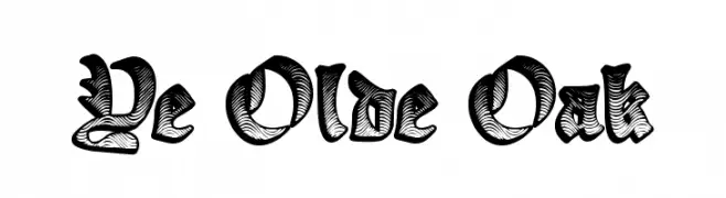
( www.redbubble.com/people/anfa/portfolio )
An ornate, medieval-style font with bold, decorative strokes.
![Ye Olde Oak font caratteri gratis]() Scaricare 316 Downloads@WebFont
Scaricare 316 Downloads@WebFont -
![Gevano font caratteri gratis]() Scaricare 316 Downloads@WebFont
Scaricare 316 Downloads@WebFont -
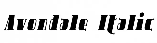
( Fonts by Apostrophic Lab )
A bold, italic serif font with strong forward slant and striking visual impact.
![Avondale Italic font caratteri gratis]() Scaricare 316 Downloads@WebFont
Scaricare 316 Downloads@WebFont -
![Brighton SmallCaps NBP font caratteri gratis]() Scaricare 316 Downloads@WebFont
Scaricare 316 Downloads@WebFont -
( Fonts by www.freakyfonts.de )
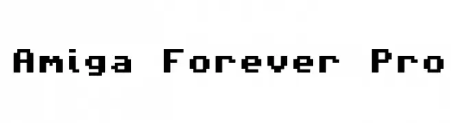
A pixelated, retro-style font with a blocky, geometric design.
![Amiga Forever Pro font caratteri gratis]() Scaricare 316 Downloads@WebFont
Scaricare 316 Downloads@WebFont -
( HackFonts - hackfonts.blogspot.com.co/ )
A bold, impactful font with thick, uniform strokes and tight spacing.
![Placard GF font caratteri gratis]() Scaricare 316 Downloads@WebFont
Scaricare 316 Downloads@WebFont -
( Fonts by a The Branded Quotes - https://sellfy.com/thebrandedquotes. Personal-use only. For commercial use please contact owner. )
A lively and dynamic script font with flowing, interconnected letterforms.
![Noble Notes font caratteri gratis]() Scaricare 316 Downloads@WebFont
Scaricare 316 Downloads@WebFont -
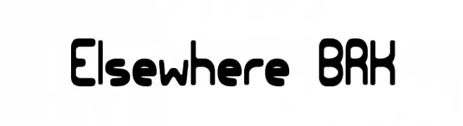
![Elsewhere BRK font caratteri gratis]() Scaricare 316 Downloads@WebFont
Scaricare 316 Downloads@WebFont -
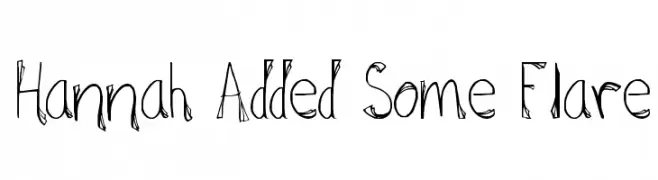
![Hannah Added Some Flare font caratteri gratis]() Scaricare 316 Downloads@WebFont
Scaricare 316 Downloads@WebFont -
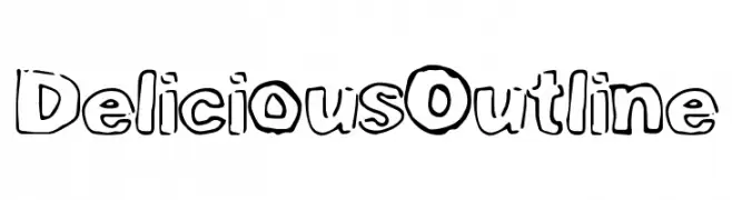
( Fonts by a Max Infeld - XEROGRAPHER FONTS - xerographer.blogspot.com . Personal-use only. For commercial use please contact owner. )
A playful, bold outline font with a hand-drawn, whimsical style.
![DeliciousOutline font caratteri gratis]() Scaricare 316 Downloads@WebFont
Scaricare 316 Downloads@WebFont -
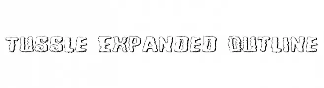
( Fonts by Daniel Zadorozny - www.iconian.com - Free for personal use )
A bold, rugged outline font with a distressed, hand-drawn aesthetic.
![Tussle Expanded Outline font caratteri gratis]() Scaricare 316 Downloads@WebFont
Scaricare 316 Downloads@WebFont -
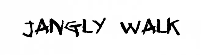
( Fonts by Jacob Fisher - www.pizzadude.dk )
A bold, expressive handwritten font with jagged, textured strokes.
![Jangly walk font caratteri gratis]() Scaricare 316 Downloads@WebFont
Scaricare 316 Downloads@WebFont -
![Display Gothic Regular font caratteri gratis]() Scaricare 316 Downloads@WebFont
Scaricare 316 Downloads@WebFont


Quali sono i font più popolari adesso?
Poppins, Roboto, Montserrat, Open Sans e Lato sono molto usati per le forme pulite e l'ampia applicabilità — dall'identità di marca alle landing page e ai poster.
Quali font si usano spesso nei loghi?
Le sans serif geometriche (es. Poppins, famiglie in stile Gotham) sono scelte comuni per un branding pulito e scalabile. Per un tocco personale restano valide script e stili manoscritti. Abbina un display deciso per i titoli a un corpo testo neutro per riconoscibilità ed equilibrio.
Ogni quanto si aggiorna la lista?
Con regolarità, in base ai download e all'attività reale. Torna spesso per scoprire in anticipo le nuove preferite.
💡 Consiglio: aggiungi ai preferiti — le tendenze cambiano in fretta e i font top di oggi possono ispirare il rebranding di domani.