Benvenuto nelle Font Più Popolari — dove popolarità e qualità si incontrano. Qui trovi i font più scaricati e usati dell'anno. Se cerchi scelte sicure per logo, web o social, inizia da qui.
Ogni font top si distingue per equilibrio, leggibilità e versatilità. Troverai sans serif moderne, script eleganti, serif vintage e display minimalisti.
-
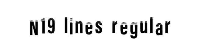
( Fonts by Nineteen Works )
A bold, modern font with horizontal line accents for a dynamic look.
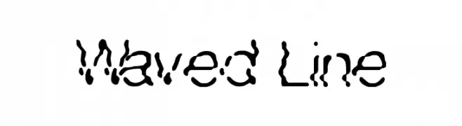
 Scaricare 314 Downloads@WebFont
 -
![Waved Line font caratteri gratis]() Scaricare 314 Downloads@WebFont
Scaricare 314 Downloads@WebFont -
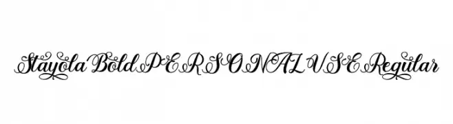
( Fonts by Mans Greback - Personal-use only. For commercial use please contact owner. )
An elegant script font with intricate swashes and decorative flourishes.
![Stayola Bold PERSONAL USE Regular font caratteri gratis]() Scaricare 314 Downloads@WebFont
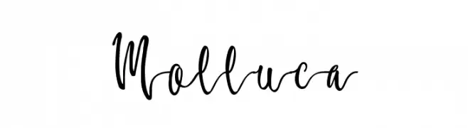
Scaricare 314 Downloads@WebFont -
![Molluca font caratteri gratis]() Scaricare 314 Downloads@WebFont
Scaricare 314 Downloads@WebFont -
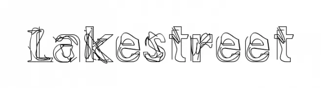
![Lakestreet font caratteri gratis]() Scaricare 314 Downloads@WebFont
Scaricare 314 Downloads@WebFont -
-
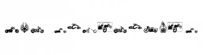
![choppersforlife font caratteri gratis]() Scaricare 314 Downloads@WebFont
Scaricare 314 Downloads@WebFont -
( www.southype.com )
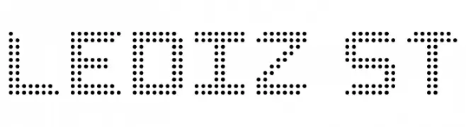
A dot matrix style font with a modern, digital appearance.
![LediZ St font caratteri gratis]() Scaricare 314 Downloads@WebFont
Scaricare 314 Downloads@WebFont -
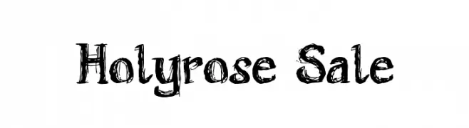
![Holyrose Sale font caratteri gratis]() Scaricare 314 Downloads@WebFont
Scaricare 314 Downloads@WebFont -
![bog Black font caratteri gratis]() Scaricare 314 Downloads@WebFont
Scaricare 314 Downloads@WebFont -
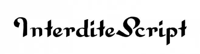
![InterditeScript font caratteri gratis]() Scaricare 314 Downloads@WebFont
Scaricare 314 Downloads@WebFont -
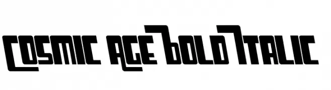
![Cosmic Age Bold Italic font caratteri gratis]() Scaricare 314 Downloads@WebFont
Scaricare 314 Downloads@WebFont -
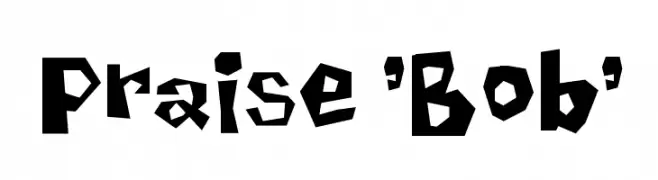
( Fonts by Spork Thug Typography - Josh Wilhelm - www.lifewithouttaffy.com/taffy/blog )
A bold, playful font with an irregular, jagged design.
![Praise 'Bob' font caratteri gratis]() Scaricare 314 Downloads@WebFont
Scaricare 314 Downloads@WebFont -
![Aceituna DEMO Regular font caratteri gratis]() Scaricare 314 Downloads@WebFont
Scaricare 314 Downloads@WebFont -
( Fonts by Letterafa Studio )
Casual handwritten cursive font.
![The Rangnick Regular font caratteri gratis]() Scaricare 314 Downloads@WebFont
Scaricare 314 Downloads@WebFont -
( CloutierFontes - Steve Cloutier - www.cloutierfontes.ca/ )
A modern, narrow font with a sleek and elegant design.
![CF Craig Robinson Regular font caratteri gratis]() Scaricare 314 Downloads@WebFont
Scaricare 314 Downloads@WebFont -
![LCSimple font caratteri gratis]() Scaricare 314 Downloads@WebFont
Scaricare 314 Downloads@WebFont -
( Fonts by a Max Infeld - XEROGRAPHER FONTS - xerographer.blogspot.com . Personal-use only. For commercial use please contact owner. )
A playful, cloud-themed font with a whimsical and airy design.
![GhostClouds font caratteri gratis]() Scaricare 314 Downloads@WebFont
Scaricare 314 Downloads@WebFont -
( Fonts by dustBUST - Andreas Nylin )
A modern, pixelated font composed of 3x3 dot grids, offering a playful and tech-inspired aesthetic.
![3x3 dots Bold font caratteri gratis]() Scaricare 314 Downloads@WebFont
Scaricare 314 Downloads@WebFont -
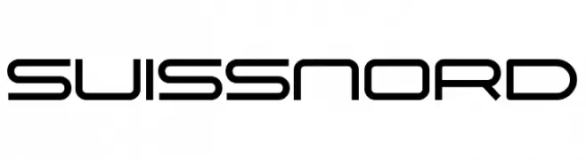
( Sharkshock - Dennis Ludlow - www.sharkshock.net )
A sleek, modern font with geometric and futuristic design elements.
![Suissnord font caratteri gratis]() Scaricare 314 Downloads@WebFont
Scaricare 314 Downloads@WebFont -
( Fonts by Dan P. Lyons - Personal-use only. For commercial use please contact owner. )
A bold, futuristic font with rounded edges and a digital aesthetic.
![Entertainment 4 Digital Font font caratteri gratis]() Scaricare 313 Downloads@WebFont
Scaricare 313 Downloads@WebFont -
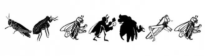
( Fonts by Manfred Klein. Free for private and charity use. Free for commercial with donation to organizations )
Highly detailed insect illustrations replace standard alphanumeric characters.
![Insects font caratteri gratis]() Scaricare 313 Downloads@WebFont
Scaricare 313 Downloads@WebFont -
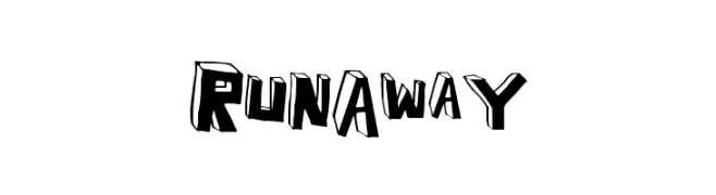
( Fonts by a Max Infeld - XEROGRAPHER FONTS - xerographer.blogspot.com . Personal-use only. For commercial use please contact owner. )
A bold, 3D decorative font with a playful and dynamic style.
![RunAway font caratteri gratis]() Scaricare 313 Downloads@WebFont
Scaricare 313 Downloads@WebFont -
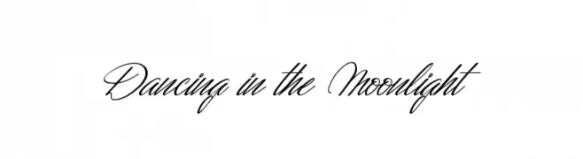
( Fonts by Maelle.K - Thomas Boucherie - Personal-use only. For commercial use please contact owner. )
An elegant script font with fluid, cursive strokes and ornate flourishes.
![Dancing in the Moonlight font caratteri gratis]() Scaricare 313 Downloads@WebFont
Scaricare 313 Downloads@WebFont -
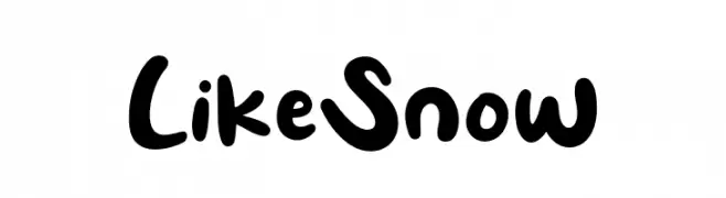
( Fonts by Khurasan )
A playful, bold font with rounded, hand-drawn letterforms.
![Like Snow font caratteri gratis]() Scaricare 313 Downloads@WebFont
Scaricare 313 Downloads@WebFont -
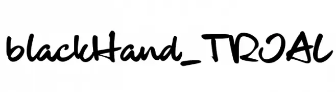
( JOEBOB graphics - Joe vanderHam - www.joebob.nl )
A bold, handwritten font with a playful and energetic style.
![blackHand_TRIAL font caratteri gratis]() Scaricare 313 Downloads@WebFont
Scaricare 313 Downloads@WebFont -
( Fonts by Daniel Gauthier )
A bold, jagged font with high contrast and thorn-like edges, perfect for dramatic designs.
![FlyLegs font caratteri gratis]() Scaricare 313 Downloads@WebFont
Scaricare 313 Downloads@WebFont -
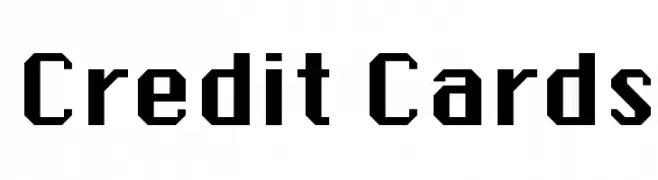
( Fonts by Rick Mueller )
A bold, decorative dingbat font with credit card and commercial icons.
![Credit Cards font caratteri gratis]() Scaricare 313 Downloads@WebFont
Scaricare 313 Downloads@WebFont -
![child writing font caratteri gratis]() Scaricare 313 Downloads@WebFont
Scaricare 313 Downloads@WebFont -
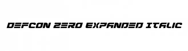
( Fonts by Iconian Fonts )
A bold, expanded, and italicized font with a futuristic and dynamic style.
![Defcon Zero Expanded Italic font caratteri gratis]() Scaricare 313 Downloads@WebFont
Scaricare 313 Downloads@WebFont -
( Alan Carr )
A bold, geometric font with strong, modern letterforms.
![AdLib font caratteri gratis]() Scaricare 313 Downloads
Scaricare 313 Downloads -
( Fanastudio )
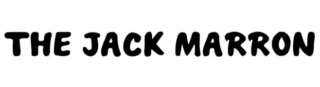
A bold, playful font with rounded edges and a bubbly appearance.
![THE JACK MARRON font caratteri gratis]() Scaricare 313 Downloads@WebFont
Scaricare 313 Downloads@WebFont -
( Fonts by Steve Cloutier - www.cloutierfontes.ca )
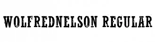
A bold, distressed font with a vintage, rugged appearance.
![WolfredNelson Regular font caratteri gratis]() Scaricare 313 Downloads@WebFont
Scaricare 313 Downloads@WebFont -
![amputierte font caratteri gratis]() Scaricare 313 Downloads@WebFont
Scaricare 313 Downloads@WebFont -
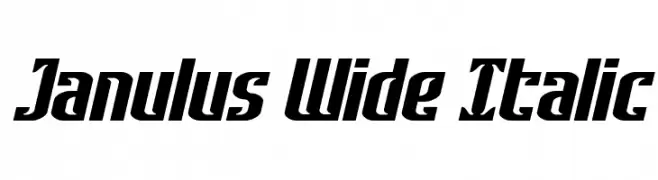
( Fonts by Daniel Zadorozny - www.iconian.com - Personal-use only. For commercial use please contact owner. )
A bold, wide, and italicized font with a modern and dynamic style.
![Janulus Wide Italic font caratteri gratis]() Scaricare 313 Downloads@WebFont
Scaricare 313 Downloads@WebFont -
![Pixapp Inter font caratteri gratis]() Scaricare 313 Downloads@WebFont
Scaricare 313 Downloads@WebFont


Quali sono i font più popolari adesso?
Poppins, Roboto, Montserrat, Open Sans e Lato sono molto usati per le forme pulite e l'ampia applicabilità — dall'identità di marca alle landing page e ai poster.
Quali font si usano spesso nei loghi?
Le sans serif geometriche (es. Poppins, famiglie in stile Gotham) sono scelte comuni per un branding pulito e scalabile. Per un tocco personale restano valide script e stili manoscritti. Abbina un display deciso per i titoli a un corpo testo neutro per riconoscibilità ed equilibrio.
Ogni quanto si aggiorna la lista?
Con regolarità, in base ai download e all'attività reale. Torna spesso per scoprire in anticipo le nuove preferite.
💡 Consiglio: aggiungi ai preferiti — le tendenze cambiano in fretta e i font top di oggi possono ispirare il rebranding di domani.