Benvenuto nelle Font Più Popolari — dove popolarità e qualità si incontrano. Qui trovi i font più scaricati e usati dell'anno. Se cerchi scelte sicure per logo, web o social, inizia da qui.
Ogni font top si distingue per equilibrio, leggibilità e versatilità. Troverai sans serif moderne, script eleganti, serif vintage e display minimalisti.
-
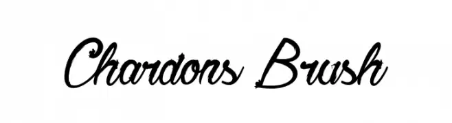
( Fonts by Greg Medina - www.dcoxy.com - Personal-use only. For commercial use please contact owner. )
A dynamic brush-style font with fluid, cursive strokes and varying thickness.
 Scaricare 310 Downloads@WebFont
 -
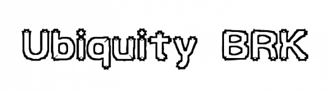
( Fonts by www.aenigmafonts.com )
A bold, outlined font with a playful, hand-drawn style.
![Ubiquity BRK font caratteri gratis]() Scaricare 310 Downloads@WebFont
Scaricare 310 Downloads@WebFont -
![SailingJunco font caratteri gratis]() Scaricare 310 Downloads@WebFont
Scaricare 310 Downloads@WebFont -
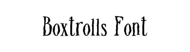
( Fonts by Fran Fernandez - Personal-use only. For commercial use please contact owner. )
A whimsical, hand-drawn style font with playful, irregular strokes.
![Boxtrolls Font font caratteri gratis]() Scaricare 310 Downloads@WebFont
Scaricare 310 Downloads@WebFont -
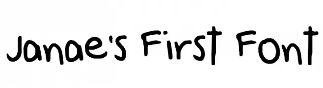
![Janae's First Font font caratteri gratis]() Scaricare 310 Downloads@WebFont
Scaricare 310 Downloads@WebFont -
-
![Rinehart Oblique font caratteri gratis]() Scaricare 310 Downloads@WebFont
Scaricare 310 Downloads@WebFont -
( Fonts by Dibujado )
A vintage, textured serif font with a handcrafted, antique appearance.
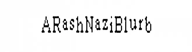
![ARashNaziBlurb font caratteri gratis]() Scaricare 310 Downloads@WebFont
Scaricare 310 Downloads@WebFont -
( Fonts by Matthew Welch - www.squaregear.net/fonts/ )
A brush-like, calligraphy-inspired font with dynamic strokes and an exotic aesthetic.
![Far East font caratteri gratis]() Scaricare 310 Downloads@WebFont
Scaricare 310 Downloads@WebFont -
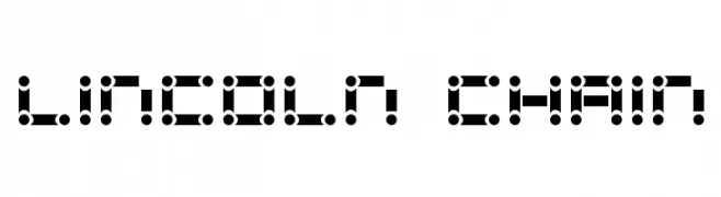
![Lincoln Chain font caratteri gratis]() Scaricare 310 Downloads
Scaricare 310 Downloads -
( Måns Grebäck - www.mansgreback.com )
A bold, italicized font with a modern and dynamic style.
![Sonika PERSONAL USE Bold Italic font caratteri gratis]() Scaricare 310 Downloads@WebFont
Scaricare 310 Downloads@WebFont -
![KurierCond-Bold font caratteri gratis]() Scaricare 310 Downloads@WebFont
Scaricare 310 Downloads@WebFont -
![Magic Christmas font caratteri gratis]() Scaricare 310 Downloads@WebFont
Scaricare 310 Downloads@WebFont -
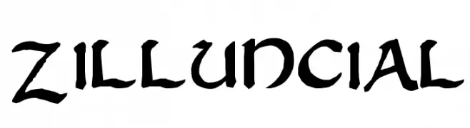
![Zilluncial font caratteri gratis]() Scaricare 310 Downloads@WebFont
Scaricare 310 Downloads@WebFont -
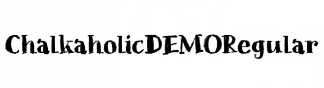
![Chalkaholic DEMO Regular font caratteri gratis]() Scaricare 310 Downloads@WebFont
Scaricare 310 Downloads@WebFont -
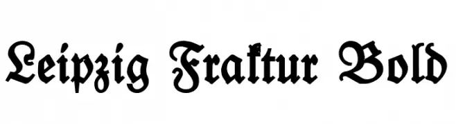
( Fonts by Peter Wiegel - www.peter-wiegel.de - Personal-use only. For commercial use please contact owner. )
A bold, blackletter typeface with intricate, angular strokes and a traditional Fraktur style.
![Leipzig Fraktur Bold font caratteri gratis]() Scaricare 310 Downloads@WebFont
Scaricare 310 Downloads@WebFont -
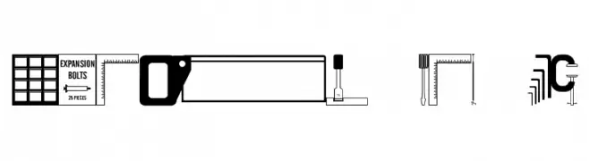
( Fonts by Jeff Levine. FREEWARE )
Illustrative, tool-themed decorative font with high visual complexity.
![Quick Fix JL font caratteri gratis]() Scaricare 310 Downloads@WebFont
Scaricare 310 Downloads@WebFont -
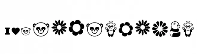
( Free for Personal Use. To use commercially please visit the www.bvfonts.com )
A playful, panda-themed decorative font with bold, cartoonish icons.
![Pandamonium font caratteri gratis]() Scaricare 310 Downloads@WebFont
Scaricare 310 Downloads@WebFont -
( Fonts by dustBUST - Andreas Nylin )
A modern, pixelated font composed of 3x3 dot grids, offering a playful and tech-inspired aesthetic.
![3x3 dots Bold font caratteri gratis]() Scaricare 310 Downloads@WebFont
Scaricare 310 Downloads@WebFont -
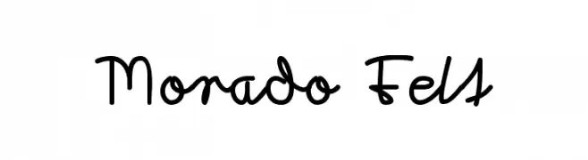
( Fonts by www.peter-wiegel.de. Personal-use only. For commercial use please contact owner. )
A playful, handwritten font with fluid and dynamic strokes.
![Morado Felt font caratteri gratis]() Scaricare 309 Downloads@WebFont
Scaricare 309 Downloads@WebFont -
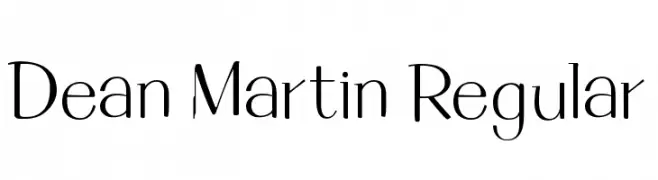
( Fonts by Mario Arturo - marioarturo.com. Personal-use only. For commercial use please contact owner. Contact the owner for a donation. )
A modern, elegant font with sleek, elongated characters.
![Dean Martin Regular font caratteri gratis]() Scaricare 309 Downloads@WebFont
Scaricare 309 Downloads@WebFont -
( www.woodcutter.es )
A modern, bilingual font combining sans-serif Roman and Japanese characters.
![Apple Japanese Keyboard font caratteri gratis]() Scaricare 309 Downloads@WebFont
Scaricare 309 Downloads@WebFont -
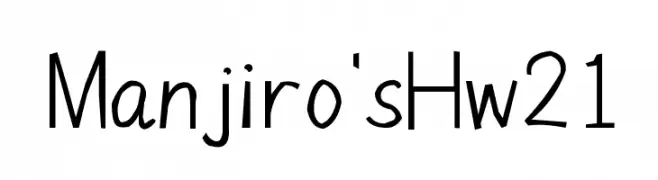
![Manjiro'sHw21 font caratteri gratis]() Scaricare 309 Downloads@WebFont
Scaricare 309 Downloads@WebFont -
( Fonts by Bud White. Personal-use only. For commercial use please contact owner. )
A modern, geometric font with a linear and rhythmic design.
![Baddit font caratteri gratis]() Scaricare 309 Downloads@WebFont
Scaricare 309 Downloads@WebFont -
![Daville Condensed Rev Slanted font caratteri gratis]() Scaricare 309 Downloads@WebFont
Scaricare 309 Downloads@WebFont -
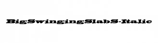
![BigSwingingSlabS-Italic font caratteri gratis]() Scaricare 309 Downloads@WebFont
Scaricare 309 Downloads@WebFont -
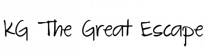
( Fonts by www.kimberlygeswein.com - Kimberly Geswein )
A playful, informal handwritten font with smooth, flowing lines and a cohesive appearance.
![KG The Great Escape font caratteri gratis]() Scaricare 309 Downloads@WebFont
Scaricare 309 Downloads@WebFont -
![Millennium font caratteri gratis]() Scaricare 309 Downloads@WebFont
Scaricare 309 Downloads@WebFont -
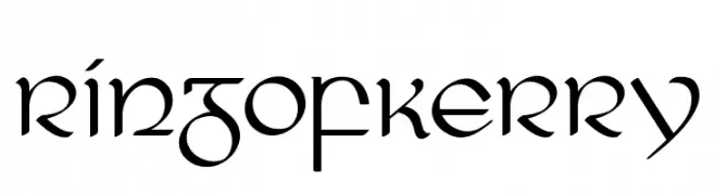
( Fonts by Sharkshock )
A modern calligraphic font with elegant, flowing letterforms and sharp serifs.
![RingofKerry font caratteri gratis]() Scaricare 309 Downloads@WebFont
Scaricare 309 Downloads@WebFont -
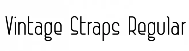
![Vintage Straps Regular font caratteri gratis]() Scaricare 309 Downloads@WebFont
Scaricare 309 Downloads@WebFont -
( Sigit Nur Wicaksono - creativemarket.com/ogit )
A modern, geometric sans-serif font with clean lines and balanced spacing.
![revilo san font caratteri gratis]() Scaricare 309 Downloads@WebFont
Scaricare 309 Downloads@WebFont -
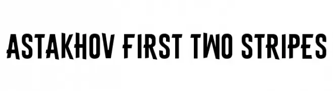
( Fonts by Dmitry Astakhov - www.behance.net/adonis-abe1e - Personal-use only. For commercial use please contact owner. )
Bold, geometric, and condensed font with a modern style.
![Astakhov First Two Stripes font caratteri gratis]() Scaricare 309 Downloads@WebFont
Scaricare 309 Downloads@WebFont -
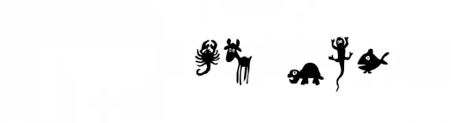
( Fonts by Font Environment - fontenvironment.com )
Cartoon animal pictogram font with bold, playful silhouettes.
![FE-WinPets2 font caratteri gratis]() Scaricare 309 Downloads@WebFont
Scaricare 309 Downloads@WebFont -
![Schwarzenegger Condensed Italic font caratteri gratis]() Scaricare 309 Downloads@WebFont
Scaricare 309 Downloads@WebFont -
( Fonts by Kong Font - https://fontkong.com/ - Personal-use only. For commercial use please contact owner. )
A dynamic and expressive handwritten font with fluid strokes.
![The Rambler font caratteri gratis]() Scaricare 309 Downloads@WebFont
Scaricare 309 Downloads@WebFont -
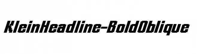
( Fonts by Manfred Klein. Free for private and charity use. Free for commercial with donation to organizations )
A bold, oblique font with a modern and dynamic style.
![KleinHeadline-BoldOblique font caratteri gratis]() Scaricare 309 Downloads@WebFont
Scaricare 309 Downloads@WebFont


Quali sono i font più popolari adesso?
Poppins, Roboto, Montserrat, Open Sans e Lato sono molto usati per le forme pulite e l'ampia applicabilità — dall'identità di marca alle landing page e ai poster.
Quali font si usano spesso nei loghi?
Le sans serif geometriche (es. Poppins, famiglie in stile Gotham) sono scelte comuni per un branding pulito e scalabile. Per un tocco personale restano valide script e stili manoscritti. Abbina un display deciso per i titoli a un corpo testo neutro per riconoscibilità ed equilibrio.
Ogni quanto si aggiorna la lista?
Con regolarità, in base ai download e all'attività reale. Torna spesso per scoprire in anticipo le nuove preferite.
💡 Consiglio: aggiungi ai preferiti — le tendenze cambiano in fretta e i font top di oggi possono ispirare il rebranding di domani.