Benvenuto nelle Font Più Popolari — dove popolarità e qualità si incontrano. Qui trovi i font più scaricati e usati dell'anno. Se cerchi scelte sicure per logo, web o social, inizia da qui.
Ogni font top si distingue per equilibrio, leggibilità e versatilità. Troverai sans serif moderne, script eleganti, serif vintage e display minimalisti.
-
( Sharkshock - Dennis Ludlow - www.sharkshock.net )
A sleek, modern font with geometric and futuristic design elements.
 Scaricare 321 Downloads@WebFont
 -
( Fonts by Manfred Klein. Free for private and charity use. Free for commercial with donation to organizations )
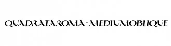
An oblique serif font with medium weight and elegant, angular serifs.
![QuadrataRoma-MediumOblique font caratteri gratis]() Scaricare 320 Downloads@WebFont
Scaricare 320 Downloads@WebFont -
![KGCHEF font caratteri gratis]() Scaricare 320 Downloads@WebFont
Scaricare 320 Downloads@WebFont -
( Fonts by New Typography - Vernon Adams. Personal-use only. For commercial use please contact owner. )
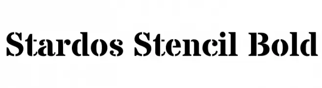
A bold, stencil-style font with high contrast and geometric shapes.
![Stardos Stencil Bold font caratteri gratis]() Scaricare 320 Downloads@WebFont
Scaricare 320 Downloads@WebFont -
( Fonts by Leonardo Falaschini - www.liondart.com - Personal-use only. For commercial use please contact owner. )
A bold, modern font with thick, rounded characters and unique cutouts.
![Martina font caratteri gratis]() Scaricare 320 Downloads@WebFont
Scaricare 320 Downloads@WebFont -
( Character )
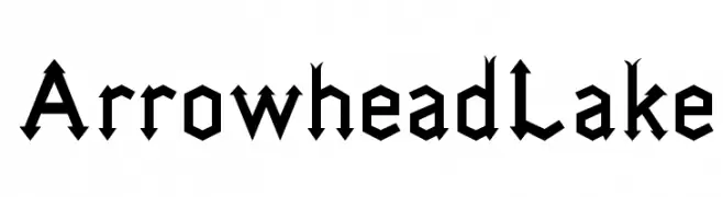
A bold, angular font with sharp, arrowhead-like serifs.
![ArrowheadLake font caratteri gratis]() Scaricare 320 Downloads@WebFont
Scaricare 320 Downloads@WebFont -
( Fonts by El Stinger )
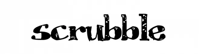
A bold, distressed font with a grunge, hand-painted aesthetic.
![Scrubble font caratteri gratis]() Scaricare 320 Downloads@WebFont
Scaricare 320 Downloads@WebFont -
( Fonts by Bartek Nowak - www.nowak.tv/fontoholic/ )
A decorative and artistic font with a medieval-inspired style.
![Volan font caratteri gratis]() Scaricare 320 Downloads@WebFont
Scaricare 320 Downloads@WebFont -
( Fonts by a Max Infeld - XEROGRAPHER FONTS - xerographer.blogspot.com . Personal-use only. For commercial use please contact owner. )
A bold, 3D decorative font with a playful and dynamic style.
![RunAway font caratteri gratis]() Scaricare 320 Downloads@WebFont
Scaricare 320 Downloads@WebFont -
( Fonts by www.peter-wiegel.de. Personal-use only. For commercial use please contact owner. )
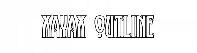
A bold, outlined font with art deco influences, featuring tall, narrow characters.
![XAyax Outline font caratteri gratis]() Scaricare 320 Downloads@WebFont
Scaricare 320 Downloads@WebFont -
![101! Closer Inspection font caratteri gratis]() Scaricare 320 Downloads@WebFont
Scaricare 320 Downloads@WebFont -
![Din Kursivschrift Left Eng font caratteri gratis]() Scaricare 320 Downloads@WebFont
Scaricare 320 Downloads@WebFont -
![ZRex Trial Version font caratteri gratis]() Scaricare 320 Downloads@WebFont
Scaricare 320 Downloads@WebFont -
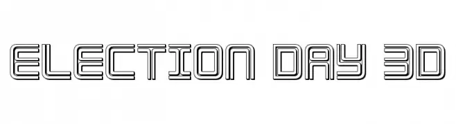
( Fonts by Daniel Zadorozny - www.iconian.com )
A bold, 3D outline font with a futuristic and dynamic style.
![Election Day 3D font caratteri gratis]() Scaricare 320 Downloads@WebFont
Scaricare 320 Downloads@WebFont -
( Fanastudio )
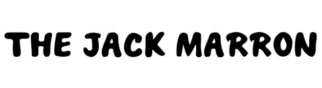
A bold, playful font with rounded edges and a bubbly appearance.
![THE JACK MARRON font caratteri gratis]() Scaricare 320 Downloads@WebFont
Scaricare 320 Downloads@WebFont -
( thealexzone.com/ )
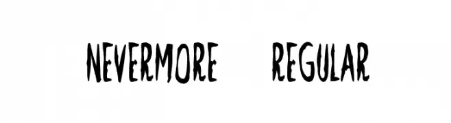
A bold, hand-drawn font with a mysterious and dynamic style.
![Nevermore-Regular font caratteri gratis]() Scaricare 320 Downloads@WebFont
Scaricare 320 Downloads@WebFont -
( Fonts by www.DigitalDreamDesign.net )
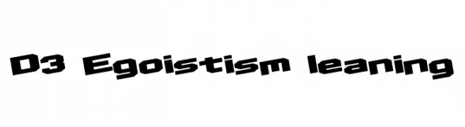
A bold, angular font with a dynamic slant and blocky structure.
![D3 Egoistism leaning font caratteri gratis]() Scaricare 320 Downloads@WebFont
Scaricare 320 Downloads@WebFont -
( Fonts by Jonathan S. Harris - www.tattoowoo.com. Personal-use only. For commercial use please contact owner. )
A bold, expressive handwritten script with dynamic strokes and a brush-like texture.
![Rockers font caratteri gratis]() Scaricare 320 Downloads@WebFont
Scaricare 320 Downloads@WebFont -
( Fonts by www.aenigmafonts.com )
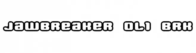
A bold, rounded font with a playful, bubble-like design.
![Jawbreaker OL1 BRK font caratteri gratis]() Scaricare 320 Downloads@WebFont
Scaricare 320 Downloads@WebFont -
( Fonts by Eko Bimantara - Personal-use only. For commercial use please contact owner. )
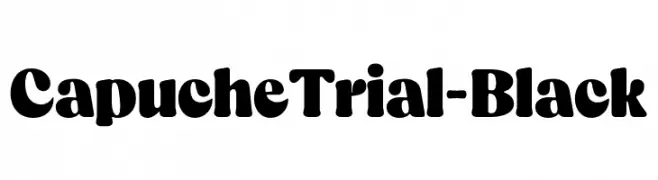
A bold, rounded font with a playful and robust appearance.
![CapucheTrial-Black font caratteri gratis]() Scaricare 320 Downloads@WebFont
Scaricare 320 Downloads@WebFont -
( Fonts by www.asleycruz.com - Asley Cruz - Personal-use only. For commercial use please contact owner. )
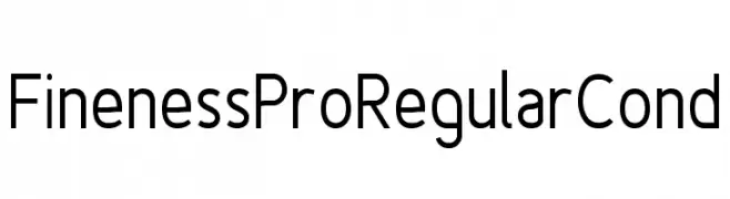
A modern, geometric sans-serif font with a clean and professional look.
![Fineness Pro Regular Cond font caratteri gratis]() Scaricare 320 Downloads@WebFont
Scaricare 320 Downloads@WebFont -
( Fonts by a Max Infeld - XEROGRAPHER FONTS - xerographer.blogspot.com . Personal-use only. For commercial use please contact owner. )
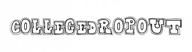
A bold, playful font with a three-dimensional outlined style.
![CollegeDropout font caratteri gratis]() Scaricare 320 Downloads@WebFont
Scaricare 320 Downloads@WebFont -
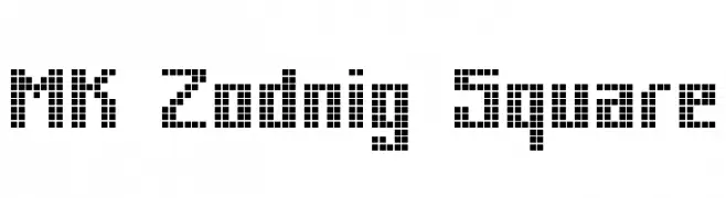
![MK Zodnig Square font caratteri gratis]() Scaricare 320 Downloads@WebFont
Scaricare 320 Downloads@WebFont -
( Fonts by Letterhend Studio - Hendry Juanda - Personal-use only. For commercial use please contact owner. )
A clean, modern sans-serif font with bold, uniform strokes and geometric structure.
![Antone DEMO Clean font caratteri gratis]() Scaricare 320 Downloads@WebFont
Scaricare 320 Downloads@WebFont -
( Fonts by Iconian Fonts )
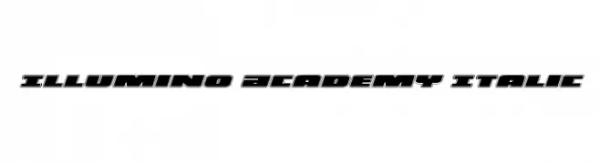
A bold, italicized font with a futuristic, geometric design.
![Illumino Academy Italic font caratteri gratis]() Scaricare 320 Downloads@WebFont
Scaricare 320 Downloads@WebFont -
( Fonts by Rizki Alisaptamarza )
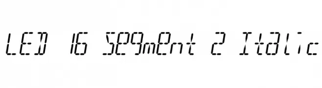
A modern, digital-inspired font with an italic, segmented LED display style.
![LED 16 Segment 2 Italic font caratteri gratis]() Scaricare 320 Downloads@WebFont
Scaricare 320 Downloads@WebFont -
( Darrell Flood )
A bold, angular font with sharp edges and a modern aesthetic.
![Raptors font caratteri gratis]() Scaricare 320 Downloads@WebFont
Scaricare 320 Downloads@WebFont -
( Fonts by Ingo Zimmermann - www.ingofonts.com )
A bold, geometric font with a modern, Art Deco-inspired design.
![DekoBlakk font caratteri gratis]() Scaricare 320 Downloads@WebFont
Scaricare 320 Downloads@WebFont -
![Agym font caratteri gratis]() Scaricare 320 Downloads@WebFont
Scaricare 320 Downloads@WebFont -
( Font by Jonathan Harris - www.tattoowoo.com )
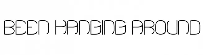
A modern, artistic font with elongated, geometric strokes and a futuristic vibe.
![Been Hanging Around font caratteri gratis]() Scaricare 320 Downloads@WebFont
Scaricare 320 Downloads@WebFont -
![DANOISE-Medium font caratteri gratis]() Scaricare 320 Downloads@WebFont
Scaricare 320 Downloads@WebFont -
![EversonMono-Oblique font caratteri gratis]() Scaricare 320 Downloads@WebFont
Scaricare 320 Downloads@WebFont -
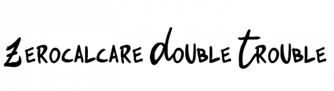
( Fonts by Zetafonts )
A bold, playful handwritten font with a comic book flair.
![Zerocalcare Double Trouble font caratteri gratis]() Scaricare 320 Downloads@WebFont
Scaricare 320 Downloads@WebFont -
![Americana Dreams Upright Bold font caratteri gratis]() Scaricare 320 Downloads@WebFont
Scaricare 320 Downloads@WebFont -
( Fonts by Ef Studio - Personal-use only. For commercial use please contact owner. )
A playful, handwritten font with smooth lines and a casual style.
![Salmonpie - Personal Use font caratteri gratis]() Scaricare 320 Downloads@WebFont
Scaricare 320 Downloads@WebFont


Quali sono i font più popolari adesso?
Poppins, Roboto, Montserrat, Open Sans e Lato sono molto usati per le forme pulite e l'ampia applicabilità — dall'identità di marca alle landing page e ai poster.
Quali font si usano spesso nei loghi?
Le sans serif geometriche (es. Poppins, famiglie in stile Gotham) sono scelte comuni per un branding pulito e scalabile. Per un tocco personale restano valide script e stili manoscritti. Abbina un display deciso per i titoli a un corpo testo neutro per riconoscibilità ed equilibrio.
Ogni quanto si aggiorna la lista?
Con regolarità, in base ai download e all'attività reale. Torna spesso per scoprire in anticipo le nuove preferite.
💡 Consiglio: aggiungi ai preferiti — le tendenze cambiano in fretta e i font top di oggi possono ispirare il rebranding di domani.