Benvenuto nelle Font Più Popolari — dove popolarità e qualità si incontrano. Qui trovi i font più scaricati e usati dell'anno. Se cerchi scelte sicure per logo, web o social, inizia da qui.
Ogni font top si distingue per equilibrio, leggibilità e versatilità. Troverai sans serif moderne, script eleganti, serif vintage e display minimalisti.
-
 Scaricare 316 Downloads@WebFont
 -
![Sharp Objects NBP Regular font caratteri gratis]() Scaricare 316 Downloads@WebFont
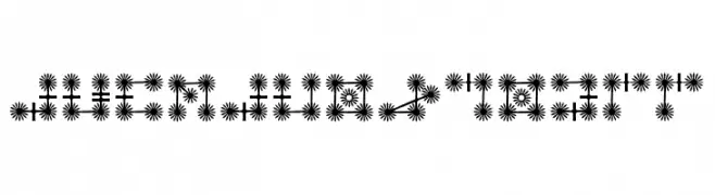
Scaricare 316 Downloads@WebFont -
![AlphabetGenii font caratteri gratis]() Scaricare 316 Downloads@WebFont
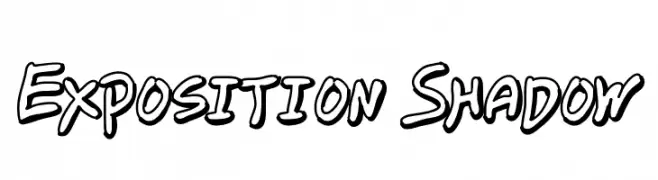
Scaricare 316 Downloads@WebFont -
![Exposition Shadow font caratteri gratis]() Scaricare 316 Downloads@WebFont
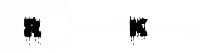
Scaricare 316 Downloads@WebFont -
![Raptor Kill font caratteri gratis]() Scaricare 316 Downloads@WebFont
Scaricare 316 Downloads@WebFont -
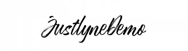
( Runsell Studio - creativemarket.com/RunsellStudio )
A bold, expressive handwritten font with fluid, cursive strokes.
![JustlyneDemo font caratteri gratis]() Scaricare 316 Downloads@WebFont
Scaricare 316 Downloads@WebFont -
( Fonts by Woodcutter )
A playful, bold, and handwritten font with a whimsical touch.
![Breaking Funny News font caratteri gratis]() Scaricare 316 Downloads@WebFont
Scaricare 316 Downloads@WebFont -
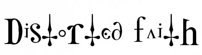
( Fonts by http://perso.calixo.net/~uzim/ )
An artistic, high-contrast font with gothic influences and modern flair.
![Distorted Faith font caratteri gratis]() Scaricare 316 Downloads@WebFont
Scaricare 316 Downloads@WebFont -
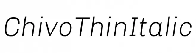
( Fonts by Omnibus Type )
A sleek, modern thin italic font with a minimalistic design.
![Chivo Thin Italic font caratteri gratis]() Scaricare 316 Downloads@WebFont
Scaricare 316 Downloads@WebFont -
( Fonts by Tom Raaijmakers )
A bold, expressive handwritten font with dynamic strokes.
![Paul PC font caratteri gratis]() Scaricare 316 Downloads@WebFont
Scaricare 316 Downloads@WebFont -
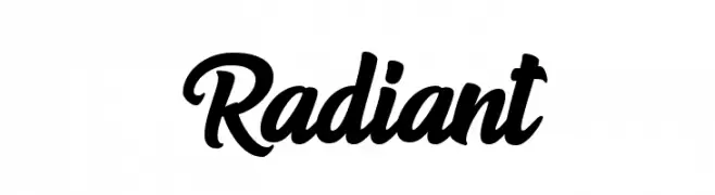
( Fonts by Andhi Yulianto - Personal-use only. For commercial use please contact owner. )
A bold, expressive script font with fluid, dynamic strokes.
![Radiant font caratteri gratis]() Scaricare 316 Downloads@WebFont
Scaricare 316 Downloads@WebFont -
( Fonts by Nirmala Creative - Personal-use only. For commercial use please contact owner. )
Playful handwritten script font.
![Little Penguin font caratteri gratis]() Scaricare 316 Downloads@WebFont
Scaricare 316 Downloads@WebFont -
( Fonts by Douglas Vitkauskas - www.vtksdesign.com. Personal-use only. For commercial use please contact owner. )
A bold, sketch-like font with a hand-drawn, textured appearance.
![VTKS 36 font caratteri gratis]() Scaricare 316 Downloads@WebFont
Scaricare 316 Downloads@WebFont -
( Fonts by Apostrophic Lab )
A modern, italic font with a sleek, condensed design and consistent stroke weight.
![Republikaps Exp - Light Italic font caratteri gratis]() Scaricare 316 Downloads@WebFont
Scaricare 316 Downloads@WebFont -
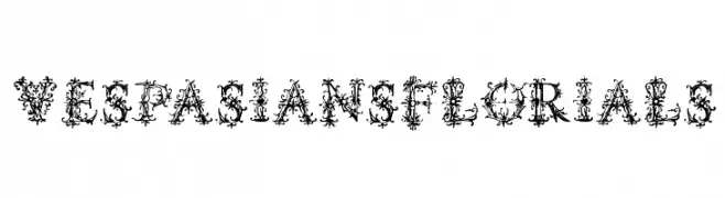
( Fonts by Manfred Klein - manfred-klein.ina-mar.com )
An ornate, floral-themed decorative font with intricate details.
![VespasiansFlorials font caratteri gratis]() Scaricare 316 Downloads@WebFont
Scaricare 316 Downloads@WebFont -
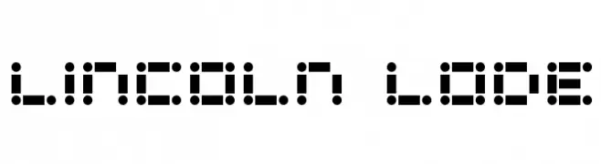
![Lincoln Lode font caratteri gratis]() Scaricare 316 Downloads
Scaricare 316 Downloads -
( Fonts by Chris Vile - fontmonger.com - Personal-use only. For commercial use please contact owner. )
A bold, gothic font with dripping, textured elements and a blackletter style.
![Burn The Witch font caratteri gratis]() Scaricare 316 Downloads@WebFont
Scaricare 316 Downloads@WebFont -
![Keep Scrolling Regular font caratteri gratis]() Scaricare 316 Downloads@WebFont
Scaricare 316 Downloads@WebFont -
( Fonts by Manfred Klein. Free for private and charity use. Free for commercial with donation to organizations )
A classic serif font with elegant curves and a modern touch.
![Lipsiantiqua-Regular font caratteri gratis]() Scaricare 316 Downloads@WebFont
Scaricare 316 Downloads@WebFont -
![Marfhaus font caratteri gratis]() Scaricare 316 Downloads@WebFont
Scaricare 316 Downloads@WebFont -
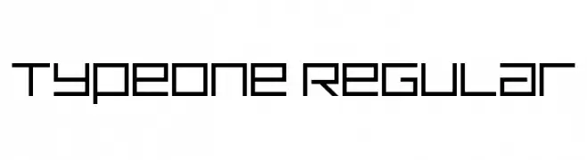
( Fonts by Nirmal Biswas - www.be.net/nirmalbiswas/ - Usage demands USD 25 or more via PayPal to nirmalbiswas@gmail.com )
A geometric, modern font with uniform stroke width and angular shapes.
![TypeOne Regular font caratteri gratis]() Scaricare 316 Downloads@WebFont
Scaricare 316 Downloads@WebFont -
![Simple Signature font caratteri gratis]() Scaricare 316 Downloads@WebFont
Scaricare 316 Downloads@WebFont -
( Fonts by Jacob Fisher - www.pizzadude.dk )
A bold, geometric font with a modern, industrial style.
![Zenith 2000 font caratteri gratis]() Scaricare 316 Downloads@WebFont
Scaricare 316 Downloads@WebFont -
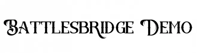
( Fonts by Edric Studio - Personal-use only. For commercial use please contact owner. )
An ornate and decorative font with elaborate swirls and flourishes.
![Battlesbridge Demo font caratteri gratis]() Scaricare 316 Downloads@WebFont
Scaricare 316 Downloads@WebFont -
![ProggyTinyTT font caratteri gratis]() Scaricare 316 Downloads@WebFont
Scaricare 316 Downloads@WebFont -
![Zone23_nootropics font caratteri gratis]() Scaricare 316 Downloads@WebFont
Scaricare 316 Downloads@WebFont -
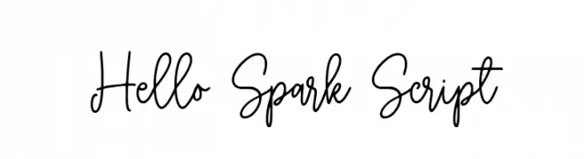
( Fonts by Typebae Foundry )
A lively and flowing script font with elegant, interconnected letters.
![Hello Spark Script font caratteri gratis]() Scaricare 316 Downloads@WebFont
Scaricare 316 Downloads@WebFont -
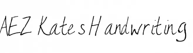
( Fonts by Adult Ramblings - Anastacia E. Zittel - Personal-use only. For commercial use please contact owner. )
A casual, handwritten-style font with uneven strokes and a personal touch.
![AEZ Kate's Handwriting font caratteri gratis]() Scaricare 316 Downloads@WebFont
Scaricare 316 Downloads@WebFont -
( Fonts by ShyFonts )
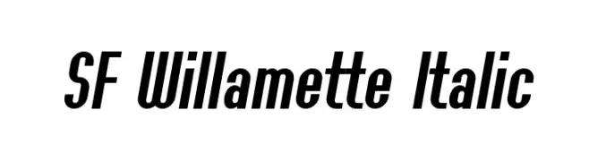
A bold, italic font with a modern and dynamic style, ideal for headlines.
![SF Willamette Italic font caratteri gratis]() Scaricare 316 Downloads@WebFont
Scaricare 316 Downloads@WebFont -
( Fonts by Utopiafonts )
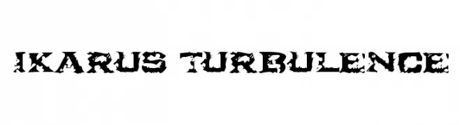
A bold, distressed font with jagged edges and a turbulent, rebellious style.
![Ikarus Turbulence font caratteri gratis]() Scaricare 316 Downloads@WebFont
Scaricare 316 Downloads@WebFont -
( Copyright (c) 2010, Danh Hong (khmertype.blogspot.com) )
A clean, modern font with balanced spacing and clear characters.
![Suwannaphum font caratteri gratis]() Scaricare 316 Downloads@WebFont
Scaricare 316 Downloads@WebFont -
( Fonts by Jayde Garrow - GarrowGlitch - http://jaydegarrow.wix.com/jaydefonts. Personal-use only. For commercial use please contact owner. )
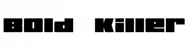
A bold, geometric font with block-like characters and tight spacing.
![Bold Killer font caratteri gratis]() Scaricare 316 Downloads@WebFont
Scaricare 316 Downloads@WebFont -
( Fonts by Press Gang Studios - Andeh Pinkard - www.pressgang-studios.com )
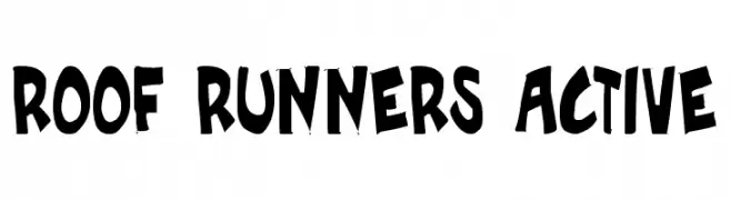
A bold, playful font with a hand-drawn, graffiti-like style.
![Roof runners active font caratteri gratis]() Scaricare 316 Downloads@WebFont
Scaricare 316 Downloads@WebFont -
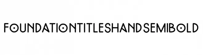
( Fonts by Foundation Titles Hand - Personal-use only. For commercial use please contact owner. )
A playful, modern handwritten font with bold, rounded characters.
![FoundationTitlesHand-SemiBold font caratteri gratis]() Scaricare 316 Downloads@WebFont
Scaricare 316 Downloads@WebFont -
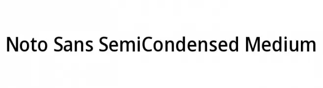
( Fonts by Google )
A modern, semi-condensed sans-serif font with balanced stroke widths and excellent readability.
![Noto Sans SemiCondensed Medium font caratteri gratis]() Scaricare 316 Downloads@WebFont
Scaricare 316 Downloads@WebFont


Quali sono i font più popolari adesso?
Poppins, Roboto, Montserrat, Open Sans e Lato sono molto usati per le forme pulite e l'ampia applicabilità — dall'identità di marca alle landing page e ai poster.
Quali font si usano spesso nei loghi?
Le sans serif geometriche (es. Poppins, famiglie in stile Gotham) sono scelte comuni per un branding pulito e scalabile. Per un tocco personale restano valide script e stili manoscritti. Abbina un display deciso per i titoli a un corpo testo neutro per riconoscibilità ed equilibrio.
Ogni quanto si aggiorna la lista?
Con regolarità, in base ai download e all'attività reale. Torna spesso per scoprire in anticipo le nuove preferite.
💡 Consiglio: aggiungi ai preferiti — le tendenze cambiano in fretta e i font top di oggi possono ispirare il rebranding di domani.