Benvenuto nelle Font Più Popolari — dove popolarità e qualità si incontrano. Qui trovi i font più scaricati e usati dell'anno. Se cerchi scelte sicure per logo, web o social, inizia da qui.
Ogni font top si distingue per equilibrio, leggibilità e versatilità. Troverai sans serif moderne, script eleganti, serif vintage e display minimalisti.
-
( Fonts by Qaratype - Personal-use only. For commercial use please contact owner. )
A bold, playful handwritten font with a casual and energetic style.
 Scaricare 314 Downloads@WebFont
 -
![SextonSerif font caratteri gratis]() Scaricare 314 Downloads@WebFont
Scaricare 314 Downloads@WebFont -
![Bitstorm-SQUARE font caratteri gratis]() Scaricare 314 Downloads@WebFont
Scaricare 314 Downloads@WebFont -
( Fonts by Niskala Huruf )
A playful, hand-drawn font with bold, energetic characters.
![Electricity Generation Regular font caratteri gratis]() Scaricare 314 Downloads@WebFont
Scaricare 314 Downloads@WebFont -
( Fonts by Burhan Afif - hanscostudio.com - Personal-use only. For commercial use please contact owner. )
A decorative and bold font with whimsical uppercase letters and straightforward lowercase characters.
![Blue Spirits font caratteri gratis]() Scaricare 314 Downloads@WebFont
Scaricare 314 Downloads@WebFont -
( Fonts by Colorful Typhoon - http://orange.s56.xrea.com/blog/ )
A bold, pixelated font with a retro digital aesthetic.
![DOSUKOI font caratteri gratis]() Scaricare 314 Downloads@WebFont
Scaricare 314 Downloads@WebFont -
![BOSS M D font caratteri gratis]() Scaricare 314 Downloads@WebFont
Scaricare 314 Downloads@WebFont -
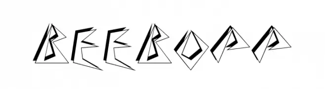
( Fonts by Alan Carr )
A bold, angular font with sharp geometric lines and a dynamic style.
![BeeBopp font caratteri gratis]() Scaricare 314 Downloads
Scaricare 314 Downloads -
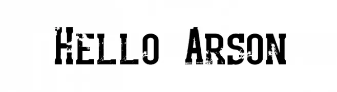
( www.dismantledesign.com )
A bold, distressed font with a grunge, vintage style.
![Hello Arson font caratteri gratis]() Scaricare 314 Downloads@WebFont
Scaricare 314 Downloads@WebFont -
( Fonts by Kreative Korporation - www.kreativekorp.com )
A pixelated, monospaced font with a retro, digital aesthetic.
![LisaTerminal Paper Raw font caratteri gratis]() Scaricare 314 Downloads@WebFont
Scaricare 314 Downloads@WebFont -
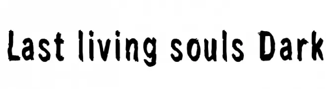
( Fonts by junkohanhero )
A bold, distressed font with a hand-drawn, edgy style.
![Last living souls Dark font caratteri gratis]() Scaricare 314 Downloads@WebFont
Scaricare 314 Downloads@WebFont -
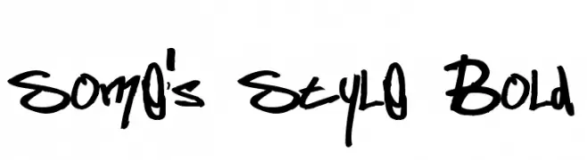
( Fonts by or from www.graffitifonts.net )
A bold, graffiti-inspired handwritten font with dynamic, expressive strokes.
![Some's Style Bold font caratteri gratis]() Scaricare 314 Downloads@WebFont
Scaricare 314 Downloads@WebFont -
( Fonts by Daniel Gauthier )
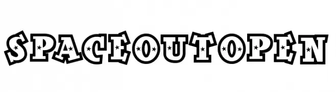
A bold decorative font with star-shaped cutouts and thick outlines, perfect for playful designs.
![SpaceOutOpen font caratteri gratis]() Scaricare 314 Downloads@WebFont
Scaricare 314 Downloads@WebFont -
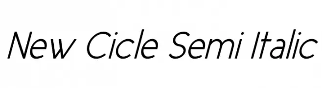
![New Cicle Semi Italic font caratteri gratis]() Scaricare 314 Downloads@WebFont
Scaricare 314 Downloads@WebFont -
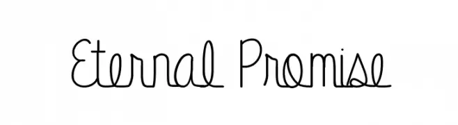
( Fonts by Vanessa Bays - bythebutterfly.com )
A whimsical, handwritten font with narrow, elongated letterforms.
![Eternal Promise font caratteri gratis]() Scaricare 314 Downloads@WebFont
Scaricare 314 Downloads@WebFont -
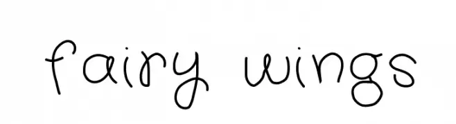
![fairy wings font caratteri gratis]() Scaricare 314 Downloads@WebFont
Scaricare 314 Downloads@WebFont -
![Aierbazzi font caratteri gratis]() Scaricare 314 Downloads@WebFont
Scaricare 314 Downloads@WebFont -
( Fonts by letterey )
A playful, handwritten font with smooth, flowing lines and a casual style.
![Liddy font caratteri gratis]() Scaricare 314 Downloads@WebFont
Scaricare 314 Downloads@WebFont -
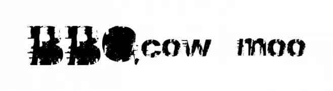
![BBQcow moo font caratteri gratis]() Scaricare 314 Downloads@WebFont
Scaricare 314 Downloads@WebFont -
![CRU-Janon font caratteri gratis]() Scaricare 314 Downloads@WebFont
Scaricare 314 Downloads@WebFont -
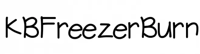
( Fonts by Khrys Bosland )
A playful, informal handwritten font with rounded, consistent strokes.
![KBFreezerBurn font caratteri gratis]() Scaricare 314 Downloads@WebFont
Scaricare 314 Downloads@WebFont -
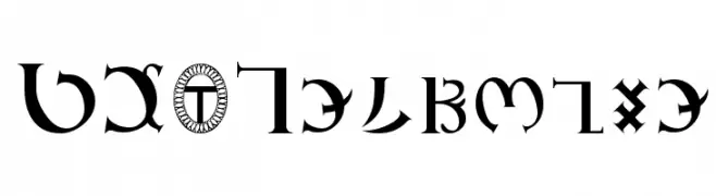
( Fonts by Kenneth Hirst )
A mystical and decorative font with intricate curves and sharp angles.
![GD_Enochian font caratteri gratis]() Scaricare 314 Downloads@WebFont
Scaricare 314 Downloads@WebFont -
( Fonts by MJType )
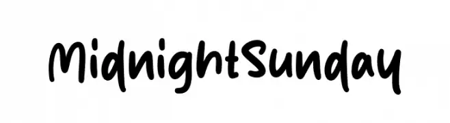
A playful, bold handwritten font with rounded, casual letterforms.
![Midnight Sunday font caratteri gratis]() Scaricare 314 Downloads@WebFont
Scaricare 314 Downloads@WebFont -
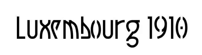
( Fonts by www.peter-wiegel.de. Personal-use only. For commercial use please contact owner. )
A bold, geometric font with art deco influences and angular letterforms.
![Luxembourg 1910 font caratteri gratis]() Scaricare 314 Downloads@WebFont
Scaricare 314 Downloads@WebFont -
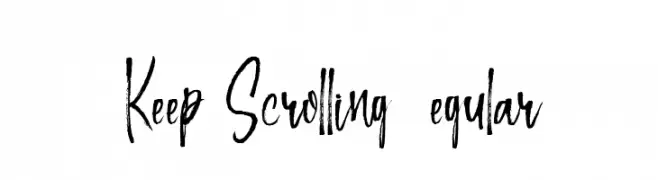
![Keep Scrolling Regular font caratteri gratis]() Scaricare 314 Downloads@WebFont
Scaricare 314 Downloads@WebFont -
( Fonts by Manfred Klein. Free for private and charity use. Free for commercial with donation to organizations )
A classic serif font with elegant curves and a modern touch.
![Lipsiantiqua-Regular font caratteri gratis]() Scaricare 314 Downloads@WebFont
Scaricare 314 Downloads@WebFont -
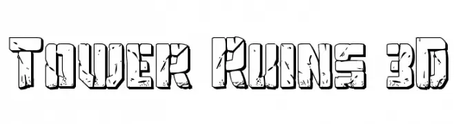
( Fonts by Daniel Zadorozny - www.iconian.com - Free for personal use )
A bold, 3D block font with a distressed, stone-like texture.
![Tower Ruins 3D font caratteri gratis]() Scaricare 314 Downloads@WebFont
Scaricare 314 Downloads@WebFont -
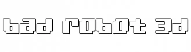
( Fonts by Daniel Zadorozny - www.iconian.com - Free for personal use )
A bold, geometric font with a 3D effect and a futuristic, robotic style.
![bad robot 3d font caratteri gratis]() Scaricare 314 Downloads@WebFont
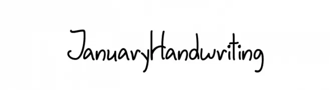
Scaricare 314 Downloads@WebFont -
![JanuaryHandwriting font caratteri gratis]() Scaricare 314 Downloads@WebFont
Scaricare 314 Downloads@WebFont -
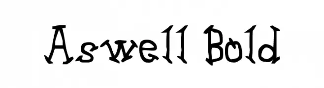
( Fonts by uatype.faithweb.com - UnAuthorized Type )
A bold, playful font with a hand-drawn, whimsical style.
![Aswell Bold font caratteri gratis]() Scaricare 314 Downloads@WebFont
Scaricare 314 Downloads@WebFont -
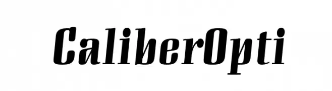
( Fonts by Castcraft Software - opti.netii.net - check the website before use )
A bold, slanted font with a modern and dynamic style.
![CaliberOpti font caratteri gratis]() Scaricare 314 Downloads@WebFont
Scaricare 314 Downloads@WebFont -
( dcoxy - Greg Medina - www.dcoxy.com/ )
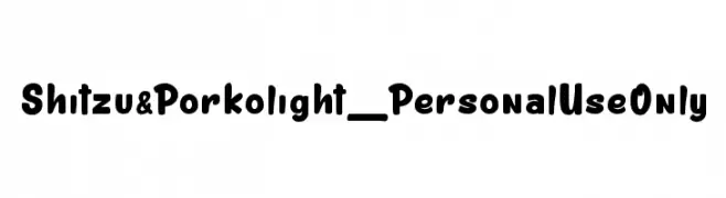
A playful, bold font with rounded, thick strokes and a friendly appearance.
![Shitzu&Porko light_PersonalUseOnly font caratteri gratis]() Scaricare 314 Downloads@WebFont
Scaricare 314 Downloads@WebFont -
![Simple Signature font caratteri gratis]() Scaricare 314 Downloads@WebFont
Scaricare 314 Downloads@WebFont -
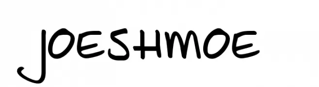
( Fonts by David Kerkhoff - www.hanodedphotography.com )
A playful, handwritten font with smooth, flowing curves and a casual style.
![JoeShmoe font caratteri gratis]() Scaricare 314 Downloads@WebFont
Scaricare 314 Downloads@WebFont -
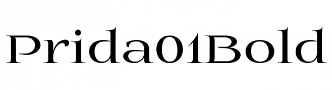
![Prida01Bold font caratteri gratis]() Scaricare 314 Downloads@WebFont
Scaricare 314 Downloads@WebFont


Quali sono i font più popolari adesso?
Poppins, Roboto, Montserrat, Open Sans e Lato sono molto usati per le forme pulite e l'ampia applicabilità — dall'identità di marca alle landing page e ai poster.
Quali font si usano spesso nei loghi?
Le sans serif geometriche (es. Poppins, famiglie in stile Gotham) sono scelte comuni per un branding pulito e scalabile. Per un tocco personale restano valide script e stili manoscritti. Abbina un display deciso per i titoli a un corpo testo neutro per riconoscibilità ed equilibrio.
Ogni quanto si aggiorna la lista?
Con regolarità, in base ai download e all'attività reale. Torna spesso per scoprire in anticipo le nuove preferite.
💡 Consiglio: aggiungi ai preferiti — le tendenze cambiano in fretta e i font top di oggi possono ispirare il rebranding di domani.